Showing posts with label Melee Publications. Show all posts

Saturday, February 29, 2020

Kitbashing a Space Ship 3

Next up, something that's a mix of the previous two:

  • Keeps the stair steps of the main unit.
  • Brings back the three engines to the rear, but smaller.
© Mike Mitchell

Similar problems continue. The proportions are off and it just doesn't look as cool as the first one.

I still have a few more to go, and these will be rather different from these first three.

Thursday, February 27, 2020

Kitbashing a Space Ship 2

When I started kitbashing these spaceships, I spent about four hours one night just going through my Runtime and mixing and matching ships and pushing things together. The next night I reviewed my work and chose the one I thought would work best, and that is the one I posted on Wednesday.

Here's the second one I thought would be workable. The things I liked about it:

  • The little "stair steps" behind the main module; I thought they would catch some cool shadows.
  • I thought the square engines on the back would be more in style with the square engines on the front.

© 2020 Mike Mitchell

It's not bad, but not good enough to be the "hero ship" of my series. I think the main issues are that it's just too stubby and the stair steps don't really catch the shadows the way I thought they would. They're kind of weak.

Oh well, maybe it can appear as a background ship.

Friday, January 3, 2020

Days Gone 22 - Cabin in the Woods (Blue)

One of the great things about being busy is that I've got a lot of great artwork to show for my past year. One of the not-so-great things is that I frequently neglect to post project updates.

So, yes, I've done a lot of work on Days Gone over the past year. Okay, not a lot, but some. And it's been pretty good. One thing that became apparent was that I needed to include more scenes with the dragon being wicked, so I started to create a scene showing the dragon attacking a village (or at least a farmhouse). And this is what I came up with – regarding the farmhouse in the woods, that is. As you can clearly see, the dragon is nowhere in sight.

At least not yet.

You see, as i created this scene, I kind liked how simple it was. No dragons, zombies or goblins. Just a cabin in the woods as a simple landscape. So, over the past two days, that's exactly what I created: this simple landscape in my signature blues and browns.

Fear not, fantasy fans, as I shall work on adding the dragon any day now.

© 2020 Mike Mitchell

Next Time: Another (long-overdue) update

Friday, May 31, 2019

Days Gone 22 - Fitting Room to the Rescue (mostly)

Poser has a great feature called the Fitting Room. This is a place where you can do a sort-of cloth simulation in order to make adjustments to clothing props and make them fit the current morphs/pose of the selected figure.

I say it's sort of like the Cloth Room because it really doesn't seem to do full-cloth simulations (like where you can drape cloth from a pole or hang it on someone like a shroud. The Fitting Room is designed to be more limited in scope and just make clothing fit better on problematic or extreme poses.

So, as you saw last time, I was having more trouble with the straps of the chest harness the character wears:

Detail from Days Gone, page 5
© 2019 Mike Mitchell
Both the size and location were not consistent, plus the ring on the side should be under his arm, not forward, almost in line with his nipple. I messed around with this several times in Poser and just couldn't get what I wanted while the straps were conformed to his body. That's when I decided to give the Fitting Room a shot.

Now, I have used the Cloth Room in the past and had watched two quick videos about the Fitting Room, so it wasn't completely alien when I got there. I knew that I would need to define the soft object (the chest harness) and the target (M4 model) and then run a simulation.

Something I did not know was that this works best when all targets load at the 0,0,0 coordinates. When I was in the room I didn't see either top or M4. The viewports were empty. However, the Fitting Room Dialog box showed that the two meshes were available, so I ran the simulation anyway.

And guess what? It worked.

The top was reshaped to Mike's body. Of course, now I had to move the top across the cave and manually place it on his body, but it fit and looked pretty good. However, when it came time to render, I decided that i wanted more control, so I rendered his body and the strap in separate images and then combined them in Clip Studio Paint. I even used the Mesh Transform tool to reshape it just a little so I could get that ring away from his chest and just a little more under his armpit area.

Here are the results of my hard work (this time showing the entire four-panel sequence that spans both page 4 and 5):

Days Gone, pages 4 & 5
© 2019 Mike Mitchell

Needless to say, I'm much happier with the results. The detail on the stomach is more interesting and I think I did a better job on his hair this time around.

Next up: Selling Emotion Through Body Language

Friday, May 24, 2019

Days Gone 21 - Current Project Update

The good news is that I have not been sitting on my butt since my last blog post about this project (wow – 9 months or so?). I've been working on pages, figured out a new system for doing the hero's hair, and have been making progress. I also took some breaks to work on other things, such as Princess of the Trees 2 and a book cover for The Epic Anthology of Galaxy Prime. I will write (and share pics) about both in the future.

I'll play catch-up later and reveal some shots of the comic in progress so far. Here's a look at what I'm working on right now (and how I fixed the problem).

In order to "rough up" the hero a little and give us some visual cues that he had been in a rough fight with the dragon, I decided to add some cuts to the character. A few on his arm and one on his face. Now, the cuts on his arm are pretty easy to place – and if they move a little bit between panels I'm okay with that, as it enhances the hand-drawn look I'm going for.

But the cut on the left side of his face... That's turned out to be problematic.

I'll see if I can find a shot of the original attempt, but the short of it is that I couldn't draw it consistently from panel to panel, especially when his face was moving around. After a few failed attempts (and some discussion with other artists during a DigitalArtLive.com workshop, I decided that I just needed to go back and edit the texture map for the face.

Now, as you may recall (that is if I wrote about it, I can't remember), I have stripped almost all of the texture maps off of my main characters. This gives me crisper shadows and gets rid of the speckling that can be caused by bump and displacement maps.

Here's an example of a figure that still has those maps, and you can clearly see the small dotted effects on his face. Now, there's nothing wrong with this effect at all. in fact, I might keep it for The Princess of the Trees 2 book. But for this one it is an effect I don't want.

Arton Character Design (not used)
© 2019 Mike Mitchell
I do keep textures on some of the props and scenery, but for the main figures in this story I only have textures applied to:

  • Hair
  • Face (for eyebrows that I hand drew)
  • Eyes
  • Eyelashes (texture makes them 100% transparent)

So, in regards to the cut on his face I went back to the face map and drew the cut on in Photoshop. It took a few tries to get it placed correctly, but I am ultimately satisfied with the results.

Here's a look at the face map. When in use it is 100% white with only a few black items drawn on it; in this image I'm letting some of the UV guides show through so you can get an idea of where everything is placed.

M4 Face Texture Map
(click to blow it up so you can see the eyebrow details)

So, now that you've seen the underlying mesh and my Photoshop edits, here's how the map looks when applied to the figure across two panels of the comic.

Days Gone, page 5, panels 1 & 2
© 2019 Mike Mitchell
As you can see, him turning his head doesn't affect the placement of the cut on his face. This serves as a perfect guide for any edits I need to make to it during the touch-up phase (in the second panel I shortened it just a little because it looked too close to his mouth).

In the future, I will definitely be relying more on edited texture maps and less on hand-drawn post work to resolve these issues. Which will give me more time to focus on things like why, in the second panel, are the straps so much smaller looking and why has the bottom strap ridden up so much?

Next Time: A long overdue update


Friday, October 12, 2018

Days Gone 20: Poser Tip – Cloth Room Settings

I'm doing some experimentation with a dynamic version of the hero's chest harness, and in doing so I came across these useful settings for the Poser Cloth Room:


I found this online at a discussion group. You can find it here:
https://community.hivewire3d.com/threads/pulling-back-the-drapes-the-cloth-room.368/page-2

My first attempt at using a dynamic harness.
Not bad, but it looks too thin to be leather.
Definitely needs some more work.

For those of you unfamiliar with this feature, Poser has the ability to simulate dynamic cloth. That is, it creates an animation wherein the cloth folds and flows across the body in an attempt to create realistic folds and flow with the body. It's a neat feature (and there is now a plug-in for Daz Studio that does the same thing), but it's very tricky to get it looking just right.

EDIT (05-20-2019): The Dynamic Harness was a dead-end. It just didn't lead anywhere useful. For the remainder of the project I will be using Prae's Epoch Top available from Renderosity.

NEXT TIME: Current update

Friday, October 5, 2018

Days Gone 19 - Panel Set-up, part 3 (Fitting the Frame)

Now that I've got my first render complete, it's time to see how it fits into the panel shape I have already defined in Manga Studio (Clip Studio Paint). As you can see, the slight oversize render makes it fit darned near perfectly in the frame.

Render pasted into the frame in Manga Studio 5 EX
(aka Clip Studio Paint Pro).

I'm more or less happy with the size and shape, but his neck looks a little weird at this angle and I think I need to make him either bigger or smaller. Or, I might start small and then progressively make him bigger in each of the four panels.

I'm going to have to play around with this a bit more to decide what I want it to do in terms of composition and emotional progression.

Next Up: More about panels

Wednesday, October 3, 2018

Days Gone 18 - Fight or Flight

I'm getting deeper into the page, particularly these four panels, and here I hit a problem that is one I frequently encounter with 3D-based artwork: one of the wardrobe pieces doesn't fit the way I want it to fit. In this case, it's the Epoch top (the leather chest harness he is wearing), and in this panel you can clearly see down at the bottom that the strap is folding over.

Red background and blue frame added in
Photoshop to make it easier to see the
render's dimensions.

Now, I don't care if this might be technically accurate in the way that leather straps hang (I don't think it is, but they do flow and fold based on the way your body is moving – and no, I will not tell you how I know that). In this case, it just looks weird.

As I've said, this is a comic book not a movie. I am not striving toward 100% realism. So, I'm faced with a problem that I call Fight or Flight.

Do I spend time in Poser fighting with it (I've already spent about half an hour with the built-in morphs and controls to get it as good as it looks now) with a magnet/deformer? I could easily set one up and try to twist it (I could also try some of the simpler adjustment tools).  Or do I just give up (flight) and fix it in Photoshop afterwards?

Now, if this were his hair or some part of his britches or armor, I probably would spend the time to fix it in Poser. But, honestly? This is a simple strap across his belly/lower chest. I can do a quick edit and resolve the problem.

A few quick lines are all it takes to fix this problem.
That makes it not worth the effort to fix the geometry in Poser.
(Potential edit shown in blue line)

So, rather than get hung up on something that could take me a full day to fix, it's time to move on and worry about lights and his position in the frame. 

Next Time: Panel Set-up, part 3 (Making it fit the frame)

Sunday, September 30, 2018

Days Gone 17 - Panel Set-up, part 2 (Poser Render Settings)

As shown in the last post, I need to match my render size to the printed size. Since I'm working at 800 dpi, this means even slim panels have a lot of pixels. If you're familiar with my Noir Style Tutorial you will remember that having a lot of pixels is a very good thing because it gives Poser and Manga Studio (Clip Studio Paint) the pixels they need to show the detail that I want to work with.

So, in Manga Studio I used some rulers to measure the panels. Across two pages, I have four panels with the identical size. In this case, the dimensions are very close to:
  • Horizontal: 2.65 in (2110 pixels)
  • Vertical: 5.27 in (4220 pixels)
Overview
So I'm going to:
  1. Open the Poser file for pages 2-3.
  2. Use the hierarchy editor to hide all the items I don't want (in this case, everything but the hero).
  3. Set up a new camera (focused on the hero).
  4. Set the render dimensions to roughly match the numbers above.
When I say "roughly," I mean that I'm going to make the panel a little bigger so I have some extra "bleed" room to move the figure around a little bit. I also might bring back the ceiling of the cave, if I feel it adds to the image more than an abstract sketched background.


Click to expand image.
Open the Hierarchy Editor under the Window Menu (gold highlight).
Click on the eyeball icon for each item to make it invisible.
In the screenshot above, I'm about halfway finished hiding the items I don't want for the next panel. This makes the scene load faster and there is less strain on the memory, so everything responds faster. Also, since the item is hidden, I can't accidentally click on it. 

Keep in mind you will need to click on each piece and part. In this picture, you can see that I've successfully hidden the dragon but the cool back ridge scales are still visible. As I finished this, I have decided to keep only the hero, the rock he is sitting on, the ceiling visible. And as I get into working this scene, I may move those items around or hide them again. I won't know until I get deeper into it.


Camera Lock
The first step I'm going to describe is optional: you may not need to do this.

With the Hierarchy Editor open, and the "Cameras" checkbox ticked, I select the Main Camera, then I go to Objects > Lock and turn off the checkmark next to the word Lock. 

I always lock my main camera, so if you didn't do that in a previous step,
you can skip these instructions/advice.

In the past, I have lost work because I accidentally moved my camera between renders. Since this process is built around layering images, it is essential that the camera not move between renders. These days, once I have my camera where I want it, I always lock it. This simple step has saved me a lot of time and heartache.

Camera Settings
Now that I can manipulate the camera, I rotate it and frame my figure from an almost completely straight-on angle. Once I have the hero more or less framed in the window, it's time to set the render dimensions. The can be accessed under Render > Render Dimensions (or by pressing SHFT+CTRL+Y). That will open this window:

Enter the new dimensions. Make sure the "Render to Exact Resolution" option is selected.
Make sure the "Constrain aspect ratio" is NOT selected.

Note the settings above, including the two items that need to be checked/unchecked. After completing this, your active window dimensions will change shape. As always with Poser, the area behind the gray bands to the sides will not render. They are there so you can see what's out of camera, and they help you determine where unexpected shadows might be coming from.

I highlighted the active camera area in the image below.

With the render dimensions set, I now have
a tall, narrow camera view that is the same shape and size
as my final panel dimensions.

This is a tall, narrow space, and since I really to focus on his face (and possibly upper arm – I'm toying with the idea of adding some hand motions to the next four panels as a means of enhancing his emotions – we'll see how it goes). Even before I get into the finer details of posing him, I'm pretty sure his leg is too high from this angle, and it covers up too much of his chest and prevents me from using a lower camera angle. After I get the camera distance set (how close I am to the figure, and which focal length I plan to use for the camera) I will probably need to adjust both his arm and knee on his right side.

A few small adjustments to the camera position helped, but not enough. I also adjusted the focal length to 90mm. This is a variation of a standard portrait setting (typically, portraits are shot at 70mm or 100mm) that is designed to help flatten the nose a little and not widen the face (if you'd like to see a great example of how the lens settings can change the shape of a human head, check this out).


This is almost right, but his forearm and bracer are huge. There are also
problems with the line thicknesses. This means I have different values
for different body parts in the Materials Room.


Time for more adjustments. The forearm and bracer are HUGE, and those thick outlines (which helped in the long shot of the previous page) look outrageous here. So, I went to the Materials Room and set his shoulders and the bracer to a smaller value (Geometric_Edge = 0.003). Then I scaled down the bracer by 3% and tweaked a few other scale settings.

Click to see the scale adjustments I made for the bracer.
Also note the thinner outlines on his shoulders.

This is looking better. The arm isn't so exaggerated, the lines are tighter against his body. I do see the need to tweak his chest harness to his side, and possibly the angle of his neck. But all in all, this is getting close enough for me to do a test render and see if it fits in the comic panel the way I want it to.

Next Time: Mock-ups and using the Sketch Render as a proofing tool

Friday, September 28, 2018

Days Gone 16 - Panel Set-up, part 1 (using the Ruler Tool)

Recap: The script is written, I've sketched out the thumbnails and set up the "roughs" of the pages in Manga Studio 5 EX (also known as Clip Studio Paint – they are basically the same software). The roughs have the panels shaped and sized the way I want them and the lettering is roughly where I think it will go based on the thumbnails.

So, now it's time to go back to Poser and render the images that will serve as the basis of my artwork.

Now, the two previous "panels" I worked on were full-page illustrations (page 1 is a single page showing the mountain, pages 2-3 is a two-page spread showing the opening scene inside the cave). This made it very easy to work on them because I didn't have to worry much about frame borders or anything like that. And, because they were the first pages, whatever I did would look fine because it's the first thing you're going to see.

But, moving forward I have to worry about keeping my inking line thicknesses consistent. I can't have a character with really thick outlines on panel one and then thin outlines in panel two, then back to thick for panel three. It needs to be roughly consistent between panel to panel to panel (and throughout the story, really).

Even though they are called "roughs," these pages are 100%
size and resolution with all the frames drawn out and where I want
them. Text, balloons and that background shading is for placement
purposes and will be tweaked prior to publication.


Measuring the Panels
This brings me back to why I created the page "roughs" in Manga Studio (aka Clip Studio Paint). I need to know the approximate panel size so I can set up a matching camera in Poser Pro 11. But there's sort of a problem... I did this so long ago I don't recall what the panel sizes are, and if there's a way to click on a panel and see its dimensions, I haven't yet figured out how to do it. I could just print it out and use a physical ruler, but I'm a little concerned that the printer might shrink or grow the page a little to fit on the paper (even though I told it not to – and in the end, it turns out it did print correctly, but I didn't know that until I made the in-software measurements to confirm it).

So, I needed to use the Ruler Tool in Manga Studio.

Here are the steps I used to measure the panel and get the measurements I need to set up the render window and cameras in Poser:

I edited the rulers and provided the emphasis
to make this easier to read online.
Using the Ruler tool:

  1. Select the Ruler icon from the tools, then select the type of ruler you want (I chose the Linear ruler).
  2. Select the page, then select the frame (or whatever) you want to measure.
  3. Create a new layer (not shown in screenshot)
  4. Click and drag the ruler from where you want to start and stop. Release the button.
  5. A ruler will appear on the new layer (if you need to change the units (pixels or inches), you can do so on the tool details – see pic below).
  6. A ruler will appear and you can then zoom in and read the ruler.

Before you start drawing the ruler, select the desired units.


In my case, I wanted both pixels and inches, so I made two rulers for each direction: horizontal and vertical. Note, these rulers are very small and very light, so in the screenshot above, I edited them to make them easier to read. They are actually a very light turquoise/cyan.

In this case, the dimensions are approximately:

  • Horizontal: 2.65 in (2110 pixels)
  • Vertical: 5.27 in (4220 pixels)
I don't need these to be precise. I just need a good estimate (I'll explain why next time). Now that I have those numbers, I can go into Poser and use them to create the cameras for the next scene.

NEXT UP: Panel Set-up, part 2 (render dimensions)

Wednesday, September 26, 2018

Days Gone - Project Contents

Now that my work schedule has finally settled into something more of a routine, I'm finding time to actually get back to work on this "short" comic project that was supposed to be done about a year ago (as I write this). As I got back to work, I took a glance through my old blog posts (some of which may serve as supplemental material when I get around to publishing this as a comic), and I realized that I should finally collect the individual posts into a single list.

For this, I think I'm actually going to sort the articles by topic, rather than just include a numeric/chronological list. I'll try to keep this updated, but you can always click on the "Days Gone" link under the Topics (keywords) list to the right. And, by the way, if you want to read a chronological listing of the articles, you can use the topic heading listed above.


Days Gone Posts

Project Workflow & Creating a Comic
These are primarily about organizing the project. Ideas and observations about character design and about actually making the comic. This includes everything from sketching thumbnails to buying the 3D elements used in the scenes (wardrobe and sets) and using the software to put it all together.


Technical (Software Use: Poser, Manga Studio / Clip Studio Paint)
Day-to-day use of the software is discussed above. These posts are detailed, technical issues or problems focusing directly on the use of the software itself, as well as links to resources and tutorials that may not be directly flagged as "days gone" in the keywords, but were discovered as part of my process.


Art Samples / Works In Progress
Art and character design, as well as illustrations used in other projects (and some work that I did before "officially" starting the Days Gone project).

Friday, August 17, 2018

Days Gone 15 - Large Scene Management and the Poser Hierarchy Editor

This is one of the largest scenes I've created in a long while. There are LOTS of elements and lots of pieces to them. If you've ever used Poser with a large scene, you know that it can be difficult (and frustrating) to use the Hierarchy Editor to find a specific nested node (in lay speak, that means you have to look through a complicated list to find something, like the hair, that is buried deep in the list of an item's editable properties).


A rare color view of my scene (note the pink light on the hero:
This sort of trick makes it easy to spot which light is hitting which surface
(and since I work in b&w output, the light color doesn't matter as
far as the final render is concerned).

You can also see a little of the complicated Hierarchy Editor, which shows
a list of everything in the scene.

The way I navigate this long, complicated list is to put really long names with dashes (or other characters) in the item name property. So, instead of looking for Nirona, Michael 4 (Hero) and the Dragon, I'm looking for:

  • V4 Nirona +++++++++++++++++ V4 Nirona
  • Michael 4 = = = = = = = = = = = = =  Hero M4
  • DAZ Dragon 3 - - - - - - - - - - - - DAZ Dragon 3
A compressed look at the items in the scene, as shown in the Hierarchy Editor.
Also notice that I mark one item with the words, HIDE, which is a very
useful note for later. I also used numbers (2 ----- 2, or 1 ----- 2) to
mark which items are near each other.


These long names really stand out in the list and (so far) do not seem to have any negative effect on application performance. Here's a screenshot of the Hierarchy Editor window, and although it's not highlighted, you can see that I also mark specific items of interest that are nested inside a figure. In this case, I've added a bunch of dashes to the M4 figure's hair, making it easy to find in case I need to make a quick fit adjustment.

Click to see it in more detail.

I know a few people who find this to be VERY weird. They like short names and don't want to clutter things up. I, on the other hand, find that this is a very useful method of finding what I want very quickly.

NEXT TIME: Moving on to the next steps

Wednesday, August 15, 2018

Days Gone 14 - Building a Better Cave

Whew! Sorry for the looooong delay between posts. I've just been busy with other stuff and have really fallen behind on both the comic book work and on posting updates.

As promised, here's a quick post about the "set design" for the interior scene. I put that phrase in quotes for a definite reason. You see (at least I hope you will), this is not a full set design as I would make for an animated film. I didn't worry about walls or even exact locations. I put stuff where I needed it so it would fall where I wanted it in the main camera (for those of you who are just now joining us, I'm working in Poser 11 Pro).

Here's the final picture, which shows everything where it is.

Here's a look at the basic scene that will take up pages 2 and 3.
I marked two landmarks in the scene: 1. Hero Rock and 2. Treasure Chest.

Here's a shot from another angle that gives you an idea of how I moved things around to fit them into the viewport.

This is an oblique view, looking down at the scene. In some cases, I have
scaled objects to increase their size so they would look better from a distance.
The ceiling is hidden in this view.

As you can see here, I'm being loosey-goosie with the location of objects; my goal was to fit them into the scene and frame the shot I wanted. As such, I had to play around with their scale. The gold coins in front are scaled down to 75%, but the coin piles in the rear are scaled up to 130%, and the treasure chest is a whopping 194%.

View from the side. You can see that I also played around with the y-axis.
By that, I mean there is no ground plane visible. I raised things up or lowered
them down as needed to get the framing I wanted.
The different scales were needed to get the sense of space that I was striving for in this scene. I fully expect that I will have to move things around again for other panels. If they were going to be walking around the set a lot, this approach would be problematic, but fortunately there are no other long shots that cover the rest of the cave. From this point on, I'll be working with medium and close-ups, so the fragmented construction of the set shouldn't be an issue.

Top-down shot. That big black blob near the Hero Rock is actually the cave ceiling.
I thought about having it cover the entire scene, but that just blocked all the lights
and made things a lot harder to work with. Having a small prop in front of the camera
worked out a lot better for multiple technical reasons (most having to do with lighting).
 I was inspired to try this approach from a variety of sources:

  • I read an interview about the creation of the first Incredibles movie, wherein the director said they only built the parts of sets that would actually appear on camera (much the way most movie sets are built).
  • A visit to the Houston Natural History museum several years ago: We saw an exhibit of the props from The Lord of the Rings movies, and there was a set recreation that showed how they used forced perspective to blend the actors together with the scenery so that the Hobbits could be farther away (and thus look smaller) and Gandalf would be closer to the camera to make him look bigger.
  • My old college film classes where we saw how they used matte paintings (a sheet of glass with a painting on it to put in something that wasn't really there (this is why I chose to do the ceiling/cave roof the way I did).


Here's a few videos on Forced Perspective to give you an idea of what I saw at the museum.


Not a perfect example, but very good advice.


And here's another one, that shows how the masters did it in the LoTR movies.


This special feature shows the same table set that I saw at the museum.
It was a very cool display, as we could walk around and see it from multiple directions,
then move to the camera position and see it from that POV.


And, just one last thing. Yes, since I am working in 3D, I find just as much useful information from filmmakers and photographers as I do from comic book and traditional artists.

NEXT TIME: More on developing my establishing shot


Friday, August 10, 2018

Days Gone 13 - The Hero Makes a Cameo

Haven't had time to work on Days Gone for a while now, but the other day I needed an illustration for a mailing label for the Collectors' Club Newsletter, so I took an old illustration and colorized it.

© 2018 Mike Mitchell

Not a bad job for a quickie. To be honest, I had expected to make his trousers blue or brown, but I found that they looked nice when I matched them to the red arm bands. I don't think these are the definitive colors I'll use when I create cover art for the book, but it was still a fun exercise in digital coloring.

Friday, May 18, 2018

Days Gone [Addendum]

Hard to believe that I haven't posted an update on this project for almost six months. Wow. Time flies when your full-time career starts consuming almost all of your waking hours with commute and work. But I think the big hurdle in that particular project has been passed, so I'm trying to get a handle on time again so I can get back to work on Days Gone #3.

As a side note to this project, I found myself needing a back cover illustration for the Collectors' Club Newsletter #122, so I quickly pulled out two separate illustrations from the Days Gone project and combined them into the illustration below.

Dragon Spire
© 2018 Mike Mitchell

I made the color choices because I wanted to emulate the old three -color printing process that was frequently used in fanzines back in the 1970s and early 1980s. I also chose the framing effect (cropping the background smaller than the figure so we could see paper on the sides) based on a Conan or Kull portfolio piece I saw in an old Savage Sword of Conan magazine.

Speaking of which, I've really been enjoying reading those old issues. I've been buying lots of them this year, and have about half of the series. I'll write more about this in a future blog.

Friday, December 15, 2017

Days Gone 12 - Location, Location, Location, pt 4

Last time I showed you the unretouched render that Poser 11 created. As you could see, the basic shapes were there, but it was nowhere near a finished illustration. It lacked detail, and anything that would really give it a sense of scale. Not to mention the cave near the top where the dragon lived.

So, I then started on a process that surprised me with how long it took to get something solid that I really liked. Oh, I was able to generate a few images that were kind of close to what I wanted, but since this was the first page of the story, I really wanted to make an impression with it. Plus, even though my deadline was rapidly heading toward me (so much so that I was pretty darned sure I was going to miss it), I spent the extra time to figure out what I wanted and how to get it.

Here are a few examples of the early drafts that I was able to create.


1. My first attempt at page 1
Note the dark shadows on the distant mountains
and the tick horizon lines.

This first look (and all subsequent designs) include a hand-drawn trail going up the side of the mountain to a small cave opening. I struggled for a long time as to whether there should be a path leading directly up to the mountain, or off to the side. I finally decided to forego logic (why would anyone in their right mind make a road leading to the home of a fire-breathing dragon?) and just focus on the illustration itself. The composition was simply stronger with this path, so it stayed.


2. This was a very experimental look, with a very
strong tint of gray sand and a less
dramatic sun effect.
My first attempt at darkening the sand was promising, as it made the road really stand out and enhanced the sense of "dramatic scale" that I was striving for. Alas, it was just too dark. And when I showed the illustration to some people at the Daz3D forums, they thought it looked more like a vortex than the sun, so this experiment was very short lived.


3. A later attempt. Note the thinner horizon lines
and the obvious addition of the gray tint to the sand.
This helped make the road "pop" more, but
ultimately I didn't like the effect.

Other experiments included lightening the sand, editing out some of the ground lines, and working to add another layer of shadow the dunes. This one survived for a long time, but I ultimately decided that the ground was still just too dark, so I scapped it and moved on.


4. Getting much closer to the final version.
Note the addition of the mountain's shadow,
and toning down the shadows on the
distant mountains.

The image above (No. 4) is very close to the final piece. I added the ground shadows to the dunes, leaving the barren sands mostly white. And, of course, the mountain's shadow helps deliver the "pop" that the previous "dark sand" versions did. I also simplified the plants in the foreground, and greatly lightened the distant horizon. As I said, a lot of work, but I'm finally mostly happy with it, and that means I was finally able to move onto the interior of the cave.

Next Time: Building a Better Cave


Friday, December 8, 2017

Days Gone 11 - Location, Location, Location, pt 3

With the landscape props selected (see last week's post), I then set about creating the base image. I set the camera up with the correct page dimensions, yielding me an image with the dimensions of 5,300 x 8,200 pixels. This is for an 800 dpi resolution.

Some of you who do 3D on a regular basis might be freaking out about the size of the image. I can't count the number of times I've had "experts" tell me that anything above 300 dpi is a waste of time. Even some of the more "enlightened experts" think that going above 600 dpi is a waste. But here's the reality, folks: for you to get the most out of Poser and Manga Studio, YOU NEED TO HAVE ENOUGH PIXELS TO WORK WITH. Yeah, I shouted that because it's important.

The Comic Book Preview in Poser works better when it has a lot of pixels to work with. And, because it is only rendering in b&w, even an image of that size will render in less than 3 minutes (often half that time).

A screenshot of my Poser environment for creating
the opening page of my story.
I also find that the pens in Manga Studio (aka Clip Studio Paint) work better with more pixels. There's simply more pixels for it to use when calculating the end tails (the thin part at the end of a stroke) as it goes from thick to thin.

The groundscape was a bit of a challenge, and I do wish I could show you a link to what I chose, but I can't find the original product. I suspect it's something that's been in my Runtime directory for a long time. I didn't find any ground or desert plains that I liked, but I did find patches of snow that I liked. I distorted them to be very flat and then moved them around until I came across something I thought looked like desert dunes...more or less. If I do ever track down the source for the snow, I'll provide it to you.

With the basic shapes in place (using the distorted Cliff Demon for the front, and other ones for the background), I was ready to render and then move it into Manga Studio to start working with it. As you will see, this process produced a lot of variations as I struggled to find a look that I liked and that captured the sense of scale I was trying to convey.

Next Time: A few rough drafts

Friday, December 1, 2017

Days Gone 10 - Location, Location, Location, pt 2

As an artist who uses 3D as the basis of my work, I face a few problems that are more closely related to film making than they are to traditional comic book illustration. That is to say, a comic book artist can pretty much draw whatever he imagines, whereas a filmmaker needs to scout for locations, or build a set on a studio.

In terms of 3D, these two options can be equated to buying a ready-made 3D resource (prop, set or scene) or modeling one from scratch (or paying someone else to create it for you). Modeling anything, even something as relatively simple as a mountain spire, is a time-consuming task, and one that I would rather avoid whenever I can. So, I hit the 3D asset stores and started looking for both the mountain and the cave. The three places I searched hardest were:


The first two of those vendors should be very familiar to anyone who works with either Poser or Daz Studio. The third store is tied to the Unity game development platform. Despite not having content specifically geared for use in Poser, there are a LOT of useful models and assets there that can easily be imported into any 3D program, including Poser.

After a fairly long search, I finally settled on Cliff Demons Landscape Props by Poisen.

Cliff Demons Landscape Props by Poisen
Available from Renderosity.com
The thing that I liked was the general shapes, not so much the faces (although I did consider using them). These were sold as OBJ files with associated textures (which I did not use). Ultimately, I selected one that had the general properties and then stretched it up nice and tall, and turned the face away from the camera.

This is the one I selected. I stretched it very tall
and then turned the face away from the camera.

I also used some of the others, stretched out short and wide, as the distant mountains that you saw in last week's post of my initial rough draft.

Next Time: A few drafts of the first page

Friday, November 24, 2017

Days Gone 9 - Location, Location, Location, pt 1

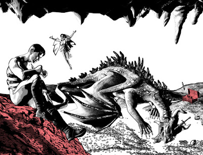
As I said much earlier, one of the things that appealed to me about this story was the small cast (whom you've "met") and a limited location. In fact, the whole thing takes place inside a single location: A mountaintop cave which happens to be the lair of Clawfire the Wicked.

My very first thumbnails for the story opened inside the cave and all action took place there. But when I started to flesh it out, I instantly realized that I needed an establishing shot to show where the cave was located. So, I drew the rough draft shown below:

Original rough draft sketch for page 1
of Days Gone. © 2017 Mike Mitchell

As you can see, my sketch is very rough. The sketch is 100% of its final printed size, with the various boxes representing the bleed, trim and safe zones for the story. I created the template in Photoshop based on the template provided by my printer, Comix Wellspring. I also pre-printed the intended logo for the story (but that's since changed, and moved to page 2).

The goal of this image is to set the scene for the story, with a fantasy-type mountain as the scene. The switchback path on its front was added to help give it a sense of scale. You'll also see that I originally considered adding a bunch of trees or a village to help set the scale and give it a sense of place in the world.

As you'll see, very little of that survived my first attempts at actually creating the image.

Next Time: Finding the right 3D resrouces

Friday, November 17, 2017

Days Gone 8 - Meet the Cast, pt 3

Calling this next figure a "character" in the story may seem like a bit of a stretch because he doesn't have any dialogue in story. But he's a very powerful presence, nonetheless:

Clawfire the Wicked


I always knew the dragon would be a big part of the story. Heck, without him, there is no story! But finding the right look for him, on a model that would work correctly in Poser, took a little doing. I found several good dragons, but none of them had the classic ridge spines I wanted. They all looked like glorified lizards with wings. In other words, they lacked the epic quality that I wanted for this story.

I finally found a combination of a figure and character that worked for me: The figure is the Daz Original Dragon 3 figure, and the character is the Zilladreki character by RawArt. Both of these products can be purchased at Daz 3D website: www.daz3d.com.

Daz Dragon 3
Provided the base shape
and movement parameters

Zilladreki
The spine ridges are a separate
prop that can be added to the dragon
.

To get the horns and other modifications to the base model, I also needed the Dragon 3 Morphs by Daz Originals. Combined, these gave me the tools I needed to create this powerful creature of myth and magic.


Clawfire the Wicked    |    © 2017 Mike Mitchell
Of course, having the character's look didn't mean that I had a NAME for our fire-breathing friend... er, fiend. For some assistance, I posted a request for naming help on Facebook. I put the request in two groups: The ICC Independent Comics Creators (a great place to hang out with other creative folk) and a group devoted to old-school gaming (RPGs and minis, mostly). Between those two groups, I got more than 500 suggestions. The funny thing is, I chose two and mixed them together to come up with the name, and they were submitted in the first 10 names I got!

Thanks to David and Ronan Houston (a father and son team) for creating the name of our wicked dragon who will drive the action of this story.

Next Time: More about the Location of our Tale