When I started on this Noir Style Tutorial, I honestly had no idea that it would be this long. Both in terms of content, and in terms of how many posts there would be. This is part 20, for goodness sake, and this will have run (twice a week, no less) from July through almost the end of September. There were a few times, I admit, that I struggled with whether or not I was going into too much detail. But, truth be told, if I'm going to sit down and document all of this, I'd rather be thorough so that newbies can understand what I'm talking about.
Nevertheless, I do recognize that experts are going to be put off (if not downright angry) that this is so long. So, I'm going to summarize the entire process again, but this time very quickly and with minimal screenshots. I'm also going link each example back to the main article so you can easily find your way to more detail, should you need it.
Our Goal / Summary
- Our goal is to create a static, black and white image that looks like it was hand draw using a stark, "Film Noir" (or "Crime Noir") look.
- We are going to create at least 2 renders in Poser 11:
- Render 1 will have small, tight shadows. I call this the "black" render."
- Render 2 has larger shadows. I call this the "gray" render."
- We will clean the renders in Photoshop (this step is optional – I have actually removed it from my workflow because I have gotten better at using Clip Studio Paint).
- Final editing in Clip Studio Paint (aka Manga Studio):
- Create a new document in Clip Studio Paint.
- In the Layers Panel, put Render 2 on top of Render 1.
- Set the blending mode for Render 2 to "Multiply."
- Set the opacity of Render 2 to 30%.
- Add frames, words, edit the base renders, etc. to complete the image.
|
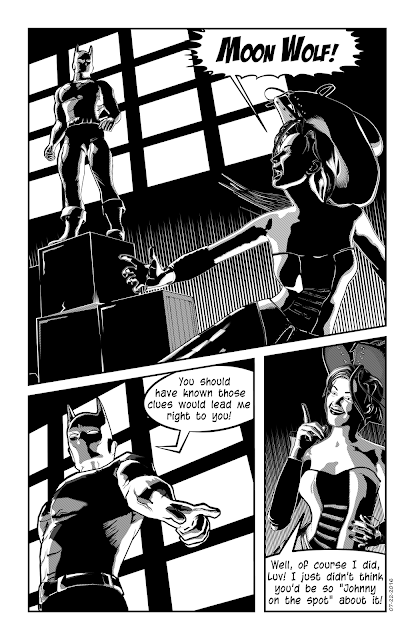 |
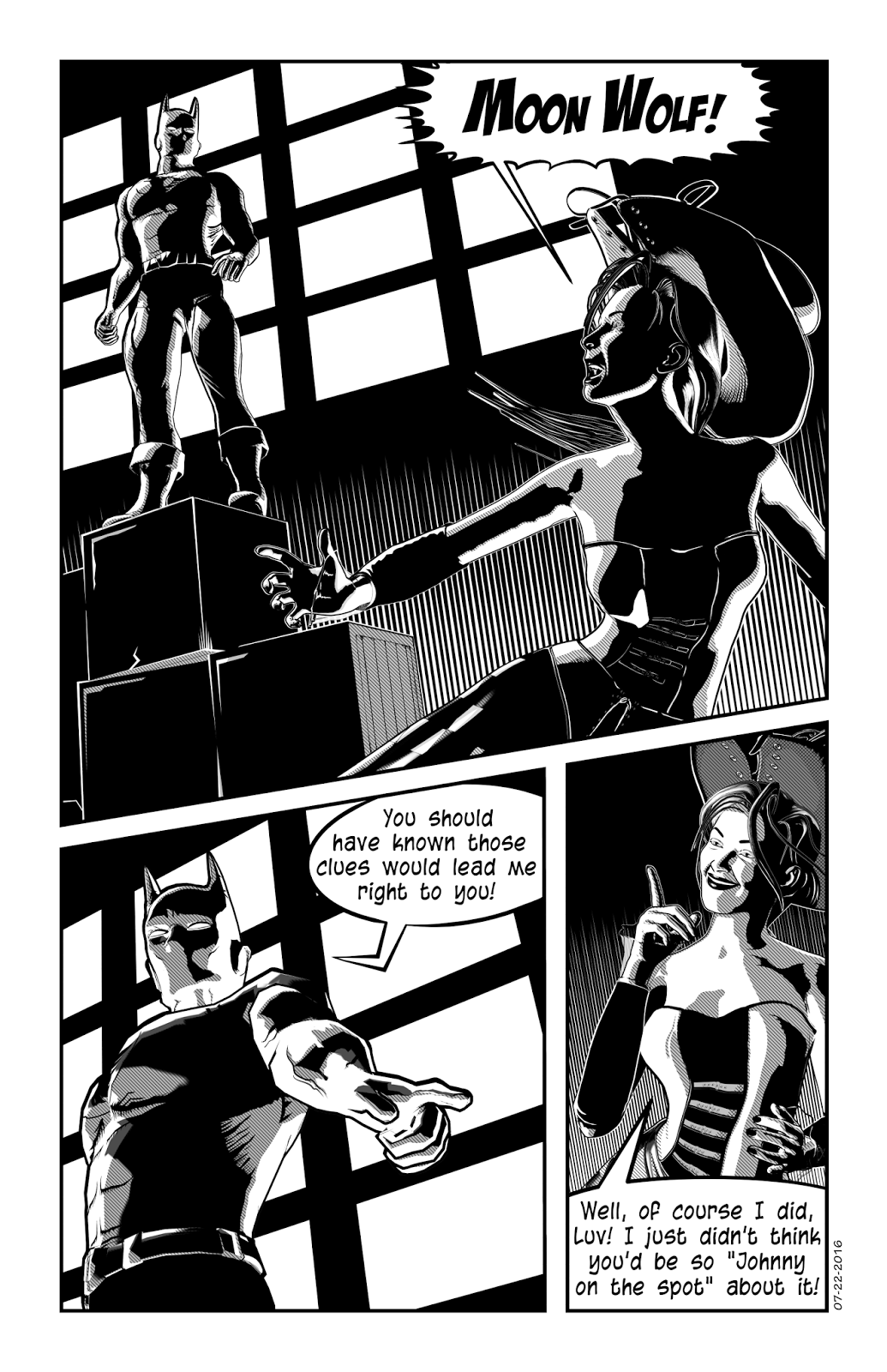
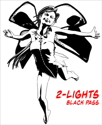
Stark lines, deep shadows and dramatic angles
are all part of the Noir look. This page was
created using the Anomaly Process.
© 2016 Mike Mitchell |
The Anomaly Process, Step-by-Step
Step 1: Figure Set-Up
This process only works with
Poser 11 (Pro or regular versions), so you need to limit yourself to a figure that works well in Poser 11. I suggest Michael 4 and Victoria 4 as your starting point. We start by opening Poser 11 and setting up our figure, props, etc.
Step 2: Turn on Live Comic Book Preview
One of the cool things about this process is that it is LIVE. You see your results
before you render. This makes it very easy to make subtle changes to your render. The icon to turn on the Comic Book Preview is at the bottom of the main viewport. Note that this works with all the
display modes: you'll probably want Shaded Textured (or possibly Comic Book).
|
|
Click the icon to open the Comic Book Preview Options pane.
|
Regarding the settings in the Comic Book Preview: Please note that the default settings in Poser are horrible. You need to change these or you will not get good results. I suggest setting the
Geometric Edge Lines between 0.25 - 0.66. The smaller the number, the thinner the line that will appear around the edges of the shapes. Likewise, I find that the
Threshold settings work best between 0.33 - 0.8 (I typically keep mine around 0.4 to 0.6). The smaller the number, the smaller she shadows. As for the color, that's up to you; I prefer to work in black and white.
Step 3: Edit Materials
For most figures, bump maps are not your friends. They cause little ripples on the skin that look weird. I usually strip my figure of all color and make the eyelashes transparent. Note that, in the Material Room, you can assign a different weight and color to each materials group. This means that clothes can be thicker than skin, etc.
Step 4: Set up Lights
Delete most of your lights so that you have only two in the scene. For each light, you will need to increase the Shadow Preview Map Size. I recommend going as large as your video card can handle (I usually go with 4096, but never go below 1024).
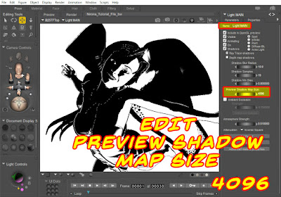 |
Preview Shadow Map Size tops out at 4096.
Notice that this got significantly darker. |
If you only read two full articles in this series, I strongly suggest you read this and the next one. Even if you're very familiar with shadow maps, you can still learn some stuff from this article.
Step 5: Adjust Lighting
I usually work with just two lights: A key light, which is placed to the left and slightly behind/above the figure so that it illuminates the head/shoulders area and makes the figure pop out from the background. And a main light, to illuminate the figure from the other direction. There are different types of lights (Spot, Point, Infinite, etc. Experiment with them to get the results you want.
Step 6: Render Settings
We are using the PREVIEW renderer, so you will need to adjust your Preview Resolution. Render Settings are available from Render option in the Menu Bar (or press CTRL+Y). You'll see the panel, and then you can make the following modifications:
This setting drives how much detail is allotted to your textures. The bigger the number, the more detail (and potentially longer render times). Remember, if you're working in b&w, the hit to your processor will be minimal. While creating each of the images in the animated GIF below, I didn't even notice a difference between 128k and 8MB.
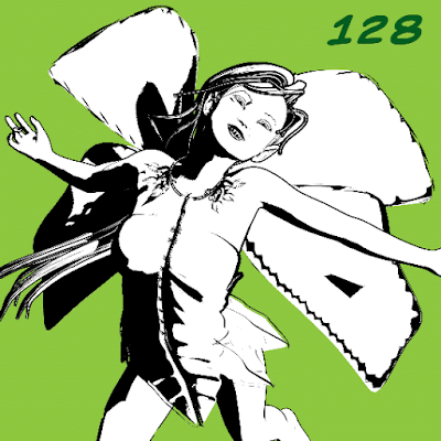 |
Detail is in the eye of the beholder. You can see that the texture
resolution "tops off" around the 4,096 mark. |
The shadows and lines around the top of her dress seem to remain consistent, no matter what settings I use. But the detail on the wings (the only texture map in this scene) definitely look sharper at larger sizes. The shadows on the dress don't change because the dress does not have a texture map. Although you will see subtle changes in shadow placement and clarity on all objects, the most dramatic changes will be on objects with texture maps applied. Personally, I seldom see a "return on investment" by going above 4096, but you should experiment to see what works best for you.
Step 7: Creating Render Passes
The final image will be made up of two or three separate renders.
- Outlines: No other shadows or details. You can get this by setting one of the lights to IBL.
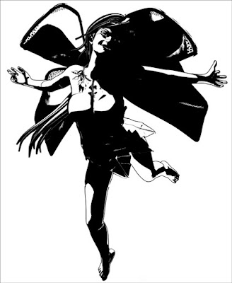
- Black: You want a tight group of shadows that define key facial and body features.
- Gray: A wider range of black shadows (when we put this in MS or Photoshop, we'll set this layer to 30% - 50% opacity).
Since my finished art includes a solid black area and a secondary gray area, I usually start with the black render: It's usually got small, tightly defined areas of shadow, and I pay special attention to casting light on the jawline because it gives the figure shape.
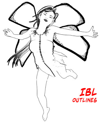 |
Once I settle the pose, I almost always make a render
using an IBL light because it generates clean outlines. |
 |
A strong light from the upper left, just behind the head
helps create a nice contrast under the neck, which
gives the jaw definition. |
 |
Get a bigger spread of black for what will be,
in the end, the Gray layer. |
Step 8: Cleaning up Renders
Put the various renders into a single Photoshop file (one per layer) and then use the Threshold Adjustment to remove any gradients or soft shadows. You may also want to fill any gaps or trim off any excess lines that might exist. Pay special attention to hands and hair, as they tend to get a lot of random artifacts. Also, watch for places where the geometric edge line breaks up (strong curves can be a problem). Save file as a PSD (preserve layers).
Step 9: Image Clean-Up / Hand-Work / Post Work
You can open the PSD file directly in Manga Studio, or you can import each image separately and build your own layer structure. Either way, once you have the renders in MS, clean them up, add detail, and so forth. Pay attention to the teeth, eyes, and hair tips. Also look for any places that you want really sharp points. NOTE: For reasons that will be apparent in future steps, you should make the
majority of your clean-up efforts directly on the image layers themselves. For areas that I know I want to be stark white or pure black, I make those edits on a new "touch-up" layer that I keep at the top of the stack.
Step 10: Quick-n-Easy Contour Line
By default, the geometric edge lines are fairly consistent in width. A contour line (often called a cross contour line) is a line that gives extra dimension to a figure by going from thin-to-thick-to-thin again (or the inverse). If you have kept your figure isolated from the background, you can add a quick contour line to your figure with just a few steps. 1. Ctrl+Click the layer with the figure (add/subtract the selection if needed); this will select only the figure. 2. Create a new layer behind the figure. 3. Fill the selection with black. 4. Move the layer a few pixels up and to the right. You will see (as shown here) that the line on this side of the image is thicker, and if you look closely at the calf, you'll see that it is thicker in the middle than at the edge. NOTE: This only creates the contour line
outside the figure. You will need to touch up the areas inside the image (see below). Also pay attention to
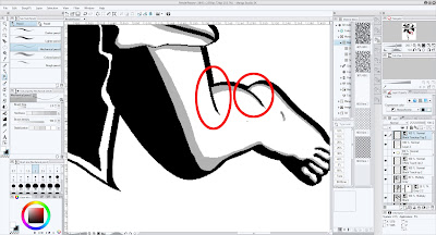 |
Zoom in on the figure, and you'll see areas
that require additional editing. |
Always check the tips of hair, and look closely at fingers, toes, and other small areas. These tend to get gaps that need to be filled.
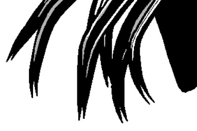 |
Always check the tips of the hair to see if you are getting duplicate lines.
In this case, I trimmed some and kept the others. It's a matter of personal preference. |
Step 11: Applying a Tone Layer
If you plan to print your work (as opposed to just displaying it on the web), a shading tone can add a nice touch of old-school authenticity. You can either drag-n-drop a pre-defined tone from the Materials Panel, or add a Tone Layer. I usually use the Tone Layer because it gives me more control of the final output. I typically replace the Gray Layer with a tone. 1. On the Gray Layer, Select Color Gamut. Then hide the Gray Layer. 2. Create a new tone layer (see below). 3. Pick the settings you want. 4. Click OK and the tone will be created with a layer mask that shows the tone where the gray used to be.
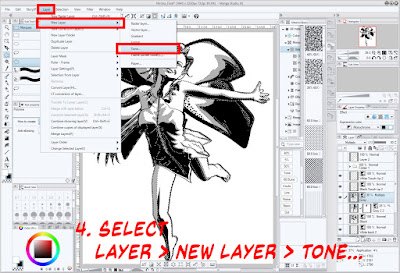 |
| Select Layer > New Layer > Tone... |
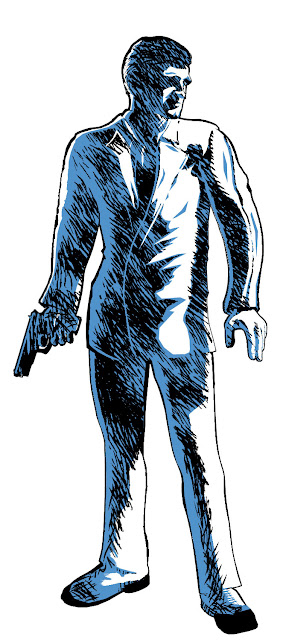
Step 12: Applying a Color Wash
Sometimes you want a spot of color. Using the same steps as above, Select Color Gamut on the Gray layer, then create a new layer and fill it with a color (I like light blue).
 |
| Select the color, then fill the area (CTRL+Del) |
Step 13: BONUS: Applying a Quick Sketch Effect
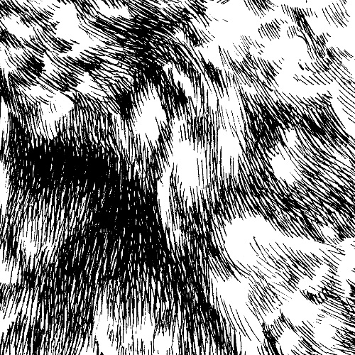
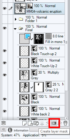
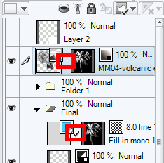
This one is harder to explain; if you're really interested, read the full article. But, in a nutshell, here's a cheat to get a jump start on adding a sketched fill to the Gray layer. In the materials panel, you will find MM04-volcanic eruption (we're using this because it has lots of random lines in it). Drag this on top of the current illustration. Increase its size (don't be afraid to make it huge). Again, use the Select Color Gamut to select the Gray Layer, then create a layer mask to hide the parts of the pattern you don't want to see. With some manipulation (unlink the mask and the material), you can move it around until you have something you like. You will need to add some extra lines and do some touch-up to get the best results from this technique.
 |
I used the sketch technique on this image;
I chose this as an example because it looks
better than when the effect was applied to the fairy. |
Step 14: Saving Your Final Image
One of the things that Manga Studio does better than Photoshop is scale down the tone patterns consistently. In other words, it will shrink the image, but keep the line frequency of the dot/line patterns the same. This is
VERY useful for print. Chose
File > Export and select the appropriate settings for your image (PNG, JPG, TIF, etc.).
And that, dear friends and true believers, is it. This is a one-post summary of the entire process.
NEXT TIME: A "Contents" Launch Page