Wednesday, August 23, 2017

Noir Style Tutorial, Pt. 15 - Step 10: Quick-n-Easy Contour Line

Clean-up is, of course, going to take as much time as you are willing to invest. I tend to overdo things, to be honest, and I need to learn to let go of small details that don't matter (in this instance, I could have ignored the lacing on her top, but I thought it added a nice touch to have it). Since this is a character that will appear in a comic book story, I will probably need to do another pass at the textures to make sure I have something that will work repeatedly, and at the small sizes at which she will appear (she will be interacting with a human-sized character, and she's going to be about 8 inches tall, more or less).

This is one of the base renders I used for my final image.
Note the shading on the wings and the tips of her hair.
If you take a look at last week's blog post, you'll see the close-up image I did of her teeth and hair tips. At a small scale, like the image above, the hair tips are fine. But when blown up, they look clunky. This is an artifact of the geometric line process; hair tips are almost always flat and not sharp. That's something I always fix in the clean-up phase.

As I showed you last time, I added another render pass to create a grayscale, which will serve as the basis for the shading (or the shading itself, should you choose to forego the use of a tone). Here the base of the clean-up.

You can also see that I made a lot of artistic interpretations to her outfit, including changing the entire front so it closes completely at the bottom. I also did a lot to the wing shadows. They may not be exactly realistic, but that's not always required in a comic book look. This is more about drama.

Speaking of which – –

Significant Edits. note the wings, and my alterations to her dress.
I also added a lot of custom work to the shadows.
This looks nice, but the base outlines are all very uniform in width. There's nothing wrong with this, but I prefer to add a contour line (that is, a line that varies in thickness from thin to thick to thin again) around the body.  This gives it a more organic, hand-drawn look. Although I can't automate this process entirely, I do have a quick workaround that will save me a lot of time.

In Manga Studio / Clip Studio (or Photoshop; I'm not sure if this works in GiMP), choose a layer that has everything on it that you want to select. I apologize for the screenshot below: I should have hidden the white background so you could see that the figure and wings are the only thing on the layer. The white background is a bottom layer. I'm always careful to keep the figure isolated from other elements and characters so that I can perform this step with ease.

1 + 2. CTRL+Click to select everything on a layer
works in both Manga Studio and Photoshop.
(Red outline for emphasis only.)


Step-by-Step

  1. Once you have decided which layer to use, click on it once to select it, then CTRL+Click the layer (i.e. hold down the CTRL button on your keyboard and click once on the layer). 
  2. This will select everything on that layer. To indicate this, I have added a red outline to the image above for emphasis.
  3. Create a new layer (I usually put this behind the main figure, but for this tutorial I'm putting it on top of the layer stack). Also, if you are using MS/CS, make sure you set the layer Expression Color to Monochrome (as we discussed last time).
  4. Fill the selected area with solid black. You can do this from the EDIT menu, or by using the CTRL+Del key combo.
  5. Move the layer below the other layers, so it's behind all your other layers (except the white background, obviously. 
  6. Then use the Move Layer and the arrow keys on your keyboard to move the layer a few pixels to the right, and then up a few pixels.
  7. You now have a contour line on the outside of your figure. You will need to zoom in and look for areas that will need additional editing. In the example image below, note how the line forms a nice thin-to-thick curve on her leg, but does not continue inside the image. 
  8. On a layer above the contour line (I usually do it on my topmost layer), I quickly add a few details to carry the external contour line inside the illustration. This give it a finished look, and enhances that "hand-drawn" look I'm shooting for.
  9. a. Always check fingertips, toes and hair to see if there are any gaps.
    b. I usually trim these areas and add a few pixels to fill in gaps.
    c. Double-check the hair tips for duplicates, and clean as you like.


4. On a separate layer, fill the selected area with solid black.

5 + 6. Move the layer down, then push the black filled area
down and the the right, just a few pixels.

7. Zoom in on the figure, and you'll see areas
that require additional editing.


8. On a layer above the others, fill in the details needed to carry the contour
lines inside the image. I used red in this example so you can see what I'm talking about.

One thing you will need to watch out for are odd gaps that appear and strong curves. This typically happens with fingertips and hair (although the hair edge is hidden by her wings, so in this case that's not an issue).

9a. Always check fingertips and hair to see if the contour line
has left any gaps, or made these areas too thick.

In this instance, I actually think the hand looks too thick, so I trimmed it back a little to make her look a bit more dainty.

9b. A few quick edits can fix up these problem areas.
As I said, make sure you watch out for the hair, especially the tips. The contour line will give you double tips. Now, with some hairstyles, this actually looks nice. But in general, you're going to want to trip them out.

9c. Always check the tips of the hair to see if you are getting duplicate lines.
In this case, I trimmed some and kept the others. It's a matter of personal preference.


When all is said and done, you have a final image that could, if you want, go to print, if this is the look you're going for.

The contour line added, hair tips and fingers cleaned up,
she is ready to fly into print... or is she?


However, I usually add a shading tone or a blue wash, which I will cover in the next two steps.

NEXT TIE: Applying a Tone Layer

Friday, August 18, 2017

Noir Style Tutorial, Pt. 14 - Step 9: Image Clean-Up / Hand-Work / Post Work

Always save renders with the PNG
file format; this isolates the figure
on a transparent background
that is easier to work with.
It's finally time to take your renders and move them into Manga Studio. Keep in mind, even though I call it Manga Studio, this software also goes by the name Clip Studio Paint. These are identical products, with the only difference being: Manga Studio is a physical product shipped on a flash drive or DVD, whereas Clip Studio Paint is the name of the product when you buy it for direct download.

As I said earlier, there are two versions: Pro and EX. Pro is the less-expensive version (ABOUT $40 on sale) and EX is the "full" version (ABOUT $99 on sale). Either version will work with this tutorial.

There is a comparison matrix available at the SmithMicro Website, but the main difference is the EX version handles multiple pages (in other words, you can create a "book" file that stores all the pages of your comic in a single file). This is not really that important, because you can make a multi-page comic one page at a time, just like you would in Photoshop or GiMP.

You might be wondering why, if I have Photoshop (and have been using it for decades), I do my clean-up in Manga Studio. That's a fair question that I've been asked more than a few times. The simple truth is, Manga Studio was designed specifically for creating comics, so it has some useful tools:

  • The pen can create contoured lines (a single line that starts thin, gets thick, and then thin again) without a pressure-sensitive tablet (Photoshop only has a fade-off setting)
  • The pens have a lot more control of stabilization (very useful when dealing with software drag and latency issues.
  • One of my favorite features is the ability to set a layer as black & white, while leaving the other layers in color or grayscale. This means my artwork stays crisp and clean, but I can still fall back on color for my other layers.
  • I'm not in love with the type tool, but it does a serviceable job.
  • A tool for creating text balloons.
  • Panel Tools. Panels are basically layer groups with a custom mask applied, meaning that it forms a vector frame. Everything inside the frame is visible, and everything outside the frame is hidden (but still there). The panel tools also help you space your panels, so moving one panel can automatically move the others (you can override this if you want to overlap panels). 
All lines created with a standard mouse in Manta Studio 5:
I did not use a pressure-sensitive pen or tablet.

Now it's time to get to work. First off, I need to break some sad news to you: There is no "Magic Make Pretty Art" button in Manga Studio. No matter how clean your renders are to start with, there will always be the need for some clean-up and adding some additional lines. Brian Haberlin calls it "hand work" and I call it "post work," as in work that is done post-render. Whatever you choose to call it, it's time to get down to it.

Open the PSD (or whatever layered file you created with your graphics software) in Manga Studio. All of your layers will be there, with opacities and blending modes set just the way you left them. The only thing that will NOT import correctly are type layers. MS will rasterize all type. 

You can use the Layer Properties to set individual layers to monochrome (bitmap),
which ensures that all lines are crisp and do not have anti-aliasing on them.
This is not a global setting (as it is in Photoshop); other layers can still have color.
Right-click on the layer and select "Convert Layer." A pop-up window will appear where you can set the layer to monochrome.


If you intend to work with gray tones in your line work, this step is, of course, optional. I find that I like the clean, crisp lines of working strictly in b&w for my line work.

Now that the layers are set to monochrome, I simply turn the top one to 50% opacity with the blending mode set to Normal.

Black Layer is set to 100%, Gray Layer is set to 50% with blending mode set to Normal.
And there you have it. The basis for the noir art.  To refresh your memory, here's what the layers looked like separately. I moved the text a little in Manga Studio so it would be easier to read, but these are the base layers I'm working with. As you can see, the white areas on her dress lighten the blacks to become gray. BTW, I also turned the background to white. She's actually separate from the background right now.


And keep in mind, you have full access to the blending modes. Here's the same image again, but with the blending mode changed to multiply and a small tweak to the opacity.

Gray Layer is set to 30% Opacity, blending mode set to Multiply.

I could even bring in some of the other layers and experiment with them, or use layer masks to bring in just some of the details from other layers. This really comes down to what I feel works for the image in context to the story.Whatever the case may be, it's time to add another layer on top and touch up the outlines. I will also edit the weird little lines on wing shadows, but I will do this directly on that layer itself. Additional things that need touch-up would be the tips of her hair, and her teeth.

Hair tips, wing shadows and teeth are just a few areas that need some TLC.
I hope you'll all forgive me, but I'm not going to go into a lot of detail on how I clean up the renders. Suffice to say:

  • I edit directly on the layers themselves (it makes it easier to manage where my pixels are coming from).
  • I will create and use a layer called "Touch-up Black"
  • And another layer called "Touch-up White"
  • These new layers will be where I fix her hair and add some variations/contours to the figure inking.

I'll share the final, touched-up (but not completed) image next time, when I'll also share a neat trick I learned on how to add some variation to your inking.

NEXT TIME: Quick-n-Easy Contour Line

Wednesday, August 16, 2017

Noir Style Tutorial, Pt. 13 - Step 8: Cleaning up Renders

Now that I have a collection of three or four images to start with, I'll be moving on to a very quick step: I'm going to run them through Photoshop and do a little clean-up. Specifically, I will:

  • Erase excess outlines (depending on the camera's position, there are sometimes "ghost lines" around some of the geometry).
  • I run the Threshold Adjustment to get rid of any grayscale artifacts in the image (the process of adding tones in Manga Studio really works best with strong, b&w lines, as opposed to faded grayscale edges).

This detail from her upper-right wing shows the "ghost line" and some grayscale artifacts.
I deleted the ghost line (cut it out, did not cover it with white; that's an important distinction)
and ran the Threshold Adjustment. I'll remove those thin lines in Manga Studio.

Generally speaking, I only spend 3-5 minutes per render pass to do a quick clean-up. I do this in Photoshop because it does a better job of running the Threshold Adjustment than I get in Manga Studio. And, of course, this will work in GiMP or almost any other image processing program.

PRO TIP
  • Combine all your renders in a single, layered PSD file.
  • Then you can quickly trim off any excess lines and fill in any gaps by going layer to layer.
  • You can then open the layered file in Manga Studio and everything will be in place, ready to go.

Now that the renders have been cleaned up, we're ready to move them into Manga Studio so we can combine them and then apply the finishing touches to make it ready for print.

NEXT TIME: Image Clean-Up / Hand-Work / Post Work

Friday, August 11, 2017

Noir Style Tutorial, Pt. 12 - Step 7: Creating Render Passes

© 2016 Mike Mitchell
Once I had the pose and general lighting set up,
I pumped up the ridges on his forehead and around
his eyes to get a more dramatic look.
This is the one section for which I really regret that this isn't a video tutorial. Because, I suspect some of you may be wondering why I'm so enthusiastic about this approach when it is possible to get similar results by rendering with other software.

Getting geometric lines from Daz Studio and Carrara issn't all that difficult. There are scripted cameras (LineRender 9000 is a fantastic product for that, btw: top of its class and I highly recommend it if you intend to stick with Daz Studio) and a clever shaders that can be applied that allow you to render a fair approximation of geometric lines.

But you see, that's the key difference: those are RENDERED solutions. You have to render the final image to see what it is, and in Poser 11 you get to see it live. Every time you move the lights, even a little, you get to see how it's going to look.

Take a look at the detail from my Moon Wolf comic. It would have taken me hours of trial and error to find lighting that perfectly captured the tiny crescents I wanted to accentuate his ears and arm. This scene was about shape and shadow, and by controlling the lights "live" in Poser 11, I was able to get exactly the look I was after.

And, as I said before, this look comes from combining two more more renders in Manga Studio. So, in this section, I'm going to show you how I get the raw renders, after that, we'll go through the process of cleaning them up and combining them.

Hang tight, true believers, we're finally at the fun part!

Render Passes
If you've been following along, you have already:
  • Stripped out unwanted bump maps and textures from your figures
  • Deleted all but two lights
  • Changed the light properties to your preferred choices (I usually like Infinite with a Preview Shadow Map Size of 4096)
  • Pumped up your Preview Texture Resolution to at least 4096
  • Set your figure poses and camera angles to what you want
You're now ready to create a series of renders.

It would be nice to say I usually only make two or three renders and then jump right into clean-up and composition. But that's not true. I usually make up to 10 renders in my quest to find the perfect one or two that will combine to create the image I have in mind. 

Since my finished art includes a solid black area and a secondary gray area, I usually start with the black render: It's usually got small, tightly defined areas of shadow, and I pay special attention to casting light on the jawline because it gives the figure shape.


Once I settle the pose, I almost always make a render
using an IBL light because it generates clean outlines.

A strong light from the upper left, just behind the head
helps create a nice contrast under the neck, which
gives the jaw definition. 

As you'll see, the gray pass will lighten her torso and throw the
side of her head into shadow. This will also expand the shadow
on her leg (although I think it might need some hand cleanup).
When I made this one, it was an afterthought. But the more I look at it,
the more I think the detail on the front of the dress is interesting.


This is a mental process, and one I'm getting better at the more I do it. I've got to picture the dark area and then imagine the next render sitting on top of it. The main thing is to provide a solid foundation and then build some detail on top of it.

NOTE: These thumbnails are only 33% of their actual size. Once I cropped away a lot of the whie space around the figure, I would up with an active image area of 1825 x 2250 pixels (about 6 x 7.5 inches at print resolution). 

As I said, I do create other images before selecting the ones with which I want to work, and here's a few of my discards. There's nothing particularly wrong with these, but I just liked the lighting on the other renders better.


Next up, a quick "bath" through Photoshop will make things easier when it's time to apply the textures.

NEXT TIME:  Cleaning Up Renders

Wednesday, August 9, 2017

Noir Style Tutorial, Pt. 11 - Step 6: Render Settings

As I said earlier, the render settings are based on OpenGL, so they tend to run VERY fast. You don't need to panic about rendering at large sizes. In fact, to get the most out of the Anomaly Method of comic book art creation, you need to THINK BIG. As a general rule of thumb, you should plan to render at least twice your finished size, if not four times larger.

Page Template from Ka-blam.com
© 2017 Ka-Blam
With my work, I routinely create renders between 2,500 through 8,000 pixels wide. And I seldom have a render that takes more than one minute to complete. We're working with black & white, folks, so there's not a lot of overhead. And even when I work with color, I seldom have a 10,000 pixel-wide render take more than 3 minutes to complete. Most of them are significantly shorter than that.

So, why do I work with such huge renders? That's because I work for print. And the bare minimum for a good printed image is 300 dpi (that's dots per inch). The standard comic book page is about 7 inches wide by 10 inches tall, so if I'm creating a full-bleed image to be printed at Ka-Blam.com needs to be 2,100 pixels wide by 3,000 pixels tall. And this is if you've framed the image exactly in the render window.

Grekoprinting-comixwellspring.com (the folks I usually use because they have a faster turnaround than Ka-Blam) have a base page size of 2063 x 3150 pixels.

Since I'm not usually that precise, I usually render larger and manipulate it as needed. Additionally, as you'll see when we get into the clean-up phase, you'll want the extra pixels in Manga Studio because it lets you set up more variation in the width of your lines (by that, I mean your lines will be able to go from thin to thick and thin again). You'll see what I mean when we get to that.

Render Settings are available from Render option in the Menu Bar (or press CTRL+Y). You'll see the panel, and then you can make the following modifications:


With the Render Panel open:

  1. Select the Render Settings Tab.
  2. Select the Preview tab (on the second row).
  3. Make sure "Enable OpenGL Mip Maps" is checked.
  4. Increase the "Preview Resolution" slider to at least 4096 (Note: Unless your scene has LOTS of tiny detail, I have not seen significant improvement by going up to 8192 or 16384).
  5. If you need to adjust the Render Dimensions, you can click on this button.
Once you have the settings you want, you can click on the "Render Now (Preview) button in the lower-right of the window. NOTE: Once you have the settings down, you can render subsequent images by pressing CTRL+R.


Preview Texture Resolution
This setting drives how much detail is allotted to your textures. The bigger the number, the more detail (and potentially longer render times). Remember, if you're working in b&w, the hit to your processor will be minimal. While creating each of the images in the animated GIF below, I didn't even notice a difference between 128k and 8MB.

Detail is in the eye of the beholder. You can see that the texture
"tops off" around the 4,096 mark.
The shadows and lines around the top of her dress seem to remain consistent, no matter what settings I use. But the detail on the wings (the only texture map in this scene) definitely look sharper at larger sizes. Personally, I seldom see a "return on investment" by going above 4096, but you should experiment to see what works best for you.

NEXT TIME: Creating Render Passes

Tuesday, August 8, 2017

Children Game, Pt. 2 Illustration selected as "Staff Pick" over at Renderosity

I got a nice bit of news today. Another one of my illustrations has been selected as a "Staff Pick" (in other words, an "Image of the Week") over at Renderosity.com. The Poser group moderator (a nice lady by the name of Boni) chose seven images for the week of July 31 - Aug. 7, 2017 as the best for the week.

© 2017 Mike Mitchell

The image was created for a short story by Roger Keel, called "The Children Game." It was serialized in the Collectors' Club Newsletter, and this was for the second half of the story. The central figure is based on the Michael 4 model, and the two cops are LoRez figures by Predatron. I rendered the base images in Poser 11, then created the sketch effects with Akvis Sketch.

Renderosity is an online community of artists who work in traditional and digital media. If you're interested in seeing the other illustrations selected that week, the list is available here at the Renderosity website.

Again, no prize, but it's always nice to get a pat on the back and be told that other people like what you're doing.

Friday, August 4, 2017

Noir Style Tutorial, Pt. 10 - Step 5: Adjust Lighting

Last time we talked about the need to adjust the Preview Shadow Map Size for each light in your scene. Failure to do so will result in rough-looking renders with blocky shadows. In general, I recommend you use either 1024 or 4096.

By the way, since we are doing PREVIEW RENDERS in (primarily) black and white, setting your lights to very high map sizes will have almost no impact on your render times. Before I upgraded to my new powerhouse computer, I created my comics on my old Pentium Dual Core system. Here are the specs for each machine:
  • System 1: Alienware 17 laptop: Windows 10 Pro, 32GB RAM | Intel Core i7-6700HQ (Quad-Core, 6MB Cache 3.5GHz) | Onboard Video: NVIDIA GeForce GTX 970M 3GB GDDR5 1028 CUDA Cores | Alienware Graphics Amplifier: GeForce GTX 980 ti 6GB (006G-P4-4996-KR)  2816 CUDA Cores
  • System 2: ASUS Essentio Desktop: Windows 10 Home, 16GB DDR3 RAM | Intel Pentium E5500 Dual Core @ 2.80GHz | GeForce GTX 960 (EVGA) 4GB (04G-P4-3962-KR) 1024 CUDA Cores
Even back when my old computer only had 4GB of RAM, I could churn out a 4000-pixel wide image in less than one minute. So, even if you're using old tech, you don't need to worry about your machine grinding to a halt.

Now that you need to know how Shadow Maps affect the lighting, let's take a look at how the different types of lighting affects the scene. As I said last time, I generally stick to these types of lights.

Poser Lights
  • Infinite Lights: Like the sun, lights everything in the scene from the same direction with the same intensity (no fall-off).
  • Spot Light: Like those found on stage or in movies, it points in a specific direction with an intensity that falls off the farther the object is from it. Very useful for highlighting specific objects or parts of a scene.
  • Point Light: Similar to a light bulb; emits light in 360 degrees, and it falls off the farther things are from it. Very useful to put next to a gun to simulate muzzle flash, or with a candle or flashlight.
Source: Poser 11 manual, pages 317 - 321


For the examples below, I'm going to change the Key Light to Infinite, and then I will modify the Main light so that you can see how the type of light affects the render.

Example 1: Key Light (the green one) is set to Infinite with no Shadows.
The Main Light (pink) is set the same way.

Example 2: With the Main Light shadows turned off, notice
how much brighter her face and side are.

Example 3: Spot with Shadows. Compare this to the Infinite Light with shadows.
Note how her entire face is dark and the wing now has no highlights.

Example 4: Turning off the shadows brings out her arm and more
of her side. Also note there are more highlights on her hair.
I'm not going to provide screenshots of the Point Light at this time because, when loaded in their default positions, the Spot and Point look almost identical. The key benefit from using a point light is best seen when you have a background or the figure is interacting with other figures or props. With a single figure in a white void, there's really no reason to use a point light.

Example 5: When you want clean outlines,
the Diffuse (IDL) light is the way to go!
No matter what my project goals are, I almost always make at least one render with the Diffuse Light on. As you can see, this gives me clean lines without shadows. Even with all the other detail going on in my work, this is useful to have as a reference, or as a way of punching up the outlines. Shadows seldom have much effect on the default IDL Light.

NEXT TIME: Render Settings

Wednesday, August 2, 2017

Noir Style Tutorial, Pt. 9 - Step 4: Set up Lights

Lighting is always one of the most important things you need to deal with in ANY render. It sets the mood and lets us actually see what's going on. Since this style is all about shadows, sometimes what we don't see is as important as what we make apparent.

On this subject, I want to mention a really good book you should look for (I got mine at Half-Price Books a few years ago), but it's still available from Amazon.com.

Drawing Crime Noir: For Comics and Graphic Novels by Chistopher Hart. The book is out of print, but Amazon has used copies for around $3. This really has a lot of useful tips for lighting and character design.


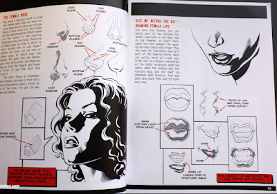
Drawing Crime Noir, © 2016 by Christopher Hart
A useful source of inspiration for getting the most out of this approach
to rendering and character design.

Before the Anomaly Webinar, I didn't understand how important the light settings are to this type of work. Specifically the settings we will use to create crisp shadows. Sure, I understood that I needed to place the lights in the right place to illuminate the scene, but I didn't understand the technical settings that you need to set within Poser to get better results.

In this article, we're not going to focus as much on where to put the lights, but on the technical settings you need to get clean, consistent results from the lights in Poser 11.

First, select the light controls, located in the lower-left of the Poser 11 window. You will see confirmation of the light selection (and its name) in the upper-right.

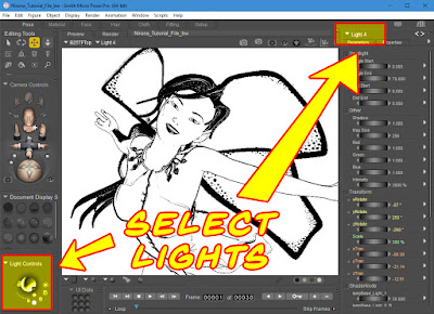
There are multiple ways to select the lights in Poser 11.

Since noir is all about light and shadow, I usually only have two lights in a scene (sometimes I add a third, but that's for special situations or when I want to keep one as a helper tool). With the light controls, delete all the other lights you're not going to use. You do this by selecting the light control and then clicking the trash can icon.

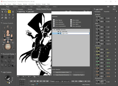
I usually rename my lights by using the Hierarchy Editor

Now I've only got two lights left, I usually rename them so they are easy to track. Opening the Hierarchy Editor and clicking on the name of the light there is a fast way to change its name (note here, in the screenshot I'm only showing Lights, which is why you don't see V4, the wings or the other stuff in this scene). When i have more than two lights (or two sets of lights), I might give them a little hint of color so I can tell which is which. This is just a helper though, as it doesn't really affect the output.

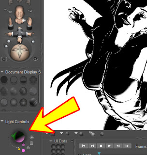
If you're working in black & white exclusively,
you can add a little color to the lights
without affecting your render.

Understanding the types of lights you have available will make it easier to light your scenes.

Poser Lights
  • Infinite Lights: Like the sun, lights everything in the scene from the same direction with the same intensity (no fall-off).
  • Spotlight: Like those found on stage or in movies, it points in a specific direction with an intensity that falls off the farther the object is from it. Very useful for highlighting specific objects or parts of a scene.
  • Point Light: Similar to a light bulb; emits light in 360 degrees, and it falls off the farther things are from it. Very useful to put next to a gun to simulate muzzle flash, or with a candle or flashlight.
  • IBL (Diffuse Image Based Lights): Takes a light probe and creates a map to illuminate the scene. Requires you set up the light probe in the Materials Room and requires Raytracing. NOT USED FOR LINE ART RENDERS (except when you want to blow out all shadows).
  • Area Lights: Area lights simulate real lights more accurately. They work a lot like a photographer’s “soft box” light. You can adjust the size to control the amount of light that is emitted. Area lights are represented by a square outline that depicts the light position in 3D space. A dotted line protruding from the light shows the direction that the light is pointing.
Source: Poser 11 manual, pages 317 - 321


In general, I use the lights that I have marked in RED. I find these to be the most useful. My fallback light is always Infinite Light, though, as it tends to provide strong, even illumination across my entire scene. It also does a decent job of casting shadows.

And, speaking of Shadows, we need to discuss the Map Size and Preview Shadow Map Size. Their technical definitions are provided below, but in general, the one we care most about the the Preview Shadow Map Size.

Shadow Maps
  • Map Size: The Map Size parameter dial sets the size of the selected light’s shadow map in pixels (shadow maps are square). Poser uses image maps to apply shadows to objects in the scene, and applies these shadows during rendering. Larger map sizes increase the accuracy and detail of shadow maps, but at a cost in memory and render time. For example, each 1024x1024 map requires about 4MB of space, while a 2048 x 2048 map requires 16MB. You cannot animate the shadow map’s size. 
  • Preview Shadow Map Size: Sets the amount of detail in the shadows that are displayed by the preview render. Default is 512. Higher values will make the shadow preview more detailed and accurate but will increase usage of system resources.
Source: Poser 11 manual, pages 327 - 334


SIDE NOTE; If you are only going to work with Preview renders, you may completely ignore the Map Size setting. While I'm editing the lights, though, I always increase it to at least 1024, just in case I want to do a Firefly or Superfly render of the scene. Sometimes I do this to get some grayscale data to work with in the scene.

In general, the bigger your Preview Shadow Map Size, the better/smoother your renders will look. Here are some examples of the type of detail I'm talking about:

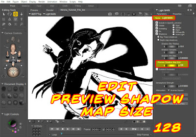
128k is the lowest possible setting: Blow this up
to note the speckling on her wings.

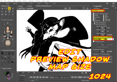
Smoother details become apparent at 1024 k.

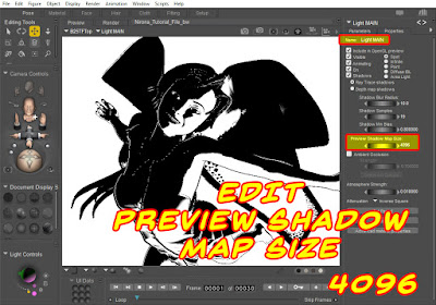
Preview Shadow Map Size tops out at 4096.
Notice that this got significantly darker.

As you can see, there is a lot of difference to be found simply by adjusting the Shadow Preview Map Size from just one of the lights. In production, you will need to adjust the map size for ALL lights in the scene, and they don't have to be identical. My fallbacks are usually 1024 and 4096.

In the previous examples, I only edited the size for the Main Light. Here, I'm setting both lights to 1024, and you can see that we're now getting a funky jagged shadow on her wing. That's because, at this size and angle, we're actually picking up artifacts from where the polygons are joining together. In the right situation, this could be a cool effect (or I could use it as the basis for some stroked inking during the clean-up phase).

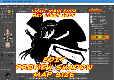
In this one, I set the Preview Shadow Map Size for BOTH lights.

But, in this instance, I don't want it, so I'll increase my Preview Shadow Map Sizes up to maximum: 4096, and then I'll start moving the lights around to bring out the features and details on which I wish to focus.

So, in summary, here's what we covered:

  • Delete most of your lights: you only want two or three.
  • Rename your lights so you know what function they will serve (main and key)
  • You can add color to your lights to help you quickly figure out which is which
  • Increase your Map Size to 1024
  • Increase your Preview Shadow Map Size to either 1024 or 4096


NEXT TIME: Adjust Lights