Showing posts with label Illustration. Show all posts

Friday, August 16, 2024

How the Poser and Renderosity impacted my creative life

The sponsors of the Renderosity contest I recently won (see previous post) asked me to write up something about how Renderosity impacted my creative life. Here's what I sent them:

-------------------

I was asked to think about how the Poser software and Renderosity Community has impacted me creatively. That’s a tall order because, as cliché as it might sound, Poser has changed my life – my artistic life, that is. I was always interested in creating line art that looked hand drawn, and to be honest, although I can draw tolerably well with traditional tools, it’s just not my strength. In other words, my skills have always fallen short of my goals, which is why I turned to various software tools. Looking back at my Renderosity gallery, I can track my progress for 20+ years. I see that I dabbled with Poser 3, but really dove into it with the release of Poser 4 with the Pro Pack. Looking back at my gallery, I see my first image was an attempt to create a hand-drawn sketch of a cowboy; this was back in July 2003. Over the next few years, I used various techniques – like tracing renders in Photoshop, using PS actions, etc. – but none of them really succeeded in delivering a consistent result.

That didn’t stop me, though, as I continued to plod along creating logos and doing artwork for some Role Playing Games, but I was never really happy and I was limited to creating single images instead of sequential art (in other words, comics). During this time, it was positive feedback and interactions with other members of the Renderosity Community that helped fuel my creativity and let me know when I was on the right track and when I was going astray. It was like having my own private art commune at my beck and call. I made some great friends online and found several artists who, like me, were still exploring how shift the inherently detached nature of digital tools and humanize it by creating art.

Time moved on and, although I kept buying the latest versions of Photoshop up through version 10 (I had vers. 11, but I was fortunate enough to have won it in a contest so I didn’t pay for it), it was falling further behind in usability and I had almost completely transitioned to using Daz Studio. I was very close to abandoning Poser completely, and then something momentous happened.

There are very few single incidents that I can look back at and say, "This changed the way I work or think." There are a few teachers and classes in college, one particular issue of a fanzine (I was editing a fanzine and I abruptly changed from just tossing it together to being mindful of layout and design; it went from looking like a high school kid did it to looking like a professional magazine).

Attending the Anomaly Webcast was one of those “life-changing” events. It was a broadcast of a discussion/demo by professional comic book creators who used Poser as part of their daily workflow. I was fortunate to attend it live on Jan. 30, 2016 and was blown away by what I saw what they were doing with Poser 11’s “Live Comic Book Preview.”

There it was on the screen: a simple, repeatable way to produce consistent line art.

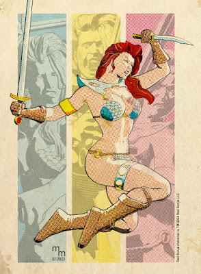
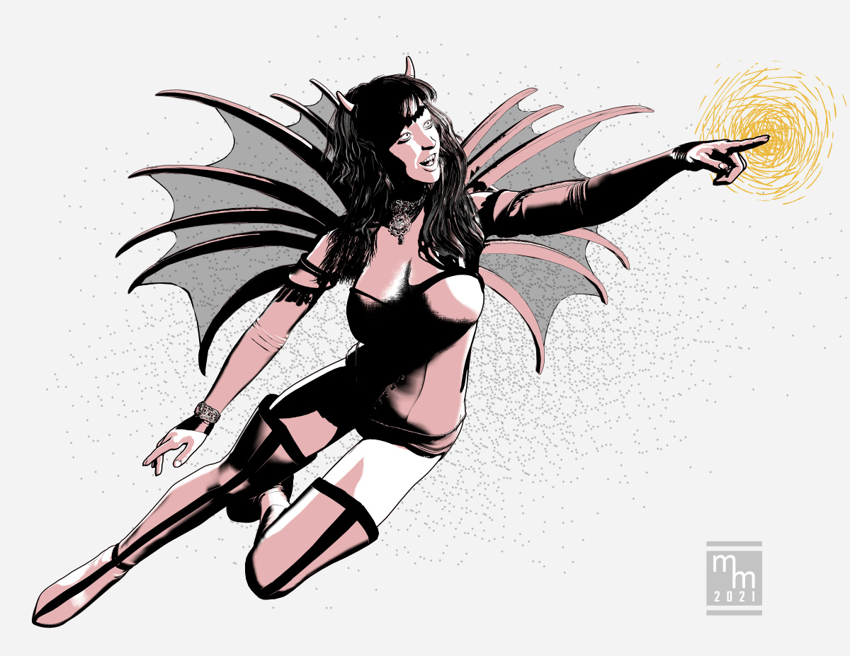
After this event, I completely changed the way I approached making comics and using digital tools to create line art. I found a combination of software and a methodology for using Poser and Clip Studio Paint that energized me and my creative endeavors. And, at the risk of blowing my own horn, other people at Renderosity noticed a change in my work and began to react enthusiastically on what I was doing. And I’ve apparently stunned a lot of people by revealing that my work is entirely 3D based, including several people at Renderosity who know Poser and know what it’s capable of. Not that I ever start out to pull the wool over anyone’s eyes, it’s still a thrill to know that my work is finally approaching the level of consistency and quality that it really does look hand drawn.

I’m currently working on comic book projects that would not be possible without Poser, and without its incredible depth of available content, both already purchased and that’s available in the Poser Marketplace.

And that raises another benefit of Poser: in an age where almost everything has a pre-set shelf life of obsolescence built into it, I am still able to draw on my library of Renderosity-purchased content that dates back to 2004! That’s two decades of props (and, to be honest, it’s mostly the older props that still work well; the ancient figures are often clunky looking) and other content that I can pull from to populate scenes and make artwork that looks fresh and professional.

My entire workflow for line art is now rooted firmly in using Poser and Clip Studio Paint: the work I’m doing isn’t possible in Daz Studio or any other commercial-grade 3D software. So, thank you to comic book artist Brian Haberlin for taking the time to share his secrets, and a particular thank you to everyone in the Poser Community. I would be a much sadder and unfulfilled artist without the Poser software, the incredibly deep library of content which has been lovingly created over the ensuing decades and the knowledgeable and accepting community of artists at Renderosity. Without all of you, my artistic dreams would remain in my head and unrealized.

Thank you all!

Tuesday, July 2, 2024

Renderosity - Staff Picks + Poser Pulse

 The other day someone asked me how often my 3D illustration work had been selected for recognition by Renderosity -- and I wasn't sure. There is a way to search this blog for the proper keywords, but to save time I decided to create a running list on this page. For this list, I'm just going to make a list with a link to the blog post and to the original art as it appears on the Renderosity site (in other words, I won't repost the picture here). Also, for ease of maintenance, I'm going to add the newest items to the top of the list.

Friday, October 6, 2023

Graveyard Shift 04 - Lauren's Car

Visual arts convey a LOT of info via clothing and props. Off the top of my head, I can think of a few things that Lauren's clothing and vehicle can tell us:
  • She wears scrubs, so she's some kind of medical professional from the latter part of the 20th century to present.
    • If she were a nurse in the 1940s or 50s, she would be wearing one of those sexy nurse costumes.
    • If she were dressed like a nun that would put her sometime after Florence Nightingale revolutionized nursing (mid 1800s) to early 1900s.
    • Also, I put her in tennis shoes ("trainers" for you blokes across the pond), that shows she's on her feet all day and values comfort and utility.
  • She drives a car, so:
    • We know that she's not in the wild west (or some other time period).
    • She's not riding in a Model-T, so that moves the timeline up into the 20th century.
    • She's not riding the bus, so she's at least got enough money for a car.
      • This also indicates that she values her privacy, or at least works someplace that doesn't have bus routes.

But what KIND of car should she drive?

What you drive says a LOT about who you are, or at least the "who" you are trying to present to the world. I have a buddy who loves driving a Dodge Charger (I think he got hooked when he watched The Dukes of Hazzard as a kid). But he's also had a Dodge pick-up and a Jeep. And those suit his personality. I, on the other hand, prefer a non-flashy sedan that blends into the crowd. As a young man, I had too many speeding tickets to ever want to draw attention to myself these days.


But let's get back to our lady vampiress, shall we?

I browsed through my runtime directories to find out what I already had on hand. I had a lot of sports cars and racecars. I had a cool 1961 Corvette convertible, but that's a vintage car that's got a hefty price tag. Would a humble nurse be tooling around in a hot number like that? Especially one who wants to fly under the radar?

That got me thinking about cars that could be described as "basic," "reliable" or "unassuming." I thought, maybe an Audie or something like that. Or maybe an old sedan or station wagon. Browsing my own stuff, and then checking out Daz3D and Renderosity didn't really find anything that leapt out at me. Sure, there were lots of nice cars, but none of them said "old reliable" to me by having a boxy, almost clunky shape.

Looking deeper, I found something that clicked, and it was neither boxy nor clunky: A VW Bug.


© 2023 Mike Mitchell
First render with a VW: it was not used.


The first one I found was a nice, modern bug with a sunroof. This was okay, but something just wasn't right about it. Even though the sun roof was great for me because it would make lighting her face a lot easier, it seemed too expensive and nice for a struggling vampire.

So I dug deeper and found one from 1969, and it was perfect! Rex thought so, too. Here's what he said when I showed him the rough draft of the splash page with her driving to Victor's house:

I love that you placed her in a VW bug.
It has just the right amount of retro to fit a vampiress-nurse.


© 2023 Mike Mitchell


The above is basically the first panel of the story, although I am going to go back and add a few shadows on her face.


Saturday, September 30, 2023

Graveyard Shift 03 - Character Design Lauren Transformed

 There's no way to progress this series of blog posts without dropping some serious spoilers. Since this is a horror comic I don't think you'll be very surprised to find out that our dear Lauren is a vampire who hides her existence by working as a night nurse for dying people; she drinks a little bit of their blood each night. When they die, who's going to do an autopsy? After all, her patients are dying.

In Rex's story there isn't really a transformation from human to vampire; he handles that subtly.

Of course, this is a comic book, and in a visual medium like this (and with the tropes of trying to emulate the old Warren horror magazines) "subtle" just won't do. So, I'm going to modify Rex's original description of the confrontation scene (below) and have her do a full-on "vamp-out" scene.

Original text by Rex Munsee:

Loren smiled and began to rise up from her chair. Victor reached into his shirt and held the crucifix out in front of him. Instantly, Loren turned her head and moved against the wall. He heard a cry of pain and a guttural snarl.

“Stay back! I don’t care that you’re a vampire! 1 need you to listen to me! I want to make a bargain.”

In a hoarse voice she croaked. “Put it away.”

Victor lowered the crucifix to his side.

Her crimson eyes glared at him through her tangled mane of hair. 

Here's my take on what she'll look like with full frontal fangs.

© 2023 Mike Mitchell

If you compare this to the previous character design, you'll notice I did more than just add a vampy face. I changed her entire physique by making her a lot thinner and exaggerated her poses. The hair still clearly needs work, by the way. I'm still playing around with its color, as I'm still concerned about how I'm going to standardize it against dark backgrounds. (Yeah, I did a few tests already, but they're a waste of time until I really settle on the look and feel of the interior scenes in the house.)

◄ Back to Graveyard Shift main page

Thursday, August 31, 2023

Graveyard Shift 02 - Character Design Lauren Normal

 Rex's original story is brisk in its pacing and doesn't dwell a lot on detailed descriptions. That was perfect for my needs, as I wanted to have a lot of freedom in designing the characters and setting. One thing I did have to go on was the cover illustration he created for the story. As you can see below, it's kind of rough and he doesn't exactly follow his own descriptive text (illustration shows "Loren" as a blonde but the text says she has dark hair).

© 2023 Rex Munsee

Here's the text from the story:

“Evening, Loren,” he smiled at the tall woman, wrapped in a long coat and carrying a large handbag. “You’re right on time.”

“Hi, Victor.” He watched as she set her handbag down, shrugged out of her coat, and picked up her bag. She handed Victor the coat and he folded it over the back of his recliner. As she was smoothing out the wrinkles on her solid green scrubs, he gazed at her coal-black hair which contrasted with her pale skin, which his deceased mother would have said was a “peaches and cream complexion.”


Loren vs Lauren

If you read headlines, then you'll have noticed that I changed the spelling of the lady's name. Although "Loren" is an acceptable spelling of the name, in my experience that spelling is usually for males. "Lauren" is more often for females (and that includes the two to which I am relate). I discussed this with Rex and he was okay with the change.

So, spelling settled, I started work on the character sheet. I don't always do character sheets for my own work, but as I'm working with a collaborator, I decided it was something I should do this time around. As it turned out, it also provided me with space to make notes about the various assets and dial settings I used to refine her look.


As you can see, I'm still playing around with the hair color – I'm not sure how light or dark it will be. I'll need to test it with the dark backgrounds called for in the script before I will make that decision. After this, I have three more character designs to whip up.

As you can see in the notes, the main figure is Victoria 4. I've documented the various dial and prop settings on the sheet (I didn't share these with the writer, as this would only confuse him because he doesn't know anything about Poser or 3D art). My standard workflow is in play: I create 2-to-3 renders in Poser 13 and transfer them to Clip Studio Paint for compositing, setting the tones and clean-up.

◄ Back to Graveyard Shift main page

Monday, August 28, 2023

Graveyard Shift 01

 I've started work on adapting a short story into comic format. The exercise is really just so I can take a stab at doing something that I have not written myself. I also think it would be fun to go back and do some public domain horror stories and try to nail down the style of the old Warren Magazines like EERIE, CREEPY or VAMPIRELLA.

I am starting with a short story titled "Graveyard Shift" by Rex Munsee. He's a member of the Snicker Snack Amateur Press Association (APA), which is a type of fanzine. Rex wrote the story a few issues ago, I read it and decided it would be fun to adapt it. So I wrote to him and he agreed to let me do his story, and the results will be printed in Snicker Snack and the Collectors' Club Newsletter.

The story has simple modeling and set requirements, which is a major criteria for my selection process:

  • Few character designs (there are 4)
  • Limited locations / sets:
    • Exterior:
      • Country road a night with a small car driving on it
      • Country road leads to a nice house in the woods
      • Front of the house as she enters
    • Interior:
      • Living room
      • Bedroom
      • Possibly another part of the house, like a hallway or kitchen area
    • Props (key items):
      • Reclining chair (i.e. La-Z-Boy)
      • Lamp, side table, misc. items
      • Hospital-type bed
      • Hypodermic & medical equipment
      • Set dressings (pictures, furniture, etc.)
      • Video/security camera
      • Video monitor
      • Antique mirror
If you're familiar with my workflow, then you know I start out in Poser (a 3D app) and then render line art which is composited and cleaned up in Clip Studio Paint. This makes the first step is to collect the 3D assets I need, and fortunately I already had most of the items above. The exterior of the country road has proved to be the most problematic because I didn't have exactly the sort of hilly environment I imagined when I started to block out the story and make thumbnails.

As for the character design, we'll cover that next time!

Other Posts in this Series

Thursday, August 24, 2023

Captain America illustration selected by Renderosity

 Awesome news! Another illustration I created was selected by the Renderosity moderators to be included in their Poser Pulse Gallery for August. I think this may have replaced their "Staff picks of the Week" feature.

As you can see, this illustration uses my standard workflow of creating the base renders in Poser (in this case, Poser 13) and then combining them in Clip Studio Paint (in this case, version 3.0). In this case, I also added retro comic book colors with the True Grit comic book color tools.

© 2023 Mike Mitchell
Captain America and Red Skull are TM by Marvel Comics

A link to the image – and my notes on its creation – can be found on Renderosity.

A link to the Poser Pulse gallery can be found here.


Friday, January 20, 2023

Retro Coloring 06: Skin Color

As noted previously, coloring comics was a two-step process performed by two different people.. The colorist indicated which colors should be used, but the separator did the actual, physical task of stripping the color separations. This is why there were often errors in the colors printed in old comics; either the colorist made an error, or (more likely) the person doing the separations made an error do to being in a hurry or simple inexperience.

Experience is also something that mattered, a lot. There was a lot of repetition in coloring comics, and as such both colorist and separator tended to skip over common things that were done over and over again. This becomes apparent when looking at old color guides: One thing that is often skipped is the code for Caucasian skin tones. This was a very standard code so the colorist really didn't need to specify it since the separators already knew what it was.

That's all good and fine, except for poor ole me living in the 21 Century! 

I actually had a little trouble confirming that these are the standard skin tones used by Marvel, DC, Archie and Harvey. Okay, it wasn't like I had to delve into books of forgotten lore, but it did take a few days to find and confirm through multiple sources that these are, in fact, the correct codes for standard skin tones from the 1940s - 80s:

  • White People: Y2R2
  • Conan's Skin (redder skin): Y3R3
  • Black People: YR3B2
  • Hulk's Green Skin: YB2

Tuesday, December 13, 2022

Retro Coloring 05: Champions #4

 Anyone who knows me is aware that I have a big soft spot in my heart for Archie comics, so it shouldn't be a surprise that the first color guides I bought were for Archie Comics. I think I have 6 so far, and 5 of those are for Archie titles – some old and two from the late 1990s, and those use the "expanded color palette" that has more variations of the CMY colors, and brings in screens of black, as well. At some point in the future I'll talk more about those colors, but for now I'm going to stick to the classic look of 64-colors (if you don't know what I'm talking about, go back to part one of this series, or read the article in Marvel Age #13: "How to Color Comics the Marvel Way").

Editorial Input on Color Guides

But back to Archie. I love the company's work and I find their simple color guides as a PERFECT starting point for my own efforts (you'll see my own that in an upcoming article when I actually use new digital tools to attempt recreating the original colors of an Archie comic from the 1960s). But, the colors are simple.

Superhero and horror comics had much more sophisticated coloring, and therefore more editorial input. As I said last time, superhero comic color guides are more expensive, typically running about $50 - $100 per page (that's not to say you can't find a few bargains out there, but they are more infrequent). A little hunting got me an interesting find: an 8-page back-up story in the Marvel Comic, The Champions #4 (March 1976), colored by Janice Cohen for about $83.

Unlike the Archie color guides I have shared with you, this color guide is on standard 8.5 x 11 inch letter size copies, which provides a nice big work area for notes and guidance. Unfortunately, I'm not sure who wrote them: Writer, Artist, Editor? If I ever find out I'll update this article.

Take a look at the editorial comments for a behind-the-scenes look at the production of this story (incidentally, I have not yet obtained this comic so I cannot provide you with a scan of it in its printed form; I'll also update that when I can).

Color Guide for Champions #4 (March 1976)


On this page, notice now her skin tones are marked as Y4R3B3.
The use of the number 4 is very surprising because that is part of the "expanded" color palette that (even without adding black (as I'll discuss in a future article) more than doubles the color options from 64 to 125. As noted in the previous article, the letter/number combo represents a specific dot intensity (i.e., fill percentage). In this formula, 4=70%, making her skin tone:


Y4Yellow70%
R3Red [magenta]50%
B3Blue [cyan]50%
This will print as:

The normal skin tone for a black character would be: YR3B2. I'm going to go into this a lot more next time, as I dive into the very important (and illusive) topic of Skin Color.

But on this page (and others) her skin tone is crossed out with pencil marks.
Also, take a look at how someone wrote "OK" on the bed color and blue background in the last panel.


Story and art © 1976 Marvel Comics Group

NOTE: This color guide is presented for the scholarly purpose of discussing how comics were colored in the past. Its fair-use inclusion here recognizes that the underlying story and artwork are the copyrighted property of Marvel Comics.

Next up: Retro Coloring 06: Skin Color

Tuesday, December 6, 2022

Retro Coloring 04: Reggie and Me #25 Color Guide, pt 2

Here's another story from Reggie and Me #25 (Aug 1967). I picked up these 8 pages (2 non-story, and missing the first page) for about $80. Like the other story, this 

I don't have the complete guide for this next story, so I'm including the first page as it was printed, which includes a coloring mistake that is rather revealing! Look at Ronnie's blouse in the first panel and note that incredible crop top she's sporting! There's no way that was kosher at school in 1967! And, as you can see in panel 2, her modesty (and The Bee's dress code) is restored!

Credits:

  • Script: Frank Doyle
  • Pencils: Harry Lucey
  • Inks: Marty Epp
  • Colors: (attributed to) Barry Grossman
  • Letters: Bill Yoshida


On the following pages, I've placed the guide on the left and the published page on the right. I wanted to show you the editorial changes that were made after Barry Grossman submitted his work. Note on page one how the editor indicated that the lower-right box should be red, not yellow. This is the sort of thing that turns up quite a bit in the next color guide I'm going to share with you.


Want to read the whole printed comic?
Check it out here: https://viewcomics.me/reggie-and-me-1966/issue-25


NOTE: This color guide is presented for the scholarly purpose of discussing how comics were colored in the past. Its fair-use inclusion here recognizes that the underlying story and artwork are the copyrighted property of Archie Comics.

Next up: Retro Coloring 05: Champions #4

Tuesday, November 29, 2022

Retro Coloring 03: Reggie and Me #25 Color Guide, pt 1

 Color guides are a type of original art created in the production of comic books. They are one-of-a-kind creations with hand work by the Colorist. To be honest, they're not very collectable, at least not when compared to the original art. But that's also part of their charm. For instance, the 6 pages I'm presenting here only cost about $88. Not bad for something created about 54 years ago!

However, I have seen some color guides go for very high figures, especially for covers. If you decide to look into it, you should expect to pay about $50 a page for most comics, more for mainstream superheroes like Superman and Batman. Honestly, you could see $200+ a page for those, and if it's a famous story, multiply that by whatever the seller wants. I recently saw the cover color guide for Amethyst, Princess of Gem World #1 listed at $1,999.

Reggie and Me #25, 

I think Archie is a great place to start with color guides. The colors are simple, straightforward and do not include a lot of special instructions. So, without further ado, here it is. (Note, the copies are on what feels like regular paper; it's kind of thin and definitely shows a little "bubbling" from the application of wet dyes (and you can see the ink stains on the third page. There is an odd, brownish border to the pages, which are about the size of the printed book.)

Credits:

  • Script: Frank Doyle
  • Pencils: Al Hartley
  • Inks: Jon D'Agostino
  • Colors: (attributed to) Barry Grossman
  • Letters: Jon D'Agostino


© 1967 Archie Comics

NOTE: This color guide is presented for the scholarly purpose of discussing how comics were colored in the past. Its fair-use inclusion here recognizes that the underlying story and artwork are the copyrighted property of Archie Comics.

By the way, if you have sharp eyes, you'll notice that page 26 is missing. That page was an ad, so it's not part of the story. Want to read the whole printed comic? Check it out here: https://viewcomics.me/reggie-and-me-1966/issue-25


Next up: Retro Coloring 04: Reggie and Me #25 Color Guide, pt 2

Tuesday, November 22, 2022

Retro Coloring 02: Color Guides

When talking about coloring comics, it's easy to forget something that was once very obvious: Coloring comics was a two-step process performed by two different people:
  1. The Colorist decided what colors went where. This person's job was to start with a stat (later photocopy) of the black & white artwork and then, using special dyes, paint the desired colors where they go. Afterwards, the colorist would hand write color codes on the art. (For more info on this, read last week's blog and don't forget to read "How to Color Comics the Marvel Way" from Marvel Age #13: https://viewcomics.me/marvel-age/issue-13/22.) The finished Color Guide was then handed off to the next person...
  2. The Separator took the Color Guide and then used a variety of physical tools and media (mostly acetate (thin plastic sheets) and cutting and pasting them where they go based on the color formulas provided by the colorist. This was a physical job that was often done by women (at least by the 1960s) and the accuracy with which the separator followed the colorist's guidance was kind of hit-or-miss. By that, I mean that the better comic shops got (and paid for) separators who did at least a workman-level job. They usually got it right, but sometimes (especially on tight deadlines), you'd see color get missed or messed up. But the cheap shops had a lot of problems.

I'm trying to track down some good videos on the physical part of color separations. If I find any, I'll link to them. This one is a good discussion about modern recoloring, and it has a few pics of the separation process: https://www.youtube.com/watch?v=uNYDiJibRM4.

Color separation is now handled digitally with computers (unless you're working with some old-school print-making equipment). So we're not going to focus on that aspect of the process. Instead, we're going to look at some Color Guides.

Color Guides

As I said, a Color Guide starts off as a black & white copy of the black line art. The colorist then paints in each color with special dyes (again, that Marvel Age article covers all that jazz) and then makes up the page with the associated codes that relate to the chart published in last week's entry.

Here's what a simple color guide looks like:

Reggie and Me #25 (Aug 1967)

The colors in this guide are attributed to Barry Grossman (by that, I mean most Archie scholars agree that is probably who colored this; it looks like his work and that was his job at the time).

Here's a scan of the printed page so you can compare the two:


Want to read the whole printed comic? Check it out here: 


Tuesday, November 15, 2022

Retro Coloring - 01: Overview

I have started looking into classic comic book coloring techniques based on the traditional 64-color palette of 64 colors. Specifically, I'm looking at using the old color codes with modern tools that can recreate those effects in Clip Studio Paint and Photoshop. (If you don't know what I'm talking about, skip to the end for some links that explain how comics were color coded for separation using the CMYK color process.) 

Now, before I dive into this series of articles, I'm going to get snippy. I'm not talking about using some cheesy Photoshop filter to emulate a grainy halftone on your comic art. That's all nice and fun for what it is, but unless you are using the correct, limited color scheme based on the actual 64 colors made from the CMYK progress, the results of your little filter and action are going to look fake. There's nothing wrong with that; if that's what you like, go for it. It's faster than doing it this way and you'll get a much wider ranger of colors than is possible from this old-school, retro coloring process that was used to color comics from the 1930s through the 1980s and early 1990s. Near the end of the 1990s, presses and paper made it possible to expand the color gamut and get more.

Before I get into the modern tools, you need a little background.

64-Colors for Super Comics

I'm not going to go into the full details of how this process works; there are simply too many good other resources available that explain it in detail. One thing you're going to need to understand is that the names of the color channels don't exactly line up with the color codes. 

As stated above, printing is done with four traditional printing plates: Cyan, Yellow, Magenta and Black (represented by the letters, CMYK). In traditional comics, Black is used only for the black lines: it is NOT used in colors (this changed in the 1990s, but for now we're going to ignore it). If you're uncertain, here's the colors in their raw forms:

Cyan is a light blue
Yellow is yellow
Maginta is a shade of pink


Unfortunately, Color Codes (which were hand-painted onto copies of the black & white artwork as guides for the men and women who did the actual coloring), did not reference CMYK. Color codes use BYR for Blue, Yellow and Red. 

Yeah, it's confusing, but they did it that way for 50+ years, so it must not have been too weird.

Nevertheless, here are a few details, pulled from the article, "How to Color Comics the Marvel Way" from Marvel Age #13 by Mark Lerer (link to article at end of this post):

"Comic books are printed in the sixty-four combinations of red, blue, yellow and their lighter shades shown here in the printer's color chart. The notation may be a little confusing. R means a solid, or "100% screen" of red [magenta]. Likewise, B means a "100% screen" of blue [cyan], and Y means a "100% screen" of Yellow. "Y2" means a 25% screen of yellow, which makes a very light yellow shade, and "Y3" means a 50% screen of yellow which makes up the intermediate yellow shade. Similarly for R2, R3, B2 and B3. Every color on the chart is a combination of these shades. For example, solid green is YB, a 100% yellow combined with a 100% blue. R3B2, a reddish purple, is a 50% red screen combined with a 25% blue screen."

Here's a copy of a traditional color chart from Marvel Age #13:


As I said, I'm not going to try to make full sense of this. Go check out the following resources for more info.

Other Resources

The basics of old-school coloring:

An article about the physical act of creating color separations. This is a fantastic article that has a lot of detail about the way Marvel Comics were separated:

Fun to watch, but not really informative.

And the super-important "How to Color Comics the Marvel Way" from Marvel Age #13:
https://viewcomics.me/marvel-age/issue-13/22


Monday, March 7, 2022

Red Sonja - Retro Selected as Renderosity Poser Staff Pick of the Week (Feb 29 - March 6)

 HUZZAH! It's always gratifying when you put in some hard work on something and it garners recognition from your peers! Once more, an illustration I created has been selected by the Renderosity site as a "Poser Staff Pick of the Week." And, if you're counting, this is the eighth illustration to receive this honor. You can see the whole list here.

They selected my "Red Sonja - Retro" illustration, as shown below.

© 2022 Mike Mitchell
Red Sonja TM 2022 by Red Sonja LLC

The moderators of Renderosity's Poser gallery review all the submissions for the week and pick the most outstanding work posted during that time. This week they selected 6 illustrations, which includes some pretty cool work. 

The entire list can be see here: https://www.renderosity.com/forums/threads/2969252/poser-staff-picks-feb-28-thru-march-6#msg4435565

And, once again, I didn't get any money or prizes for this honor. I just got a nice, virtual pat on the back for making something memorable.

Thursday, March 3, 2022

Retro Coloring - Red Sonja Attacks

 This is an illustration for a fanzine (in other words, this is for print and the "Anthems" is the name of the feature in the magazine.). This is my first serious attempt at using the KraftTone brushes from Vintage Texture Supply Co. These are a product that emulates old-fashioned comic book coloring techniques from the 1930s through the 1980s. A very nice set of tools, which are available for Clip Studio Paint, Photoshop, Procreate and the Affinity tools.

I used my standard workflow: I rendered the figures in Poser Pro 11 using the Comic Book Preview. I then took them into CSP for clean up, inking adjustment and coloring.

Figure is a customized Victoria 4.2 wearing the cool Red Sonja cosplay costume by the inimitable Terry McG. Hair is End of Summer Hair by goldtassel and Daz Originals.


Image © 2022 Mike Mitchell
Red Sonja TM 2022 by Red Sonja LLC

Wednesday, October 6, 2021

Devil Wing™ Takes Flight

 Here's a character study for a comic book character I might work with. Devil Wing™ is an anti-hero in the tradition of Vampirella or Satana. Here we catch her in a light mood as she revels in the joy of flight.

Figure is V4 with Bettie Page morphs and hair. Outfit includes the top from the Rockabilly Burlesque and the boots are custom for me by Terry McG.

Workflow is Poser Pro 11 renders with clean-up in Clip Studio Paint.

© 2021 Mike Mitchell


Thursday, August 5, 2021

Hey, I got sampled in the intro to a Poser 12 Tutorial Video

 Well, this is cool!

I was at YouTube and I saw a video titled "Poser 12 Tutorial: SuperFly Render Settings: Pixel Samples." Sounds like a fun topic, so I watched it. And yeah, I know that I have a weird definition of "fun," but I think we all know that! Anyway, the video opens with a bunch of still images flying by very, very fast, and I did a double-take.

"Did I just see what I thought I saw?" I asked myself (yeah, I often talk to myself because I love an intelligent conversation!).

I went back and slowed the video down and... Yup. I saw exactly what I thought I saw (and no, it was NOT a "puddy tat"). Right there at about the 2-second mark:


There it is, one of my illustrations! The line art of the guy and the gal in the car. That's so cool. 

And before ya ask: 

  1. No, I don't get any money. 
  2. Yes, I gave them permission (it's an option when I upload the image to their gallery).
For anyone interested, I created this illustration for a book of short stories. Honestly, I'm not happy with the way they printed the illustration (it was printed in b&w, of course). They were supposed to put it at the bottom of a page under the text, and the editor shoved it in sideways, centered on an opposite page. It looks AWFUL in print, so I really don't mention the book to anyone.

Nevertheless, here's a full-size copy of the color version (I like to add a little spot color when I post the pics online – it makes them a little more interesting):

© 2020 Mike Mitchell


 If you'd like to watch the video (which is a decent, fast little tutorial on pixel sampling; I learned stuff I didn't know), you may watch it here:


By the way, I glanced at a few other videos for Poser 12, and it appears that this illustration is in the standard intro for all of them. VERY, very cool! Apparently, this started last year (at least in November 2020), and I'm just now noticing it.

Heh. Ya snooze, ya lose!

It's still pretty cool.

Wednesday, June 2, 2021

Cerebus Attacks

 Cerebus the Aardvark is one of the most successfully published indy comic characters of all time. Artist Dave Sim, running 300 issues published from 1977 thru 2004. After the series veered off into politics, it faded away from my interest, to be honest. But the early issues are still brilliant and I still learn a lot from the artwork and storytelling (seriously, even though you probably cannot see it in my work, Sim's approach to lighting and backgrounds are a strong influence on how I approach comics art).

Anyway, I found a 3D figure of the Aardvark over at ShareCG, so I downloaded it and was pleasantly surprised to find that it's pretty good. It also "kind of" accepts poses for Michael 4. So, here is just a quickie illustration I did to play around with the figure and some free brushes I got from Clip Studio's website.

Typical workflow applies: Poser Pro 11 and Clip Studio Paint.

© 2021 Aardvark-Vanaheim


Wednesday, July 15, 2020

Insectoid [Galaxy Prime]

 Here's the final illustration that I created for the Sector Treks anthology being published by Epic Age Media. The deadline on this one was super, super short (in other words, I was behind schedule again). So I repurposed an older character study and updated it to fit the format for this book. The problem was, all I really had was an alien standing menacingly in front of a starfield. 

I thought about adding another ship back there, but I really didn't have anything ready and none of the ships I had available looked "alien" enough for this race. So, I opted to do something simple that would harken back to the 1970s and 80s: The giant head floating in space.

© 2020 Mike Mitchell


As you can see, it's really just a simple render with the shadows being set to vanish (I used the Screen Blending Mode in Clip Studio Paint – this makes the solid blacks disappear). All in all, pretty good for a quickie (definitely less than an afternoon's work).


Monday, July 6, 2020

Claim Jumper [Galaxy Prime] selected as a Poser Staff Pick of the Week

I did five illustrations for the interior of the upcoming Galaxy Prime: Galaxy Treks rpg supplement. And I'm pleased to say that one of them has been selected by the staff at Renderosity as a "Staff Pick of the Week." In this case, it is the one that gave me the most trouble: Claim Jumper.

© 2020 Mike Mitchell


As before, this is a nice honor to be recognized from among the many great illustrations that are posted to the Renderosity website. This week they selected six illustrations, and as usual, I'm the only one working in b&w. Although this time there was another "artistic" render in the mix, which was rather nice. 


If you'd like to see my illustration at Renderosity, you can find it here: https://www.renderosity.com/mod/gallery/claim-jumper-galaxy-prime-/2949721/