Showing posts with label black and white. Show all posts

Wednesday, July 10, 2024

Renderosity Contest Winner

I entered three images in the Renderosity Summer Carnival Contest for 2024. The challenge was described as: 

Theme: Pretzel People

Welcome to Pretzel People. In this game challenge, create the craziest, unique, and most creative twisted poses you can come up with. You may submit as many entries as you like, and discuss techniques with each other. Staff will pick the winner at the end of the carnival. You may use pre-made products. No AI.

So, I whipped up three submissions and – huzzah! – I was one of two people to win 4th place. The prize was 5 items from RPublishing. By selecting some bundles, including dinosaurs and military equipment and La Femme 2.0 Pro, that amounted to a bit more than $300 in prizes. The coolest thing is, those are some items that I can definitely use in future projects.

The winning image, by the way, is the battle scene that's not in full (comic book) color.

-----------

As per usual, my workflow includes making two renders in Power 13 and compositing them in Clip Studio Paint. Figures this time include Victoria 4 and Herr Cadaver by the incomparable creator, Cybertenko. The color version was created using  the comic book coloring system from Retro Supply Company.

© 2024 Mike Mitchell
This is the prize winner.

© 2024 Mike Mitchell

© 2024 Mike Mitchell


Friday, October 6, 2023

Graveyard Shift 04 - Lauren's Car

Visual arts convey a LOT of info via clothing and props. Off the top of my head, I can think of a few things that Lauren's clothing and vehicle can tell us:
  • She wears scrubs, so she's some kind of medical professional from the latter part of the 20th century to present.
    • If she were a nurse in the 1940s or 50s, she would be wearing one of those sexy nurse costumes.
    • If she were dressed like a nun that would put her sometime after Florence Nightingale revolutionized nursing (mid 1800s) to early 1900s.
    • Also, I put her in tennis shoes ("trainers" for you blokes across the pond), that shows she's on her feet all day and values comfort and utility.
  • She drives a car, so:
    • We know that she's not in the wild west (or some other time period).
    • She's not riding in a Model-T, so that moves the timeline up into the 20th century.
    • She's not riding the bus, so she's at least got enough money for a car.
      • This also indicates that she values her privacy, or at least works someplace that doesn't have bus routes.

But what KIND of car should she drive?

What you drive says a LOT about who you are, or at least the "who" you are trying to present to the world. I have a buddy who loves driving a Dodge Charger (I think he got hooked when he watched The Dukes of Hazzard as a kid). But he's also had a Dodge pick-up and a Jeep. And those suit his personality. I, on the other hand, prefer a non-flashy sedan that blends into the crowd. As a young man, I had too many speeding tickets to ever want to draw attention to myself these days.


But let's get back to our lady vampiress, shall we?

I browsed through my runtime directories to find out what I already had on hand. I had a lot of sports cars and racecars. I had a cool 1961 Corvette convertible, but that's a vintage car that's got a hefty price tag. Would a humble nurse be tooling around in a hot number like that? Especially one who wants to fly under the radar?

That got me thinking about cars that could be described as "basic," "reliable" or "unassuming." I thought, maybe an Audie or something like that. Or maybe an old sedan or station wagon. Browsing my own stuff, and then checking out Daz3D and Renderosity didn't really find anything that leapt out at me. Sure, there were lots of nice cars, but none of them said "old reliable" to me by having a boxy, almost clunky shape.

Looking deeper, I found something that clicked, and it was neither boxy nor clunky: A VW Bug.


© 2023 Mike Mitchell
First render with a VW: it was not used.


The first one I found was a nice, modern bug with a sunroof. This was okay, but something just wasn't right about it. Even though the sun roof was great for me because it would make lighting her face a lot easier, it seemed too expensive and nice for a struggling vampire.

So I dug deeper and found one from 1969, and it was perfect! Rex thought so, too. Here's what he said when I showed him the rough draft of the splash page with her driving to Victor's house:

I love that you placed her in a VW bug.
It has just the right amount of retro to fit a vampiress-nurse.


© 2023 Mike Mitchell


The above is basically the first panel of the story, although I am going to go back and add a few shadows on her face.


Saturday, September 30, 2023

Graveyard Shift 03 - Character Design Lauren Transformed

 There's no way to progress this series of blog posts without dropping some serious spoilers. Since this is a horror comic I don't think you'll be very surprised to find out that our dear Lauren is a vampire who hides her existence by working as a night nurse for dying people; she drinks a little bit of their blood each night. When they die, who's going to do an autopsy? After all, her patients are dying.

In Rex's story there isn't really a transformation from human to vampire; he handles that subtly.

Of course, this is a comic book, and in a visual medium like this (and with the tropes of trying to emulate the old Warren horror magazines) "subtle" just won't do. So, I'm going to modify Rex's original description of the confrontation scene (below) and have her do a full-on "vamp-out" scene.

Original text by Rex Munsee:

Loren smiled and began to rise up from her chair. Victor reached into his shirt and held the crucifix out in front of him. Instantly, Loren turned her head and moved against the wall. He heard a cry of pain and a guttural snarl.

“Stay back! I don’t care that you’re a vampire! 1 need you to listen to me! I want to make a bargain.”

In a hoarse voice she croaked. “Put it away.”

Victor lowered the crucifix to his side.

Her crimson eyes glared at him through her tangled mane of hair. 

Here's my take on what she'll look like with full frontal fangs.

© 2023 Mike Mitchell

If you compare this to the previous character design, you'll notice I did more than just add a vampy face. I changed her entire physique by making her a lot thinner and exaggerated her poses. The hair still clearly needs work, by the way. I'm still playing around with its color, as I'm still concerned about how I'm going to standardize it against dark backgrounds. (Yeah, I did a few tests already, but they're a waste of time until I really settle on the look and feel of the interior scenes in the house.)

◄ Back to Graveyard Shift main page

Thursday, August 31, 2023

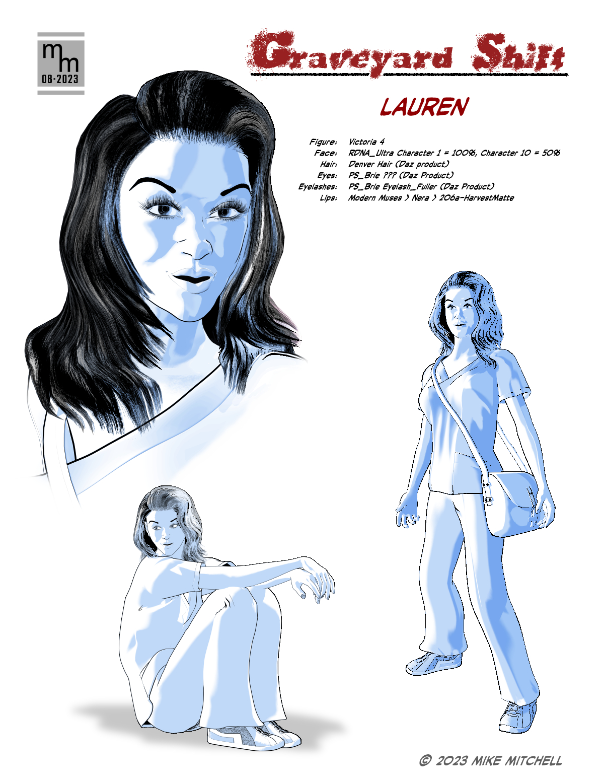
Graveyard Shift 02 - Character Design Lauren Normal

 Rex's original story is brisk in its pacing and doesn't dwell a lot on detailed descriptions. That was perfect for my needs, as I wanted to have a lot of freedom in designing the characters and setting. One thing I did have to go on was the cover illustration he created for the story. As you can see below, it's kind of rough and he doesn't exactly follow his own descriptive text (illustration shows "Loren" as a blonde but the text says she has dark hair).

© 2023 Rex Munsee

Here's the text from the story:

“Evening, Loren,” he smiled at the tall woman, wrapped in a long coat and carrying a large handbag. “You’re right on time.”

“Hi, Victor.” He watched as she set her handbag down, shrugged out of her coat, and picked up her bag. She handed Victor the coat and he folded it over the back of his recliner. As she was smoothing out the wrinkles on her solid green scrubs, he gazed at her coal-black hair which contrasted with her pale skin, which his deceased mother would have said was a “peaches and cream complexion.”


Loren vs Lauren

If you read headlines, then you'll have noticed that I changed the spelling of the lady's name. Although "Loren" is an acceptable spelling of the name, in my experience that spelling is usually for males. "Lauren" is more often for females (and that includes the two to which I am relate). I discussed this with Rex and he was okay with the change.

So, spelling settled, I started work on the character sheet. I don't always do character sheets for my own work, but as I'm working with a collaborator, I decided it was something I should do this time around. As it turned out, it also provided me with space to make notes about the various assets and dial settings I used to refine her look.


As you can see, I'm still playing around with the hair color – I'm not sure how light or dark it will be. I'll need to test it with the dark backgrounds called for in the script before I will make that decision. After this, I have three more character designs to whip up.

As you can see in the notes, the main figure is Victoria 4. I've documented the various dial and prop settings on the sheet (I didn't share these with the writer, as this would only confuse him because he doesn't know anything about Poser or 3D art). My standard workflow is in play: I create 2-to-3 renders in Poser 13 and transfer them to Clip Studio Paint for compositing, setting the tones and clean-up.

◄ Back to Graveyard Shift main page

Monday, August 28, 2023

Graveyard Shift 01

 I've started work on adapting a short story into comic format. The exercise is really just so I can take a stab at doing something that I have not written myself. I also think it would be fun to go back and do some public domain horror stories and try to nail down the style of the old Warren Magazines like EERIE, CREEPY or VAMPIRELLA.

I am starting with a short story titled "Graveyard Shift" by Rex Munsee. He's a member of the Snicker Snack Amateur Press Association (APA), which is a type of fanzine. Rex wrote the story a few issues ago, I read it and decided it would be fun to adapt it. So I wrote to him and he agreed to let me do his story, and the results will be printed in Snicker Snack and the Collectors' Club Newsletter.

The story has simple modeling and set requirements, which is a major criteria for my selection process:

  • Few character designs (there are 4)
  • Limited locations / sets:
    • Exterior:
      • Country road a night with a small car driving on it
      • Country road leads to a nice house in the woods
      • Front of the house as she enters
    • Interior:
      • Living room
      • Bedroom
      • Possibly another part of the house, like a hallway or kitchen area
    • Props (key items):
      • Reclining chair (i.e. La-Z-Boy)
      • Lamp, side table, misc. items
      • Hospital-type bed
      • Hypodermic & medical equipment
      • Set dressings (pictures, furniture, etc.)
      • Video/security camera
      • Video monitor
      • Antique mirror
If you're familiar with my workflow, then you know I start out in Poser (a 3D app) and then render line art which is composited and cleaned up in Clip Studio Paint. This makes the first step is to collect the 3D assets I need, and fortunately I already had most of the items above. The exterior of the country road has proved to be the most problematic because I didn't have exactly the sort of hilly environment I imagined when I started to block out the story and make thumbnails.

As for the character design, we'll cover that next time!

Other Posts in this Series

Thursday, August 24, 2023

Captain America illustration selected by Renderosity

 Awesome news! Another illustration I created was selected by the Renderosity moderators to be included in their Poser Pulse Gallery for August. I think this may have replaced their "Staff picks of the Week" feature.

As you can see, this illustration uses my standard workflow of creating the base renders in Poser (in this case, Poser 13) and then combining them in Clip Studio Paint (in this case, version 3.0). In this case, I also added retro comic book colors with the True Grit comic book color tools.

© 2023 Mike Mitchell
Captain America and Red Skull are TM by Marvel Comics

A link to the image – and my notes on its creation – can be found on Renderosity.

A link to the Poser Pulse gallery can be found here.


Wednesday, October 6, 2021

Devil Wing™ Takes Flight

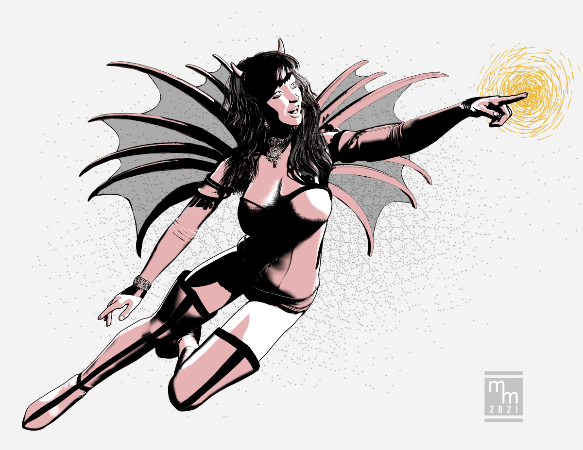
 Here's a character study for a comic book character I might work with. Devil Wing™ is an anti-hero in the tradition of Vampirella or Satana. Here we catch her in a light mood as she revels in the joy of flight.

Figure is V4 with Bettie Page morphs and hair. Outfit includes the top from the Rockabilly Burlesque and the boots are custom for me by Terry McG.

Workflow is Poser Pro 11 renders with clean-up in Clip Studio Paint.

© 2021 Mike Mitchell


Thursday, August 5, 2021

Hey, I got sampled in the intro to a Poser 12 Tutorial Video

 Well, this is cool!

I was at YouTube and I saw a video titled "Poser 12 Tutorial: SuperFly Render Settings: Pixel Samples." Sounds like a fun topic, so I watched it. And yeah, I know that I have a weird definition of "fun," but I think we all know that! Anyway, the video opens with a bunch of still images flying by very, very fast, and I did a double-take.

"Did I just see what I thought I saw?" I asked myself (yeah, I often talk to myself because I love an intelligent conversation!).

I went back and slowed the video down and... Yup. I saw exactly what I thought I saw (and no, it was NOT a "puddy tat"). Right there at about the 2-second mark:


There it is, one of my illustrations! The line art of the guy and the gal in the car. That's so cool. 

And before ya ask: 

  1. No, I don't get any money. 
  2. Yes, I gave them permission (it's an option when I upload the image to their gallery).
For anyone interested, I created this illustration for a book of short stories. Honestly, I'm not happy with the way they printed the illustration (it was printed in b&w, of course). They were supposed to put it at the bottom of a page under the text, and the editor shoved it in sideways, centered on an opposite page. It looks AWFUL in print, so I really don't mention the book to anyone.

Nevertheless, here's a full-size copy of the color version (I like to add a little spot color when I post the pics online – it makes them a little more interesting):

© 2020 Mike Mitchell


 If you'd like to watch the video (which is a decent, fast little tutorial on pixel sampling; I learned stuff I didn't know), you may watch it here:


By the way, I glanced at a few other videos for Poser 12, and it appears that this illustration is in the standard intro for all of them. VERY, very cool! Apparently, this started last year (at least in November 2020), and I'm just now noticing it.

Heh. Ya snooze, ya lose!

It's still pretty cool.

Wednesday, June 2, 2021

Cerebus Attacks

 Cerebus the Aardvark is one of the most successfully published indy comic characters of all time. Artist Dave Sim, running 300 issues published from 1977 thru 2004. After the series veered off into politics, it faded away from my interest, to be honest. But the early issues are still brilliant and I still learn a lot from the artwork and storytelling (seriously, even though you probably cannot see it in my work, Sim's approach to lighting and backgrounds are a strong influence on how I approach comics art).

Anyway, I found a 3D figure of the Aardvark over at ShareCG, so I downloaded it and was pleasantly surprised to find that it's pretty good. It also "kind of" accepts poses for Michael 4. So, here is just a quickie illustration I did to play around with the figure and some free brushes I got from Clip Studio's website.

Typical workflow applies: Poser Pro 11 and Clip Studio Paint.

© 2021 Aardvark-Vanaheim


Wednesday, July 15, 2020

Insectoid [Galaxy Prime]

 Here's the final illustration that I created for the Sector Treks anthology being published by Epic Age Media. The deadline on this one was super, super short (in other words, I was behind schedule again). So I repurposed an older character study and updated it to fit the format for this book. The problem was, all I really had was an alien standing menacingly in front of a starfield. 

I thought about adding another ship back there, but I really didn't have anything ready and none of the ships I had available looked "alien" enough for this race. So, I opted to do something simple that would harken back to the 1970s and 80s: The giant head floating in space.

© 2020 Mike Mitchell


As you can see, it's really just a simple render with the shadows being set to vanish (I used the Screen Blending Mode in Clip Studio Paint – this makes the solid blacks disappear). All in all, pretty good for a quickie (definitely less than an afternoon's work).


Monday, July 6, 2020

Claim Jumper [Galaxy Prime] selected as a Poser Staff Pick of the Week

I did five illustrations for the interior of the upcoming Galaxy Prime: Galaxy Treks rpg supplement. And I'm pleased to say that one of them has been selected by the staff at Renderosity as a "Staff Pick of the Week." In this case, it is the one that gave me the most trouble: Claim Jumper.

© 2020 Mike Mitchell


As before, this is a nice honor to be recognized from among the many great illustrations that are posted to the Renderosity website. This week they selected six illustrations, and as usual, I'm the only one working in b&w. Although this time there was another "artistic" render in the mix, which was rather nice. 


If you'd like to see my illustration at Renderosity, you can find it here: https://www.renderosity.com/mod/gallery/claim-jumper-galaxy-prime-/2949721/

Monday, June 29, 2020

Hot Pursuit (Galaxy Prime)

Here's the next illustration created for the Galaxy Treks book coming out by Epic Age Media. This one is another reworking of an earlier piece I did for a sci-fi comic I'm working on. I had a bit of fun with this one, and once more I fell back to using what is fast becoming one of my favorite celestial bodies (at least visually): Jupiter's moon, Ganymede. It just has a really cool look to it (especially when I used a posterize effect on it).

In this one, the thing that gave me fits were the laser pulses.

Rather than just draw them in postwork (which, in retrospect, would have been easier), I wanted them to have a realistic rounded edge to them. So, I set up two rows of about 15 little "pills/capsules" in Poser and parented them to the pursuit ship. This gave me a great prop to work with that maintained the proper position and aspect ration as I put them into the scene.

Of course, this turned out to be a problem and I had a lot of issues with them. I tried all sorts of experiments to get a good look out of them, and they just didn't work. I even spent about two hours applying little, feathered motion lines after each pulse. That was a colossal waste of time!

I finally fell back on semi-transparent fills with a slight gray glow effect. All in all, it works well enough. And I am pleased with the dramatic effect of moving the lead ship off the page: it just screams of action.

© 2020 Mike Mitchell


Standard workflow applies: Poser Pro 11 and Clip Studio Paint.

Tuesday, June 9, 2020

Space Station Sector 4 [Galaxy Prime]

The second completed illustration for the upcoming Galaxy Prime RPG supplement: Galaxy Treks. On a production note, this will be printed in b&w on a 6x9 page. I'm working at 900 dpi so – if needed – this could be blown up to a cover or poster. I'm creating a series of 5 illustrations: one per chapter in the book. I've got a great deal of artistic freedom on this project. I was given a one-sentence description of each chapter, and this one simply said "This one takes place on a space station."

As usual, my workflow consists of creating two renders in Poser Pro 11 and then combining them (and doing additional touch-ups) in Clip Studio Paint.

© 2020 Mike Mitchell

And I owe a special thanks to Bob Keck. He saw an earlier version of this illustration and suggested pulling the entire space station out of the frame (previously, the station was smaller and the wheel was inside the circle). This suggestion really helped make this illustration work on a whole different level.

I also thank Divamakeup from the Daz forums. She provided some great tips about where to place the motion lines for the shuttle. 

Both of their contributions made this a much stronger illustration.

Wednesday, June 3, 2020

Starship Exiting Warp [Galaxy Prime]

Hey there, one and all. I was contacted by the publisher of Epic Age Media who needed a fast turnaround for some illustrations for an RPG supplement he's putting together for his game, Galaxy Prime. The book is a 6x9 inch b&w collection of adventures/scenarios for the game. So, I'm quickly creating five or six b&w illustrations that will (I think) run opposite the title of each adventure (in other words, there will be a full-page illo at the start of each "chapter"). 

Because of the time crunch, the publisher was practically giddy because I already had some sci-fi art "in the can" as concept drawings for a sci-fi comic I'm working on. Since these had not been printed before, he happily agreed to use two or three of the illustrations I already had ready to go. So, with a few tweaks, here's a reworking of another illustration you'll find in my gallery.

© 2020 Mike Mitchell


As you can see, I made some modifications to the previous one, mainly adding a circle motif for the background. My reasoning behind this was simple and twofold:
  1. A smaller background means less work and a faster turnaround.
  2. It just looks cool! By having the ship burst out of the circle, it instantly adds more energy, movement and a greater sense of depth.

Keep your eyes peeled, sci-fi fanatics! I've got more illos (and a cover) on the way!

[Created in Poser Pro 11 and Clip Studio Paint: Space Background based on a royalty-free photo from NASA]

Saturday, February 29, 2020

Kitbashing a Space Ship 3

Next up, something that's a mix of the previous two:

  • Keeps the stair steps of the main unit.
  • Brings back the three engines to the rear, but smaller.
© Mike Mitchell

Similar problems continue. The proportions are off and it just doesn't look as cool as the first one.

I still have a few more to go, and these will be rather different from these first three.

Thursday, February 27, 2020

Kitbashing a Space Ship 2

When I started kitbashing these spaceships, I spent about four hours one night just going through my Runtime and mixing and matching ships and pushing things together. The next night I reviewed my work and chose the one I thought would work best, and that is the one I posted on Wednesday.

Here's the second one I thought would be workable. The things I liked about it:

  • The little "stair steps" behind the main module; I thought they would catch some cool shadows.
  • I thought the square engines on the back would be more in style with the square engines on the front.

© 2020 Mike Mitchell

It's not bad, but not good enough to be the "hero ship" of my series. I think the main issues are that it's just too stubby and the stair steps don't really catch the shadows the way I thought they would. They're kind of weak.

Oh well, maybe it can appear as a background ship.

Wednesday, February 26, 2020

Making Comics: Nebula Background

My online buddy and fellow space enthusiast, tkrobert, asked how I created the nebula background in my recent space illustration (see Wednesday's post), so I thought I'd share that answer with you guys.

It's a remarkably easy process. The ship is, of course, on its own layer(s). So, to create the background:

  1. Set background layer to solid black.
  2. Go to nasa.gov and search their gallery for "nebula." (Their space images are generally free for personal and commercial use - just don't use the NASA logo or photos of people.)
  3. Once you have an image you like (look for things with nice, abstract patterns and high-contrast areas), paste it into your image editing software on a layer between the black background and the ship.
  4. Photoshop/GIMP, etc.: Play around with the following filters: Poster Edges, Stamp, Find Edges. Mix-and-match effects until you get something nice and abstract. You might also want to play around with Levels or Contrast. Then I convert the layer to b&w. Personally, I like the strong posterized look (sharp deleniations between the colors, but you can easily go for a softer, more gentle look).
  5. Adjust the nebula layer's opacity (usually 30% - 50% works well.
  6. Just move the nebula around until it works with the composition. 

A side note on composition: In the case of a ship being dead center of the frame, I tend to put the brighter parts behind it, near the exhaust areas. Also, because I planned to use those white motion lines in front of the ship, I left that part of the background completely black (note that there aren't even any stars). I did this to simplify things, because those speed lines quickly clutter things up.

I spent significantly more time playing around with the white lines than I did creating the background (in this case, I used some version of "find edges" filter in Clip Studio Paint (not Photoshop) because I wanted to do all the work in CSP.

I learned/self-taught myself this technique when I was working on the illustrations I created for the Galaxy Prime Role Playing Game.

Tuesday, February 25, 2020

Kitbashing a Space Ship

I'm working on a comic book set in space (more on this soon), and so (naturally) I need a space ship. Unfortunately, I have not yet found a model at Renderosity or Daz3D that suits both my artistic and my story needs.

Specifically, I need a starship that can fulfill two needs:

  • It needs to look cool when rendered in b&w (which means more angles and less curves).
  • It is about the right size to fit 4-6 crewmen and some cargo.
© 2020 Mike Mitchell

Most ships are too big or too small (Enterprise vs X-Wing Fighter). So I got a bunch of stuff at Renderosity (50% off sales are verrrrry dangerous to my wallet) and decided to mix-and-match it. In modeling terms, this is known as "Kit Bashing" (or kitbashing). And by "modeling," I mean this terms goes back to the days when boys routinely spent a rainy afternoon working on plastic kits wherein they glued together replicas of airplanes, spaceships and cars. My older brother was really into that pastime around ages 10-14; right up until that time he "discovered girls" and then started obsessing about cars.

So, back to my ship. Poking around the stuff I bought from Renderosity, I really liked look of the HeavyLander by shawnaloroc, but its not big enough. So I decided to modify it to create a slightly larger/longer version of the ship by adding elements from Simon-3D's Space Ship Constructor Set 4 (which came with a pre-built ship called the C Hume).


I'm not sure this ship will make the cut, but I think I'm on the right track. A few more experiments (and mixing-and-matching parts) should yield something I can use, so stay tuned: more ships to come!

Workflow: Poser Pro 11 (Comic Book Preview) and Clip Studio Paint

Friday, September 13, 2019

ULTRA™ Quick Illustraion

Sorry for taking so long between posts these days, folks. I've just been tied up creating art, and that leaves little time to write about it. Here's a quick illustration of my ULTRA™ character.

Ultra flies to the rescue!
© 2019 Mike Mitchell

The usual workflow applies here: Poser Pro 11 and Clip Studio Paint.

Tuesday, December 11, 2018

I made the "Poser Staff Pick of the Week" list again!

I got another virtual pat on the back yesterday!

Once again one of my illustrations was selected as a "Poser Staff Pick of the Week" at the Renderosity online community. Considering there are thousands of Poser-based illustrations posted there each week, this is a pretty big honor (and the second time it's happened, the first being in June 2017 with a Ms. Marvel illustration).

This time it happened for a simpler illustration that is a character design for the the up-coming comics project, "Princess of the Trees 2: Heart of the Forest." Read other posts for more about this project with writer Roger Keel.

Here's this week's pick: Arton + Bow 3

Arton + Bow 3
© 2018 Mike Mitchell

You can see the entire list of illustrations selected here:
https://www.renderosity.com/mod/forumpro/?thread_id=2929461


You'll probably need a Renderosity log-in to see the whole list, but trust me, I'm in some pretty amazing company (in fact, if I'm being completely honest, although I think this is an interesting illustration with a good expression and some decent lighting, this isn't the best thing I've done lately).

And before anyone asks, no: there is not a prize or award. It's just an honor to be recognized by my peers.