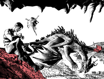
As promised, here's a quick post about the "set design" for the interior scene. I put that phrase in quotes for a definite reason. You see (at least I hope you will), this is not a full set design as I would make for an animated film. I didn't worry about walls or even exact locations. I put stuff where I needed it so it would fall where I wanted it in the main camera (for those of you who are just now joining us, I'm working in Poser 11 Pro).
Here's the final picture, which shows everything where it is.
 |
| Here's a look at the basic scene that will take up pages 2 and 3. I marked two landmarks in the scene: 1. Hero Rock and 2. Treasure Chest. |
Here's a shot from another angle that gives you an idea of how I moved things around to fit them into the viewport.
 |
| This is an oblique view, looking down at the scene. In some cases, I have scaled objects to increase their size so they would look better from a distance. The ceiling is hidden in this view. |
As you can see here, I'm being loosey-goosie with the location of objects; my goal was to fit them into the scene and frame the shot I wanted. As such, I had to play around with their scale. The gold coins in front are scaled down to 75%, but the coin piles in the rear are scaled up to 130%, and the treasure chest is a whopping 194%.
- I read an interview about the creation of the first Incredibles movie, wherein the director said they only built the parts of sets that would actually appear on camera (much the way most movie sets are built).
- A visit to the Houston Natural History museum several years ago: We saw an exhibit of the props from The Lord of the Rings movies, and there was a set recreation that showed how they used forced perspective to blend the actors together with the scenery so that the Hobbits could be farther away (and thus look smaller) and Gandalf would be closer to the camera to make him look bigger.
- My old college film classes where we saw how they used matte paintings (a sheet of glass with a painting on it to put in something that wasn't really there (this is why I chose to do the ceiling/cave roof the way I did).
Here's a few videos on Forced Perspective to give you an idea of what I saw at the museum.
Not a perfect example, but very good advice.
And here's another one, that shows how the masters did it in the LoTR movies.
This special feature shows the same table set that I saw at the museum.
It was a very cool display, as we could walk around and see it from multiple directions,
then move to the camera position and see it from that POV.
And, just one last thing. Yes, since I am working in 3D, I find just as much useful information from filmmakers and photographers as I do from comic book and traditional artists.
NEXT TIME: More on developing my establishing shot


I like it. There's something about 3D that makes artists too obsessed with realism. I'm looking at old illustrators and comic book artists to see how much you can leave out and how much you can cheat for effect. The short answer is a lot.
ReplyDeleteThank you, Will. I really appreciate the comment. And I feel the same way about 3D and "realism." I'm not interested in making a movie here. I want to make a comic book, and that is all about creating an artistic focus based on what you leave in and leave out. The great comic artists who inspired me (and whom I'll never, ever be as good as) include Alex Toth and Milt Caniff. Those guys were masters at using shadow and line to paint a scene and indicate motion on the static page.
Delete