Showing posts with label Strata Design 3D. Show all posts

Friday, June 3, 2016

CCN #114 Christmas Cover

Wow! How has (almost) half the year sped by already? I just recalled that a while back I promised that I'd post the cover I created for the Christmas issue of the Collectors' Club Newsletter.

CCN #114 Cover: The Front & Back View

The cover is a front and back view of a hectic, odd Christmas scene. For those of you into details like this, it was done in Daz Studio 4.8 with Iray. I actually modeled the candles and candle holders that are on the tree (and used instances for the first time to replicate about 20 of them). I did the modeling in Strata 3D ver 7.

The entire scene was so complex that it actually took about 48 hours or rendering to get a decent, high-resolution image. Post work was done in Photoshop.

By the way, a tip of the (Santa) hat to Alan Sissom for giving me the idea to do a front-and-back scene. I sent him a different image, and when I told him it was done in 3D, he asked if I could also show what was behind him. I thought it was a brilliant idea and started the task of updating it for Christmas, and showing what was going on behind the scenes, so to speak.

Friday, September 5, 2014

Galaxy Prime Art 16: So Long, and Thanks for All the Art!

Last week, I started telling you about the differences between Word Processors and Page Design programs. Now it's time to dig a little deeper.

Word Processors: You should write your text in a word processor. It has automatic spell check, automatic grammar check, and should help you do simple formatting like lists and tables (if your work requires it). It should also let you import images and set margins nicely. The main strength, though, comes from the tools that let you write quickly, outline if you need it (hopefully automatically, if you've been using Title and Header styles). It should also automatically generate your Table of Contents, have footers & headers. But mainly, it should be there to help you write quickly and clearly.

Page Design: This software is for after you've written your novel or book or whatever. It usually does not have automatic spelling or grammar checking (and often, it does not check grammar at all). That's not its job. It is supposed to help you create uniform pages with left/right headers & footers. It should let you adjust the spacing of your text, both horizontally and vertically. If you have a font that looks tight at small sizes (or you are printing it over a dark background), you can take complete control of the letter spacing to add 5% spacing between each letter. You can easily add a different title page, like the one above.And it handles spreads (left/right facing pages) much better than MS Word ever dreamed of doing -- see the example below.
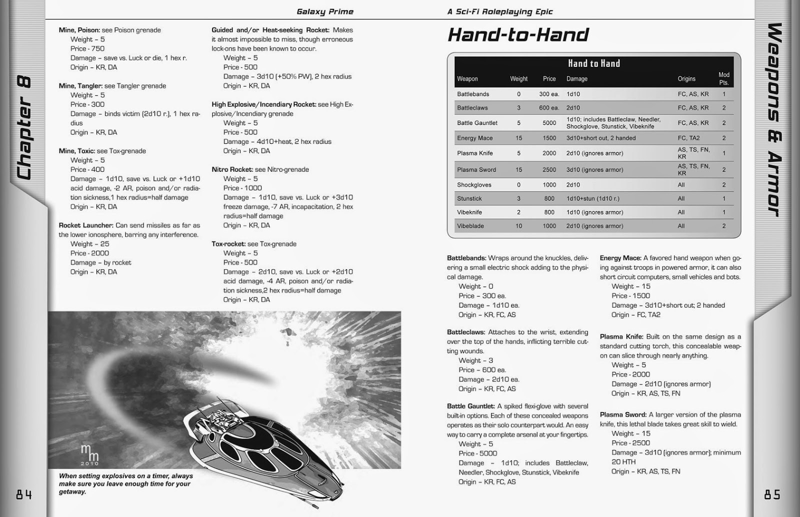
GP, pg. 84 - 85 

Page design software handles styles in a similar way to Word and Open Office: You define them beforehand and then just put your cursor in a paragraph and then click on the appropriate style from the list. Bingo! The text is formatted correctly. Another great thing about Page Design software is that you define boxes/content holders in which to put your elements. In the cases above, I placed an image box at the bottom of the page, imported the image of the air car, and then added another small box for the caption. The text automatically flowed around the image. The same is true of the table on the next page. This sort of design only takes seconds to add to a page. Yes, you can do similar things in Word and Open Office, but the layouts are not stable, and unless you know exactly what you're doing, the tables and images will flow along with the text, causing weird page breaks and formatting problems.

Text handling is where the page design software really shines. As I said above, you can compress or expand text and control exactly how much space to put between lines. This is a powerful tool to help you with type fitting. How many times have you had a paragraph that is just two or three words too long, so it creates a new page that will be 98% blank? With the type tools in these programs, you can compress a few paragraphs (or just single lines) to imperceptibly suck space out between letters so that those few errant words wind up on the previous page, thus eliminating that extra blank page. This is the most invaluable tool in the typesetter's arsenal. And yes, it does it better than Word, Word Perfect, or any of those other programs.
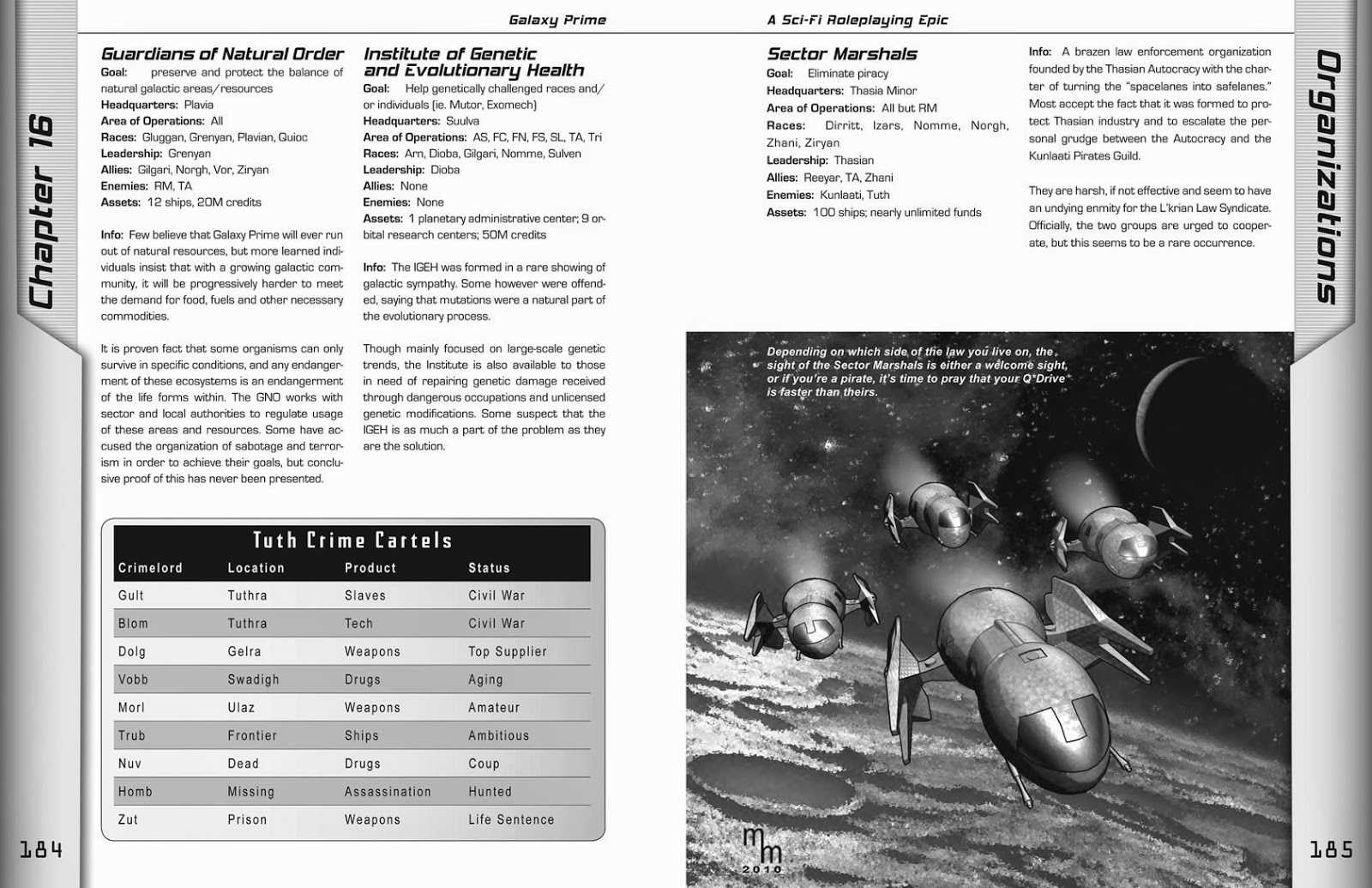
GP, pg. 184 - 185 

Finally, if you are going to have your book professionally printed, it handles bleeds (ink running off the edge of the paper) and color with more precision. Galaxy Prime had a bleed on almost each and every page of the book.To do this, the actual size of the each page was 8.75 x 11.25 inches. After printing, it was trimmed to a standard 8.5 x 11 size. The design tools in InDesign (which I used to create GP) gave me the control and power I needed to create a solid, exciting, and professionally typeset book.


Earth Re-entry in 3... 2... 1...
I think this concludes our trip to GALAXY PRIME. Although I might do a few more illustrations or covers for future projects, I've moved on to other work and different genres. Before we move on, though, I would like to remind you that this is a really fun Role Playing Game, and it is available from Amazon.com. BTW: My work on this book is finished, so I don't get any money for suggesting it. It's just that if you're looking for a good RPG, I think you'll enjoy this one. Also, if you go to the Amazon site and click the "Look Inside" arrow above the photo of the cover, you can look at more pages from the book and see how I worked with Amy Fanning's incredible artwork as I integrated them into my page design.

I had a blast on this project, and I thank James Shade for letting me take full charge of the editing and design of this book so I could make something we could both be proud of.

Pleasant travels, spacefarers! 

Friday, August 29, 2014

Galaxy Prime Art 15: Paging GP

I think we're just about ready to come back to earth from our tour of Galaxy Prime. That's my glib way of saying that I've finished reprinting the illustrations I created for the book. But there was one other aspect of art I created for the book, and that is the book itself.

GP, pg. 208
The illustrations I created weren't standalone pieces -- they were part of a page design that I was also responsible for creating. In this case, I used Adobe InDesign to create the book that author James Shade had originally written in Microsoft Word.

In this example below, you can see how the illustration is at the bottom of the page. It also extends far to the right of the text margin because it "bleeds" into the spine of the book. That's also why my signature is so far indented -- I didn't want it to get lost in the fold where the pages gather.

This is actually one of the things that I had to think about on a regular basis with this, and all other commercial illustrations that I create for publication. The original image actually needs to be a little larger than it will appear in the final book so that there is room for it to bleed off the page or into the spine.

A few of the cool things I liked about the design of this book was that each chapter opened with a quote -- which I wrote. I read the descriptions that author James Shade wrote about the various races, and then came up with some sort of saying that reinforces some of that race's basic traits. For instance, the Uncha are a race of gnome-like tinkerers known for building fantastic devices. For them, I wrote this saying that appeared at the start of Chapter 4:

"Planning is overrated. Just start putting things together and sometimes something wonderful happens."
Or this fun Molgan saying from Chapter 5:

"Money can't buy you friends... but when you have enough money you can always rent some." 

As you can easily guess, the Molgans are the financiers of the galaxy, always wheeling and dealing.

These quotes (and other textual elements) are the sort of features I worked into the text to perform multiple functions:

  • They help introduce new material that supports the content, but isn't part of the main text.
  • The reinforce character traits and give the book personality
  • They break up the text so it isn't overwhelming. There is little more dull than page after page after page of boring text. This is a game book, not a novel. 
  • They take up space. As a design decision, the side bars tell the reader which chapter is currently open. This meant that chapters start on the left page (even numbers). So, every chapter has to start with an even page and end with an odd page. To prevent blank pages, textual elements and graphics were added to just fill space. As in the example below, I tried to have fun with it by putting quotes in an alien font, and then putting the translation below it.
  • There are also 16 sectors in Galaxy Prime, so I selected an "sigil" for each one. So, when I put one of those in the background, it actually indicated which sector the quote originated from.

GP, 228 - 229
This is one of the few times James edited one of the quotes I wrote:
Translation of a Runarian saying: "The Future is not your to take, it's yours to make."


Word Processors vs.
Page Design Programs
The Galaxy Prime book that went to press would not have been possible if I had been forced to work with MS Word. In fact, James actually tried laying out the book in Word -- and he did a passable job of -- but it was unstable (an edit on one page could start a ripple effect that would reflow the text throughout the entire book. Plus, it was more than 350 pages long!

MS Word is a fine program -- and many people successfully use it to create fairly complex documents. Including myself. I've published many documents in Word, and got very nice results. But, it is not a page design program (or what we used to call "desktop publishing software").

I actually had a discussion with a fellow professional recently who said that almost anything you can do in InDesign can be duplicated in Word. That is true, but the key phrase is almost anything.  I'm not going to go into a long discussion about how the page design program is better at using visual and spacing algorithms to better process type (but if you're interested, there's a very accessible article about it here). I'm just going to list a few of the differences between the two types of software.

Word ProcessorsPage Design
MS Word
Open Office *
Google Docs *
Word Perfect
Text Maker
Corel Write
Adobe InDesign
QuarkXPress
MS Publisher
Adobe Illustrator (single pages & short docs)
Page Plus (* free version available)
Scribus *
For a review of many of these products, check out this link: http://office-software-review.toptenreviews.com/word-processing-software/
* Indicates Free software
For a review of discount products, visit this link: http://desktop-publishing-software-review.toptenreviews.com/ 
* Free tools reviews: http://www.techsupportalert.com/best-free-desktop-publishing-program.htm

There are MANY more programs out there. Many of them free. Many of them very good. But I'm going to be brutally honest: MS Word is the top word processor and the top two design programs are Adobe InDesign and QuarkXPress. Everyone else in the market is an "also-ran." Those programs dominate their markets, and rightly so. They are good programs that get the job done.


In our next installment, we'll do a level-1 diagnostic about
the differences between these two types of programs. See you on Friday!

Friday, August 22, 2014

Galaxy Prime Art 14: Space Station Wire Frame

Even though I use 3D models as the basis of my illustration work, I actually don't want it to look like it's 3D. I'm putting in a lot of work (my Photoshop Wizardry" as I call it) to make it look like traditional line art.

GP, pg. 208, This station is allegedly abandoned...
but we know better, don't we?
That's why this illustration for the Galaxy Prime book was a lot of fun. Since this was for the adventure, "The Lone Liyek," I felt I could break loose a little more. Plus, the material was being presented like a technical briefing (sort of), so this seemed like a good time to let the readers see behind the facade, so to speak, and see the wireframe underneath the artwork.

In this case, I created the image normally (but using a smoother art style than usual), and then created a second render of the wireframe. I then faded between the two images in Photoshop for a pretty cool effect. Click on it to see a bigger version -- it really brings the detail to life.


Friday, August 15, 2014

Galaxy Prime 13: The Cutting Room Floor

This week, I thought I'd share something that didn't make the cut. This ship is a cool design, but I could never get it to turn out right. This is what I started with:

This cool ship never made it into Galaxy Prime.
I guess it's Q*Drive stopped working in mid flight.

And, when the usual effects didn't pan out, I actually tried a few approaches like the one below. Although it looks kind of cool, it just was too different from the other illustrations I had created for the Galaxy Prime RPG published by Epic Age Media.

You know, this ship always reminded me of the Blackbird that the X-Men flew around in. In retrospect, I think the failure of this design to mesh well with my style stems from its smooth lines. There's not enough detail for me to pull from. This model is all about sexy, shiny surfaces... and that's not quite right for my "old school" retro approach to this project.

Plus, I really didn't like the way the front window came out. It looks recessed, for some reason. This definitely got the fate it deserved.

Friday, August 8, 2014

Galaxy Prime Art 12: Sky Car

If I recall correctly, this is the image on which I first used the rough line (i.e. "retro") look. I recall that the reelections on the windshield were particularly difficult to perfect, but I really like the slightly beat-up look that this technique gave the body.

GP, pg. 57, "Small grav cars are a great way to get around when you are
planet-side. To successfully operate one, your character will need the Small Air/Sea skill.
And if you buy your car from a Molgan... make sure you look under the hood first!

The Molgans are a race of traders with a less than stellar reputation. The rest of the text refers to game mechanics involving skill checks.

Next week, we'll take a look at some stuff that didn't quite make it into the book.

Friday, August 1, 2014

Galaxy Prime Art 11: The Lone Liyek

Hmmm. Two weeks ago, on the Fourth of July, I skipped a week of Galaxy Prime artwork. I'm feeling kind of generous right now, so this week I'll treat you to two space ships that appeared in the Sample Adventure Module that appears in the book. The adventure is about a crew (that would be you guys) who arrive at an "abandoned" space station... and find there's a mystery to solve.

GP, pg. 210. Responding to a distress call, this is the ship you arrived in,
only to find the space station empty... or is it?

You'll probably recognize this ship from the space station illustration a few weeks back. This one has a lot more detail than was visible in that image (and if you click on the picture, you can even make out the door opening mechanisms on the side doors).
GP, pg. 211. If the station is abandoned, then whose ship is this?
I like the roughness of the lines on this one, particularly in context with the story of this adventure. I also used the fisheye lens effect that I described in a previous post. This sort of thing might seem like an odd choice,but it helps give the ship a sense of dynamic proportion that keeps it from looking overly flat or mechanical. Plus, if forced foreshortening worked so well for Jack Kirby, then who am I to say nay?


Friday, July 25, 2014

Galaxy Prime Art 10: Desert World

This is the only two-page illustration I created for the Galaxy Prime RPG. It appears in the Timeline chapter, which explains the history of the GP Universe. To be honest, it has little to do with the material in the chapter, but the chapter came up really short and I needed a BIG filler.

GP, pgs. 134-135:  “The Skenn homeworld in the Tratt system is one of the
harshest environments to be inhabited by any intelligent species. To the casual
observer, it would appear that this is a backward society... but it is actually quite
sophisticated, even though they are not a space-faring civilization, they are ready
(and able) to defend their home at the slightest provocation.”
 -- From Rollo’s Tourists Guide to the Galaxy

So, I found a funky "alien" adobe style buildings and came up with this idea. I originally didn't have the space ships in it, but that side of the illustration just looked so danged empty that I finally decided that I had to do something. So, I popped open the file for the Sector Marshals (pg. 183), took three of the ships and changed the angle and lighting, and then added them to this illustration. The shadows were done entirely in postwork (i.e. in Photoshop). And, looking at them now, i can't get past the fact that I did them so poorly. The buildings have harsh shadows but the ships have soft shadows. I should have compromised between the two and made them the same. Oh well... that's what happens when the editor is also the artist -- stuff like this slips through the cracks.

A close-up of a Skenn settlement.

I don't remember where the background came from. It's either some kind of highly manipulated stock photo, or I drew it from hand. I just don't remember.

BY THE WAY: In case you were wondering, I actually wrote all the captions for these images, including the one above. Most of the time I just wrote the caption and James liked it. This one, however, James took a lot of interest in and helped me fine-tune the details about the Skenn society (for example, the fact that they are not space-faring).

Friday, July 18, 2014

Galaxy Prime Art 9: Gear & Equipment

Flying away from superheroes and heading back into space, this week I thought I'd show you a little something different that I created for the Galaxy Prime Role Playing Game project. My previous pictures were all of space ships and vehicles, which I admit was a lot of fun. But then came Chapter 9, which included equipment. The fact is, this section was seeming pretty empty, so I had to dig up some designs for gear that looked both alien and familiar. To be honest, I think it came out looking more familiar than not, but at least it looked suitably futuristic.

Galaxy Prime, page 89

The rifle and glasses were free models I downloaded from the StrataCafe.com website (it's a community of Strata Design 3D users who share models, textures, and tips with each other). The pad is my own original creation that I made for a client who kept pushing me to create a more unusual interface for a software control panel. I finally popped this out, and it's all black and chrome and funky. Yup... too funky. We went with something a lot simpler. The model languished in my files, unseen for 6 or 7 years, but, when this project came along, I thought it was a great place to put it to some use.

After the game had been out for a year or so, I met up with game creator James Shade at a convention (OwlCon in Houston, I think), and he mentioned to me that a lot of people had commented on this particular illustration, wanting to know two things: What does it say on the tablet, and what the heck are those those three little things on the right?

The symbols on the tablet are in an "alien font" I downloaded for use int he book. It's name is actually ALIEN, and I'm sorry, but I don't remember where I downloaded it. If I can remember (or find it again), I'll let you know. At any rate, this was the "standard" alien language font that I used in the book. As filler, I wrote a variety of quotes and attributed them to the various races. For example, one such quote (and one of my favorites on pg. 193) states: "Translation of an old Kor saying: 'Don't be afraid to bite the hand that feeds you... sometimes it has the tastiest meat!" The Kor are the Warlords of the galaxy, and not afraid to take power by force.

But back to the tablet. Here's what it says:

If you actually take the time to decode this, you probably have too much time on your hands! But thanks for your enthusiasm.

As for those little things on the side? They're energy cartridges for the laser rifle. They plug in somewhere at the back or bottom. I don't know. I just made it all up, so don't spend too much time trying to find any logic or hidden meanings..

Friday, July 4, 2014

Happy Fourth of July

I thought we'd take a break from my sci-fi artwork and spend a little time here on earth to honor the men and woman who have contributed to making our nation a great bastion of hope and freedom.


I'm not going to lie... in recent years, the divisiveness in the United States is making it hard to put aside politics and focus solely on the meaning of this day. But, looking at this illustration I created a few years ago, I can try. I've never discussed the imagery in this picture with anyone before. But it is there.

  • The hat is white because we are the good guys.
  • The gun is there because we must never be afraid to fight for the rights and freedoms that are enumerated and stated so eloquently in the Constitution upon which it sits.
  • There are six bullets present... They represent the fact that we fired off the first six shots securing the past. Now we must reload to secure the future.
  • The American Flag is in the background because it is the backdrop against all that we do, every day, to ensure that the freedom it represents never fades into the black shadows that cling to its surface.
  • And why the cowboy imagery? Yes, I created it for Hawgleg Publishing (the company my buddies and me founded to publish our Western game, Gutshot). But more than that, I believe -- no, I'm convinced that the hope for the future lies in the mindset and patriotic hearts of the the men and women who embody the spirit of the South and the West. So yeah, I think our best hope lies in the cowboy spirit that has not, and WILL NOT, fade from the South and Southwest regions our great nation.
I hope I'm not being too highbrow or preachy today. But the truth is in the words you see here: "Liberty is never without cost." I hope, in the years to come, we don't shirk from paying that cost with steadfast determination and humble hearts.

Friday, June 20, 2014

Galaxy Prime Art 8: Space Station

This picture reminded me of one of the things I learned while creating artwork for a game set in outer space: even though space is really black, you cannot have that much blackness in your artwork. The fact is, it overpowers the reader and taxes the printer.

Galaxy Prime, pg. 129. This is one of the few illustrations I created that
does not have a caption in the book. I don't remember why, either.

Most of my backgrounds are public domain images from NASA or other space agencies. They come into Photoshop as beautiful color spectacles, and through filters and adjustments, are transformed into interesting backdrops for interstellar adventure in the world of Galaxy Prime!

Friday, June 13, 2014

Galaxy Prime Art 7: Battleship

Available at Amazon.com
It just dawned on me the other night, that I've been sharing the art of Galaxy Prime with you for almost two months now, and I've never bothered to show you the cover of the book that all my work appears in. Now, first of all,

I DID NOT CREATE THIS COVER ART!
This was painted by the very talented AMY FANNING.


I did, however, do a lot of work on this. It was painted on a large canvas board and I had to scan it with a standard flatbed scanner. I believe there were at least 8-10 scans to get it all. I then had to stitch them together and do some color correction. It was quite a bit of investment in time and technique to get it all to look right.

I did design the logo, though (two of them, actually -- this is the second... the first was more Star Wars inspired and creator James Shade wanted something a little more modern). I also chose to use the purple band at the bottom. This was a necessity because the vivid colors at the bottom made it too difficult to read James' name. This purple bar solved the problem by making it easy to read, and it helped provide a nice anchor to the page.

If you're interested in getting a copy of Galaxy Prime for your own, you can buy one at Amazon.com (among other places).


Don't Sink My Battleship
This week's image was a simple one, but one of the first where I used the rough lines to give it the retro feel that I was developing for this project.

GP pg. 103, "Long-range starships are used by explorers, merchants,
and anyone who wants to travel the stars in style and safety."
Although this one came out okay, I do think it looks better in the book because it was in the equipment section on starships, so the static shot (rather than an "action shot" of it in space) fit in well with the section's design.

Also, for those of you who are interested, here's another look at the original color render from Strata Design 3D.

Original color render.

In this one, you can see the highlights and shading that formed the basis of the image above. It is worth mentioning (again, for those of you who are interested in this sort of thing), that this is an exaggerated color render. By this, I mean I specifically used odd colors so that the various parts would stand out from each other. If everything were just a simple shade of white or chrome, it would be very difficult to recolor it into the b&w image that made it into the book.

Friday, June 6, 2014

Galaxy Prime Art 6: Routine Maintenance

I think this one was also an earlier illustration. I recall that I originally intended to put this into space, but I had some better ships, so I used them, instead.

GP, pg. 108, "Routine maintenance isn't just a good idea...
it's a matter of life and death!"

And now for a revelation that is hysterical... at least to me. As you can see, I did this four years ago. It's been in print in the Galaxy Prime Role Playing Game book since early 2011. This is the first time I ever noticed that the front landing gear is not connected to anything! Yup. I deleted a line on the ship, or something like that. Anyway, it's just floating there. Unbelievable!

Honestly, someone should contact the editor of the book and give him a piece of their mind... oh, wait. I WAS THE EDITOR. Ummmm... never mind.

Behind the Scenes
I don't know if any of you are really interested in the process behind how I create this artwork, but as I've said, I basically use two programs, one of which is Strata Design 3D. As with all 3D applications, you place a model into the program and then you can move it in three dimensions, putting it as close or far away from the "camera" as you want. You can also move the camera around (up, down, turn left or right), and in this program, you can even define what type of lens and shutter speed you want to use. In other words, it tries to duplicate the real world as closely as possible.

While working in the program, everything is very rough. You see shapes, basic colors, and even some detail. But it's still a far cry from the final image that is "rendered." The images I render (that is, process into the final image with reflections, shadows, etc.) are actually in color. Another thing about rendering -- you can render at different levels of complexity. The image above was based on a level of complexity that included detailed shadows on the fuselage of the ship and you can see the details on the fuel depots in the background (yeah... that's what those are supposed to be). One of the other base renders I created included simplified shadows -- sort of a "toon" render, if you will. This helps provide basic color blocking and outlines... at lease usually. As you can see, the outline on the landing gear flap didn't come in and I missed adding it by hand (and yes, there's a lot of touch-ups that are required in this process).

A simplified color render that was used as part of my process that
ended with the image above. In other words, this is a "Before" picture.

Now, you may ask why I bother with color, only take it out in the end? That's easy -- 3D apps are set up to work with real-world colors, so taking it out there wouldn't be easy. And as for my Photoshop trickery that converts it into black & white line art? That's easy. I take out the color because the book was printed in black & white!

PS: Looking at the color image above, I can see how, in my haste, I removed the metal flap that covered the landing gear.

Friday, May 30, 2014

Galaxy Prime Art 5: Sector Marshals

This was my first multi-ship image in the series I created for the Galaxy Prime RPG. Yeah, it's the same ship repeated over and over, but I actually did put four of them in this scene so I could get the angles right and convey a sense of perspective.

GP pg. 183, "Depending on which side of the law you live on, the sight of the
Sector Marshals is either a welcome sight, or if you're a pirate, it's time to pray
that your Q*Drive is faster than theirs.
I remember this one being a pain in the you-know-what because I was kept having to tweak the "exhaust" to get it just right. Plus, the cratered surface of the moon took a lot of work. I also recall that the surface texture of the ship's was problematic. It looked better in color than in b&w, so it took a little doing to get them to work in print. because of the problems I had with the surfaces, I didn't try for a strong retro look with this illustration. I let the lines stay smoother than usual and also let the highlights stay softer.

All in all, though, I liked the way it all turned out in the end.

Friday, May 23, 2014

Galaxy Prime Art 4: The Getaway

This week's image from the Galaxy Prime RPG was, if I recall correctly, one of the early images in the series. As such, it's a bit smoother and cleaner than the later images. The more I created, the more I realized that I wanted them to feel "old school," as though they had been copied out of an old pulp magazine, like Amazing Stories or The Magazine of Fantasy & Science Fiction (the latter a favorite of mine, growing up).

GP, pg. 82, "When setting explosives on a timer, always make sure
you leave enough time for your getaway.


Like last week's image, this one is at the bottom of the page and the ship looks like it's about to fly off the bottom of the page.

By the way, if you're interested in this level of detail, this is a 3D model I purchased a few years ago, and you can see more about it here at the Daz3d Web site: http://www.daz3d.com/stinger.  The original model was created by an artist named Kibarreto, who did an excellent job with this vehicle. Check it out at their site, and you can even see the cool details inside the cabin and on the undercarriage.

Friday, May 16, 2014

Galaxy Prime Art 3: Space Battle

This is probably my second-favorite piece that I did for the Galaxy Prime Role Playing Game.

GP, pg. 120: "When facing a Runarian Dreadnaught, the best
strategy for an Izars Heavy Fighter is to run!"

Because of time considerations, this is the only real action shot in the book The other images are cool, but a bit static. Honestly, I just didn't have the time or skill at that time to create cool space battles. It took a few images to develop the skills and speed I needed to make something like this.

By the way, this picture is particularly effective in the book because it's at the bottom of the page, so it looks like both ship and laser blast are about to speed off the page to escape capture.

For those of you interested in this type of detail, if you look closely at the Dreadnaught, you'll see that there is a slight curve to the ship. I achieved this by bringing the camera in close and using a very short focal length; as in the real world, this contributed a little fisheye effect to the picture, which I think helped enhance the sense of movement and menace. This also accounts for the distortion of the outer nacelle to appear a lot bigger than the other one.


Friday, May 9, 2014

Galaxy Prime Art 2: Icarus

As promised last week, here's another sample of art from the Galaxy Prime Role Playing Game by Epic Age Media. Like the work in this series, this is actually created and rendered in a 3D program called Strata Design 3D. I've been using this program for a very long time (it's currently on version 7.5 and I started waaaay back in version 3 -- probably around 1999-2000).

From GP, pg 125: "The L'Kri are known for their fast ships that
utilize powerful Q*Drives to traverse the vast distances between systems."
This particular ship design is called the Icarus, named after the doomed young man who flew too close to the sun in Greek mythology. The L'kri, by the way, are on of my favorite races from this cool game. I've got to hand it to game creator James Shade... he really came up with some super cool aliens for this game.

Friday, May 2, 2014

Galaxy Prime Art - Blast from the Past...

I was looking through my archives the other day and found some cool images that I hadn't posted here. These were created for the Role Playing Game, GALAXY PRIME, that is published by Epic Age Media.
These are all 3D images that were originally created in a very cool program called Strata 3D. I then used a lot of Photoshop wizardry to give them a cool, retro look.

From Galaxy Prime, pg 113: "Short-range interceptors and light fighters
usually have room for two crew members: A pilot and a gunner."

I've made several illustrations for the book. I'll post them here, one a week, every Friday until they run out. Hope you enjoy them!

PS: Scroll down -- there's more GP art below.