Friday, November 14, 2014

CCN: Superhero Cover 3

I was pulling links from my blog today so I could send them to a game developer looking for an artist for an upcoming project, and I just realized that I had not actually posted the final cover to the Collectors' Club Newsletter that I was working on earlier this year.

So, without further ado, here it is!


As you can see, this is a wraparound cover -- the reader will see the scene on the front, then open it up to see the picture of the "Earth-2" Captain Epistle flying out of a magazine on the back cover. I created everything in here digitally, and had a blast doing it! I also had a blast figuring out who to do the "old school" coloring on the cover -- I was aiming for a 1980s feel, and I think I did a pretty good job of it. It's not a 100% match to that era, but it definitely conveys that feeling in general.

Friday, November 7, 2014

Why I Hate this Cover by Frank Frazetta

I was recently discussing the great covers that used to grace books back in the 1960s & 70s. There was a raw energy to the painting style back then that seems lost to me under the slick and polished covers that grace books today.

And this cover by Frank Frazetta came to mind.

Now, I love Frazetta's work in general. I think he's one of the great artists of the 60s & 70s. He drew a lot of great comics and painted a lot of great book covers, including a LOT of Tarzan covers. In short, he's one of the premier fantasy cover artists of the previous century, and his work is rightly revered by many.

But I hate this cover. I really do.

This is a dramatic image, I won't deny that. The pose, the menace, the sense of restrained energy about to burst loose.. it's all there. Even though it's a bit dark and monochromatic, i can't argue with the artistry in this image. But I still think it's the worst cover ever.

Here's Why
This short novel opens with a young thief stealing a girl's jewelry from a wealthy house. He then hooks up with some hobos who try to rob him, but is saved by another hobo and -- on the run -- they take refuge in a house. And then spooky stuff starts to happen: someone was murdered there years ago, they find a body in the house, and a girl is tossed out of a speeding car outside, and there are creepy noises coming from the basement. Growls and chains... oh my! Whatever could it be? I dunno? Maybe it's A BIG BROWN BEAR?
There's a complete plot here: http://en.wikipedia.org/wiki/The_Oakdale_Affair

And that's why I think this is the worst cover ever because it reveals the answer to the mystery that occupies about half the book. This is akin to doing a cover for Agatha Christie's "Murder on the Orient Express" and showing twelve people with knives standing over the body.

And this brings to mind several times in the Silver Age (and later) when the cover art of a comic revealed something important inside the story. I'm trying to remember specifics, but I clearly recall this happening in the Avengers and the Fantastic Four, as well as in an issue of Batman (or Detective Comics). Can any of you guys think of specific examples where the cover revealed the identity of a character that the writer was trying to hide?

Friday, October 31, 2014

Halloween 2014: Afterlife with Archie

This year, to celebrate one of my favorite holidays, I decided to create a large display in my yard based on my favorite comic book, AFTERLIFE WITH ARCHIE. To this end, I created a graveyard complete with tombstones for all the members of The Archies, and even created a life-sized figure of Jughead as the King of the Zombies!


Here it is by the light of day...
It is roped off with purple lights. The backdrop is painted plywood.
Since I took this photo, I have added a shelf to the back of the
wall so I can rest two pumpkins on it.


And at night it comes alive with black light.

Not even poor Betty could escape.

The two pumpkins up front rest on a small "brick" wall.


Looks like our boy's been eating ribs... but whose?


There are four black lights used to illuminate the scene.


And Jughead is lit from within

I got the Jughead mask as Halloween Express for about $20.
The rest of the pieces came from a Dollar Store, including the hands,
lights inside the hands (just strings of orange mini lights)
and the night light inside Juggie's head.


My Wife carved these "Funkins" a few years ago. Slowly but surely, we add
a new on each year. I'll actually pull out a lot more tonight when the
Trick-or-Treaters start making their rounds.

The tombstones are made of two flat Coke cartons that are duct taped
together and then painted with black paint for daylight, and
highlighted with glow-in-the-dark paint for night.

Almost everything here is custom made I did buy the Jughead mask (and, of course, all the paints, lights and plastic body parts), but the rest were created by me. All in all, I'm pretty happy with the display, although there are a few additional touches I'd like to add. But, the boils and ghouls will be here this evening, so the Riverdale sign and other touches will have to wait until next year.

Monday, October 27, 2014

Comics: Archie & the Gang as Superheroes

I was browsing through my Archie comics the other day and came across some fun reprints of the 1960s SUPERHERO versions of the Archie Characters. These were created back when superheroes were finally coming back into the mainstream consciousness after the drought of the 1950s.

For those of you who don't know, superheroes all but vanished during that decade: only the BIG THREE maintained constant publication from their halcyon days of the Golden Era that was the 1940s: Superman, Batman and Wonder Woman. Other heroes did pop up here and there, but the magic was gone. Even Captain Marvel (who once outsold Superman and moved a million comics a month) had hung up his cape (mostly due to a lawsuit from DC, but even if not for that, his glory days were also gone).

But 1956 changed that. The new version of THE FLASH revived interest by updating an old hero for a new age. Within 10 years, superhero mania swept the nation, especially when the Batman TV show became a monster hit in 1966.

Even the Archie gang was swept up in this super fever.

In October 1965, both Archie and Betty gained super powers: Archie got them in Life With Archie #44 and the girl next door acquired hers in Betty & Veronica #118. I personally didn't read these until the 1970s when they started reprinting these stories in their digest comics. I loved them, especially the Pureheart stories because they toyed around with the idea that they could actually be happening in the major continuity; every time Archie called on the "PH Factor" to activate his powers, it scrambled the memories of everyone around him, including himself, so he wasn't sure if these were real adventures or just daydreams.

The first Pureheart issue was illustrated by one of the underrated Archie artists, Bob White. Bob didn't acquire the following of Dan DeCarlo or Samm Schwartz, but he definitely captured the zany villains and absurd fun of these stories.

Copyright 1965 Archie Comics

I'm showing Super Teen's first appearance here, drawn by the incomparable Dan DeCarlo, but I'm actually showing the second appearance of PH because it's a better cover, AND it introduces his nemesis, EVILHEART (who is none other than Reggie Mantle). Of course, Jughead would soon follow with CAPTAIN HERO. It would actually take until 1995 before Veronica would get in on the game and get her own super identity as... Miss Vanity.

Friday, October 3, 2014

Ultra Update: The project in a nutshell

I realize that I haven't been exactly clear about what's going on here. So here it is:

  • About 30 years ago (among other things), I created a superhero called ULTRA.
  • I sent rough sketches to Steve Addlesee, who refined my initial costume ideas and did some concept art for me (check the last post for two of the images from the character design phase).
  • I then wrote a 20-page story and Steve penciled and lettered it. I may or may not have done some layouts/breakdowns for this story.
  • I then had some trouble finding someone to ink it. Ken Holden, Jr. inked the first 5 pages, then dropped the project due to other commitments.
  • Andrew Peopy (who was a teenager at the time and has since gone on to become an award-winning artist) inked the first 11 pages before dropping it (it's also possible that he never got the second half of the story -- I'm not sure).
  • I then got distracted with other things -- being the president of the Collectors' Club, going to college, dating, etc. All the usual things encountered by guys in their early 20s.
  • So I dropped the project. It's been sitting in my files, unfinished and unseen for about 30 years.
  • I recently went through my files and found a LOT of cool stuff.
  • So, I've decided to reactivate my old fanzine label, MELEE PUBLICATIONS, and print/reprint some of this old material.
  • I've contacted both Steve and Andrew, and they both gave me their blessings on this project. And they will receive royalties from each issue sold.
In future updates, I'll fill you in on the clean-up process for the artwork, and some of the other zines I'll be printing.

Friday, September 26, 2014

Ultra Busts Out in COLOR!

This may sound odd, but when I created Ultra 30+ years ago, I never really thought of her in color. I was pretty sure she was a redhead, but since I was working in b&w line art, I designed the costume to look good in b&w. Back then, color was prohibitively expensive for a small press publisher to use, so it really didn't cross my mind.

Of course, nowadays we have cheap Print On Demand color, and the Web is a cornucopia of color. It's everywhere. In fact, the only people using black and white on the Web are doing so to be artsy (and even then, most of them use pops of color for emphasis and drama).

But I digress.

Now that I'm going to reprint ULTRA in this modern era, that means I need to figure out what she looks like in color. And, I must admit, that's proving to be a challenge.  You see, I really like the idea of gold boots and wrist bands. I also know she's a redhead. So, of course, that moves me toward green as her costume color. Um... high yellow boots and a green outfit? Sound like anyone's favorite female mutant with a fiery bird motif? Yup. It would be very easy to have her look like Phoenix.

Which is something I don't want.

So, Right now I'm taking suggestions (my old buddy Eric C. suggested I glam her up with metallic colors and some greens, purples, and so forth. I like it, but I'm not sure it's exactly the look I'm going for.  

Ultra Color Concepts. If you have any suggestions, send 'em in!

 I also took Eric's advice about making the trunks and vest purple. I actually kind of like that (as you can see above, I extended that to the trim on the boots). I'm considering adding it to the wrist bands. I like the orange, but it reminds me a bit too much of when Nova Kane had super powers in the old E-Man comics. It's also a little too Aquaman for me. But -- well -- it does kind of work. 

If you have any suggestions for her costume colors, send 'em in. If I use your idea, I'll send you a free PDF of the comic when it comes out.


Ultra will soon appear in a full-size comic book, FANZINE FLASHBACK: ULTRA #1. It features a 20 page story penciled by Steven R. Addlesee and the first 11 pages were inked by a teenaged Andrew Pepoy. For project and ordering info, visit us at: www.meleepublications.com

Friday, September 12, 2014

Ultra is Coming!

Illustration by Steven R. Addlesee, created Sept. 1982
Copyright 1982, 2014 Mike Mitchell

Here's a little glimpse at what I'm working on next! If you blow this up to full size, you'll see that I did NOT draw this. It was created based on original sketches and ideas that I sent to the incomperable Steven R. Addlesee waaaaay back in 1982! Yup.

I was just out of high school, and must stop before I call myself a "fresh-faced kid," because, if I recall correctly, I was rocking a serious boy-stache back them. Yup. That bit of under-nose hair all guys think makes them look older when they're at that age. And, of course, it really just looks silly.

But I digress.

Back then, and for several years after, I self published comic books and magazines. I created this superhero and sent the very rough concepts to Steve (we knew each other through the auspices of the Collectors' Club, which is a group of people who collect & enjoy comics) and he created the stunning b&w inked illustration you see above.

I added the color to make her "pop" in this image.

Stay tuned for a big announcement next week!

Friday, September 5, 2014

Galaxy Prime Art 16: So Long, and Thanks for All the Art!

Last week, I started telling you about the differences between Word Processors and Page Design programs. Now it's time to dig a little deeper.

Word Processors: You should write your text in a word processor. It has automatic spell check, automatic grammar check, and should help you do simple formatting like lists and tables (if your work requires it). It should also let you import images and set margins nicely. The main strength, though, comes from the tools that let you write quickly, outline if you need it (hopefully automatically, if you've been using Title and Header styles). It should also automatically generate your Table of Contents, have footers & headers. But mainly, it should be there to help you write quickly and clearly.

Page Design: This software is for after you've written your novel or book or whatever. It usually does not have automatic spelling or grammar checking (and often, it does not check grammar at all). That's not its job. It is supposed to help you create uniform pages with left/right headers & footers. It should let you adjust the spacing of your text, both horizontally and vertically. If you have a font that looks tight at small sizes (or you are printing it over a dark background), you can take complete control of the letter spacing to add 5% spacing between each letter. You can easily add a different title page, like the one above.And it handles spreads (left/right facing pages) much better than MS Word ever dreamed of doing -- see the example below.
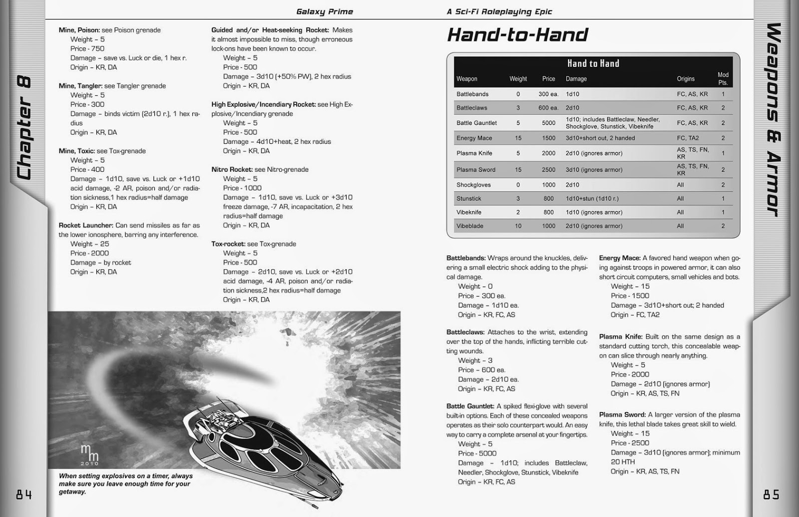
GP, pg. 84 - 85 

Page design software handles styles in a similar way to Word and Open Office: You define them beforehand and then just put your cursor in a paragraph and then click on the appropriate style from the list. Bingo! The text is formatted correctly. Another great thing about Page Design software is that you define boxes/content holders in which to put your elements. In the cases above, I placed an image box at the bottom of the page, imported the image of the air car, and then added another small box for the caption. The text automatically flowed around the image. The same is true of the table on the next page. This sort of design only takes seconds to add to a page. Yes, you can do similar things in Word and Open Office, but the layouts are not stable, and unless you know exactly what you're doing, the tables and images will flow along with the text, causing weird page breaks and formatting problems.

Text handling is where the page design software really shines. As I said above, you can compress or expand text and control exactly how much space to put between lines. This is a powerful tool to help you with type fitting. How many times have you had a paragraph that is just two or three words too long, so it creates a new page that will be 98% blank? With the type tools in these programs, you can compress a few paragraphs (or just single lines) to imperceptibly suck space out between letters so that those few errant words wind up on the previous page, thus eliminating that extra blank page. This is the most invaluable tool in the typesetter's arsenal. And yes, it does it better than Word, Word Perfect, or any of those other programs.
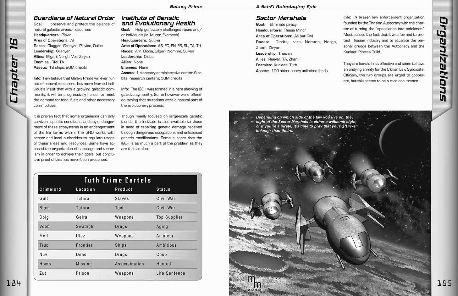
GP, pg. 184 - 185 

Finally, if you are going to have your book professionally printed, it handles bleeds (ink running off the edge of the paper) and color with more precision. Galaxy Prime had a bleed on almost each and every page of the book.To do this, the actual size of the each page was 8.75 x 11.25 inches. After printing, it was trimmed to a standard 8.5 x 11 size. The design tools in InDesign (which I used to create GP) gave me the control and power I needed to create a solid, exciting, and professionally typeset book.


Earth Re-entry in 3... 2... 1...
I think this concludes our trip to GALAXY PRIME. Although I might do a few more illustrations or covers for future projects, I've moved on to other work and different genres. Before we move on, though, I would like to remind you that this is a really fun Role Playing Game, and it is available from Amazon.com. BTW: My work on this book is finished, so I don't get any money for suggesting it. It's just that if you're looking for a good RPG, I think you'll enjoy this one. Also, if you go to the Amazon site and click the "Look Inside" arrow above the photo of the cover, you can look at more pages from the book and see how I worked with Amy Fanning's incredible artwork as I integrated them into my page design.

I had a blast on this project, and I thank James Shade for letting me take full charge of the editing and design of this book so I could make something we could both be proud of.

Pleasant travels, spacefarers! 

Friday, August 29, 2014

Galaxy Prime Art 15: Paging GP

I think we're just about ready to come back to earth from our tour of Galaxy Prime. That's my glib way of saying that I've finished reprinting the illustrations I created for the book. But there was one other aspect of art I created for the book, and that is the book itself.

GP, pg. 208
The illustrations I created weren't standalone pieces -- they were part of a page design that I was also responsible for creating. In this case, I used Adobe InDesign to create the book that author James Shade had originally written in Microsoft Word.

In this example below, you can see how the illustration is at the bottom of the page. It also extends far to the right of the text margin because it "bleeds" into the spine of the book. That's also why my signature is so far indented -- I didn't want it to get lost in the fold where the pages gather.

This is actually one of the things that I had to think about on a regular basis with this, and all other commercial illustrations that I create for publication. The original image actually needs to be a little larger than it will appear in the final book so that there is room for it to bleed off the page or into the spine.

A few of the cool things I liked about the design of this book was that each chapter opened with a quote -- which I wrote. I read the descriptions that author James Shade wrote about the various races, and then came up with some sort of saying that reinforces some of that race's basic traits. For instance, the Uncha are a race of gnome-like tinkerers known for building fantastic devices. For them, I wrote this saying that appeared at the start of Chapter 4:

"Planning is overrated. Just start putting things together and sometimes something wonderful happens."
Or this fun Molgan saying from Chapter 5:

"Money can't buy you friends... but when you have enough money you can always rent some." 

As you can easily guess, the Molgans are the financiers of the galaxy, always wheeling and dealing.

These quotes (and other textual elements) are the sort of features I worked into the text to perform multiple functions:

  • They help introduce new material that supports the content, but isn't part of the main text.
  • The reinforce character traits and give the book personality
  • They break up the text so it isn't overwhelming. There is little more dull than page after page after page of boring text. This is a game book, not a novel. 
  • They take up space. As a design decision, the side bars tell the reader which chapter is currently open. This meant that chapters start on the left page (even numbers). So, every chapter has to start with an even page and end with an odd page. To prevent blank pages, textual elements and graphics were added to just fill space. As in the example below, I tried to have fun with it by putting quotes in an alien font, and then putting the translation below it.
  • There are also 16 sectors in Galaxy Prime, so I selected an "sigil" for each one. So, when I put one of those in the background, it actually indicated which sector the quote originated from.

GP, 228 - 229
This is one of the few times James edited one of the quotes I wrote:
Translation of a Runarian saying: "The Future is not your to take, it's yours to make."


Word Processors vs.
Page Design Programs
The Galaxy Prime book that went to press would not have been possible if I had been forced to work with MS Word. In fact, James actually tried laying out the book in Word -- and he did a passable job of -- but it was unstable (an edit on one page could start a ripple effect that would reflow the text throughout the entire book. Plus, it was more than 350 pages long!

MS Word is a fine program -- and many people successfully use it to create fairly complex documents. Including myself. I've published many documents in Word, and got very nice results. But, it is not a page design program (or what we used to call "desktop publishing software").

I actually had a discussion with a fellow professional recently who said that almost anything you can do in InDesign can be duplicated in Word. That is true, but the key phrase is almost anything.  I'm not going to go into a long discussion about how the page design program is better at using visual and spacing algorithms to better process type (but if you're interested, there's a very accessible article about it here). I'm just going to list a few of the differences between the two types of software.

Word ProcessorsPage Design
MS Word
Open Office *
Google Docs *
Word Perfect
Text Maker
Corel Write
Adobe InDesign
QuarkXPress
MS Publisher
Adobe Illustrator (single pages & short docs)
Page Plus (* free version available)
Scribus *
For a review of many of these products, check out this link: http://office-software-review.toptenreviews.com/word-processing-software/
* Indicates Free software
For a review of discount products, visit this link: http://desktop-publishing-software-review.toptenreviews.com/ 
* Free tools reviews: http://www.techsupportalert.com/best-free-desktop-publishing-program.htm

There are MANY more programs out there. Many of them free. Many of them very good. But I'm going to be brutally honest: MS Word is the top word processor and the top two design programs are Adobe InDesign and QuarkXPress. Everyone else in the market is an "also-ran." Those programs dominate their markets, and rightly so. They are good programs that get the job done.


In our next installment, we'll do a level-1 diagnostic about
the differences between these two types of programs. See you on Friday!

Friday, August 22, 2014

Galaxy Prime Art 14: Space Station Wire Frame

Even though I use 3D models as the basis of my illustration work, I actually don't want it to look like it's 3D. I'm putting in a lot of work (my Photoshop Wizardry" as I call it) to make it look like traditional line art.

GP, pg. 208, This station is allegedly abandoned...
but we know better, don't we?
That's why this illustration for the Galaxy Prime book was a lot of fun. Since this was for the adventure, "The Lone Liyek," I felt I could break loose a little more. Plus, the material was being presented like a technical briefing (sort of), so this seemed like a good time to let the readers see behind the facade, so to speak, and see the wireframe underneath the artwork.

In this case, I created the image normally (but using a smoother art style than usual), and then created a second render of the wireframe. I then faded between the two images in Photoshop for a pretty cool effect. Click on it to see a bigger version -- it really brings the detail to life.


Friday, August 15, 2014

Galaxy Prime 13: The Cutting Room Floor

This week, I thought I'd share something that didn't make the cut. This ship is a cool design, but I could never get it to turn out right. This is what I started with:

This cool ship never made it into Galaxy Prime.
I guess it's Q*Drive stopped working in mid flight.

And, when the usual effects didn't pan out, I actually tried a few approaches like the one below. Although it looks kind of cool, it just was too different from the other illustrations I had created for the Galaxy Prime RPG published by Epic Age Media.

You know, this ship always reminded me of the Blackbird that the X-Men flew around in. In retrospect, I think the failure of this design to mesh well with my style stems from its smooth lines. There's not enough detail for me to pull from. This model is all about sexy, shiny surfaces... and that's not quite right for my "old school" retro approach to this project.

Plus, I really didn't like the way the front window came out. It looks recessed, for some reason. This definitely got the fate it deserved.

Sunday, August 10, 2014

RuntimeDNA: My Zombie Attack was selected as an Image of the Week!

I received another VERY COOL accolade this week. My Zombie Attack illustration was selected by the RuntimeDNA community as an Image of the Week.

You may not remember this one, because I usually post my zombie art over at the Hawgleg Blog, but it features young Sheriff Mike Foreman coming face to face with a newly risen fiend.

I am particularly pleased with this illustration, as his expression really conveys a sense of terror. Plus, I like the blast effect -- messy without being too messy!

RuntimeDNA is an online community similar to Rendrosity. They sell a variety of products, focused more on the Poser community than on Daz Studo. Renderosity has a lot more members, so the traffic over there is very high. But although RuntimeDNA has a smaller user base, that translates to the images posted there being of a high quality. That's probably just a product of the math -- when you have tons of anything, more of it is going to be average rather than spectacular.

I'm not exactly sure how large RDNA is, but they select about five images a week, and I'm very proud to be one of them -- especially since this accolade comes with a prize! As a winner, I was able to pick an item from their store! There were a few restrictions (no software & no bundles), but nevertheless, something free is AWESOME!

For me, the item I selected was almost a no-brainer (don't tell the zombies I said that). Last September RDNA released a really cool Saloon Gal outfit that I really wanted to use for a character in the upcoming book, Gutshot: Night of the Living Deadwood. But, at $25, it was a bit pricey (not unaffordable, but I prefer to wait for sales and coupons when buying something that can really only be used for one character).

But, as a freebie? Ohhhhh yeeeah! That is exactly the item I selected as my prize. Here's the promo art for the Rockabilly Burlesque outfit.

Copyright 2013 RuntimeDNA
Yeah, I can definitely picture her whipping out a hidden Derringer to shoot a surprised undead gambler right between the eyes. And yes, I may even go all cliche and have her pine for young Sheriff Foreman, knowing all the while that she can never wind up with him.

Anyway, we'll see how that plays out. But you can definitely plan on seeing her (or at least her outfit -- I haven't designed the face or selected the hair, yet, but I admit that I like this a lot) sometime in the near future.

Friday, August 8, 2014

Galaxy Prime Art 12: Sky Car

If I recall correctly, this is the image on which I first used the rough line (i.e. "retro") look. I recall that the reelections on the windshield were particularly difficult to perfect, but I really like the slightly beat-up look that this technique gave the body.

GP, pg. 57, "Small grav cars are a great way to get around when you are
planet-side. To successfully operate one, your character will need the Small Air/Sea skill.
And if you buy your car from a Molgan... make sure you look under the hood first!

The Molgans are a race of traders with a less than stellar reputation. The rest of the text refers to game mechanics involving skill checks.

Next week, we'll take a look at some stuff that didn't quite make it into the book.

Friday, August 1, 2014

Galaxy Prime Art 11: The Lone Liyek

Hmmm. Two weeks ago, on the Fourth of July, I skipped a week of Galaxy Prime artwork. I'm feeling kind of generous right now, so this week I'll treat you to two space ships that appeared in the Sample Adventure Module that appears in the book. The adventure is about a crew (that would be you guys) who arrive at an "abandoned" space station... and find there's a mystery to solve.

GP, pg. 210. Responding to a distress call, this is the ship you arrived in,
only to find the space station empty... or is it?

You'll probably recognize this ship from the space station illustration a few weeks back. This one has a lot more detail than was visible in that image (and if you click on the picture, you can even make out the door opening mechanisms on the side doors).
GP, pg. 211. If the station is abandoned, then whose ship is this?
I like the roughness of the lines on this one, particularly in context with the story of this adventure. I also used the fisheye lens effect that I described in a previous post. This sort of thing might seem like an odd choice,but it helps give the ship a sense of dynamic proportion that keeps it from looking overly flat or mechanical. Plus, if forced foreshortening worked so well for Jack Kirby, then who am I to say nay?


Friday, July 25, 2014

Galaxy Prime Art 10: Desert World

This is the only two-page illustration I created for the Galaxy Prime RPG. It appears in the Timeline chapter, which explains the history of the GP Universe. To be honest, it has little to do with the material in the chapter, but the chapter came up really short and I needed a BIG filler.

GP, pgs. 134-135:  “The Skenn homeworld in the Tratt system is one of the
harshest environments to be inhabited by any intelligent species. To the casual
observer, it would appear that this is a backward society... but it is actually quite
sophisticated, even though they are not a space-faring civilization, they are ready
(and able) to defend their home at the slightest provocation.”
 -- From Rollo’s Tourists Guide to the Galaxy

So, I found a funky "alien" adobe style buildings and came up with this idea. I originally didn't have the space ships in it, but that side of the illustration just looked so danged empty that I finally decided that I had to do something. So, I popped open the file for the Sector Marshals (pg. 183), took three of the ships and changed the angle and lighting, and then added them to this illustration. The shadows were done entirely in postwork (i.e. in Photoshop). And, looking at them now, i can't get past the fact that I did them so poorly. The buildings have harsh shadows but the ships have soft shadows. I should have compromised between the two and made them the same. Oh well... that's what happens when the editor is also the artist -- stuff like this slips through the cracks.

A close-up of a Skenn settlement.

I don't remember where the background came from. It's either some kind of highly manipulated stock photo, or I drew it from hand. I just don't remember.

BY THE WAY: In case you were wondering, I actually wrote all the captions for these images, including the one above. Most of the time I just wrote the caption and James liked it. This one, however, James took a lot of interest in and helped me fine-tune the details about the Skenn society (for example, the fact that they are not space-faring).

Renderosity: I moved up to #2!

More amazing news! I've no idea why, but I've actually moved up to the #2 Favorite Artist slot in the daily rankings. You can see it here (but only for today).

Needless to say, I'm pretty stoked about this honor.


Here's another Blast from the Past...

Here's another image from the past. I remember this was also created in Vue, and I remember that I really liked the way it came out. The single red ball just seemed to work amidst this field of chrome. I also recall that I actually put a mountain range way off in the distance so there would actually be something in the reflections, rather than just sky. That's the key to reflections... there has to be something to reflect!

Have a Ball
06-17-2004

Wednesday, July 23, 2014

Renderosity: Holy Cow! Now I'm #3!

Got moved up to #3!
For more info, check out last week's column.
Renderosity.com had a recalculation of the data, and now I'm actually the #3 Favorite Artist of the week!

Needless to say, I'm shocked and amazed. I mean, hitting #6 was amazing enough, but apparently even more people are taking notice of my gallery and are liking what they see.

Which is very cool.

And, to be honest, it doesn't change anything. I'm going to keep making the best images I can and I'll still be my harshest critic (just ask my buddies Mike Murphy or Paul Mauer... or my very bestest "buddy" of all time, my wife, Donna). They'll tell you that I seldom really like my finished work. It's just that I can always see something (even if it's just a line or a shadow) that I could make better. Thankfully, my past experience in newspapers taught me one thing: Once you publish, you need to stop looking at it and move on to the next task.

But, that being said, it's nice to be recognized by my peers. I'm talking to a lot of great people who like what I'm doing, and we're even discussing comics in general and we help each other improve each other's work (I had some great tips on improving the colors in one of my comic book style illustrations).

Anyway, enough late-night rambling. I've gotta get up early for work tomorrow. Before I go, though, I'll leave you with two more creations from my "glass & chrome" period. As with the other two, these were created in Vue D'Esprit waaaaay back in 2004.

Reflections of a Rose
8-24-2004

And here's another one that I had fun with. It is actually the third of a series I made with this bottle -- which I modeled in another program and imported into Vue, which is why the title is "Still Dreaming..."

Still Dreaming of Sandy
7-13-2004

On this one, I recall that the red smoke was difficult to texture properly. Normally I would do this in postwork (i.e. Photoshop), but I wanted it to be reflected properly in the chrome spheres.

Friday, we'll continue the desert theme with a visit to a dry planet in the Galaxy Prime universe! See you then.


Tuesday, July 22, 2014

Renderosity: I was selected the #6 Favorite Artist of the Week!

This was a pleasant surprise! once more, my work has been recognizes by my peers in the 3D Digital Art Community at Renderosity.com.

As before, there's no prize for this, but it's still quite an honor to be selected out of more than 75,000 artists. Out of these, there are probably 3,500 actively posting within a single week, and of those, about 800+ produce work that is popular enough to be considered. So, #6 out of about 800 or more? Yeah, I'm pretty flattered right now.

Here's what the Website says about the selection process:

Favorite Artists
Renderosity's Favorite Artists are displayed here after careful calculation of the statistics artists have accumulated in the last week. The base statistic being the number of members who have added a particular artist to their favorites in the last week, also taken into account are the number of images each artist has uploaded in the last week and the number of comments that have been posted on those images, to distinguish the more visited of two artists with the same number of favorites. The featured thumbnails taken for each artist represent the most popular image to-date that each artist has uploaded, as according to views, comments and favorites.
-- from the bottom of the Art Charts page


I decided to preserve the entire list of the Top 20 Favorite Artists from this week by taking a large screenshot of the entire page. You'll obviously need to click on it to read the names on the list.

By the way, if you have a long memory, this happened before in Sept. 2013. That time I was selected the #16 Favorite Artist of the Week. This time I've actually moved up 10 slots!  There's more info about Renderosity and its membership size in that blog: http://mikemitchellonline.blogspot.com/2013/09/i-hit-renderosity-top-20-this-week.html.

Blasts from the Past
Since I've been posting all of my recent artwork here and at the Hawgleg Publishing blog, I'm not going to repeat it all here. Instead, I thought I'd show a few of the really old pieces in my gallery, including "my most popular image," which is the one they used for my thumbnail on the list.

I Left My Heart At Crystal Beach
Sept 1, 2004

Although I still like this image, and enjoyed discussing it with people at the time, it's really not representative of the type of work I do any more. This was created in Vue d'Esprit, which is a very powerful landscape creation program. It does amazing things with water, air, sky, and textures like glass and metal. Back then, I was just playing around with the software, creating whatever image I fancied at the time. These days, I must admit I'm more focused on art for publication online and in print. Here's another image from that same time period -- sort of my "glass & chrome" period, if you will:

Sun and Shadow, Light and Love
Aug. 25, 2004
For me, at this time, the image was all about the reflections and the colors cast by the glass. Again, I like this, but it's not really what I'm into now. If anyone's interested, I may post a few more of these "oldies but goodies" later in the year, after I finish the Galaxy Prime postings, and the series I've got planned for after that.

Friday, July 18, 2014

Galaxy Prime Art 9: Gear & Equipment

Flying away from superheroes and heading back into space, this week I thought I'd show you a little something different that I created for the Galaxy Prime Role Playing Game project. My previous pictures were all of space ships and vehicles, which I admit was a lot of fun. But then came Chapter 9, which included equipment. The fact is, this section was seeming pretty empty, so I had to dig up some designs for gear that looked both alien and familiar. To be honest, I think it came out looking more familiar than not, but at least it looked suitably futuristic.

Galaxy Prime, page 89

The rifle and glasses were free models I downloaded from the StrataCafe.com website (it's a community of Strata Design 3D users who share models, textures, and tips with each other). The pad is my own original creation that I made for a client who kept pushing me to create a more unusual interface for a software control panel. I finally popped this out, and it's all black and chrome and funky. Yup... too funky. We went with something a lot simpler. The model languished in my files, unseen for 6 or 7 years, but, when this project came along, I thought it was a great place to put it to some use.

After the game had been out for a year or so, I met up with game creator James Shade at a convention (OwlCon in Houston, I think), and he mentioned to me that a lot of people had commented on this particular illustration, wanting to know two things: What does it say on the tablet, and what the heck are those those three little things on the right?

The symbols on the tablet are in an "alien font" I downloaded for use int he book. It's name is actually ALIEN, and I'm sorry, but I don't remember where I downloaded it. If I can remember (or find it again), I'll let you know. At any rate, this was the "standard" alien language font that I used in the book. As filler, I wrote a variety of quotes and attributed them to the various races. For example, one such quote (and one of my favorites on pg. 193) states: "Translation of an old Kor saying: 'Don't be afraid to bite the hand that feeds you... sometimes it has the tastiest meat!" The Kor are the Warlords of the galaxy, and not afraid to take power by force.

But back to the tablet. Here's what it says:

If you actually take the time to decode this, you probably have too much time on your hands! But thanks for your enthusiasm.

As for those little things on the side? They're energy cartridges for the laser rifle. They plug in somewhere at the back or bottom. I don't know. I just made it all up, so don't spend too much time trying to find any logic or hidden meanings..

Friday, July 11, 2014

CCN: Superhero Cover 2

Two weeks ago I showed you my first efforts in using Manga Studio 4 EX to digitally ink a character I had created and rendered in a 3D program called Daz Studio 4.6 Pro. I spent so much time explaining the project to you that I never really commented on the work I did.

To be blunt, it was a good first start, but there are a lot of errors and technical problems that I'll need to address. For instance, the line weights are very inconsistent (note the thickness at the bottom of the legs and the thinness around the head). Not to mention my sloppy work defining his abs.


Nevertheless, I decided this was a decent start, so I sent it to the CCN editor so he could use it as a simple interior illustration, either in the fanzine or our Facebook group. I decided to go really retro with the b&w version, using a large halftone pattern and some digital noise inside the cape. I also decided to create this funky "past into future" faded version of the image, showing him transition from b&w to modern color.

It's a fun technique, and I think it does an even better job of showcasing the inking issues I have with this image. But... in spite of all the things I see wrong with it, it's still good enough for a comics fanzine. This has a nice retro vibe and I can dig it!

BTW: Wish me luck on finishing the cover. It's due July 16. In order to keep it under wraps from the members, I won't be posting a full version of it until after the fanzine is published and mailed. So, look for it sometime in August.

See you next Friday as we return to the reaches of space and visit a desert planet being pestered by space ships and a hint of war. And no, Luke Skywalker does not make an appearance! See ya then!

Friday, July 4, 2014

Happy Fourth of July

I thought we'd take a break from my sci-fi artwork and spend a little time here on earth to honor the men and woman who have contributed to making our nation a great bastion of hope and freedom.


I'm not going to lie... in recent years, the divisiveness in the United States is making it hard to put aside politics and focus solely on the meaning of this day. But, looking at this illustration I created a few years ago, I can try. I've never discussed the imagery in this picture with anyone before. But it is there.

  • The hat is white because we are the good guys.
  • The gun is there because we must never be afraid to fight for the rights and freedoms that are enumerated and stated so eloquently in the Constitution upon which it sits.
  • There are six bullets present... They represent the fact that we fired off the first six shots securing the past. Now we must reload to secure the future.
  • The American Flag is in the background because it is the backdrop against all that we do, every day, to ensure that the freedom it represents never fades into the black shadows that cling to its surface.
  • And why the cowboy imagery? Yes, I created it for Hawgleg Publishing (the company my buddies and me founded to publish our Western game, Gutshot). But more than that, I believe -- no, I'm convinced that the hope for the future lies in the mindset and patriotic hearts of the the men and women who embody the spirit of the South and the West. So yeah, I think our best hope lies in the cowboy spirit that has not, and WILL NOT, fade from the South and Southwest regions our great nation.
I hope I'm not being too highbrow or preachy today. But the truth is in the words you see here: "Liberty is never without cost." I hope, in the years to come, we don't shirk from paying that cost with steadfast determination and humble hearts.

Friday, June 27, 2014

CCN: Superhero Cover 1

I thought this week we'd take a break from the space race and head back down to earth. Of course, I'm not going to stray too far astray from the fields of the fantastic.  I've been asked to do a cover for a fanzine that I was strongly associated with way back in the 1980s & 1990s: THE COLLECTORS CLUB NEWSLETTER.

I was actually the group's president and published 15 issues from #36 - #50 over the space of several years. I'm far too lazy too look up the dates right now, but I think it was from around 1983 - 1987 or so (I'll look it up later when I've got time). Anyway, the group was cool and featured several people who would go on to professional careers in comics and elsewhere, including movie producer, a screenwriter, an award-winning game designer (that last one's me).

Anyway, I left the group ages ago, but it continued on until 1999, publishing a total of 103 issues. Through the social media phenomenon that is Facebook, many of us old CC members reconnected and created an online group where we have caught up on what's happened in our live: marriages, divorces, current success... and our love for the comics of that time period. Former member Alan Sissom even decided to revive publication and created an honest-to-goodness revival of the title that is printed the same way it was back then: a small digest-sized magazine of 5.5 x 8.5 inches with a b&w interior (that's a sheet of typing paper folded in half and stapled on the spine). The fanzine includes letters, artwork, fiction, poetry and other stuff, including some highlighted conversations from the FB group (which is accepting new members, by the way, and it's free to join and free to receive a PDF version of the newsletter).

Anyway... all that preamble is just to set you up for this week's illustration. Alan asked me to do the cover for the next issue of the CCN. Being the swell guy that I am, I agreed.

I thought about doing something space based (like my Galaxy Prime work), or even adapting one of the new illustrations I've created for the GUTSHOT: NIGHT OF THE LIVING DEADWOOD project that I'm working on at Hawgleg Publishing. Both of those were viable ideas, but I decided to do something new and original for them, and something that tied in more closely with the group's focus on comic books. So, I'm going to create an original superhero cover in the style of a classic comic book. 

For the cover, I'm going to use the club's "mascot," who appears in its logo.


I did not create this logo -- I'm pretty sure it was drawn by Nick Alenikov (who used to draw under the name "Nasty"), but I did clean it up and color it a few years back for the group to use in this modern, color age (back when I was leading the group, color was too expensive, so covers were photocopied in b&w on color paper). The logo is also used over at the Website I'm setting up for the group: www.collectorsclubnewsletter.com  The plan is to host scanned covers and scanned issues to create an online archive of the material we created way back when.

Meanwhile, back at my cover project...
But I digress. Using a 3D program called Daz Studio (it's similar to Poser), I created a 3D version of the character and started to work on getting the classic comic book look I want for the cover. I tried a few of my digital inking techniques, but I wasn't happy with the way they turned out. So, I cracked open an old software program I have called Manga Studio (I have version 4). This is a VERY cool program for creating comic book art. It actually has the ability to set up panels, word balloons, force lines, and so forth. But it's best known for having a very cool set of automatic brushes that simulate real-world brushes and pens without the need for a pressure-sensitive pen and tablet.

Like any software, there's a big learning curve. I've played with this program, but have not invested the hours it will take to master its power and flexibility. And it really has a lot to offer.

I spent a few hours manually inking this sample figure illustration. Much of the time was spent figuring out how to get good results from the brushes and pens. I tried different weights, techniques, and approaches until -- by the end of the evening -- I was getting some decent results. 

The example you're seeing here is my sample inking overlaid on the original, color render (enhanced a little in Photoshop to pump up the colors a bit and make them look more like classic comic book coloring). This is JUST A SAMPLE -- this will not be used in the cover I'm creating. No... that will be something a little more interesting than a simple character pose image.

Time Spent so far:
2 hours downloading superhero props & costume bits
4 hours creating the character
4 hours inking with Manga Studio


Friday, June 20, 2014

Galaxy Prime Art 8: Space Station

This picture reminded me of one of the things I learned while creating artwork for a game set in outer space: even though space is really black, you cannot have that much blackness in your artwork. The fact is, it overpowers the reader and taxes the printer.

Galaxy Prime, pg. 129. This is one of the few illustrations I created that
does not have a caption in the book. I don't remember why, either.

Most of my backgrounds are public domain images from NASA or other space agencies. They come into Photoshop as beautiful color spectacles, and through filters and adjustments, are transformed into interesting backdrops for interstellar adventure in the world of Galaxy Prime!

Friday, June 13, 2014

Galaxy Prime Art 7: Battleship

Available at Amazon.com
It just dawned on me the other night, that I've been sharing the art of Galaxy Prime with you for almost two months now, and I've never bothered to show you the cover of the book that all my work appears in. Now, first of all,

I DID NOT CREATE THIS COVER ART!
This was painted by the very talented AMY FANNING.


I did, however, do a lot of work on this. It was painted on a large canvas board and I had to scan it with a standard flatbed scanner. I believe there were at least 8-10 scans to get it all. I then had to stitch them together and do some color correction. It was quite a bit of investment in time and technique to get it all to look right.

I did design the logo, though (two of them, actually -- this is the second... the first was more Star Wars inspired and creator James Shade wanted something a little more modern). I also chose to use the purple band at the bottom. This was a necessity because the vivid colors at the bottom made it too difficult to read James' name. This purple bar solved the problem by making it easy to read, and it helped provide a nice anchor to the page.

If you're interested in getting a copy of Galaxy Prime for your own, you can buy one at Amazon.com (among other places).


Don't Sink My Battleship
This week's image was a simple one, but one of the first where I used the rough lines to give it the retro feel that I was developing for this project.

GP pg. 103, "Long-range starships are used by explorers, merchants,
and anyone who wants to travel the stars in style and safety."
Although this one came out okay, I do think it looks better in the book because it was in the equipment section on starships, so the static shot (rather than an "action shot" of it in space) fit in well with the section's design.

Also, for those of you who are interested, here's another look at the original color render from Strata Design 3D.

Original color render.

In this one, you can see the highlights and shading that formed the basis of the image above. It is worth mentioning (again, for those of you who are interested in this sort of thing), that this is an exaggerated color render. By this, I mean I specifically used odd colors so that the various parts would stand out from each other. If everything were just a simple shade of white or chrome, it would be very difficult to recolor it into the b&w image that made it into the book.