However, I like to add a shading tone to my work; it gives it a more finished look that appeals to me. If you're producing web comics, I suggest you skip adding shading tones to your work. Tones are dots and lines designed to simulate grayscale effects in monochromatic printing. In other words, it's an old-fashioned (but still used) technology that arranges dots or lines in a manner that lets the reader perceive varying degrees of light and dark while using only black ink.
 |
| Halftones use dots to simulate grayscale images. |
If you do any sort of art, I'm sure you've seen this before. It's used to print photos in magazines and newspapers. Print comics also use the technique, but since they are printing line art, rather than photos, the coloring and shading uses Shading Tones. (I've added a list of of articles and resources to the end of this post, so scroll down for more info.)
This is one area where Manga Studio / Clip Paint Studio outshines Photoshop. Although Photoshop (and Adobe Illustrator) does an excellent job of converting images into tone patterns (and in combining vector tones with the raster line art), this is something that MS/CS just does better. First of all, it ships with a large set of tones that are ready to use: they can be found in the Materials panel.
 |
| Manga Studio (aka Clip Paint Studio) ships with a lot of shading tones ready to use. |
You can just drag-and-drop them on your image, and if you select the region where you want them to appear (like behind a figure, or as a highlight zone) before you drag it over, the tone will appear only in the area you selected (in other words, it automatically generates a layer mask for you).
Yeah, you can do this in Photoshop/Illustrator, and it's easy to find or make tones for reuse. But these are ready to go without any additional work on your part.
 |
| Just some Random Materials (i.e. shading tones) that ship with Manga Studio. |
Say you created your comic and are sending it to the printer. You definitely don't want the dot patterns to be different sizes from one page to the next. So, you meticulously set up your tones and export all your pages and send them to the printer. But then you get a message back from them, informing you that your bleed pages are the wrong size. To keep your images and text in the safe zone, you'll need to shrink each bleed page about 5%. If you have manually set up your tones in PS/AI (or GiMP), your dots will shrink, as will the space between them. This means that your patterns will become a little darker, making your pages inconsistent from page to page.
Truthfully, this might not matter much to you, but it would drive me nuts, especially if I were using a high line frequency and the shading got clumpy on those pages.Manga Studio, however, was designed specifically for comics and creating print-ready images, so it controls that in your export settings.
 |
| Manga Studio export settings let you resize a page without re-scaling your shading tones. |
 |
| No matter what size you choose, these patterns would remain the same. |
NOTE: I am aware that there is a difference between Halftones and Dithered Printing. That discussion is really beyond the scope of this article.
Applying Shading Tone as a Layer
 Even though it has lots of nice tones built-in, I prefer to create a new one for my projects as a separate layer because I can create specifications that don't match the presets. Specifically, I like to use lines at a 45-degree angle. The thickness of the lines determines the darkness levels.
Applying a shading tone layer to a specific area of the illustration.
 |
| I am going to replace the gray area with a shading tone made of diagonal lines. |
Step-by-Step
|
 |
| 3. This will select everything that is black (or whatever color you pick with the eyedropper). You can also tell it to choose the active layer, or all layers. |
 |
| 3. The Select Color Gamut dialogue box will open |
 |
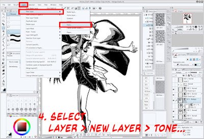
| 4. Select Layer > New Layer > Tone... |
Although I usually limit myself to diagonal lines, there are lots of fun options available. I can easily see where a heart background could be useful for an anime-style love comic, or the Diamond, Heart, Clubs or Spades could be useful for a poker-themed scene.
 |
| 7. Whatever was once gray, will now have the diagonal line tone. |
And that's it! You now have a professional tone that will stay consistent, even when you scale your image. And remember, you can combine different layers with tones to create different effects, like having both the gray and the line pattern appear.
 |
| You will need to click to enlarge this to see the line pattern on top of the gray pattern. |
 |
| Look at the upper rim of her hat to see where I added a second, contrasting tone to add some shading to the brim. |
More About HalftonesIf you would like to read more about halftones and tones, here are some links to books and articles.
|
NEXT TIME: Applying a Color Wash

No comments:
Post a Comment