 |
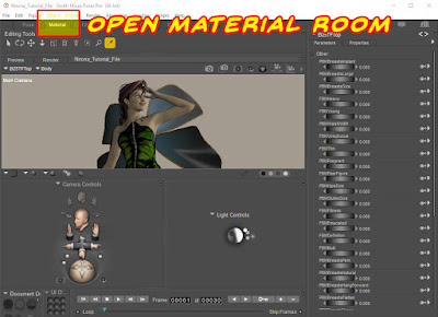
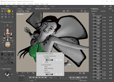
| For this example, I turned off the Comic Book Preview so you could see the base textures without any modification. |
Get started by opening the Materials Room, and then use the Material Select tool to start editing the materials and textures of each figure.
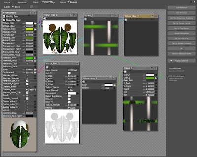 |
| Here we see the Rose Fairy V4 (available from Daz3D.com) textures and materials. |
One of the most difficult things that experienced Poser artists need to get used to is, that when creating comic book line art,
BUMP MAPS AND COMPLEX TEXTURES ARE NOT YOUR FRIENDS. In photo-realistic renders, bump maps and cool things like sub-surface scattering have the potential to add incredible life-like detail to your images. In line art, which is more about shape and shadow, those cool things you used to rely on will slow down the render process and create unpredictable results. |
Most of the people I know who have tried the Anomaly method and discarded it because they received poor results ignored this key element. They wanted to leave the textures alone and then complained that they were not getting good results. Once you master this approach, I think you can get good results with some bump and displacement maps in place, because they can add a lot of detail to your line art. But when you are starting out, I really think you'll get better results by deleting most (if not all) of the textures and replacing them with simple colors or leaving them white.
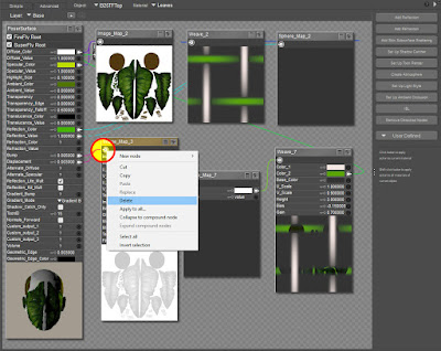 |
| Time to delete the Bump and Displacement Channels. At the VERY least, you should delete these, otherwise you'll get speckled and bumpy looking shadow edges. |
TIP: To delete the material, right-click on the little "Node Connector" icon in the upper-left of each material group. If the "Delete" option is grayed out (and this happens a lot), try clicking on the eye icon to toggle the size of the panel off/on real quick, or make a small change to one of the dials or any other setting. For some reason, sometimes Poser protects the nodes until you make a small change, then it lets you delete the texture.
|
Most of the time, I delete all the textures and replace them with white. I also adjust the Specular Value way down so I don't get large highlights. Admittedly, this is one of the areas I have the most trouble with, and it takes me a while to find just the right values for the character I'm working on.
I am now going to point out one of the COOLEST features to the Comic Book Preview. If you're familiar with the Cartoon Style wLines Display Style, you may be wondering what the heck is so cool about this. After all, we make simple line art with that setting. But, Poser 11 adds the ability to define each material group's Geometric Edge thickness and color.
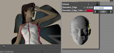 |
| Here, I've made the line very thick and changed it to red so you can see this cool option. |
Materials are set by group, so if you want to strip the color off of the Victoria Model, that can be very time consuming. Fortunately, some nice soul out there created a material preset that converts all of Victoria 4's materials to White, and turns the eyelashes transparent (trust me, this last bit is a blessing, because you don't want funky blocky eyelashes – they look weird in line art).
Link to All White Utility (and it works on M4, too!):
I will provide it when I find the source link. In the meantime, if you need it, email me and I will send it.
I will provide it when I find the source link. In the meantime, if you need it, email me and I will send it.
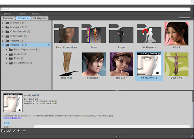 |
| This useful utility pose can save a lot of time by stripping out all image textures and bump maps, replacing them with simple white, which can then be edited for b&w. |
As you can see here, the results are simple, but clean.
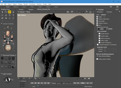 |
| Now that she's very simple, you can go in and adjust colors so they look great in b&w. Or you could then apply a simple skin tone that would work well for basic toon and comic book work. |
Now that I've got a white figure, it's time to add some custom textures. I edited the existing wing textures in Photoshop and created this:
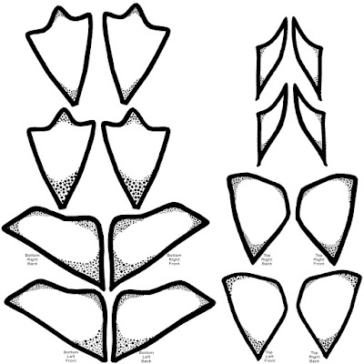 |
| Custom Texture for Enchanted Wings, © 2017 Mike Mitchell You may download and use this, but may not redistribute it or provide move it to your own computer to host the image. |
Notice that I created textures even for the wings I'm not using right now. I did this in case I change my mind later and want to show them.
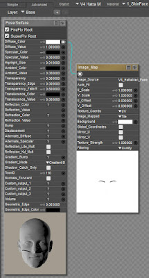
In addition to the wings, I always use a custom map for Victoria 4's face, with only the eyebrows drawn on. Since women often stylize their eyebrows, this simple map works quite well, especially in medium and long shots.
Her lips, as you'll see below, are simple black color. Again, this works well in the highly stylized, stark lighting approach I use in my noir comics.
The lips were set up by just editing the material group for her limps, and then changing the defuse color to black. Sometimes I increase the specular value (i.e. shine) on the lips when I do a close-up, or need more detail.
The usefulness for that sort of thing will become more apparent as we move into the lighting next time. For now, though, it's important to remember what I said earlier: Bump Maps are not your friends. Attempting to create art like this calls for simplification, so that the geometry is the star and the textures, like those wings, are there to provide support.
I'm not also going to contradict myself. When you look at the screenshot below, you'll see that I actually left most of the textures intact on her necklace. I broke my own rules here because my initial test showed that the details on the necklace were actually helping make it stand out more, rather than just fade into her skin.
I did the same thing for her dress and hair. Even though I will be creating b&w art, having these bits of color help me adjust these items while posing the scene. The color makes it easy for me to spot geometry intersections between the props and her body.
I know this section covered a lot, but this is where a big part of the power of the Comic Book Preview comes from. Its key advantages being:
- You can set the geometric edge width for each material group (selections/assignments made by Material ID)
- You can easily apply textures that will work in b&w. If you go back and look at Part 5, you can see where I applied the custom stockings pattern and the diamond pattern to her skirt.
- Since the geometry is the star, you can add simple colors to either carry over to the final image, or just as helpers.
NEXT TIME: Set-Up Lights
UPDATE 08-18-2017: I cannot get into it here and now, but we do need to talk about hair at some point. Dynamic hair and any sort of strand-based hair is not going to work well with this process. You should look for "toon" hair, or use older hair that is based on geometry shells, rather than hair that replies heavily on transmaps.
Very nice tutorial and many thanks... Enjoying this during my lunch hour at work...
ReplyDeleteYou're very welcome! I look forward to seeing any artwork you do based on this tutorial.
Delete