 |
| © 2016 Mike Mitchell Once I had the pose and general lighting set up, I pumped up the ridges on his forehead and around his eyes to get a more dramatic look. |
Getting geometric lines from Daz Studio and Carrara issn't all that difficult. There are scripted cameras (LineRender 9000 is a fantastic product for that, btw: top of its class and I highly recommend it if you intend to stick with Daz Studio) and a clever shaders that can be applied that allow you to render a fair approximation of geometric lines.
But you see, that's the key difference: those are RENDERED solutions. You have to render the final image to see what it is, and in Poser 11 you get to see it live. Every time you move the lights, even a little, you get to see how it's going to look.
Take a look at the detail from my Moon Wolf comic. It would have taken me hours of trial and error to find lighting that perfectly captured the tiny crescents I wanted to accentuate his ears and arm. This scene was about shape and shadow, and by controlling the lights "live" in Poser 11, I was able to get exactly the look I was after.
And, as I said before, this look comes from combining two more more renders in Manga Studio. So, in this section, I'm going to show you how I get the raw renders, after that, we'll go through the process of cleaning them up and combining them.
Hang tight, true believers, we're finally at the fun part!
Render Passes
If you've been following along, you have already:
- Stripped out unwanted bump maps and textures from your figures
- Deleted all but two lights
- Changed the light properties to your preferred choices (I usually like Infinite with a Preview Shadow Map Size of 4096)
- Pumped up your Preview Texture Resolution to at least 4096
- Set your figure poses and camera angles to what you want
You're now ready to create a series of renders.
It would be nice to say I usually only make two or three renders and then jump right into clean-up and composition. But that's not true. I usually make up to 10 renders in my quest to find the perfect one or two that will combine to create the image I have in mind.
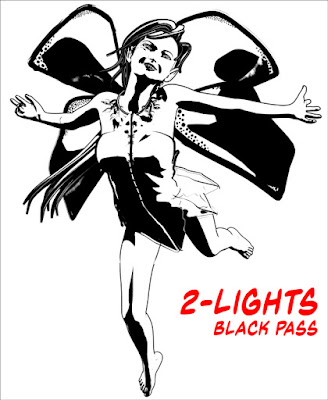
Since my finished art includes a solid black area and a secondary gray area, I usually start with the black render: It's usually got small, tightly defined areas of shadow, and I pay special attention to casting light on the jawline because it gives the figure shape.
 |
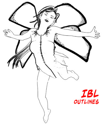
| Once I settle the pose, I almost always make a render using an IBL light because it generates clean outlines. |
 |
| A strong light from the upper left, just behind the head helps create a nice contrast under the neck, which gives the jaw definition. |
 |
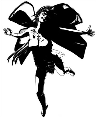
| As you'll see, the gray pass will lighten her torso and throw the side of her head into shadow. This will also expand the shadow on her leg (although I think it might need some hand cleanup). |
 |
| When I made this one, it was an afterthought. But the more I look at it, the more I think the detail on the front of the dress is interesting. |
This is a mental process, and one I'm getting better at the more I do it. I've got to picture the dark area and then imagine the next render sitting on top of it. The main thing is to provide a solid foundation and then build some detail on top of it.
NOTE: These thumbnails are only 33% of their actual size. Once I cropped away a lot of the whie space around the figure, I would up with an active image area of 1825 x 2250 pixels (about 6 x 7.5 inches at print resolution).
As I said, I do create other images before selecting the ones with which I want to work, and here's a few of my discards. There's nothing particularly wrong with these, but I just liked the lighting on the other renders better.
Next up, a quick "bath" through Photoshop will make things easier when it's time to apply the textures.
NEXT TIME: Cleaning Up Renders


No comments:
Post a Comment