Saturday, September 5, 2015

Just got some cool news!

I just got a cool recognition for my work. I had been working on a 3D image as a lighting test (there are new lighting techniques required for the new iray render engine for DazStudio) and -- at the last minute -- I decided to enter the monthly contest they sponsor in the user forums.

I did put a bit of work into the image, and I thought it had some cool features in it (nice composition and a bit of whimsy), but there were a few other really kick-ass submissions. Nevertheless, I got my work done just hours before the deadline and entered the final submission for August 2015.

Yesterday I got the cool news that I took the third-place prize!

Not bad for something that started off as a bit of a lark.

The prizes were donated by a merchant name Khory, and I was allowed to select a single item from his catalog. I decided to select this cool set of Leather Shaders for use with the iray renderer  (a shader is a generic set of color and textures that can be applied to existing models -- it's like having the exact same shoe in different colors and finishes).

Where's the picture?

You're probably wondering where the prize-winning illustration is. Alas, I cannot show it to you at this time. You see, after I finished it (but before it won), I sent it over to the editor/president of the Collectors' Club as a possible cover submission. He liked it, so we're going to keep it under wraps until it is actually published, either late this year or early next.

I'll post it then.

For the meantime, I just wanted to share the cool news.

Friday, August 21, 2015

Black Owl and Hooty WIP 2

Here's the second major iRay render I worked on in DazStudio 4.8. I let the computer run for about 42 hours, which let it reach about 25% completion. This included a new mesh light behind the camera to provide stronger illumination and better defined shadows for their necks and faces. It also provides a really nice shine on their boots and gloves, but you need to open the larger image to see them.

Click on this image for a larger view.
Note that the faces are a lot clearer.
I say a larger view because the click-through image is only 1,000 pixels wide. The actual render was a whopping 3,500 pixels wide. I'm working so large for two reasons:

  • I'm thinking of using this for print (either the aforementioned Powers Beyond RPG) or possibly for the Collectors' Club Newsletter (a cool group of comics fans: you can find out more about them here: www.collectorsclubnewsletter.com).
  • I find it easier to digitally ink larger images in Manga Studio (if I decide to do that -- I might not).
Obviously, this image is too dark (and the red zone is waaaaay too bright, but that's necessary for it to cast the proper red glow throughout the scene), so I will be doing some postwork on it. Also, it took waaaaay too long to render, so I will be revisiting the lighting options I used for this illustration, and work on tweaking them for future projects.

Sunday, August 16, 2015

Black Owl and Hooty WIP

I'm working on a new project (while wrapping up the ongoing projects with ULTRA, Gutshot, etc.)

Click to see larger image.
This time I'm creating some Golden Age superheroes for an upcoming Supers RPG called Powers Beyond.

I'll also be creating some other, futuristic heroes with more SF trappings. This time, however, the project is in COLOR!

This is a fun opportunity to spread my wings a bit and branch out of b&w.

Of course, it also means focusing on new techniques like color lighting, which is what I'm working on in this Work In Progress (WIP) image. For this project, I'll be using Daz Studio 4.8 and the new NVIDA iRay render engine.

As you can see from the image above, I need to master a few more technical issues regarding this new render engine. I'll be posting more images as they become available.

Tuesday, June 30, 2015

MS Word - Align Tabs

I don't usually post things like this, but this is useful and I want to make sure I can find it later.

https://cybertext.wordpress.com/2014/07/25/word-auto-aligning-headerfooter-info-in-portrait-and-landscape-pages/ 

This tip is for Word 2007 & 2010. It details how to insert a special tab character that moves with the page margin when inserting landscape pages into a portrait document. The tab is called an Align Tab and it is very useful.


Sunday, June 28, 2015

Ultra is Still Coming

It is amazing how time flies! I had no idea it had been this long since my last blog post. The main reason for that is my new work schedule which has greatly limited the amount of time I have to work on personal projects at night and on weekends.

I have, however, not been entirely idle during the past few months. Over the past few weeks I've been returning working on Ultra #1, and finally finished cleaning the artwork of the comic itself. I have most of the editorial pages finished, but still have a few ads and extra pages to flesh out before I can wrap this up and post it for sale.

I know better than to make a prediction or state a publication date, but I am confident it will be finished sometime this year. So, fret not, true believers! Ultra is coming! And as she says on the cover, "Better late than never!"


Monday, February 2, 2015

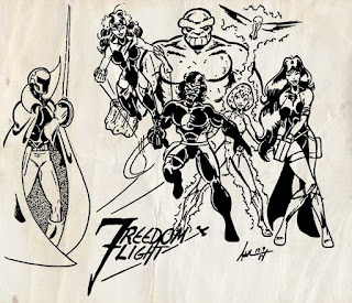
It is with great sorrow that I must announce the passing of Steve Addlesee


On Jan. 28, 2015 I received an email which was a terrible shock.

My name is Ellen Addlesee.  I am Steve's wife.  I am writing to let you know that Steve passed away on January 22, 2015 at his home.  He had multiple health issues, including kidney and heart problems.  I had gone through his email and saw where you had corresponded with him a few months ago.  So I wanted to let you know that Steve had died. Once again, I'm sorry to have had to email this terrible news. Ellen 
=========================

My thoughts and prayers are with you all in light of this tragic and shocking news. I had the distinct pleasure of making comics with Steve back in the 1980s when we were both young and unafraid. We collaborated on dozens of projects and I was always in awe of his talent and humanity. Our communication has been spotty over the past few decades, but I have always counted him as one of my friends, and was honored that he reciprocated those feelings. I will miss him -- it's as though a familiar guiding star in the vast night sky has suddenly dimmed and the firmament is diminished by its absence. I will miss you, my friend.

I will always remember the fun I had making comics with him. Even back then, his talent as a penciler and inker were head and shoulders above what everyone else was doing in fanzines at that time. I met him through our mutual involvement in the COLLECTORS' CLUB NEWSLETTER, where I was group president/editor. That quickly led to a friendship that lasted for a very long time. We collaborated on a dozen small comics projects and he was, by far, one of the best people I've known in terms of talent, skill and humanity.

One of the many creations to come out of Steve's
fertile imagination during the early 1980s.

Time isn't our friend, though, and we drifted apart during the early 1990s into our different versions of "the real world." When we reconnected back in the early 2000s, he was a different man. Angry at many things that had happened. But that didn't diminish his talent, and we conversed frequently for a year or two until we both drifted away again. I probably hadn't spoken to Steve for two or three years when I contacted him in Sept. 2014. I had been going through my files and found a large stack of unpublished artwork he had drawn for me for a superhero I had created. In 1983 & '84, Steve had graciously penciled and lettered the 20-page comic book story for me, and apparently I had even gotten the first 11 pages inked by a teen-aged friend of ours who is now a professional inker for companies like Bongo and Archie: Andrew Pepoy.

I contacted both Steve and Andrew about allowing me to blow the dust off this project from our wayward youths  and let it see the light of day. Both Steve and Andrew agreed, and they both agreed (both making me swear to remind everyone how young we were when this was created: I was about 19, Steve was 24 and Andrew was 16 or 17). When finished, the book will be available through Drive-Through Comics and Ka-Blam.

I was working on this book last night before I heard the terrible news about Steve's passing. His wife Ellen found my contact info and sent me the news. I'm really in a bit of shock. I knew he had some health issues (as do I -- as I said, time may be our constant companion, but it is not our friend), but I just thought he would be there to see this book come out and let him see all over again how much he meant to people and how much he was respected as someone who truly was touched by the hand of God and granted The Gift of being an honest-to-gosh real Artist (and yes, that's with a capital "A").

I miss him now, and I know I will miss him more as the days go by without him. My condolences go out to all of his friends here, and to his family (His wife, Ellen, will now receive the royalties from the book, FANZINE FLASHBACK: ULTRA #1). I've shared the news with people from the Collectors Club (it's still around and has a Facebook group where we talk about comics and art and all the geeky stuff that seems so important until something like this happens to remind us of what really matters). If you're on FB, search for us as the Collectors' Club Newsletter Group.

Tuesday, January 13, 2015

Ultra - Cleaning up my act (and the art)

Apparently, cleaning up 30-year old artwork is harder than I expected. It seems like the old pencil lines are just embedded in the art board. And when erased, old ink is prone to crack and flake off in tiny pieces, leaving small gaps in once-pristine black lines.

So, I'm using Photoshop to carefully clean and tidy up the artwork for Fanzine Flashback: Ultra #1. And it's going a lot slower than I expected.

Nevertheless, it is progressing. I'm more than 80% finished and the material that is finished looks great. I think it's really going to be everything I had hoped for when I started working to bring this comic book to life.

Those of you who have scanned old artwork before may be wondering what I'm talking about. Most people I know just use Photoshop and adjust the levels to get rid of yellowing artboard and drop out the pencil marks.

And most people sacrifice a LOT of detail when they do this.

I like the detail and want to keep it. I'd rather plod along at a slow pace and make sure I'm giving you the best version of the art I can. To this end, I am cleaning up lines, removing pencils marks, scooping out the bowls and holes in the lettering, and applying a lot of touch-up to make sure the solid blacks are, in fact, solid. I don't want brush lines or streaks when this is printed.

In other words, I'm printing this comic the way I would have back then, not preserving it for posterity. This is not an "Artist's Edition" that will show all the warts and blemishes.

Step One: Scooping out the Gunk
Fanzine Flashback: Ultra #1, Page 7,
in progress of being cleaned.
The first step in this process is to "scoop out the gunk" on the pages. That is, clear out the large areas of white space in the page layout, including the gaps between panels. I do this because the process of using the Levels adjustment in Photoshop darkens the blacks and makes the light areas turn pure white. In this process, little blemishes in the paper (I wonder if they have increased with age due to acid in the paper?) turn gray or black, leaving lots of little spots all over the page.

I could wait until after the levels tool is applied to do the scooping, but I actually found out that it's a little faster to do it beforehand.

As an aid to track what has and has not been scooped, I change the background color to a light pastel. This increased contrast really speeds up my work. In the example I'm providing here, I've just started cleaning out the bottom. I will complete separating all the panels (and sharpening their edges), as well as cleaning out some of the edges of the inked lines.

Step Two: Digitally Erasing Pencil Lines
After this, I will actually go in and clean out more detailed areas and remove heavy pencil lines. In general, Steve Addlesee did complete pencils with heavy lines for the inker to follow. However, there are also a lot of lighter lines where he started to place a shoulder or collar and then changed his mind. Andrew Pepoy followed them closely, but sometimes he added additional touches and interpretations to put his own stamp on the book.

Close up of panel 1, with problem areas indicated.
NOTE: This is a big scan, so click on the image to see it in detail.

That included using zip-a-tone on characters to indicate they are Black. Shading film like this is tricky to adjust; it's easy to let it clog up and hide details of the inking underneath. There are times I have had to go in and scoop out gunk between individual dots. Tedious? You bet. But sometimes it's worth it, particularly around the eyes and mouth.

Here's a sample of what the page looks like after adjusting the Levels and duplicating the layer with the blending mode set to Multiply (if that sounds like gibberish to you, I apologize, but it's the sort of detail that Photoshop users will appreciate). This gives me two identical copies of the layer, one on top of the other, so that thin lines become darker.

Panel 1 after Levels & duplicating the layer and setting the top copy's
blending mode to Multiply. Again, click on this to see it in detail.
Red zones show places that need more work.
By the way, as you'll notice, this process really messes up the lettering. That's why I remove the lettering and process it differently on a separate layer. This method is slow, but it gives me solid results that I'm pleased with.

I also have to retrace the word balloons because, as you'll notice in the first example, Steve used a felt pen for those lines, and the ink actually turned purple over time. Using the Levels tool just turns these lines into a spotty mess (and the Threshold Adjustment isn't any better -- it just makes spotty lines everything).

The process is slow and steady, but as I said, I'm mostly pleased with the results and think it will be worth all the effort when it finally sees print at the end of this year.

I'll post more updates soon!