Showing posts with label making comics. Show all posts

Wednesday, June 30, 2021

Using Poser to Make Comics: Create Custom Library Collections, pt 3

When I finished last week's tutorial, I didn't think there was a Part 3 to this series. But, as I thought about some of my other organizational techniques/practices, I realized that there is one other way I approach the Poser Library that might help give you guys some ideas.

In addition to creating lists of Favorites, you can also create a custom Runtime Library with assets that will be used in your project. In other words, a Project-Specific Library. This could include customized figures (Michael 4 and Victoria 4 are my favorites), poses, buildings, landscapes, and vehicles. 

In addition to making it easy to find the items you're looking for, it also offers you the opportunity to easily make back-ups of all the assets that go into that project. For example, here's a screenshot of my current Runtime structure.

Project-specific libraries are highlighted.
Click image for a larger view.

When I create a Library for a single project, I duplicate a lot of things that are in other Runtimes. For example, the Gutshot Library (shown in the image above) is a collection of my Western assets. This definitely includes duplication with my Architecture Library, and with some stuff in My Library (which is the Daz Studio Library). I tend not to worry about duplicates in this situation because I follow one basic rule: If I start off by using an asset from a project-specific folder, I keep on doing it. In other words, I don't get the Hat out of the Gutshot folder and then get the matching bandana from the Poser 11 folder. That sort of crisscrossing can cause problems in the long run.

At any rate, like the Favorites, I only tend to use this approach when it's a Larger project with a lot of potential for confusion later down the road. With a big visual narrative project, keeping stuff where you can find it is a powerful tool/practice that can really pay off in the end.

Creating Custom Libraries

I'm not going to go through the whole step-by-step process on this process because there are already LOTS of great tutorials on this subject. Here's one that combines text and a great video:  

https://www.posersoftware.com/article/476/how-to-manage-your-poser-library


Wednesday, June 23, 2021

Using Poser to Make Comics: Create Custom Library Collections, pt 2

 Continuing our discussion from last time, we're going to dive into the nitty gritty of exactly how you customize the "Favorites" tab in the Poser Library, and we'll look at the ways I categorize my assets for a comic book story.


How to Save a Favorite Item to the Poser Library


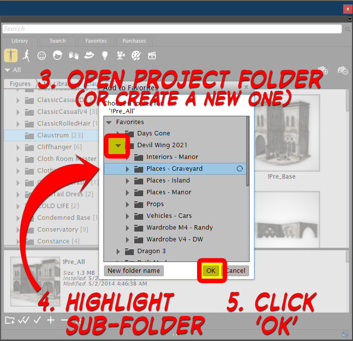
  1. Browse through your Library until you find an item you like (note, it must be a single item, you cannot add a folder).
  2. Click on the "Favorite" icon (it's a star) at the bottom of the Library window.
  3. Open / Expand the Project Folder
  4. (If the folder doesn't exist, create it by clicking on the "New Folder Name" button).
  5. Highlight the sub-folder where you wish to place the item
  6. (NOTE: This is VERY important and easy to forget, so be careful).
  7. Click "OK" button.
  8. The item is now available in the "Favorites" tab in your Library.


One thing of note is that this actually creates a duplicate of the object – not a shortcut. So, if you are short on hard drive space, you might want to be judicious with your Favorites lists.


PRO TIP: If you ever need to reorganize your Favorites, you can right-click on an object and select the "Show in Explorer" option. Once there,  you can move files around. 

This is just one of the methods I've learned to use after significant trial and error, and I know it seems like a lot of work. Really, I get it. There are times when it feels like I'm spending more time "shopping" through my Runtime than I do making art. But, this process delivers numerous benefits, including:

  • Helping me see what I've already got, rather than rushing off to Renderosity or Daz to go buy something that I already have (like sunglasses... Randy needs a pair and I almost bought some, but looking carefully through my stuff, I found I already had a pair that were perfect for him).
  • When I post the image to Daz or Renderosity, this makes it a lot easier to track back to the item so I can list it in the promotional credits.
  • Also helps remind me that, when I do find a great asset, I should go write a review.

I know that a lot of you don't use Poser, so this article may be of limited value to you, but hopefully it will get you thinking about the logistics of creating a big, Visual Narrative projects. So, for you Daz users, the takeaway I want to leave you with is simply this: Using ANY sort of asset organization on a big project will be helpful in the long run.

Wednesday, June 16, 2021

Using Poser to Make Comics: Create Custom Library Collections, pt 1


Getting Started with a Visual Narrative Project


Using Poser to create a comic (or any project that requires a lot of images/renders) consumes a LOT of assets. There are figures, costumes, equipment, vehicles, weapons and numerous other items that will be needed. Like most of you (I imagine), I have MANY thousands of items at my disposal. Purchases, freebies, and who knows what are lurking in my Runtime and it's up to me to find out what's there so i can bring the story out of my head and out into the world.


One of the approaches I use is to think of it as a movie, mentally visualizing the places and people in my story, and then doing a deep search through my Poser Runtime to find the various bits and pieces I might need or want. And this includes selecting different options, especially for clothing. If I were working on a movie, these tasks would be handled by different professionals:

  • For example, some standard movie roles include:
  • Set Designer / Set Construction (interiors)
  • Location Supervisor (exteriors)
  • Wardrobe (clothes, sunglasses, wristwatch)
  • Prop Master (guns, crucifixes, wooden stakes, possibly cars)
  • Hair & Makeup specialists
I'm not even including all the lighting and other stuff, such as "casting" because we kind of create our characters, rather than find them (at least partly – I frequently do look for pre-existing characters in my library and use them if they look right for the part; this is especially true for minor/background characters).

So, back to the tip I'm trying to summarize.

Poser has a great feature in the Library called FAVORITES, which is a fantastic way to organize assets. For a new project, I will open the Library and, on the Favorites tab, I will create a Project Folder (in this case, "Devil Wing 2021"). Then, I will go through my Runtime and look for the various items I will need and save the various items to separate, organized folders. As you can see in the attached screenshots, the folder names are pretty specific to what's in them.

In this case, that includes places/locations (the two big scenes take place in a mansion and in a graveyard, but I will also need some other assets, like a cityscape (she flies over it on her way to the graveyard) and a Greek island (flashback) and I'll also need trees and shrubs to flesh out those locations), interior (mansion interior includes long hallway, library, occult "study" room, & some other room yet to be determined). I'm not sure I'll need a vehicle this time, but I might in the future, so I tagged a few that I like. And, of course, I need to dress the characters (wardrobe) – for them, I will have different folders for each character, and possibly for different scenes (for instance, fancy dress versus casual).

SIDE NOTE: If the project goes beyond this initial two-issue short story, I would create a more detailed "Call List / Catalog" in Excel or Word (or the Google Docs equivalents) to better organize things and make it easier for me to sort out the various references and image credits.

NEXT TIME: Step-by-step instructions on how to create custom collections in your Poser Library.

Sunday, August 9, 2020

The bias against 3D Comics

Over at the Daz3D site, we were discussing comics in general and 3D comics in particular. Here's a highlight from a conversation that I thought might be of interest to others.

 I've spoken to a lot of traditional comics artists (professional, semi-pro and amateur) and have been writing comics for fanzines since I was a teenager. Back then, as a lousy artist, I had no choice put to work with other people who could draw but couldn't write as well as I could. I also found out that I was better at doing breakdowns/page design and panel flow than a lot of the artists I worked with. Just because you're good at drawing the figure does NOT mean you're automatically good at pacing the story and knowing what to show and where to add emphasis. I also knew a lot of artists who didn't know when to break for the end of the page. By that, I mean they didn't realize that you could build dramatic tension by making the reader wait to flip the page. The typical use of this is the last panel showing the hero turn and gasp, "You?" and then flip the page to see the villain holding the damsel in distress with a gun at her head. Or in the Captain America page below, note how the action is all building up:

  1. Cap is desperately outnumbered
  2. Teeth gritted, Rick is reaching for the gun, expressing self-doubt in his mind...
  3. Even as Cap runs, we seen some cues that remind us we're in a graveyard
  4. We see the horde in silhouette, the cycle is clearly visible (and that's why Cap is bent low, btw, because if he were standing up he would cut off the cycle and his height cutting through the plane of the cycle and possible the back horizon would make everybody seem closer than they are). And note how this page ends with us waiting to see what happens next. We have to wait to flip the page to see what happens when Rick pulls the trigger.

© 2020 Marvel Comics Group


But back to making my own comics... So I started doing my scripts as page breakdowns and worked with artists who liked it that way and would build on what I sketched out (Steve Addlesee was great at this, as he would change camera angles and move figures around a bit – he said it made his work better because when he started bringing his vision to it, the work was already more than halfway to where it was going to end up). Steve and I were great collaborators. (BTW, I found out recently that when Jim Shooter was a teenager writing the Legion of Superheroes for DC, he would sketch out the scripts as full breakdowns for the artists; his editor would then rip them to pieces and Jim would have to fix things based on what the Editor wanted). I'm not sure how many comics I did breakdowns for, but it was probably in the range of 250-300 pages, many of which were finished by artists and published in fanzines.

Let's get back to 3D and the discussion at hand.

Now with 3D art, I can cut out the middleman and try to do it all myself: take the images in my mind (and in my thumbnails) and bring them to life. 3D also lets me experiment with subtle changes to the pose and expression and camera angles and sometimes I have a "happy accident" and discover something even better than what I originally imagined.

But, this brings us to the unfortunate fact that most "traditional artists" think that 3D comics are crap. And I have to say that, for the most part, they are right. Not just right, but "100% right." But the traditionalists are almost completely wrong as to WHY. 

3D is not the culprit as to why the finished products seem dull and lifeless. The problem is that most 3D comics are not good comics.

It has nothing to do with the use of 3D tools, it's just that too many 3D artists don't actually read comics on a regular basis, or if they do, they're not reading them to learn anything. @Diva, you kept saying in that example above that it was an EXTREME example. You're partly right, but I also must counter and say, "No, it's not really extreme. It's a standard action page by Jack Kirby." Kirby, of course, is one of the masters of the medium who instrumental in inventing most of the modern tropes of comics as know them today. Do you want to frame a page of dialogue the way it was set up in that page? I hope not! But as far as action goes? Yeah, this is a great page. (If you want to see great dialogue pages, go look up Strangers in Paradise by Terry Moore, Bone by Jeff Smith or look at Tomb of Dracula by Marv Wolfman and Gene Colon.)

Anyway, back to my point. Most of the 3D comics I've seen are not well done in terms of storytelling. The artists don't have a grasp of the basics as to when to include an establishing shot, when to allow a scene to play out slowly over a few panels, when to use close-ups and how to frame a scene with dialogue. In short, even if the artists are good at setting up their scenes and getting good lighting (not a lot are, btw, I see LOTS of 3D scenes that are not properly lit to show faces or reactions, or that don't know when to use a silhouette to simplify the composition, like Kirby did in that last panel of the page above). I've seen too many 3D comics that don't tell stories well. The next time you look at a page done in 3D, look at it and ask yourself, if a pro artist of the top caliber were to redraw that page, would it still be a good comics page? Unfortunately, the answer is almost always "no."

So, the solution to getting past the bias of the traditional artists? MAKE GREAT COMICS WITH 3D!

Write a good strip, block out your scenes, arrange your panels well, have good lettering, and above all else, do something in 3D that you cannot do better with hand-drawn comics.

As for something more concrete? Okay, here are some tips for 3D comics creators:

  • Thumbnail your pages before you start setting up your scenes. No movie director would ever start a shoot without storyboards, and almost every professional comics artist does thumbnails or breakdowns, so why wouldn't you?
  • Don't be afraid to tilt the camera (straight on shots are dull – we all know that, so why do I see so many of them?).
  • Change the focal length on your camera (I cannot tell you how SHOCKED I am that most 3D artists tell me that they almost never change the focal length to get different results for different shots). Photographers may use 35mm lenses as the standard, but professional portrait photographers use lenses between 50mm - 100mm. 
  • Don't be afraid of shadows (let figures be in silhouette sometimes).
  • Light the heroes faces enough so that we can see reactions.
  • Think about Character Design like a pro: Even in silhouette or at a great distance, you can easily tell Batman and Superman apart. If you have a group of soldiers, then use some bit of color or something on their uniforms to help us tell them apart. No, you don't have to be as vivid as the Power Rangers, but those crazy costumes make it VERY clear who's who.
  • Don't be afraid to edit. Sometimes you can put a lot of work into a panel or page and it just doesn't work. Don't be lazy and keep it – toss it out and start over.
  • On the other hand, don't cripple your output with perfectionist tendencies like I do! Sometimes you've gotta just cut your losses and move on to the next page or the next illustration.
  • Above all else, read comic books done by great creators!
  • Anyway, I hope this gives you guys something to think about. And I hope I didn't come off as a preachy jerk.

Thursday, July 2, 2020

Why do I love comics?

The other day, someone on Facebook asked this question:

What is your philosophy? Why do you do comics? Whats your biggest motivator, and why do you choose the genre you do?


This is my reply:

I do not have a philosophy, but I love the medium because it is the perfect fusion of word and image. You can show things faster than you can describe them in a novel. Likewise, you can go deeper into thoughts than you can with film. A perfect comic book story cannot be told only with pictures or only with words: It takes both.

As for genre? I don't work in only one genre – that would be too limiting. I have too many stories to tell to be limited to just one.

I certainly could have gone on longer, but I didn't feel the need. I think I summed it up fairly well.

Wednesday, February 26, 2020

Making Comics: Nebula Background

My online buddy and fellow space enthusiast, tkrobert, asked how I created the nebula background in my recent space illustration (see Wednesday's post), so I thought I'd share that answer with you guys.

It's a remarkably easy process. The ship is, of course, on its own layer(s). So, to create the background:

  1. Set background layer to solid black.
  2. Go to nasa.gov and search their gallery for "nebula." (Their space images are generally free for personal and commercial use - just don't use the NASA logo or photos of people.)
  3. Once you have an image you like (look for things with nice, abstract patterns and high-contrast areas), paste it into your image editing software on a layer between the black background and the ship.
  4. Photoshop/GIMP, etc.: Play around with the following filters: Poster Edges, Stamp, Find Edges. Mix-and-match effects until you get something nice and abstract. You might also want to play around with Levels or Contrast. Then I convert the layer to b&w. Personally, I like the strong posterized look (sharp deleniations between the colors, but you can easily go for a softer, more gentle look).
  5. Adjust the nebula layer's opacity (usually 30% - 50% works well.
  6. Just move the nebula around until it works with the composition. 

A side note on composition: In the case of a ship being dead center of the frame, I tend to put the brighter parts behind it, near the exhaust areas. Also, because I planned to use those white motion lines in front of the ship, I left that part of the background completely black (note that there aren't even any stars). I did this to simplify things, because those speed lines quickly clutter things up.

I spent significantly more time playing around with the white lines than I did creating the background (in this case, I used some version of "find edges" filter in Clip Studio Paint (not Photoshop) because I wanted to do all the work in CSP.

I learned/self-taught myself this technique when I was working on the illustrations I created for the Galaxy Prime Role Playing Game.

Sunday, January 26, 2020

Clip Studio Paint Tip: Frame Borders

So, I finally bit the bullet and moved on from Manga Studio 5ED to Clip Studio Paint Pro. The upgrade has not been without issues, but I need to master the latest version of the software, rather than clinging to the old version (especially since, as a registered owner of Manga Studio I was eligible for a free upgrade).

Needless to say, I'm having to hunt down tutorials on how to do things that are either new or that I haven't done in a long time. Here's an important video tip on working with panel borders:


How to divide panels equally can be found around 5:50.

Friday, January 3, 2020

Days Gone 22 - Cabin in the Woods (Blue)

One of the great things about being busy is that I've got a lot of great artwork to show for my past year. One of the not-so-great things is that I frequently neglect to post project updates.

So, yes, I've done a lot of work on Days Gone over the past year. Okay, not a lot, but some. And it's been pretty good. One thing that became apparent was that I needed to include more scenes with the dragon being wicked, so I started to create a scene showing the dragon attacking a village (or at least a farmhouse). And this is what I came up with – regarding the farmhouse in the woods, that is. As you can clearly see, the dragon is nowhere in sight.

At least not yet.

You see, as i created this scene, I kind liked how simple it was. No dragons, zombies or goblins. Just a cabin in the woods as a simple landscape. So, over the past two days, that's exactly what I created: this simple landscape in my signature blues and browns.

Fear not, fantasy fans, as I shall work on adding the dragon any day now.

© 2020 Mike Mitchell

Next Time: Another (long-overdue) update

Friday, May 31, 2019

Days Gone 22 - Fitting Room to the Rescue (mostly)

Poser has a great feature called the Fitting Room. This is a place where you can do a sort-of cloth simulation in order to make adjustments to clothing props and make them fit the current morphs/pose of the selected figure.

I say it's sort of like the Cloth Room because it really doesn't seem to do full-cloth simulations (like where you can drape cloth from a pole or hang it on someone like a shroud. The Fitting Room is designed to be more limited in scope and just make clothing fit better on problematic or extreme poses.

So, as you saw last time, I was having more trouble with the straps of the chest harness the character wears:

Detail from Days Gone, page 5
© 2019 Mike Mitchell
Both the size and location were not consistent, plus the ring on the side should be under his arm, not forward, almost in line with his nipple. I messed around with this several times in Poser and just couldn't get what I wanted while the straps were conformed to his body. That's when I decided to give the Fitting Room a shot.

Now, I have used the Cloth Room in the past and had watched two quick videos about the Fitting Room, so it wasn't completely alien when I got there. I knew that I would need to define the soft object (the chest harness) and the target (M4 model) and then run a simulation.

Something I did not know was that this works best when all targets load at the 0,0,0 coordinates. When I was in the room I didn't see either top or M4. The viewports were empty. However, the Fitting Room Dialog box showed that the two meshes were available, so I ran the simulation anyway.

And guess what? It worked.

The top was reshaped to Mike's body. Of course, now I had to move the top across the cave and manually place it on his body, but it fit and looked pretty good. However, when it came time to render, I decided that i wanted more control, so I rendered his body and the strap in separate images and then combined them in Clip Studio Paint. I even used the Mesh Transform tool to reshape it just a little so I could get that ring away from his chest and just a little more under his armpit area.

Here are the results of my hard work (this time showing the entire four-panel sequence that spans both page 4 and 5):

Days Gone, pages 4 & 5
© 2019 Mike Mitchell

Needless to say, I'm much happier with the results. The detail on the stomach is more interesting and I think I did a better job on his hair this time around.

Next up: Selling Emotion Through Body Language

Friday, May 24, 2019

Days Gone 21 - Current Project Update

The good news is that I have not been sitting on my butt since my last blog post about this project (wow – 9 months or so?). I've been working on pages, figured out a new system for doing the hero's hair, and have been making progress. I also took some breaks to work on other things, such as Princess of the Trees 2 and a book cover for The Epic Anthology of Galaxy Prime. I will write (and share pics) about both in the future.

I'll play catch-up later and reveal some shots of the comic in progress so far. Here's a look at what I'm working on right now (and how I fixed the problem).

In order to "rough up" the hero a little and give us some visual cues that he had been in a rough fight with the dragon, I decided to add some cuts to the character. A few on his arm and one on his face. Now, the cuts on his arm are pretty easy to place – and if they move a little bit between panels I'm okay with that, as it enhances the hand-drawn look I'm going for.

But the cut on the left side of his face... That's turned out to be problematic.

I'll see if I can find a shot of the original attempt, but the short of it is that I couldn't draw it consistently from panel to panel, especially when his face was moving around. After a few failed attempts (and some discussion with other artists during a DigitalArtLive.com workshop, I decided that I just needed to go back and edit the texture map for the face.

Now, as you may recall (that is if I wrote about it, I can't remember), I have stripped almost all of the texture maps off of my main characters. This gives me crisper shadows and gets rid of the speckling that can be caused by bump and displacement maps.

Here's an example of a figure that still has those maps, and you can clearly see the small dotted effects on his face. Now, there's nothing wrong with this effect at all. in fact, I might keep it for The Princess of the Trees 2 book. But for this one it is an effect I don't want.

Arton Character Design (not used)
© 2019 Mike Mitchell
I do keep textures on some of the props and scenery, but for the main figures in this story I only have textures applied to:

  • Hair
  • Face (for eyebrows that I hand drew)
  • Eyes
  • Eyelashes (texture makes them 100% transparent)

So, in regards to the cut on his face I went back to the face map and drew the cut on in Photoshop. It took a few tries to get it placed correctly, but I am ultimately satisfied with the results.

Here's a look at the face map. When in use it is 100% white with only a few black items drawn on it; in this image I'm letting some of the UV guides show through so you can get an idea of where everything is placed.

M4 Face Texture Map
(click to blow it up so you can see the eyebrow details)

So, now that you've seen the underlying mesh and my Photoshop edits, here's how the map looks when applied to the figure across two panels of the comic.

Days Gone, page 5, panels 1 & 2
© 2019 Mike Mitchell
As you can see, him turning his head doesn't affect the placement of the cut on his face. This serves as a perfect guide for any edits I need to make to it during the touch-up phase (in the second panel I shortened it just a little because it looked too close to his mouth).

In the future, I will definitely be relying more on edited texture maps and less on hand-drawn post work to resolve these issues. Which will give me more time to focus on things like why, in the second panel, are the straps so much smaller looking and why has the bottom strap ridden up so much?

Next Time: A long overdue update


Friday, October 12, 2018

Days Gone 20: Poser Tip – Cloth Room Settings

I'm doing some experimentation with a dynamic version of the hero's chest harness, and in doing so I came across these useful settings for the Poser Cloth Room:


I found this online at a discussion group. You can find it here:
https://community.hivewire3d.com/threads/pulling-back-the-drapes-the-cloth-room.368/page-2

My first attempt at using a dynamic harness.
Not bad, but it looks too thin to be leather.
Definitely needs some more work.

For those of you unfamiliar with this feature, Poser has the ability to simulate dynamic cloth. That is, it creates an animation wherein the cloth folds and flows across the body in an attempt to create realistic folds and flow with the body. It's a neat feature (and there is now a plug-in for Daz Studio that does the same thing), but it's very tricky to get it looking just right.

EDIT (05-20-2019): The Dynamic Harness was a dead-end. It just didn't lead anywhere useful. For the remainder of the project I will be using Prae's Epoch Top available from Renderosity.

NEXT TIME: Current update

Friday, October 5, 2018

Days Gone 19 - Panel Set-up, part 3 (Fitting the Frame)

Now that I've got my first render complete, it's time to see how it fits into the panel shape I have already defined in Manga Studio (Clip Studio Paint). As you can see, the slight oversize render makes it fit darned near perfectly in the frame.

Render pasted into the frame in Manga Studio 5 EX
(aka Clip Studio Paint Pro).

I'm more or less happy with the size and shape, but his neck looks a little weird at this angle and I think I need to make him either bigger or smaller. Or, I might start small and then progressively make him bigger in each of the four panels.

I'm going to have to play around with this a bit more to decide what I want it to do in terms of composition and emotional progression.

Next Up: More about panels

Wednesday, October 3, 2018

Days Gone 18 - Fight or Flight

I'm getting deeper into the page, particularly these four panels, and here I hit a problem that is one I frequently encounter with 3D-based artwork: one of the wardrobe pieces doesn't fit the way I want it to fit. In this case, it's the Epoch top (the leather chest harness he is wearing), and in this panel you can clearly see down at the bottom that the strap is folding over.

Red background and blue frame added in
Photoshop to make it easier to see the
render's dimensions.

Now, I don't care if this might be technically accurate in the way that leather straps hang (I don't think it is, but they do flow and fold based on the way your body is moving – and no, I will not tell you how I know that). In this case, it just looks weird.

As I've said, this is a comic book not a movie. I am not striving toward 100% realism. So, I'm faced with a problem that I call Fight or Flight.

Do I spend time in Poser fighting with it (I've already spent about half an hour with the built-in morphs and controls to get it as good as it looks now) with a magnet/deformer? I could easily set one up and try to twist it (I could also try some of the simpler adjustment tools).  Or do I just give up (flight) and fix it in Photoshop afterwards?

Now, if this were his hair or some part of his britches or armor, I probably would spend the time to fix it in Poser. But, honestly? This is a simple strap across his belly/lower chest. I can do a quick edit and resolve the problem.

A few quick lines are all it takes to fix this problem.
That makes it not worth the effort to fix the geometry in Poser.
(Potential edit shown in blue line)

So, rather than get hung up on something that could take me a full day to fix, it's time to move on and worry about lights and his position in the frame. 

Next Time: Panel Set-up, part 3 (Making it fit the frame)

Sunday, September 30, 2018

Days Gone 17 - Panel Set-up, part 2 (Poser Render Settings)

As shown in the last post, I need to match my render size to the printed size. Since I'm working at 800 dpi, this means even slim panels have a lot of pixels. If you're familiar with my Noir Style Tutorial you will remember that having a lot of pixels is a very good thing because it gives Poser and Manga Studio (Clip Studio Paint) the pixels they need to show the detail that I want to work with.

So, in Manga Studio I used some rulers to measure the panels. Across two pages, I have four panels with the identical size. In this case, the dimensions are very close to:
  • Horizontal: 2.65 in (2110 pixels)
  • Vertical: 5.27 in (4220 pixels)
Overview
So I'm going to:
  1. Open the Poser file for pages 2-3.
  2. Use the hierarchy editor to hide all the items I don't want (in this case, everything but the hero).
  3. Set up a new camera (focused on the hero).
  4. Set the render dimensions to roughly match the numbers above.
When I say "roughly," I mean that I'm going to make the panel a little bigger so I have some extra "bleed" room to move the figure around a little bit. I also might bring back the ceiling of the cave, if I feel it adds to the image more than an abstract sketched background.


Click to expand image.
Open the Hierarchy Editor under the Window Menu (gold highlight).
Click on the eyeball icon for each item to make it invisible.
In the screenshot above, I'm about halfway finished hiding the items I don't want for the next panel. This makes the scene load faster and there is less strain on the memory, so everything responds faster. Also, since the item is hidden, I can't accidentally click on it. 

Keep in mind you will need to click on each piece and part. In this picture, you can see that I've successfully hidden the dragon but the cool back ridge scales are still visible. As I finished this, I have decided to keep only the hero, the rock he is sitting on, the ceiling visible. And as I get into working this scene, I may move those items around or hide them again. I won't know until I get deeper into it.


Camera Lock
The first step I'm going to describe is optional: you may not need to do this.

With the Hierarchy Editor open, and the "Cameras" checkbox ticked, I select the Main Camera, then I go to Objects > Lock and turn off the checkmark next to the word Lock. 

I always lock my main camera, so if you didn't do that in a previous step,
you can skip these instructions/advice.

In the past, I have lost work because I accidentally moved my camera between renders. Since this process is built around layering images, it is essential that the camera not move between renders. These days, once I have my camera where I want it, I always lock it. This simple step has saved me a lot of time and heartache.

Camera Settings
Now that I can manipulate the camera, I rotate it and frame my figure from an almost completely straight-on angle. Once I have the hero more or less framed in the window, it's time to set the render dimensions. The can be accessed under Render > Render Dimensions (or by pressing SHFT+CTRL+Y). That will open this window:

Enter the new dimensions. Make sure the "Render to Exact Resolution" option is selected.
Make sure the "Constrain aspect ratio" is NOT selected.

Note the settings above, including the two items that need to be checked/unchecked. After completing this, your active window dimensions will change shape. As always with Poser, the area behind the gray bands to the sides will not render. They are there so you can see what's out of camera, and they help you determine where unexpected shadows might be coming from.

I highlighted the active camera area in the image below.

With the render dimensions set, I now have
a tall, narrow camera view that is the same shape and size
as my final panel dimensions.

This is a tall, narrow space, and since I really to focus on his face (and possibly upper arm – I'm toying with the idea of adding some hand motions to the next four panels as a means of enhancing his emotions – we'll see how it goes). Even before I get into the finer details of posing him, I'm pretty sure his leg is too high from this angle, and it covers up too much of his chest and prevents me from using a lower camera angle. After I get the camera distance set (how close I am to the figure, and which focal length I plan to use for the camera) I will probably need to adjust both his arm and knee on his right side.

A few small adjustments to the camera position helped, but not enough. I also adjusted the focal length to 90mm. This is a variation of a standard portrait setting (typically, portraits are shot at 70mm or 100mm) that is designed to help flatten the nose a little and not widen the face (if you'd like to see a great example of how the lens settings can change the shape of a human head, check this out).


This is almost right, but his forearm and bracer are huge. There are also
problems with the line thicknesses. This means I have different values
for different body parts in the Materials Room.


Time for more adjustments. The forearm and bracer are HUGE, and those thick outlines (which helped in the long shot of the previous page) look outrageous here. So, I went to the Materials Room and set his shoulders and the bracer to a smaller value (Geometric_Edge = 0.003). Then I scaled down the bracer by 3% and tweaked a few other scale settings.

Click to see the scale adjustments I made for the bracer.
Also note the thinner outlines on his shoulders.

This is looking better. The arm isn't so exaggerated, the lines are tighter against his body. I do see the need to tweak his chest harness to his side, and possibly the angle of his neck. But all in all, this is getting close enough for me to do a test render and see if it fits in the comic panel the way I want it to.

Next Time: Mock-ups and using the Sketch Render as a proofing tool

Friday, September 28, 2018

Days Gone 16 - Panel Set-up, part 1 (using the Ruler Tool)

Recap: The script is written, I've sketched out the thumbnails and set up the "roughs" of the pages in Manga Studio 5 EX (also known as Clip Studio Paint – they are basically the same software). The roughs have the panels shaped and sized the way I want them and the lettering is roughly where I think it will go based on the thumbnails.

So, now it's time to go back to Poser and render the images that will serve as the basis of my artwork.

Now, the two previous "panels" I worked on were full-page illustrations (page 1 is a single page showing the mountain, pages 2-3 is a two-page spread showing the opening scene inside the cave). This made it very easy to work on them because I didn't have to worry much about frame borders or anything like that. And, because they were the first pages, whatever I did would look fine because it's the first thing you're going to see.

But, moving forward I have to worry about keeping my inking line thicknesses consistent. I can't have a character with really thick outlines on panel one and then thin outlines in panel two, then back to thick for panel three. It needs to be roughly consistent between panel to panel to panel (and throughout the story, really).

Even though they are called "roughs," these pages are 100%
size and resolution with all the frames drawn out and where I want
them. Text, balloons and that background shading is for placement
purposes and will be tweaked prior to publication.


Measuring the Panels
This brings me back to why I created the page "roughs" in Manga Studio (aka Clip Studio Paint). I need to know the approximate panel size so I can set up a matching camera in Poser Pro 11. But there's sort of a problem... I did this so long ago I don't recall what the panel sizes are, and if there's a way to click on a panel and see its dimensions, I haven't yet figured out how to do it. I could just print it out and use a physical ruler, but I'm a little concerned that the printer might shrink or grow the page a little to fit on the paper (even though I told it not to – and in the end, it turns out it did print correctly, but I didn't know that until I made the in-software measurements to confirm it).

So, I needed to use the Ruler Tool in Manga Studio.

Here are the steps I used to measure the panel and get the measurements I need to set up the render window and cameras in Poser:

I edited the rulers and provided the emphasis
to make this easier to read online.
Using the Ruler tool:

  1. Select the Ruler icon from the tools, then select the type of ruler you want (I chose the Linear ruler).
  2. Select the page, then select the frame (or whatever) you want to measure.
  3. Create a new layer (not shown in screenshot)
  4. Click and drag the ruler from where you want to start and stop. Release the button.
  5. A ruler will appear on the new layer (if you need to change the units (pixels or inches), you can do so on the tool details – see pic below).
  6. A ruler will appear and you can then zoom in and read the ruler.

Before you start drawing the ruler, select the desired units.


In my case, I wanted both pixels and inches, so I made two rulers for each direction: horizontal and vertical. Note, these rulers are very small and very light, so in the screenshot above, I edited them to make them easier to read. They are actually a very light turquoise/cyan.

In this case, the dimensions are approximately:

  • Horizontal: 2.65 in (2110 pixels)
  • Vertical: 5.27 in (4220 pixels)
I don't need these to be precise. I just need a good estimate (I'll explain why next time). Now that I have those numbers, I can go into Poser and use them to create the cameras for the next scene.

NEXT UP: Panel Set-up, part 2 (render dimensions)

Wednesday, September 26, 2018

Days Gone - Project Contents

Now that my work schedule has finally settled into something more of a routine, I'm finding time to actually get back to work on this "short" comic project that was supposed to be done about a year ago (as I write this). As I got back to work, I took a glance through my old blog posts (some of which may serve as supplemental material when I get around to publishing this as a comic), and I realized that I should finally collect the individual posts into a single list.

For this, I think I'm actually going to sort the articles by topic, rather than just include a numeric/chronological list. I'll try to keep this updated, but you can always click on the "Days Gone" link under the Topics (keywords) list to the right. And, by the way, if you want to read a chronological listing of the articles, you can use the topic heading listed above.


Days Gone Posts

Project Workflow & Creating a Comic
These are primarily about organizing the project. Ideas and observations about character design and about actually making the comic. This includes everything from sketching thumbnails to buying the 3D elements used in the scenes (wardrobe and sets) and using the software to put it all together.


Technical (Software Use: Poser, Manga Studio / Clip Studio Paint)
Day-to-day use of the software is discussed above. These posts are detailed, technical issues or problems focusing directly on the use of the software itself, as well as links to resources and tutorials that may not be directly flagged as "days gone" in the keywords, but were discovered as part of my process.


Art Samples / Works In Progress
Art and character design, as well as illustrations used in other projects (and some work that I did before "officially" starting the Days Gone project).

Friday, September 7, 2018

CLIP STUDIO PAINT WEBINAR / Digital Inking Techniques with Brian Haberlin

This afternoon I had the distinct pleasure of attending another Webinar by comic artist Brian Haberlin. The time, he provided a free one-hour session discussing digital inking with Clip Studio Paint (the program I use under its previous name (but same features) as Manga Studio 5 EX).

This was an amazing demonstration. It moved very fast, but covered some fantastic tools and techniques that are already working their way into my practices (they are that simple and that good).

The presenters (the software company that makes Clip Studio Paint) did a fantastic job of putting the recording up on YouTube about 12 hours after the Webinar ended. Amazing turnaround. You can view it here:


On my second viewing, I made some time code notations so I (and you as well, dear readers) can quickly find what you're looking for:

  • Color Flatting
  • 6 min - Make transparency based on brightness
  • 8 min - Make Reference layer
  • 8:30 - Close and Fill (Bucket Tool / Close and fill
  • 11:30 - More pen properties (do not exceed line in reference layer)
  • 13:20 - More about gaps
  • 14:05 - Lasso Fill tool
  • 15:00 - Finding the Lasso fill (it's under Direct Draw)
  • Inking Example
  • 15:20 - Inking example (he said its Conan, but it's Tarzan)
  • 15:45 - Importance of resolution (400 - 800 dpi)
  • 19:55 - Importance of not doing too much detail
  • 20:45 - Use Lasso fill tool to fill in lots of blacks
  • Use ANY tool as an eraser
  • 23:20 - Use your pen as an eraser
  • 23:45 - Paint with "transparent" pixels (erase)
  • 24:20 - Use x key to swap between black and white colors
  • 24:45 - Inking Style: Puller vs Thrower
  • Adding Tones
  • 28:15 - Adding tones intro
  • 28:28 - Create new layer, select areas with lasso tool
  • 28:55 - Drag over the halftone
  • 29:10 - Change resolution (density) of a halftone
  • 31:00 - Ink with a halftone pattern
  • Creating a custom brush Part 1 (cloud effect)
  • 32:15 - Create a custom brush
  • 32:27 - You can make brushes you cannot make in Photoshop
  • 33:00 - Select region with marquee (rectangle)
  • 33:15 - Register Material (settings: Use Brush as tip shape)
  • 33:40 - Adding keywords for search
  • 34:10 - Pattern Brush example (note the curves)
  • 34:38 - Copy an existing brush and apply your new tip (art)
  • 35:30 - Cloud brush in action

  • Creating a custom brush Part 2 (other shapes)
  • 37:56 - Intro to other shapes
  • 38:30 - Tricks to making new brushes
  • 38:48 - Use "Convert Layer" (right-click clayer panel) to gray
  • 38:58 - IMPORTANT tip about color vs gray layers
  • 39:28 - Walk through the brush creation phase again
  • 40:30 - Using the brush examples
  • File Objects (aka Instancing)
  • 41:05 - File Objects intro
  • 41:38 - Create shape on its own layer
  • 41:47 - Make selection, and convert to file object
  • 42:12 - Duplicate layer, move and scale, etc.
  • 42:55 - Refine and "propogate" (e.g. copy/replace)
  • 43:20 - Change shape into a tree
  • 44:12 - Back to original image, see all the trees
  • Q&A Session
  • 44:47 - Start the Q&A session
  • 45:19 - Canvas Sizes
  • 46:23 - My Question! Where to find Lasso Fill tool 
  • 46:58 - Show again how to switch from white paper to transparency
    (Edit > Brightness to transparency)
  • 47:44 - Advice on switching form traditional to digital inking
  • 48:20 - Show some distortion/transforming tools
  • 48:35 - Advice: Don't ink too much detail!
  • 49:55 - Recommends the G-Pen or Cel pen
  • 50:28 - Do you think of digital inks differently than traditional inks?
  • 51:22 - School vs practice vs Social Media? 
  • 52:55 - More difficult? Drawing or idea?
  • 54:05 - Equipment you use?
  • 54:57 - Wrap up
  • 55:28 - Links to resources
BTW: I also provided these in the comments of the video, and they actually converted to links. So if you go to the video you can click on the time code and it will jump you to the appropriate topic.

    Friday, August 17, 2018

    Days Gone 15 - Large Scene Management and the Poser Hierarchy Editor

    This is one of the largest scenes I've created in a long while. There are LOTS of elements and lots of pieces to them. If you've ever used Poser with a large scene, you know that it can be difficult (and frustrating) to use the Hierarchy Editor to find a specific nested node (in lay speak, that means you have to look through a complicated list to find something, like the hair, that is buried deep in the list of an item's editable properties).


    A rare color view of my scene (note the pink light on the hero:
    This sort of trick makes it easy to spot which light is hitting which surface
    (and since I work in b&w output, the light color doesn't matter as
    far as the final render is concerned).

    You can also see a little of the complicated Hierarchy Editor, which shows
    a list of everything in the scene.

    The way I navigate this long, complicated list is to put really long names with dashes (or other characters) in the item name property. So, instead of looking for Nirona, Michael 4 (Hero) and the Dragon, I'm looking for:

    • V4 Nirona +++++++++++++++++ V4 Nirona
    • Michael 4 = = = = = = = = = = = = =  Hero M4
    • DAZ Dragon 3 - - - - - - - - - - - - DAZ Dragon 3
    A compressed look at the items in the scene, as shown in the Hierarchy Editor.
    Also notice that I mark one item with the words, HIDE, which is a very
    useful note for later. I also used numbers (2 ----- 2, or 1 ----- 2) to
    mark which items are near each other.


    These long names really stand out in the list and (so far) do not seem to have any negative effect on application performance. Here's a screenshot of the Hierarchy Editor window, and although it's not highlighted, you can see that I also mark specific items of interest that are nested inside a figure. In this case, I've added a bunch of dashes to the M4 figure's hair, making it easy to find in case I need to make a quick fit adjustment.

    Click to see it in more detail.

    I know a few people who find this to be VERY weird. They like short names and don't want to clutter things up. I, on the other hand, find that this is a very useful method of finding what I want very quickly.

    NEXT TIME: Moving on to the next steps

    Wednesday, August 15, 2018

    Days Gone 14 - Building a Better Cave

    Whew! Sorry for the looooong delay between posts. I've just been busy with other stuff and have really fallen behind on both the comic book work and on posting updates.

    As promised, here's a quick post about the "set design" for the interior scene. I put that phrase in quotes for a definite reason. You see (at least I hope you will), this is not a full set design as I would make for an animated film. I didn't worry about walls or even exact locations. I put stuff where I needed it so it would fall where I wanted it in the main camera (for those of you who are just now joining us, I'm working in Poser 11 Pro).

    Here's the final picture, which shows everything where it is.

    Here's a look at the basic scene that will take up pages 2 and 3.
    I marked two landmarks in the scene: 1. Hero Rock and 2. Treasure Chest.

    Here's a shot from another angle that gives you an idea of how I moved things around to fit them into the viewport.

    This is an oblique view, looking down at the scene. In some cases, I have
    scaled objects to increase their size so they would look better from a distance.
    The ceiling is hidden in this view.

    As you can see here, I'm being loosey-goosie with the location of objects; my goal was to fit them into the scene and frame the shot I wanted. As such, I had to play around with their scale. The gold coins in front are scaled down to 75%, but the coin piles in the rear are scaled up to 130%, and the treasure chest is a whopping 194%.

    View from the side. You can see that I also played around with the y-axis.
    By that, I mean there is no ground plane visible. I raised things up or lowered
    them down as needed to get the framing I wanted.
    The different scales were needed to get the sense of space that I was striving for in this scene. I fully expect that I will have to move things around again for other panels. If they were going to be walking around the set a lot, this approach would be problematic, but fortunately there are no other long shots that cover the rest of the cave. From this point on, I'll be working with medium and close-ups, so the fragmented construction of the set shouldn't be an issue.

    Top-down shot. That big black blob near the Hero Rock is actually the cave ceiling.
    I thought about having it cover the entire scene, but that just blocked all the lights
    and made things a lot harder to work with. Having a small prop in front of the camera
    worked out a lot better for multiple technical reasons (most having to do with lighting).
     I was inspired to try this approach from a variety of sources:

    • I read an interview about the creation of the first Incredibles movie, wherein the director said they only built the parts of sets that would actually appear on camera (much the way most movie sets are built).
    • A visit to the Houston Natural History museum several years ago: We saw an exhibit of the props from The Lord of the Rings movies, and there was a set recreation that showed how they used forced perspective to blend the actors together with the scenery so that the Hobbits could be farther away (and thus look smaller) and Gandalf would be closer to the camera to make him look bigger.
    • My old college film classes where we saw how they used matte paintings (a sheet of glass with a painting on it to put in something that wasn't really there (this is why I chose to do the ceiling/cave roof the way I did).


    Here's a few videos on Forced Perspective to give you an idea of what I saw at the museum.


    Not a perfect example, but very good advice.


    And here's another one, that shows how the masters did it in the LoTR movies.


    This special feature shows the same table set that I saw at the museum.
    It was a very cool display, as we could walk around and see it from multiple directions,
    then move to the camera position and see it from that POV.


    And, just one last thing. Yes, since I am working in 3D, I find just as much useful information from filmmakers and photographers as I do from comic book and traditional artists.

    NEXT TIME: More on developing my establishing shot