Showing posts with label Tutorials. Show all posts

Friday, January 20, 2023

Retro Coloring 06: Skin Color

As noted previously, coloring comics was a two-step process performed by two different people.. The colorist indicated which colors should be used, but the separator did the actual, physical task of stripping the color separations. This is why there were often errors in the colors printed in old comics; either the colorist made an error, or (more likely) the person doing the separations made an error do to being in a hurry or simple inexperience.

Experience is also something that mattered, a lot. There was a lot of repetition in coloring comics, and as such both colorist and separator tended to skip over common things that were done over and over again. This becomes apparent when looking at old color guides: One thing that is often skipped is the code for Caucasian skin tones. This was a very standard code so the colorist really didn't need to specify it since the separators already knew what it was.

That's all good and fine, except for poor ole me living in the 21 Century! 

I actually had a little trouble confirming that these are the standard skin tones used by Marvel, DC, Archie and Harvey. Okay, it wasn't like I had to delve into books of forgotten lore, but it did take a few days to find and confirm through multiple sources that these are, in fact, the correct codes for standard skin tones from the 1940s - 80s:

  • White People: Y2R2
  • Conan's Skin (redder skin): Y3R3
  • Black People: YR3B2
  • Hulk's Green Skin: YB2

Tuesday, December 13, 2022

Retro Coloring 05: Champions #4

 Anyone who knows me is aware that I have a big soft spot in my heart for Archie comics, so it shouldn't be a surprise that the first color guides I bought were for Archie Comics. I think I have 6 so far, and 5 of those are for Archie titles – some old and two from the late 1990s, and those use the "expanded color palette" that has more variations of the CMY colors, and brings in screens of black, as well. At some point in the future I'll talk more about those colors, but for now I'm going to stick to the classic look of 64-colors (if you don't know what I'm talking about, go back to part one of this series, or read the article in Marvel Age #13: "How to Color Comics the Marvel Way").

Editorial Input on Color Guides

But back to Archie. I love the company's work and I find their simple color guides as a PERFECT starting point for my own efforts (you'll see my own that in an upcoming article when I actually use new digital tools to attempt recreating the original colors of an Archie comic from the 1960s). But, the colors are simple.

Superhero and horror comics had much more sophisticated coloring, and therefore more editorial input. As I said last time, superhero comic color guides are more expensive, typically running about $50 - $100 per page (that's not to say you can't find a few bargains out there, but they are more infrequent). A little hunting got me an interesting find: an 8-page back-up story in the Marvel Comic, The Champions #4 (March 1976), colored by Janice Cohen for about $83.

Unlike the Archie color guides I have shared with you, this color guide is on standard 8.5 x 11 inch letter size copies, which provides a nice big work area for notes and guidance. Unfortunately, I'm not sure who wrote them: Writer, Artist, Editor? If I ever find out I'll update this article.

Take a look at the editorial comments for a behind-the-scenes look at the production of this story (incidentally, I have not yet obtained this comic so I cannot provide you with a scan of it in its printed form; I'll also update that when I can).

Color Guide for Champions #4 (March 1976)


On this page, notice now her skin tones are marked as Y4R3B3.
The use of the number 4 is very surprising because that is part of the "expanded" color palette that (even without adding black (as I'll discuss in a future article) more than doubles the color options from 64 to 125. As noted in the previous article, the letter/number combo represents a specific dot intensity (i.e., fill percentage). In this formula, 4=70%, making her skin tone:


Y4Yellow70%
R3Red [magenta]50%
B3Blue [cyan]50%
This will print as:

The normal skin tone for a black character would be: YR3B2. I'm going to go into this a lot more next time, as I dive into the very important (and illusive) topic of Skin Color.

But on this page (and others) her skin tone is crossed out with pencil marks.
Also, take a look at how someone wrote "OK" on the bed color and blue background in the last panel.


Story and art © 1976 Marvel Comics Group

NOTE: This color guide is presented for the scholarly purpose of discussing how comics were colored in the past. Its fair-use inclusion here recognizes that the underlying story and artwork are the copyrighted property of Marvel Comics.

Next up: Retro Coloring 06: Skin Color

Tuesday, December 6, 2022

Retro Coloring 04: Reggie and Me #25 Color Guide, pt 2

Here's another story from Reggie and Me #25 (Aug 1967). I picked up these 8 pages (2 non-story, and missing the first page) for about $80. Like the other story, this 

I don't have the complete guide for this next story, so I'm including the first page as it was printed, which includes a coloring mistake that is rather revealing! Look at Ronnie's blouse in the first panel and note that incredible crop top she's sporting! There's no way that was kosher at school in 1967! And, as you can see in panel 2, her modesty (and The Bee's dress code) is restored!

Credits:

  • Script: Frank Doyle
  • Pencils: Harry Lucey
  • Inks: Marty Epp
  • Colors: (attributed to) Barry Grossman
  • Letters: Bill Yoshida


On the following pages, I've placed the guide on the left and the published page on the right. I wanted to show you the editorial changes that were made after Barry Grossman submitted his work. Note on page one how the editor indicated that the lower-right box should be red, not yellow. This is the sort of thing that turns up quite a bit in the next color guide I'm going to share with you.


Want to read the whole printed comic?
Check it out here: https://viewcomics.me/reggie-and-me-1966/issue-25


NOTE: This color guide is presented for the scholarly purpose of discussing how comics were colored in the past. Its fair-use inclusion here recognizes that the underlying story and artwork are the copyrighted property of Archie Comics.

Next up: Retro Coloring 05: Champions #4

Tuesday, November 29, 2022

Retro Coloring 03: Reggie and Me #25 Color Guide, pt 1

 Color guides are a type of original art created in the production of comic books. They are one-of-a-kind creations with hand work by the Colorist. To be honest, they're not very collectable, at least not when compared to the original art. But that's also part of their charm. For instance, the 6 pages I'm presenting here only cost about $88. Not bad for something created about 54 years ago!

However, I have seen some color guides go for very high figures, especially for covers. If you decide to look into it, you should expect to pay about $50 a page for most comics, more for mainstream superheroes like Superman and Batman. Honestly, you could see $200+ a page for those, and if it's a famous story, multiply that by whatever the seller wants. I recently saw the cover color guide for Amethyst, Princess of Gem World #1 listed at $1,999.

Reggie and Me #25, 

I think Archie is a great place to start with color guides. The colors are simple, straightforward and do not include a lot of special instructions. So, without further ado, here it is. (Note, the copies are on what feels like regular paper; it's kind of thin and definitely shows a little "bubbling" from the application of wet dyes (and you can see the ink stains on the third page. There is an odd, brownish border to the pages, which are about the size of the printed book.)

Credits:

  • Script: Frank Doyle
  • Pencils: Al Hartley
  • Inks: Jon D'Agostino
  • Colors: (attributed to) Barry Grossman
  • Letters: Jon D'Agostino


© 1967 Archie Comics

NOTE: This color guide is presented for the scholarly purpose of discussing how comics were colored in the past. Its fair-use inclusion here recognizes that the underlying story and artwork are the copyrighted property of Archie Comics.

By the way, if you have sharp eyes, you'll notice that page 26 is missing. That page was an ad, so it's not part of the story. Want to read the whole printed comic? Check it out here: https://viewcomics.me/reggie-and-me-1966/issue-25


Next up: Retro Coloring 04: Reggie and Me #25 Color Guide, pt 2

Tuesday, November 22, 2022

Retro Coloring 02: Color Guides

When talking about coloring comics, it's easy to forget something that was once very obvious: Coloring comics was a two-step process performed by two different people:
  1. The Colorist decided what colors went where. This person's job was to start with a stat (later photocopy) of the black & white artwork and then, using special dyes, paint the desired colors where they go. Afterwards, the colorist would hand write color codes on the art. (For more info on this, read last week's blog and don't forget to read "How to Color Comics the Marvel Way" from Marvel Age #13: https://viewcomics.me/marvel-age/issue-13/22.) The finished Color Guide was then handed off to the next person...
  2. The Separator took the Color Guide and then used a variety of physical tools and media (mostly acetate (thin plastic sheets) and cutting and pasting them where they go based on the color formulas provided by the colorist. This was a physical job that was often done by women (at least by the 1960s) and the accuracy with which the separator followed the colorist's guidance was kind of hit-or-miss. By that, I mean that the better comic shops got (and paid for) separators who did at least a workman-level job. They usually got it right, but sometimes (especially on tight deadlines), you'd see color get missed or messed up. But the cheap shops had a lot of problems.

I'm trying to track down some good videos on the physical part of color separations. If I find any, I'll link to them. This one is a good discussion about modern recoloring, and it has a few pics of the separation process: https://www.youtube.com/watch?v=uNYDiJibRM4.

Color separation is now handled digitally with computers (unless you're working with some old-school print-making equipment). So we're not going to focus on that aspect of the process. Instead, we're going to look at some Color Guides.

Color Guides

As I said, a Color Guide starts off as a black & white copy of the black line art. The colorist then paints in each color with special dyes (again, that Marvel Age article covers all that jazz) and then makes up the page with the associated codes that relate to the chart published in last week's entry.

Here's what a simple color guide looks like:

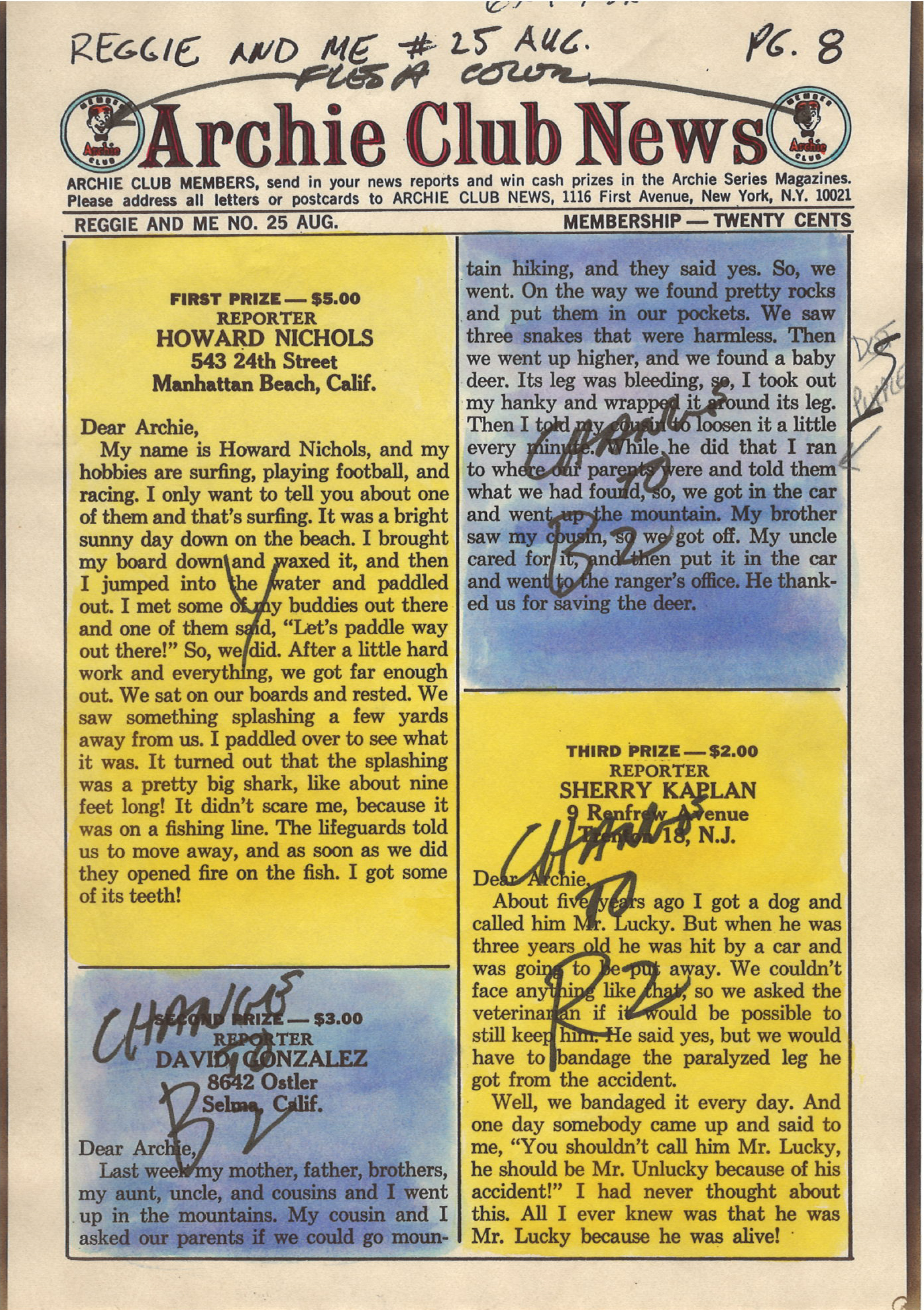
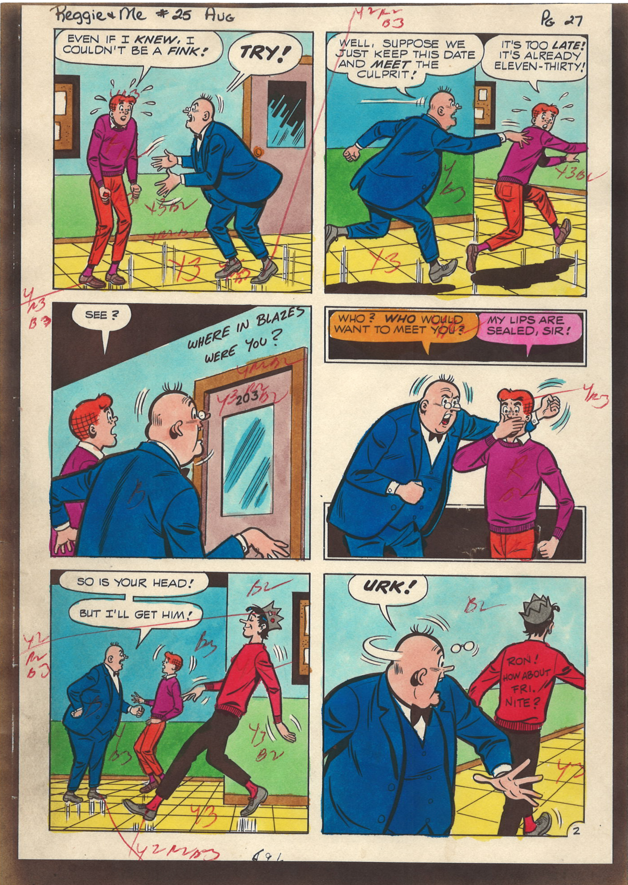
Reggie and Me #25 (Aug 1967)

The colors in this guide are attributed to Barry Grossman (by that, I mean most Archie scholars agree that is probably who colored this; it looks like his work and that was his job at the time).

Here's a scan of the printed page so you can compare the two:


Want to read the whole printed comic? Check it out here: 


Tuesday, November 15, 2022

Retro Coloring - 01: Overview

I have started looking into classic comic book coloring techniques based on the traditional 64-color palette of 64 colors. Specifically, I'm looking at using the old color codes with modern tools that can recreate those effects in Clip Studio Paint and Photoshop. (If you don't know what I'm talking about, skip to the end for some links that explain how comics were color coded for separation using the CMYK color process.) 

Now, before I dive into this series of articles, I'm going to get snippy. I'm not talking about using some cheesy Photoshop filter to emulate a grainy halftone on your comic art. That's all nice and fun for what it is, but unless you are using the correct, limited color scheme based on the actual 64 colors made from the CMYK progress, the results of your little filter and action are going to look fake. There's nothing wrong with that; if that's what you like, go for it. It's faster than doing it this way and you'll get a much wider ranger of colors than is possible from this old-school, retro coloring process that was used to color comics from the 1930s through the 1980s and early 1990s. Near the end of the 1990s, presses and paper made it possible to expand the color gamut and get more.

Before I get into the modern tools, you need a little background.

64-Colors for Super Comics

I'm not going to go into the full details of how this process works; there are simply too many good other resources available that explain it in detail. One thing you're going to need to understand is that the names of the color channels don't exactly line up with the color codes. 

As stated above, printing is done with four traditional printing plates: Cyan, Yellow, Magenta and Black (represented by the letters, CMYK). In traditional comics, Black is used only for the black lines: it is NOT used in colors (this changed in the 1990s, but for now we're going to ignore it). If you're uncertain, here's the colors in their raw forms:

Cyan is a light blue
Yellow is yellow
Maginta is a shade of pink


Unfortunately, Color Codes (which were hand-painted onto copies of the black & white artwork as guides for the men and women who did the actual coloring), did not reference CMYK. Color codes use BYR for Blue, Yellow and Red. 

Yeah, it's confusing, but they did it that way for 50+ years, so it must not have been too weird.

Nevertheless, here are a few details, pulled from the article, "How to Color Comics the Marvel Way" from Marvel Age #13 by Mark Lerer (link to article at end of this post):

"Comic books are printed in the sixty-four combinations of red, blue, yellow and their lighter shades shown here in the printer's color chart. The notation may be a little confusing. R means a solid, or "100% screen" of red [magenta]. Likewise, B means a "100% screen" of blue [cyan], and Y means a "100% screen" of Yellow. "Y2" means a 25% screen of yellow, which makes a very light yellow shade, and "Y3" means a 50% screen of yellow which makes up the intermediate yellow shade. Similarly for R2, R3, B2 and B3. Every color on the chart is a combination of these shades. For example, solid green is YB, a 100% yellow combined with a 100% blue. R3B2, a reddish purple, is a 50% red screen combined with a 25% blue screen."

Here's a copy of a traditional color chart from Marvel Age #13:


As I said, I'm not going to try to make full sense of this. Go check out the following resources for more info.

Other Resources

The basics of old-school coloring:

An article about the physical act of creating color separations. This is a fantastic article that has a lot of detail about the way Marvel Comics were separated:

Fun to watch, but not really informative.

And the super-important "How to Color Comics the Marvel Way" from Marvel Age #13:
https://viewcomics.me/marvel-age/issue-13/22


Friday, September 7, 2018

CLIP STUDIO PAINT WEBINAR / Digital Inking Techniques with Brian Haberlin

This afternoon I had the distinct pleasure of attending another Webinar by comic artist Brian Haberlin. The time, he provided a free one-hour session discussing digital inking with Clip Studio Paint (the program I use under its previous name (but same features) as Manga Studio 5 EX).

This was an amazing demonstration. It moved very fast, but covered some fantastic tools and techniques that are already working their way into my practices (they are that simple and that good).

The presenters (the software company that makes Clip Studio Paint) did a fantastic job of putting the recording up on YouTube about 12 hours after the Webinar ended. Amazing turnaround. You can view it here:


On my second viewing, I made some time code notations so I (and you as well, dear readers) can quickly find what you're looking for:

  • Color Flatting
  • 6 min - Make transparency based on brightness
  • 8 min - Make Reference layer
  • 8:30 - Close and Fill (Bucket Tool / Close and fill
  • 11:30 - More pen properties (do not exceed line in reference layer)
  • 13:20 - More about gaps
  • 14:05 - Lasso Fill tool
  • 15:00 - Finding the Lasso fill (it's under Direct Draw)
  • Inking Example
  • 15:20 - Inking example (he said its Conan, but it's Tarzan)
  • 15:45 - Importance of resolution (400 - 800 dpi)
  • 19:55 - Importance of not doing too much detail
  • 20:45 - Use Lasso fill tool to fill in lots of blacks
  • Use ANY tool as an eraser
  • 23:20 - Use your pen as an eraser
  • 23:45 - Paint with "transparent" pixels (erase)
  • 24:20 - Use x key to swap between black and white colors
  • 24:45 - Inking Style: Puller vs Thrower
  • Adding Tones
  • 28:15 - Adding tones intro
  • 28:28 - Create new layer, select areas with lasso tool
  • 28:55 - Drag over the halftone
  • 29:10 - Change resolution (density) of a halftone
  • 31:00 - Ink with a halftone pattern
  • Creating a custom brush Part 1 (cloud effect)
  • 32:15 - Create a custom brush
  • 32:27 - You can make brushes you cannot make in Photoshop
  • 33:00 - Select region with marquee (rectangle)
  • 33:15 - Register Material (settings: Use Brush as tip shape)
  • 33:40 - Adding keywords for search
  • 34:10 - Pattern Brush example (note the curves)
  • 34:38 - Copy an existing brush and apply your new tip (art)
  • 35:30 - Cloud brush in action

  • Creating a custom brush Part 2 (other shapes)
  • 37:56 - Intro to other shapes
  • 38:30 - Tricks to making new brushes
  • 38:48 - Use "Convert Layer" (right-click clayer panel) to gray
  • 38:58 - IMPORTANT tip about color vs gray layers
  • 39:28 - Walk through the brush creation phase again
  • 40:30 - Using the brush examples
  • File Objects (aka Instancing)
  • 41:05 - File Objects intro
  • 41:38 - Create shape on its own layer
  • 41:47 - Make selection, and convert to file object
  • 42:12 - Duplicate layer, move and scale, etc.
  • 42:55 - Refine and "propogate" (e.g. copy/replace)
  • 43:20 - Change shape into a tree
  • 44:12 - Back to original image, see all the trees
  • Q&A Session
  • 44:47 - Start the Q&A session
  • 45:19 - Canvas Sizes
  • 46:23 - My Question! Where to find Lasso Fill tool 
  • 46:58 - Show again how to switch from white paper to transparency
    (Edit > Brightness to transparency)
  • 47:44 - Advice on switching form traditional to digital inking
  • 48:20 - Show some distortion/transforming tools
  • 48:35 - Advice: Don't ink too much detail!
  • 49:55 - Recommends the G-Pen or Cel pen
  • 50:28 - Do you think of digital inks differently than traditional inks?
  • 51:22 - School vs practice vs Social Media? 
  • 52:55 - More difficult? Drawing or idea?
  • 54:05 - Equipment you use?
  • 54:57 - Wrap up
  • 55:28 - Links to resources
BTW: I also provided these in the comments of the video, and they actually converted to links. So if you go to the video you can click on the time code and it will jump you to the appropriate topic.

    Friday, October 6, 2017

    Manga Studio (aka Clip Paint Studio): How to Save Custom Panel Layouts

    I'm working on the Days Gone comic story, and am doing my first multi-page file in Manga Studio 5 EX (this is one of the few differences between the PRO version and the EX version: the ability to have multiple pages in the same file). The advantage to this is that it will maintain consistency between the tone frequency and panel border thickness -- all useful things in a story (as opposed to doing it manually page-by-page).

    I have two layouts that repeat on two pages: two panels at the top and one big panel at the bottom. And this looks like a layout I might want to use in the future, so I went to YouTube to find a tutorial on it -- and found a great one.


    The video is about 10 minutes long, and WORTH WATCHING in its entirety. However, if you just want to know how to save a design as a custom layout (i.e. material), then jump to the 9 min mark.

    NEXT TIME: Character Designs (and maybe some stuff on dynamic clothing)
    Update Oct. 08, 2017: Turns out, next time we're talking about workflow issues. I'll get back to character design shortly.

    Friday, September 22, 2017

    Noir Style Tutorial, Pt. 21 - Contents (Launch Page)

    © 2016 Mike Mitchell
    The funny thing about blogs is that, typically, search engines list posts in reverse order. If you're looking for the latest post, that's great. But it's not-so-great when you want a single Table of Contents or an easy, chronological listing of a series.

    So, here it is. A sort of "Table of Contents" for my Noir Style Tutorial, presented at the end of the series for easy access and indexing. But first, a definition:

    The French word for black is noir. Over time, noir has come to reflect a mood, a tone, and most appropriately, a style. Suggestive of danger or violence, film noir is characterized by low-key lighting in a bleak urban setting with corrupt, cynical characters. In my approach, the word noir simply celebrates the color black; it is not confined to a specific genre.
    – Shawn Martinbrough, How to Draw Noir Comics


    This tutorial covers how to do the following:

    • Configure Poser 11 to render line art from 3D models.
    • Generate at least three renders: black, gray and outlines-only.
    • Clean up the renders in Photoshop.
    • Compositing the layers in Manga Studio (Clip Studio Paint).
    • Different "finishing" techniques: gray scale, halftones and sketch-style.
    • Saving your final images for print or web.

    Contents

    Noir Style Tutorial, Pt. 1 - Introduction
    Noir Style Tutorial, Pt. 2 - Tools of the Trade
    Noir Style Tutorial, Pt. 3 - Figure & Limitations
    Noir Style Tutorial, Pt. 4 - Inspiration
    Noir Style Tutorial, Pt. 5 - Process At a Glance
    Noir Style Tutorial, Pt. 6 - Step 1: Figure Set-Up
    Noir Style Tutorial, Pt. 7 - Step 2: Turn on Live Comic Book Preview
    Noir Style Tutorial, Pt. 8 - Step 3: Edit Materials
    Noir Style Tutorial, Pt. 9 - Step 4: Set up Lights
    Noir Style Tutorial, Pt. 10 - Step 5: Adjust Lighting
    Noir Style Tutorial, Pt. 11 - Step 6: Render Settings
    Noir Style Tutorial, Pt. 12 - Step 7: Creating Render Passes
    Noir Style Tutorial, Pt. 13 - Step 8: Cleaning up Renders
    Noir Style Tutorial, Pt. 14 - Step 9: Image Clean-Up / Hand-Work / Post Work
    Noir Style Tutorial, Pt. 15 - Step 10: Quick-n-Easy Contour Line
    Noir Style Tutorial, Pt. 16 - Step 11: Applying a Tone Layer
    Noir Style Tutorial, Pt. 17 - Step 12: Applying a Color Wash
    Noir Style Tutorial, Pt. 18 - Step 13: BONUS: Applying a Quick Sketch Effect
    Noir Style Tutorial, Pt. 19 - Step 14: Saving Your Final Image
    Noir Style Tutorial, Pt. 20 - Process "Quick" Summary
    Noir Style Tutorial, Pt. 21 - Contents (Launch Page)


    © 2017 by Mike Mitchell

    Thanks for reading. Please post a comment to let me know if you enjoyed this series (and if not, what I can do to improve it).

    Wednesday, September 20, 2017

    Noir Style Tutorial, Pt. 20 - Process "Quick" Summary

    When I started on this Noir Style Tutorial, I honestly had no idea that it would be this long. Both in terms of content, and in terms of how many posts there would be. This is part 20, for goodness sake, and this will have run (twice a week, no less) from July through almost the end of September. There were a few times, I admit, that I struggled with whether or not I was going into too much detail. But, truth be told, if I'm going to sit down and document all of this, I'd rather be thorough so that newbies can understand what I'm talking about.

    Nevertheless, I do recognize that experts are going to be put off (if not downright angry) that this is so long. So, I'm going to summarize the entire process again, but this time very quickly and with minimal screenshots. I'm also going link each example back to the main article so you can easily find your way to more detail, should you need it.


    Our Goal / Summary
    • Our goal is to create a static, black and white image that looks like it was hand draw using a stark, "Film Noir" (or "Crime Noir") look.
    • We are going to create at least 2 renders in Poser 11:
      • Render 1 will have small, tight shadows. I call this the "black" render."
      • Render 2 has larger shadows. I call this the "gray" render."
    • We will clean the renders in Photoshop (this step is optional – I have actually removed it from my workflow because I have gotten better at using Clip Studio Paint).
    • Final editing in Clip Studio Paint (aka Manga Studio):
      • Create a new document in Clip Studio Paint. 
      • In the Layers Panel, put Render 2 on top of Render 1.
      • Set the blending mode for Render 2 to "Multiply."
      • Set the opacity of Render 2 to 30%.
      • Add frames, words, edit the base renders, etc. to complete the image.

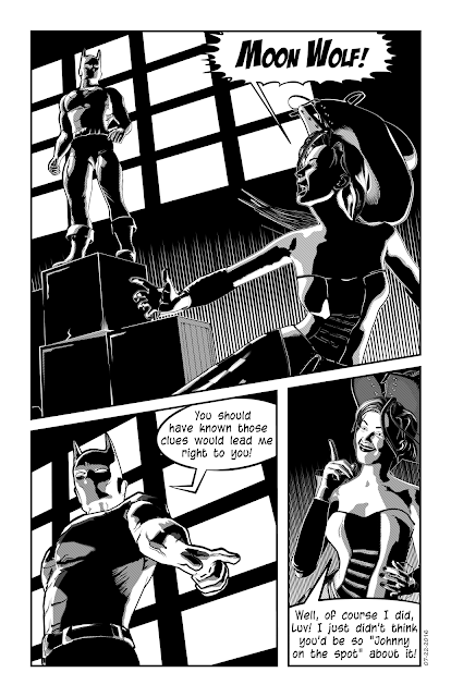
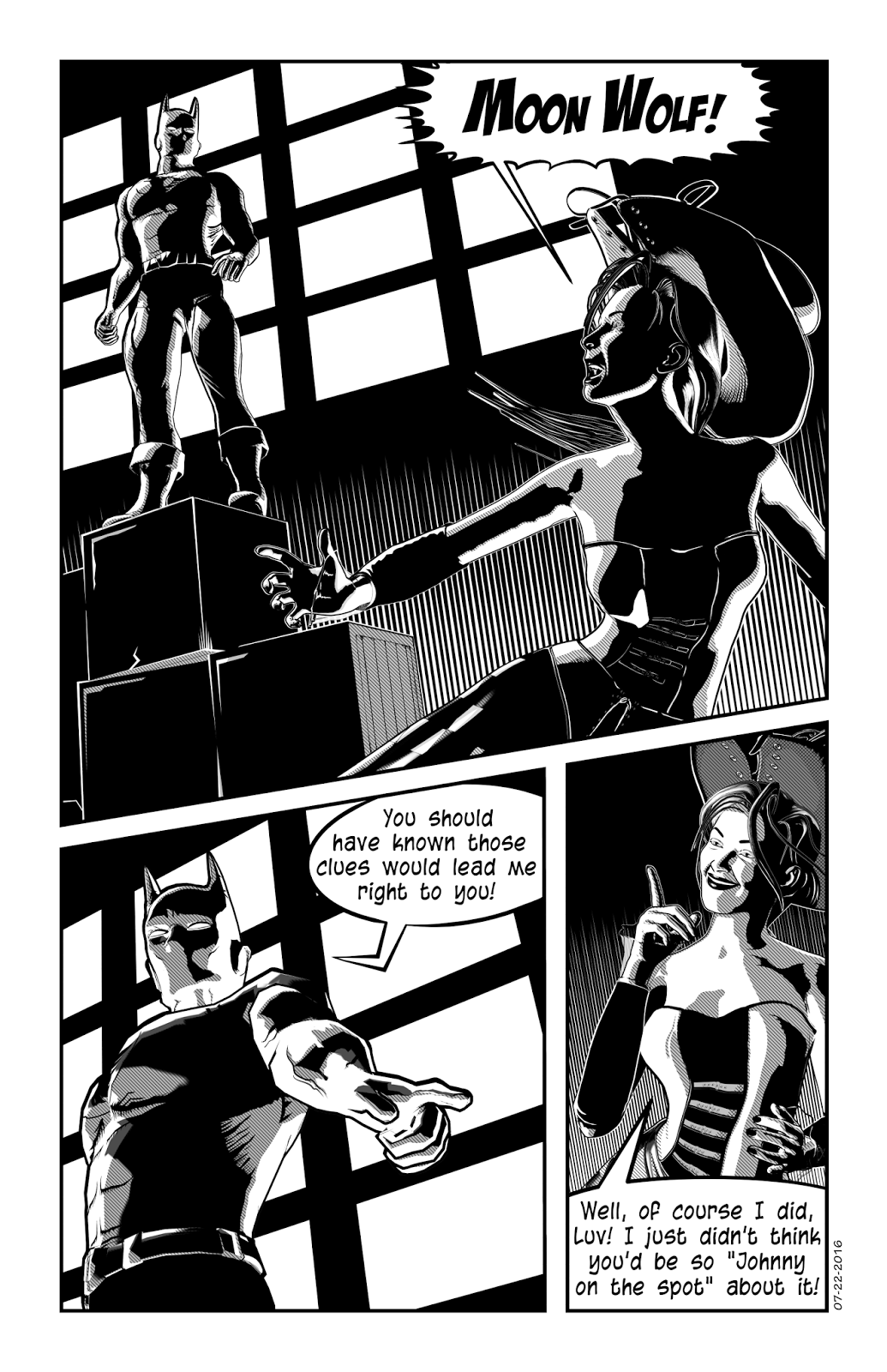
    Stark lines, deep shadows and dramatic angles
    are all part of the Noir look. This page was
    created using the Anomaly Process.
    © 2016 Mike Mitchell

    The Anomaly Process, Step-by-Step

    Step 1: Figure Set-Up
    This process only works with Poser 11 (Pro or regular versions), so you need to limit yourself to a figure that works well in Poser 11. I suggest Michael 4 and Victoria 4 as your starting point. We start by opening Poser 11 and setting up our figure, props, etc.

    Step 2: Turn on Live Comic Book Preview
    One of the cool things about this process is that it is LIVE. You see your results before you render. This makes it very easy to make subtle changes to your render. The icon to turn on the Comic Book Preview is at the bottom of the main viewport. Note that this works with all the display modes: you'll probably want Shaded Textured (or possibly Comic Book).


    Click the icon to open the Comic Book Preview Options pane.

    Regarding the settings in the Comic Book Preview: Please note that the default settings in Poser are horrible. You need to change these or you will not get good results. I suggest setting the Geometric Edge Lines between 0.25 - 0.66. The smaller the number, the thinner the line that will appear around the edges of the shapes. Likewise, I find that the Threshold settings work best between 0.33 - 0.8 (I typically keep mine around 0.4 to 0.6). The smaller the number, the smaller she shadows. As for the color, that's up to you; I prefer to work in black and white.


    Step 3: Edit Materials
    For most figures, bump maps are not your friends. They cause little ripples on the skin that look weird. I usually strip my figure of all color and make the eyelashes transparent. Note that, in the Material Room, you can assign a different weight and color to each materials group. This means that clothes can be thicker than skin, etc.

    Step 4: Set up Lights
    Delete most of your lights so that you have only two in the scene. For each light, you will need to increase the Shadow Preview Map Size. I recommend going as large as your video card can handle (I usually go with 4096, but never go below 1024).
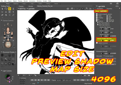
    Preview Shadow Map Size tops out at 4096.
    Notice that this got significantly darker.
    If you only read two full articles in this series, I strongly suggest you read this and the next one. Even if you're very familiar with shadow maps, you can still learn some stuff from this article.

    Step 5: Adjust Lighting
    I usually work with just two lights: A key light, which is placed to the left and slightly behind/above the figure so that it illuminates the head/shoulders area and makes the figure pop out from the background. And a main light, to illuminate the figure from the other direction. There are different types of lights (Spot, Point, Infinite, etc. Experiment with them to get the results you want.

    Step 6: Render Settings
    We are using the PREVIEW renderer, so you will need to adjust your Preview Resolution. Render Settings are available from Render option in the Menu Bar (or press CTRL+Y). You'll see the panel, and then you can make the following modifications:

    See main article for Step-by-Step guidance.


    This setting drives how much detail is allotted to your textures. The bigger the number, the more detail (and potentially longer render times). Remember, if you're working in b&w, the hit to your processor will be minimal. While creating each of the images in the animated GIF below, I didn't even notice a difference between 128k and 8MB.
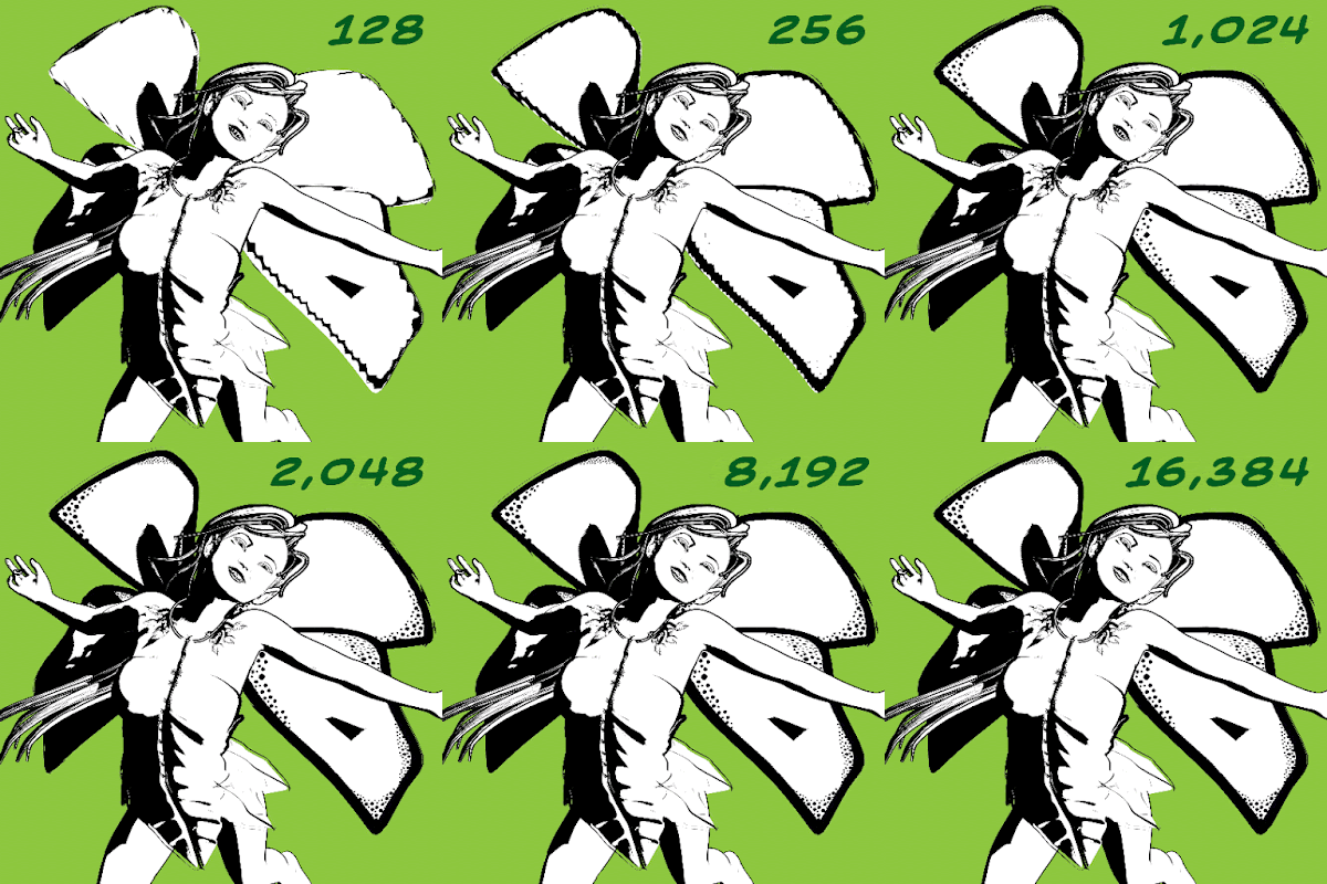
    Detail is in the eye of the beholder. You can see that the texture
    resolution "tops off" around the 4,096 mark.
    The shadows and lines around the top of her dress seem to remain consistent, no matter what settings I use. But the detail on the wings (the only texture map in this scene) definitely look sharper at larger sizes. The shadows on the dress don't change because the dress does not have a texture map. Although you will see subtle changes in shadow placement and clarity on all objects, the most dramatic changes will be on objects with texture maps applied. Personally, I seldom see a "return on investment" by going above 4096, but you should experiment to see what works best for you.


    Step 7: Creating Render Passes
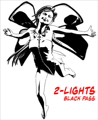
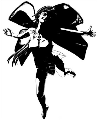
    The final image will be made up of two or three separate renders.

    • Outlines: No other shadows or details. You can get this by setting one of the lights to IBL.
    • Black: You want a tight group of shadows that define key facial and body features.
    • Gray: A wider range of black shadows (when we put this in MS or Photoshop, we'll set this layer to 30% - 50% opacity).

    Since my finished art includes a solid black area and a secondary gray area, I usually start with the black render: It's usually got small, tightly defined areas of shadow, and I pay special attention to casting light on the jawline because it gives the figure shape.
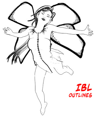

    Once I settle the pose, I almost always make a render
    using an IBL light because it generates clean outlines.

    A strong light from the upper left, just behind the head
    helps create a nice contrast under the neck, which
    gives the jaw definition. 
    Get a bigger spread of black for what will be,
    in the end, the Gray layer.


    Step 8: Cleaning up Renders
    Put the various renders into a single Photoshop file (one per layer) and then use the Threshold Adjustment to remove any gradients or soft shadows.  You may also want to fill any gaps or trim off any excess lines that might exist. Pay special attention to hands and hair, as they tend to get a lot of random artifacts. Also, watch for places where the geometric edge line breaks up (strong curves can be a problem). Save file as a PSD (preserve layers).


    Step 9: Image Clean-Up / Hand-Work / Post Work
    You can open the PSD file directly in Manga Studio, or you can import each image separately and build your own layer structure. Either way, once you have the renders in MS, clean them up, add detail, and so forth. Pay attention to the teeth, eyes, and hair tips. Also look for any places that you want really sharp points. NOTE: For reasons that will be apparent in future steps, you should make the majority of your clean-up efforts directly on the image layers themselves. For areas that I know I want to be stark white or pure black, I make those edits on a new "touch-up" layer that I keep at the top of the stack.

    Step 10: Quick-n-Easy Contour Line
    By default, the geometric edge lines are fairly consistent in width. A contour line (often called a cross contour line) is a line that gives extra dimension to a figure by going from thin-to-thick-to-thin again (or the inverse). If you have kept your figure isolated from the background, you can add a quick contour line to your figure with just a few steps. 1. Ctrl+Click the layer with the figure (add/subtract the selection if needed); this will select only the figure. 2. Create a new layer behind the figure. 3. Fill the selection with black. 4. Move the layer a few pixels up and to the right. You will see (as shown here) that the line on this side of the image is thicker, and if you look closely at the calf, you'll see that it is thicker in the middle than at the edge. NOTE: This only creates the contour line outside the figure. You will need to touch up the areas inside the image (see below). Also pay attention to
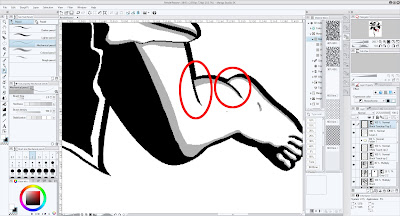

    Zoom in on the figure, and you'll see areas
    that require additional editing.
    Always check the tips of hair, and look closely at fingers, toes, and other small areas. These tend to get gaps that need to be filled.
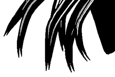
    Always check the tips of the hair to see if you are getting duplicate lines.
    In this case, I trimmed some and kept the others. It's a matter of personal preference.

    Step 11: Applying a Tone Layer
    If you plan to print your work (as opposed to just displaying it on the web), a shading tone can add a nice touch of old-school authenticity. You can either drag-n-drop a pre-defined tone from the Materials Panel, or add a Tone Layer. I usually use the Tone Layer because it gives me more control of the final output. I typically replace the Gray Layer with a tone. 1. On the Gray Layer, Select Color Gamut. Then hide the Gray Layer. 2. Create a new tone layer (see below). 3. Pick the settings you want. 4. Click OK and the tone will be created with a layer mask that shows the tone where the gray used to be.
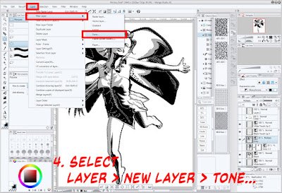
    Select Layer > New Layer > Tone...

    Step 12: Applying a Color Wash
    Sometimes you want a spot of color. Using the same steps as above, Select Color Gamut on the Gray layer, then create a new layer and fill it with a color (I like light blue).

    Select the color, then fill the area (CTRL+Del)

    Step 13: BONUS: Applying a Quick Sketch Effect
    This one is harder to explain; if you're really interested, read the full article. But, in a nutshell, here's a cheat to get a jump start on adding a sketched fill to the Gray layer. In the materials panel, you will find MM04-volcanic eruption (we're using this because it has lots of random lines in it). Drag this on top of the current illustration. Increase its size (don't be afraid to make it huge). Again, use the Select Color Gamut to select the Gray Layer, then create a layer mask to hide the parts of the pattern you don't want to see. With some manipulation (unlink the mask and the material), you can move it around until you have something you like. You will need to add some extra lines and do some touch-up to get the best results from this technique.
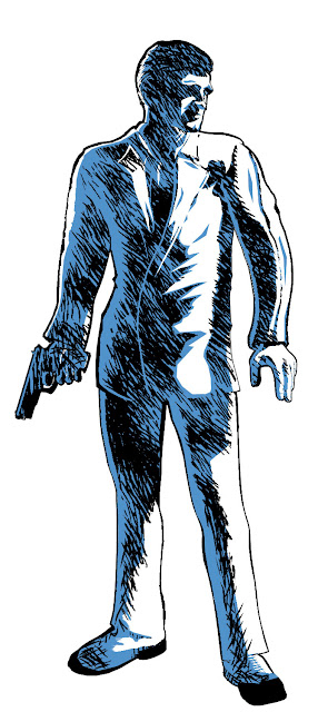
    I used the sketch technique on this image;
    I chose this as an example because it looks
    better than when the effect was applied to the fairy.


    Step 14: Saving Your Final Image
    One of the things that Manga Studio does better than Photoshop is scale down the tone patterns consistently. In other words, it will shrink the image, but keep the line frequency of the dot/line patterns the same. This is VERY useful for print. Chose File > Export and select the appropriate settings for your image (PNG, JPG, TIF, etc.).

    And that, dear friends and true believers, is it. This is a one-post summary of the entire process.

    NEXT TIME: A "Contents" Launch Page

    Friday, September 15, 2017

    Noir Style Tutorial, Pt. 19 - Step 14: Saving Your Final Image

    Now that you've got the final image, it's time to save it. As with almost every other image program out there, you're going to maintain a source file and an output file:

    • Manga Studio files have a .lip extension and contain all the layers and other info needed for you to edit it in the future:
    • Output images usually have an extension of .jpg, .png, or .tif. These are "flat" files and are intended for publication, either in print or online.
    MS handles this through an Export function.

    For web display, I usually select JPG. For print, I use a TIFF.

    If you look closely at this screenshot, you'll see that MS has two Export options: one for layered files and another one, without any other text. The Layers option lets you export as a PSD file (among other things). The second one lets you export to all the formats you see here. And, no, the sharp-eyed among you are not seeing things – Manga Studio does let you Save in Kindle format. This is a very cool feature, and one that I admit to not having used – – YET! Ditto for its ability to export as an epub. 

    Once you've selected the file type, a standard dialogue box will appear asking you to name the file and put it where it goes. After that, you get this pane:


    As you can see, it has the usual quality and color settings that you would expect. Note that at the bottom of the dialogue is one of the things I said was cool about this program: It's ability to scale tones for print.

    By default, Manga Studio selects "For Comic" and sets the Rasterize quality to "Fast." I always set it to "Prefer quality," even though I really haven't seen much difference between the two settings. In general, I do prefer the default settings "For comic" because it does do a better job of scaling the tones I use. I have experimented with the "For illustration" settings before and have never encountered the "gaps" it references. Nevertheless, why take any chances?

    Here are some images saved with the "Illustration" and "Comic" settings for comparison.


    Saved with ILLUSTRATION settings.
    This image has been scaled to 50% of its original size.
    Click for full-size image.


    Saved with COMIC settings.
    This image has been scaled to 50% of its original size.
    Click for full-size image.

    You'll have to enlarge both of these to see that there are, indeed, subtle differences between the tones. 

    Detail of the two images shown above.

    Here you can see that the Illustration setting is a little darker than the Comic setting. On the Web, I must say I prefer the Illustration settings. However, in print I think the Comic settings print better (although I must admit that, as of when I'm writing this, I only have a little experience with printing these images; if this changes in the future I'll let you know).

    Here are a few more examples, this time with an actual comic page instead of a single illustration.

    Illustration settings: Page reduced 33%

    Comic Settings: Page reduced 33%

    And here's another close up, where we can see again that the Illustration settings seem to present stronger lines, at least online in a web browser. I do suspect that the tones will print better under the Comic settings, but time will tell.


    Detail of the output settings.


    And that's that. Once you have the final image or page output, you can put it into your desktop publishing program (like InDesign, Publisher or QuarkXPress). Or, if you're feeling bold, output it as a Kindle or ePub file! It's all up to you.

    NEXT TIME: Process "Quick" Summary