Tuesday, December 13, 2022

Retro Coloring 05: Champions #4

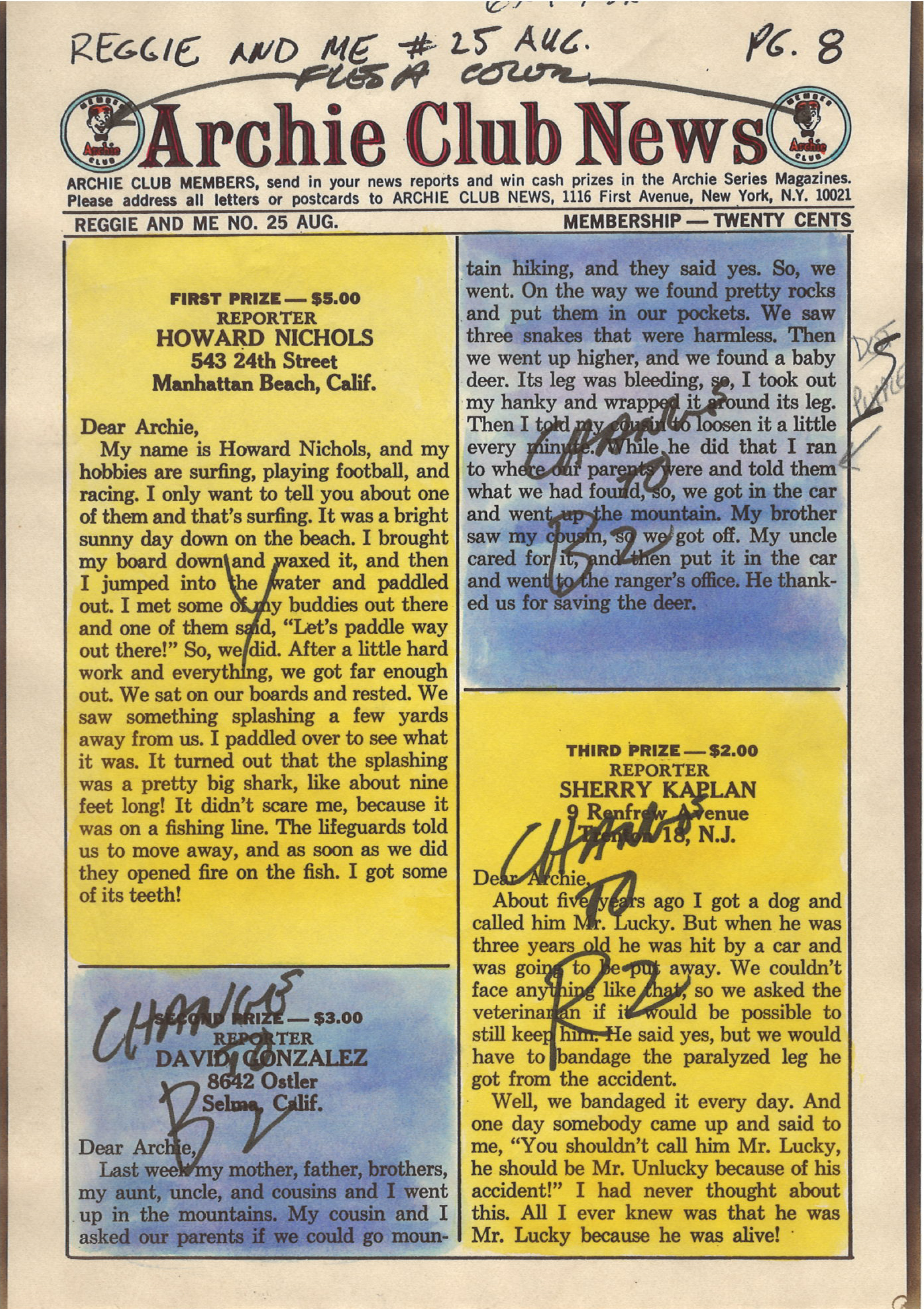
 Anyone who knows me is aware that I have a big soft spot in my heart for Archie comics, so it shouldn't be a surprise that the first color guides I bought were for Archie Comics. I think I have 6 so far, and 5 of those are for Archie titles – some old and two from the late 1990s, and those use the "expanded color palette" that has more variations of the CMY colors, and brings in screens of black, as well. At some point in the future I'll talk more about those colors, but for now I'm going to stick to the classic look of 64-colors (if you don't know what I'm talking about, go back to part one of this series, or read the article in Marvel Age #13: "How to Color Comics the Marvel Way").

Editorial Input on Color Guides

But back to Archie. I love the company's work and I find their simple color guides as a PERFECT starting point for my own efforts (you'll see my own that in an upcoming article when I actually use new digital tools to attempt recreating the original colors of an Archie comic from the 1960s). But, the colors are simple.

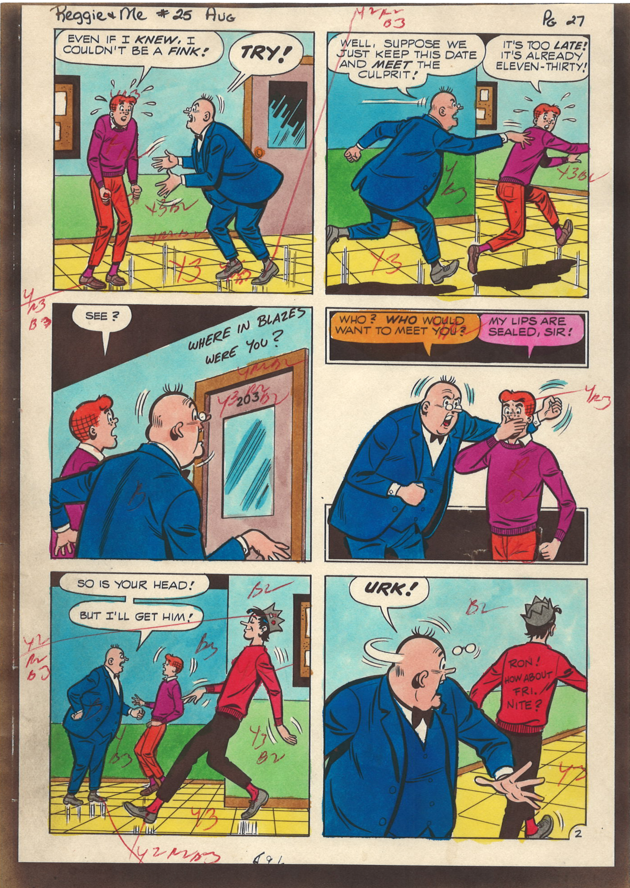
Superhero and horror comics had much more sophisticated coloring, and therefore more editorial input. As I said last time, superhero comic color guides are more expensive, typically running about $50 - $100 per page (that's not to say you can't find a few bargains out there, but they are more infrequent). A little hunting got me an interesting find: an 8-page back-up story in the Marvel Comic, The Champions #4 (March 1976), colored by Janice Cohen for about $83.

Unlike the Archie color guides I have shared with you, this color guide is on standard 8.5 x 11 inch letter size copies, which provides a nice big work area for notes and guidance. Unfortunately, I'm not sure who wrote them: Writer, Artist, Editor? If I ever find out I'll update this article.

Take a look at the editorial comments for a behind-the-scenes look at the production of this story (incidentally, I have not yet obtained this comic so I cannot provide you with a scan of it in its printed form; I'll also update that when I can).

Color Guide for Champions #4 (March 1976)


On this page, notice now her skin tones are marked as Y4R3B3.
The use of the number 4 is very surprising because that is part of the "expanded" color palette that (even without adding black (as I'll discuss in a future article) more than doubles the color options from 64 to 125. As noted in the previous article, the letter/number combo represents a specific dot intensity (i.e., fill percentage). In this formula, 4=70%, making her skin tone:


Y4Yellow70%
R3Red [magenta]50%
B3Blue [cyan]50%
This will print as:

The normal skin tone for a black character would be: YR3B2. I'm going to go into this a lot more next time, as I dive into the very important (and illusive) topic of Skin Color.

But on this page (and others) her skin tone is crossed out with pencil marks.
Also, take a look at how someone wrote "OK" on the bed color and blue background in the last panel.


Story and art © 1976 Marvel Comics Group

NOTE: This color guide is presented for the scholarly purpose of discussing how comics were colored in the past. Its fair-use inclusion here recognizes that the underlying story and artwork are the copyrighted property of Marvel Comics.

Next up: Retro Coloring 06: Skin Color

Tuesday, December 6, 2022

Retro Coloring 04: Reggie and Me #25 Color Guide, pt 2

Here's another story from Reggie and Me #25 (Aug 1967). I picked up these 8 pages (2 non-story, and missing the first page) for about $80. Like the other story, this 

I don't have the complete guide for this next story, so I'm including the first page as it was printed, which includes a coloring mistake that is rather revealing! Look at Ronnie's blouse in the first panel and note that incredible crop top she's sporting! There's no way that was kosher at school in 1967! And, as you can see in panel 2, her modesty (and The Bee's dress code) is restored!

Credits:

  • Script: Frank Doyle
  • Pencils: Harry Lucey
  • Inks: Marty Epp
  • Colors: (attributed to) Barry Grossman
  • Letters: Bill Yoshida


On the following pages, I've placed the guide on the left and the published page on the right. I wanted to show you the editorial changes that were made after Barry Grossman submitted his work. Note on page one how the editor indicated that the lower-right box should be red, not yellow. This is the sort of thing that turns up quite a bit in the next color guide I'm going to share with you.


Want to read the whole printed comic?
Check it out here: https://viewcomics.me/reggie-and-me-1966/issue-25


NOTE: This color guide is presented for the scholarly purpose of discussing how comics were colored in the past. Its fair-use inclusion here recognizes that the underlying story and artwork are the copyrighted property of Archie Comics.

Next up: Retro Coloring 05: Champions #4

Tuesday, November 29, 2022

Retro Coloring 03: Reggie and Me #25 Color Guide, pt 1

 Color guides are a type of original art created in the production of comic books. They are one-of-a-kind creations with hand work by the Colorist. To be honest, they're not very collectable, at least not when compared to the original art. But that's also part of their charm. For instance, the 6 pages I'm presenting here only cost about $88. Not bad for something created about 54 years ago!

However, I have seen some color guides go for very high figures, especially for covers. If you decide to look into it, you should expect to pay about $50 a page for most comics, more for mainstream superheroes like Superman and Batman. Honestly, you could see $200+ a page for those, and if it's a famous story, multiply that by whatever the seller wants. I recently saw the cover color guide for Amethyst, Princess of Gem World #1 listed at $1,999.

Reggie and Me #25, 

I think Archie is a great place to start with color guides. The colors are simple, straightforward and do not include a lot of special instructions. So, without further ado, here it is. (Note, the copies are on what feels like regular paper; it's kind of thin and definitely shows a little "bubbling" from the application of wet dyes (and you can see the ink stains on the third page. There is an odd, brownish border to the pages, which are about the size of the printed book.)

Credits:

  • Script: Frank Doyle
  • Pencils: Al Hartley
  • Inks: Jon D'Agostino
  • Colors: (attributed to) Barry Grossman
  • Letters: Jon D'Agostino


© 1967 Archie Comics

NOTE: This color guide is presented for the scholarly purpose of discussing how comics were colored in the past. Its fair-use inclusion here recognizes that the underlying story and artwork are the copyrighted property of Archie Comics.

By the way, if you have sharp eyes, you'll notice that page 26 is missing. That page was an ad, so it's not part of the story. Want to read the whole printed comic? Check it out here: https://viewcomics.me/reggie-and-me-1966/issue-25


Next up: Retro Coloring 04: Reggie and Me #25 Color Guide, pt 2

Tuesday, November 22, 2022

Retro Coloring 02: Color Guides

When talking about coloring comics, it's easy to forget something that was once very obvious: Coloring comics was a two-step process performed by two different people:
  1. The Colorist decided what colors went where. This person's job was to start with a stat (later photocopy) of the black & white artwork and then, using special dyes, paint the desired colors where they go. Afterwards, the colorist would hand write color codes on the art. (For more info on this, read last week's blog and don't forget to read "How to Color Comics the Marvel Way" from Marvel Age #13: https://viewcomics.me/marvel-age/issue-13/22.) The finished Color Guide was then handed off to the next person...
  2. The Separator took the Color Guide and then used a variety of physical tools and media (mostly acetate (thin plastic sheets) and cutting and pasting them where they go based on the color formulas provided by the colorist. This was a physical job that was often done by women (at least by the 1960s) and the accuracy with which the separator followed the colorist's guidance was kind of hit-or-miss. By that, I mean that the better comic shops got (and paid for) separators who did at least a workman-level job. They usually got it right, but sometimes (especially on tight deadlines), you'd see color get missed or messed up. But the cheap shops had a lot of problems.

I'm trying to track down some good videos on the physical part of color separations. If I find any, I'll link to them. This one is a good discussion about modern recoloring, and it has a few pics of the separation process: https://www.youtube.com/watch?v=uNYDiJibRM4.

Color separation is now handled digitally with computers (unless you're working with some old-school print-making equipment). So we're not going to focus on that aspect of the process. Instead, we're going to look at some Color Guides.

Color Guides

As I said, a Color Guide starts off as a black & white copy of the black line art. The colorist then paints in each color with special dyes (again, that Marvel Age article covers all that jazz) and then makes up the page with the associated codes that relate to the chart published in last week's entry.

Here's what a simple color guide looks like:

Reggie and Me #25 (Aug 1967)

The colors in this guide are attributed to Barry Grossman (by that, I mean most Archie scholars agree that is probably who colored this; it looks like his work and that was his job at the time).

Here's a scan of the printed page so you can compare the two:


Want to read the whole printed comic? Check it out here: 


Tuesday, November 15, 2022

Retro Coloring - 01: Overview

I have started looking into classic comic book coloring techniques based on the traditional 64-color palette of 64 colors. Specifically, I'm looking at using the old color codes with modern tools that can recreate those effects in Clip Studio Paint and Photoshop. (If you don't know what I'm talking about, skip to the end for some links that explain how comics were color coded for separation using the CMYK color process.) 

Now, before I dive into this series of articles, I'm going to get snippy. I'm not talking about using some cheesy Photoshop filter to emulate a grainy halftone on your comic art. That's all nice and fun for what it is, but unless you are using the correct, limited color scheme based on the actual 64 colors made from the CMYK progress, the results of your little filter and action are going to look fake. There's nothing wrong with that; if that's what you like, go for it. It's faster than doing it this way and you'll get a much wider ranger of colors than is possible from this old-school, retro coloring process that was used to color comics from the 1930s through the 1980s and early 1990s. Near the end of the 1990s, presses and paper made it possible to expand the color gamut and get more.

Before I get into the modern tools, you need a little background.

64-Colors for Super Comics

I'm not going to go into the full details of how this process works; there are simply too many good other resources available that explain it in detail. One thing you're going to need to understand is that the names of the color channels don't exactly line up with the color codes. 

As stated above, printing is done with four traditional printing plates: Cyan, Yellow, Magenta and Black (represented by the letters, CMYK). In traditional comics, Black is used only for the black lines: it is NOT used in colors (this changed in the 1990s, but for now we're going to ignore it). If you're uncertain, here's the colors in their raw forms:

Cyan is a light blue
Yellow is yellow
Maginta is a shade of pink


Unfortunately, Color Codes (which were hand-painted onto copies of the black & white artwork as guides for the men and women who did the actual coloring), did not reference CMYK. Color codes use BYR for Blue, Yellow and Red. 

Yeah, it's confusing, but they did it that way for 50+ years, so it must not have been too weird.

Nevertheless, here are a few details, pulled from the article, "How to Color Comics the Marvel Way" from Marvel Age #13 by Mark Lerer (link to article at end of this post):

"Comic books are printed in the sixty-four combinations of red, blue, yellow and their lighter shades shown here in the printer's color chart. The notation may be a little confusing. R means a solid, or "100% screen" of red [magenta]. Likewise, B means a "100% screen" of blue [cyan], and Y means a "100% screen" of Yellow. "Y2" means a 25% screen of yellow, which makes a very light yellow shade, and "Y3" means a 50% screen of yellow which makes up the intermediate yellow shade. Similarly for R2, R3, B2 and B3. Every color on the chart is a combination of these shades. For example, solid green is YB, a 100% yellow combined with a 100% blue. R3B2, a reddish purple, is a 50% red screen combined with a 25% blue screen."

Here's a copy of a traditional color chart from Marvel Age #13:


As I said, I'm not going to try to make full sense of this. Go check out the following resources for more info.

Other Resources

The basics of old-school coloring:

An article about the physical act of creating color separations. This is a fantastic article that has a lot of detail about the way Marvel Comics were separated:

Fun to watch, but not really informative.

And the super-important "How to Color Comics the Marvel Way" from Marvel Age #13:
https://viewcomics.me/marvel-age/issue-13/22


Thursday, August 11, 2022

Make your own icon fonts

 I needed a font that had symbols for the various Microsoft Office documents (Word, Excel, PowerPoint) and the Adobe PDF symbol. Alas, I couldn't find what I needed, so I started looking for a way to make my own icon font. I found a solution in minutes, and it worked perfectly.


Here's the site: fontello.com/

And here's a video on how to use it.


Monday, March 7, 2022

Red Sonja - Retro Selected as Renderosity Poser Staff Pick of the Week (Feb 29 - March 6)

 HUZZAH! It's always gratifying when you put in some hard work on something and it garners recognition from your peers! Once more, an illustration I created has been selected by the Renderosity site as a "Poser Staff Pick of the Week." And, if you're counting, this is the eighth illustration to receive this honor. You can see the whole list here.

They selected my "Red Sonja - Retro" illustration, as shown below.

© 2022 Mike Mitchell
Red Sonja TM 2022 by Red Sonja LLC

The moderators of Renderosity's Poser gallery review all the submissions for the week and pick the most outstanding work posted during that time. This week they selected 6 illustrations, which includes some pretty cool work. 

The entire list can be see here: https://www.renderosity.com/forums/threads/2969252/poser-staff-picks-feb-28-thru-march-6#msg4435565

And, once again, I didn't get any money or prizes for this honor. I just got a nice, virtual pat on the back for making something memorable.

Thursday, March 3, 2022

Retro Coloring - Red Sonja Attacks

 This is an illustration for a fanzine (in other words, this is for print and the "Anthems" is the name of the feature in the magazine.). This is my first serious attempt at using the KraftTone brushes from Vintage Texture Supply Co. These are a product that emulates old-fashioned comic book coloring techniques from the 1930s through the 1980s. A very nice set of tools, which are available for Clip Studio Paint, Photoshop, Procreate and the Affinity tools.

I used my standard workflow: I rendered the figures in Poser Pro 11 using the Comic Book Preview. I then took them into CSP for clean up, inking adjustment and coloring.

Figure is a customized Victoria 4.2 wearing the cool Red Sonja cosplay costume by the inimitable Terry McG. Hair is End of Summer Hair by goldtassel and Daz Originals.


Image © 2022 Mike Mitchell
Red Sonja TM 2022 by Red Sonja LLC