Friday, May 26, 2017

Manga Studio Brush Sets Worth Considering

I just spent money on some cool brushes for Manga Studio 5 (aka Clip Studio 5), so I want to use them before I buy more. I want to see if they are actually going to help me create art before investing in stuff just because it's new and exciting.

That being said, I did find some other cool brushes out there while I was shopping, so I have decided to list them here so I can come back and get them later.


  • Deviant Art Listing: Just a cool list of brushes, including many of those listed below.
  • Manga Studio 5 300+ Brush Super Set by Frenden: This set is $15, so I'll need to look it over closely before purchasing.
  • Comic Book Inkers Set 3 (not the official title, but I chose this name because it has pens named after Kirby, Sinnot, Mobius and Wood. I think this includes Flashtools for Manga Studio and Clip Studio Paint: Cost $5.50

Wednesday, May 24, 2017

Video: Import Multiple Brushes Into Manga Studio 5 (by Brian Allen)

I'm posting this video here so I won't lose track of it. I just purchased a cool set of 200+ brushes for Manga Studio 5 EX from artist Brian Allen. Total cost: $7. They look cool (I may review the set after using them), but now comes the hard part: Installing them.

Installing a lot of brushes is definitely one place where Photoshop is better than MS5, but Brian took the time to create a cool video on how to speed up the process.


BTW: This video is cross-posted without his permission (he seems like a nice guy, so I doubt he'll mind). If you do buy his brushes, please mention that you saw the video here. Thanks!

Monday, May 22, 2017

Video: Manga Studio 5 vs Photoshop

Those of you who have been reading this blog for a while know that I'm a big fan of both Photoshop and Manga Studio 5 (aka Clip Studio 5 – same program, different names). As of late, though, I've been doing more of my final comics illustration in Manga Studio because it has tools that are better suited for creating comics. Now, don't get me wrong, I still love Photoshop (and it's an important part of my workflow), but I do my final work in Manga Studio 5 EX.

A few people have asked me why, but except for one or two artists who found the comic panels and text balloons to be exciting additions, they haven't been sold on learning a new tool. And I can't blame them.

But...

Here's a review by professional artist Brian Allen that I found interesting, and he explains a few cool things (like Reference Layers) that might help some artists decide to give this a try.


By the way, Brian has a collection of 200+ Manga Studio Brushes available on his site for only $7. I bought them and, depending on how useful I find them, I'll try to write up a review in the next few weeks.

Thursday, May 18, 2017

Sketchy Behavior, Part 10

This illustration actually dates back to September of 2016, and it was created for a detective story I wrote which appeared in the Collectors' Club Newsletter #118. I had a lot of fun writing a traditional whodunit mystery, with all the clues provided to the readers. The story is actually part of a larger story arc, and I'll collect it with the Moon Wolf material some time in the future.


As with the other work in this style, I worked with Victoria 4 with Poser 11's Live Comic Book Preview and did my finishing in Photoshop. I started using Manga Studio 5 EX, but I find working with type is just easier in Photoshop.

My technique on this one was a little different, in that I didn't use a tone or the sketch effect – this time out I just relied on the color to provide accent. Part of the reason for this was that I was worried about reducing the tone (that tends to make it muddy and look bad), and I didn't like the way it was playing across her face. When dealing with a classy dame like this one, you wanna keep the lines clean and simple. All in all, I kinda like the way this one came out (and thanks to my friends over at the Daz3D forums for their help; I actually created multiple versions of this before selecting this one).


Monday, May 15, 2017

Sketchy Behavior, Part 9

The digression I had with Akvis Sketch and Daz Studio was fun, but so far I haven't gotten the solid results from it that I've achieved with Poser 11 and its Live Comic Book Preview mode. I think its more than familiarity – it's just that, with the proper set-up, it's easy to get consistent good results.


This title illustration that I created for a short story in the Collectors' Club Newsletter #120 is an example of something that didn't really take me that long to do, but came out as a very solid piece of work.

The figure is actually the same one I used for the Lance Worthington illustration last year (and if you compare them, it's obvious). But, since it's unlikely that the two characters will ever appear in the same issue of the CCN (or elsewhere), I don't mind repurposing my work in this way. If you do compare the two images, notice that Lance is more buff than Truman. I actually filled in the muscles apparent in Lance's jacked so that this guy, who is a little more modern and less "pulpy," wouldn't have quite the super-heroic build that Lance has.

Also, in case you're curious, this is the story for which the Bobby E. studying character sketch was created. That's another reason I wanted to use my "sketchy" style for this illustration. Here's a close-up of Truman, so you can make out more detail.


Next time, another story title with a noir feel!

Thursday, May 11, 2017

Sketchy Behavior, Part 8

As I said last time, I needed an illustration for the table of contents for the Collectors' Club Newsletter #120. So I decided to use the club's mascot, Captain Epistle (it's an inside joke, folks, that stems from the club's past wherein members would write letters to the magazine, where they would be printed).

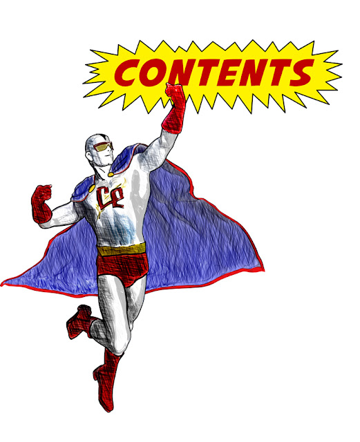
Captain Epistle flies into action...
In the magazine, there were boxes of text appearing in front of him with the details
about this issues art, comics and features.

As before,I stayed with Daz Studio because the figure was already set up properly, and I set about changing the pose and cape flourishes. Once I had a basic pose ready, I whipped out three or four renders, including a toon render. This time I checked the pose to make sure it fit with the text elements (which are not shown here), and once I confirmed that I would actually be able to use this one, I composited the various renders in Photoshop so I could adjust the blending modes and run individual layers in Akvis Sketch.

Once I had the base sketch layer, I would adjust it with the Levels tool, or even the threshold adjustment. Anything to make the faint strokes sharp (after all, this was for print, and distinct lines would work better).

Again, this is a nice start, but I don't think it's ready for production use, yet. I am getting there, and the inclusion of the gray toon render layer really helped add some definition to the final image. All in all, not a bad job for a quickie.


Monday, May 8, 2017

Sketchy Behavior, Part 7

I needed an image of this superhero (he's the mascot for the Collectors' Club Newsletter) to use on the table of contents, so I decided to revisit Akvis Sketch. There were two major reasons for this:


  1. The character was already set up for use in Daz Studio, and I didn't have time to transfer him to Poser 11.
  2. Creating the image in DS meant that i couldn't use the stark, noir render style I've been using on the recent images I've shared with you. 
Genesis base figure with a variety of shaping
morphs applied. Finished in Photoshop and Akvis Sketch.
As before, I decided to keep the original colors, but in this case, they came out so light I actually used a non-processed layer as an overlay to pump up the colors. All in all, this was a relatively successful attempt. I'm not 100% happy with it (I don't think it's ready for production work, yet, which is too bad because I really would like to use this style for an upcoming project). 

But, it was good enough for my needs... except for one thing. The final composition was wrong and it didn't fit the page. So, as you'll see next time, I had to do it again.

Saturday, May 6, 2017

Sketchy Behavior, part 6

3. Toned Lines + Wash
I really liked the close-up of the illustration from Wednesday, so I thought I'd post the larger versions of some of the other treatments I did for this character (whose name is Bobby, by the way, and yes, the sharp-eyed among you will probably recognize that this character is a thinner version of the guy studying from a while back).

Days Gone is a short project I'm working on. A few weeks ago I was up late, and just whipped out a short 8-page comic book story. I sketched it out by hand and am now going to use this as one of the characters in it.

The title, Days Gone, actually comes from two mini-comics I wrote and illustrated (by hand) in the late 80s and early 90s. While cleaning them up for inclusion in a future issue of Fanzine Flashback, I got the bug to create a new story in that series.

More on that at some future date.


Wednesday, May 3, 2017

Sketchy Behavior, Part 5

2. Sketchy + wash (or, in this case, actually a tone, but I'm calling it a wash)
When I saw Monday's post, I decided that you couldn't really make out all the detail in the Sketchy + Wash look. So, here it is, a lot bigger. 

I think this makes it clearer why I'm leaning toward this look. For a simple character, it looks really nice. But now I've got to expand and see how this works with backgrounds, which might just need a different but similar treatment.

And, by the way, not to toot my own horn, but as this came to be, I started getting a classic Al Williamson vibe from it. Definitely something I like!

If you're not familiar with the light, clean lines of Al's work, you really owe it to yourself to go take a look.

Monday, May 1, 2017

Sketchy Behavior, Part 4

Treatment in Costume: Poser 11 Pro & Manga Studio 5 EX

I was a little more thoughtful on this illustration, spending more time exploring the effects and seeing where they would take me. As before, you really should view these at the largest size possible to make out the details.

I posted this over at both Daz3D.com and Renderosity, and the general consensus came back again that the second one (Sketchy (+wash)) is the favorite. I definitely like it, but still have a few reservations about it because of the control issues, and the fact that I have to be more mindful about image size when I create it because of scaling issues – the lines can easily get too close together if I have to shrink it. The simple tone will automatically scale, thanks to the cool tone support built into Manga Studio.