Clean-up is, of course, going to take as much time as you are willing to invest. I tend to overdo things, to be honest, and I need to learn to let go of small details that don't matter (in this instance, I could have ignored the lacing on her top, but I thought it added a nice touch to have it). Since this is a character that will appear in a comic book story, I will probably need to do another pass at the textures to make sure I have something that will work repeatedly, and at the small sizes at which she will appear (she will be interacting with a human-sized character, and she's going to be about 8 inches tall, more or less).
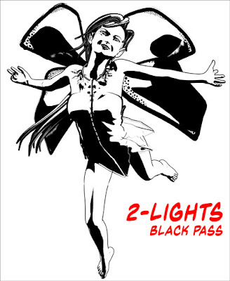 |
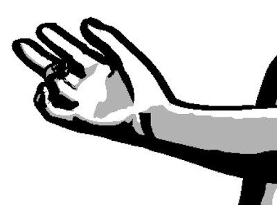
This is one of the base renders I used for my final image.
Note the shading on the wings and the tips of her hair. |
If you take a look at last week's blog post, you'll see the close-up image I did of her teeth and hair tips. At a small scale, like the image above, the hair tips are fine. But when blown up, they look clunky. This is an artifact of the geometric line process; hair tips are almost always flat and not sharp. That's something I always fix in the clean-up phase.
As I showed you last time, I added another render pass to create a grayscale, which will serve as the basis for the shading (or the shading itself, should you choose to forego the use of a tone). Here the base of the clean-up.
You can also see that I made a lot of artistic interpretations to her outfit, including changing the entire front so it closes completely at the bottom. I also did a lot to the wing shadows. They may not be exactly realistic, but that's not always required in a comic book look. This is more about drama.
Speaking of which – –
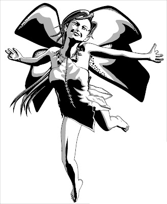 |
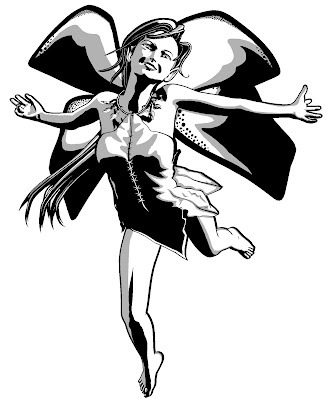
Significant Edits. note the wings, and my alterations
to her dress.
I also added a lot of custom work to the shadows. |
This looks nice, but the base outlines are all very uniform in width. There's nothing wrong with this, but I prefer to add a contour line (that is, a line that varies in thickness from thin to thick to thin again) around the body. This gives it a more organic, hand-drawn look. Although I can't automate this process entirely, I do have a quick workaround that will save me a lot of time.
In Manga Studio / Clip Studio (or Photoshop; I'm not sure if this works in GiMP), choose a layer that has everything on it that you want to select. I apologize for the screenshot below: I should have hidden the white background so you could see that the figure and wings are the only thing on the layer. The white background is a bottom layer. I'm always careful to keep the figure isolated from other elements and characters so that I can perform this step with ease.
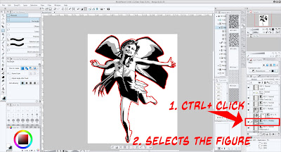 |
1 + 2. CTRL+Click to select everything on a layer
works in both Manga Studio and Photoshop.
(Red outline for emphasis only.) |
Step-by-Step
- Once you have decided which layer to use, click on it once to select it, then CTRL+Click the layer (i.e. hold down the CTRL button on your keyboard and click once on the layer).
- This will select everything on that layer. To indicate this, I have added a red outline to the image above for emphasis.
- Create a new layer (I usually put this behind the main figure, but for this tutorial I'm putting it on top of the layer stack). Also, if you are using MS/CS, make sure you set the layer Expression Color to Monochrome (as we discussed last time).
- Fill the selected area with solid black. You can do this from the EDIT menu, or by using the CTRL+Del key combo.
- Move the layer below the other layers, so it's behind all your other layers (except the white background, obviously.
- Then use the Move Layer and the arrow keys on your keyboard to move the layer a few pixels to the right, and then up a few pixels.
- You now have a contour line on the outside of your figure. You will need to zoom in and look for areas that will need additional editing. In the example image below, note how the line forms a nice thin-to-thick curve on her leg, but does not continue inside the image.
- On a layer above the contour line (I usually do it on my topmost layer), I quickly add a few details to carry the external contour line inside the illustration. This give it a finished look, and enhances that "hand-drawn" look I'm shooting for.
- a. Always check fingertips, toes and hair to see if there are any gaps.
b. I usually trim these areas and add a few pixels to fill in gaps.
c. Double-check the hair tips for duplicates, and clean as you like.
|
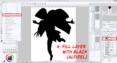 |
| 4. On a separate layer, fill the selected area with solid black. |
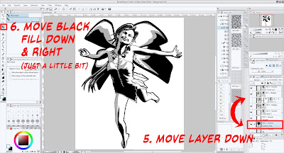 |
5 + 6. Move the layer down, then push the black filled area
down and the the right, just a few pixels. |
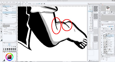 |
7. Zoom in on the figure, and you'll see areas
that require additional editing. |
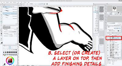 |
8. On a layer above the others, fill in the details needed to carry the contour
lines inside the image. I used red in this example so you can see what I'm talking about. |
One thing you will need to watch out for are odd gaps that appear and strong curves. This typically happens with fingertips and hair (although the hair edge is hidden by her wings, so in this case that's not an issue).
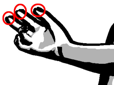 |
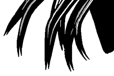
9a. Always check fingertips and hair to see if the contour line
has left any gaps, or made these areas too thick. |
In this instance, I actually think the hand looks too thick, so I trimmed it back a little to make her look a bit more dainty.
 |
| 9b. A few quick edits can fix up these problem areas. |
As I said, make sure you watch out for the hair, especially the tips. The contour line will give you double tips. Now, with some hairstyles, this actually looks nice. But in general, you're going to want to trip them out.
 |
9c. Always check the tips of the hair to see if you are getting duplicate lines.
In this case, I trimmed some and kept the others. It's a matter of personal preference. |
When all is said and done, you have a final image that could, if you want, go to print, if this is the look you're going for.
 |
The contour line added, hair tips and fingers cleaned up,
she is ready to fly into print... or is she? |
However, I usually add a shading tone or a blue wash, which I will cover in the next two steps.
NEXT TIE: Applying a Tone Layer


Filling the outline with black and using as an outline is a nice touch. Love this tutorial but I'll have to go back and read how you did the grey render as I'm not sure how you achieved it...
ReplyDeleteThe gray render was solid black when it came out of Poser. It only turned gray in Manga Studio when I set its opacity to 30%. (And I'm glad you're enjoying the tutorial).
Delete