Friday, November 1, 2024

Transfer InDesign files to Affinity Designer (via IDMarkz tools)

 As mentioned earlier, I am finally ditching Adobe software for buy-once software (no more subs for me, please). This is a very difficult decision, but I honestly cannot continue to use their products because of the expense and their very dodgy invasions of privacy (not gonna get into it here, but do a google or YouTube search and see what I mean).

Now, most image editing programs can open Photoshop files. So, switching software is not a problem.

The biggest problem I face is that I have a LOT of InDesign documents that I need to be able to access in other software.

Now, Viva Designer 11 does an amazing job of opening InDesign documents (at least the ones I've tested so far). The problem is, I would need the Commercial Edition of their software and that runs $400. That's a bit pricey, but I'd spend the money if it did the job.


Looking at MarkzWare Tools

Another option is a dedicated conversion software created by MarkzWare. They make a lot of conversion tools, but there are some issues:

  • The standalone software only runs on Apple computers. I don't own a Mac.
  • They have a no-installation web app, but it is subscription based and very limiting:
    • $39/mo for 10 docs or 100 pages
    • $79/mo for 50 docs or 500 pages
    • $119/mo for 100 docs or 1,000 pages
    • $250/mo for 250 docs or $2,500 pages
  • Although they have yearly plans, those are even pricier.
Based on my needs, I would probably need the 1,000 page plan, and then I would need to dedicate enough of my time to get the most out of it so I would be finished in one month.

But, if that's the case, why not just resubscribe to Adobe Creative Cloud for $23/mo for InDesign only and do my conversions over a month or two?

I also have no way to test this cloud-based service will actually get the job done.

This bears further analysis, but I'm leaning against this option.

Thursday, October 31, 2024

Step-by-Step Transfer InDesign files to Affinity Designer (via Viva Designer 10)

For the short term, I'm focusing on using Viva Designer 10 to convert my old .indd files to .idml so that I will be able to access them in Affinity Publisher.

Here's the step-by-step instructions on how to do it:

  1. Go to this page and download Viva Designer 10 (click on the button at the top of the page to switch from Viva 11 to Viva 10): https://viva.systems/service/downloads/
  2. Download the FULL version (not free).
  3. Install software.
  4. Open software: You will be told how many days you have left in your trial
  5. To open the InDesign file (that ends in either .indd or .indt), you must either:
    1. Drag-and-drop the file into the open software to open it; or
    2. Select File > Open and then modify the doc type to "All Readable Documents."
  6. The InDesign file will open.
  7. Check it out to confirm that it looks right (in my tests, I had to relink images and install some fonts). 
  8. Then you go to File > Export > Documents...
    1. This will give you the option to export the file as an IDML file. This stands for INDesign Markup Language. This is a format that other programs, including Affinity Publisher, can open.
    2. Export the file.
  9. Open the file in Affinity Publisher.
You're good to go!

NOTE: I am suggesting you use the older version of Viva Designer because it actually worked for me. When I tried Viva Designer 11, it did not work.

And if anyone is wondering, here is my current computer configuration:

Lenovo Legion Pro 7 16IRX9H Laptop | Windows 11 Professional | 32GB RAM |  14th Gen Intel® Core™ i9-14900HX | Nvidia RTX 4090 Laptop GPU 16GB 9728 CUDA Cores

Wednesday, October 30, 2024

Transfer InDesign files to Affinity Designer (via Viva Designer and IMDL)

 As I stated recently, I'm dumping the subscription-based Adobe Creative Cloud suite (Photoshop, InDesign, Illustrator) for either free or pay-once software. 

The Affinity 2 software (which I picked up on sale for $30, deeply discounted from its regular price of $165) is my top candidate. They are solid, mature tools that can be used by a professional without difficulty. Additionally, they can use most Photoshop and Illustrator brushes. I also like how integrated they are: You can swap back and forth between the various tools without having to open/close/export the document. It's very easy to get quick results with Affinity by Serif Software.

BTW, I suspect they will be releasing vers 3 of their software any day now. My $30 purchase will not include version 3, but they offer pretty good discounts to upgrade between versions (usually 30% - 50%).

However...

There is one problem with ditching InDesign, and that is I have a LOT of projects created with InDesign and I cannot afford to lose access to them. And Affinity Publisher does NOT read native InDesign files, at least not directly.

A bit of techno babble:
  • InDesign's native file format has the extension .indd (INDesign Document). 
  • INDD files are always set to the current version of the software, which means that if I create a doc using Creative Cloud 3 and send it to you, but you have Creative Cloud 2, then you cannot open the document.
  • In order to create backwards compatibility, InDesign can export its documents into this format (which is a form of XML): .idml (InDesign Markup Language). This writes a complex version of the document that can be interpreted by other programs, including Affinity Publisher.
The problem is, of course, how do I get the IDML file? I have the source file (INDD), but without Adobe InDesign I cannot export the file from one format to the other.


Possible Solutions

I did some research on how to do this and came across some possible ways to get away from paying for Adobe Creative Suite for a month, doing a lot of file conversions and then canceling my subscription. If all else fails, I could always do that.

One approach I discovered was that I could possibly use Viva Publisher to open the INDD file and then export it as IDML. I learned of this in this discussion at the Adobe forums: Link to discussion.


I Decided to Test this Approach 

Using Viva Designer 11, I was able to OPEN the INDD file. Viva did a pretty darn good job of interpreting the file, too. The doc looked exactly like it did in InDesign. Now, this was a moderately complex document. It had some defined stiyles, but no tables or TOCs.

Viva Designer 11 was not able to export it to IDML, however. The option was available via File > Export > Documents... The IDML option was readily available, but it no matter what I tried, the program crashed during the export (typically, it crashed about 1/3 though the process). I triple checked the document for missing fonts or images, but the source seemed rock solid, so I'm not sure what's going on.

I had better luck with Viva Designer 10. I was able to export the file, however there were LOTS of errors. The text seemed to be there, but the layout was messed up (items moved a bit and things like that). Also, the text frame linking was a complete disaster. 

UPDATE (11-03-2024): The errors in Viva 10 are not as bad as I thought. There are still some text overflow issues, but those are easy enough to fix. I think this is a workable solution. Go here for step-by-step instructions.

I'm going to continue experimenting to see if I can either stabilize Viva Designer 10 export, or get Viva Designer 11 to work.

If not, then I may have to go back to paying for InDesign for a single month and rushing through all the files.

There is also another option via IDMarkz tools.

Monday, October 28, 2024

Searching for a replacement to the Adobe Creative Suite

 I'm abandoning the Adobe Creative Suite because it's too expensive.

For me, this is a DRAMATIC change, as I've been using Photoshop professionally since version 3 was released in the early 1990s. This is also a RISKY change because I have a lot of completed projects that have been completed in Adobe InDesign, including books and other professional documents.

My main goal with this switch is to get away from subscription-based software. I want to buy it and use it for as long as I want. Right now, I'm still evaluating which software I will use as a replacement. The top contenders are:

  • The Affinity Creative Suite:
    • Affinity Photo (Photoshop replacement)
    • Affinity Designer (Illustrator replacement)
    • Affinity Publisher (InDesign replacement)
  • Viva Publisher 11 (InDesign replacement)
  • GIMP online (Photoshop replacement)

Functionality:

I have dabbled with the Affinity Suite off and on for more than a year or two. It's pretty good stuff. Each program has most of the basic features of the Adobe software with which it competes. And the software itself seems pretty stable; although I have not yet used it to create any large documents, what I have done with it seems to function quickly without crashes or serious issues.

I can say the same for GIMP. It's an oldie-but-a-goodie and I have had to use it professionally for about a year to make minor graphic edits for various work projects at a worksite that didn't have Photoshop available. In that instance, I was able to use an FREE online version of GIMP to resize, crop and make minor fixes to images.

Viva Publisher 11 is the software with which I have the lease experience. I just started testing it this week and, honestly, it seems to be a contender because it can actually open InDesign files, and seems to do a pretty darn good job of it, too.


Cost:

The Affinity programs are sold separately and each is currently on version 2. They cost about $70 per app, with a "Universal License" that lets you buy all three for $165. However, these programs are often DEEPLY DISCOUNTED, especially before a new release comes out. I just paid $30 for a lifetime universal license to version 2 of the Affinity Suite. Based on this discount, I strongly suspect they will be rolling out version 3 during the week of Black Friday. I suspect that they'll offer a discount to upgrade when they roll out the newer version (they have done this in the past).

Viva Designer has a free version, but if I were going to use it I would need to Commercial Edition and, unfortunately, that runs about $400!


Conclusion:

I do not want to pay $400 for a single app, but since it is the only one that natively opens an InDesign file, it may be my best option. Before I pony up the cash, though, I am going to look for ways to translate the InDesign files to Affinity via an intermediary step: Writing the INDD file extension to IDML.

More on this to come.

Wednesday, October 9, 2024

Renderosity – How to update your Forum Signature

 Now that I have a new laptop, I needed to update the specs in the online forums where I post my 3D art. This isn't a mandatory thing, mind you, it's just that every single time I post a tech question some bozo asks for the computer's specs. Sometimes this is important info, but most of the time it's about the software and the hardware specs make no difference at all. Rather than fuss about it, I just include the info in my signatures at Daz3D.com and Renderosity.com. 

However, since I do this so infrequently, I usually have to ask where/how to make these updates. So, to jog my own memory, here's a quick tutorial I whipped up for the Renderosity site.

After you log into your account, follow these steps:


Upgrading my System to Lenovo Legion 7 Pro

 So, on top of everything else that's happened (my house was damaged in Hurricane Beryl and – as of today – I have not lived at home for 3 months), my laptop died on Sat., Aug. 24, 2024). I had an Alienware R17 that I had purchased in 2016 and had upgraded both the RAM, the storage and the video card (the last was possible because the Alienware Graphics Adapter was a separate enclosure with a dedicated power supply that allowed the laptop to use an external graphics card). Well, the poor thing had been acting a little buggy for about a year and I was planning to buy a new on at the end of this year... but alas, 'twas not to be.

So, I bought a new laptop on Amazon:

Dell Alienware M16 R2 Gaming AI PC Laptop 16" QHD 240Hz (100% sRGB, 3ms) Intel 16-Core Ultra 7 155H 64GB RAM 4TB SSD GeForce RTX 4070 8GB Graphic: $2,100 (Link)

It arrived DOA with an error message that there was something wrong with the memory; I sent it back for a refund because there were no replacements available.

I replaced it with this, which is a slightly newer version of the previous laptop:

M16 R2 (2024) AI Gaming Laptop (16" 240Hz QHD+ 2K Display, Intel Core Ultra 7 155H, 64GB RAM, 4TB SSD, NVIDIA GeForce RTX 4070 8GB) RGB Backlit Keyboard, FHD IR Camera, WiFi 7, Win 11 Home: $2,150 (Link)

This worked great. For about a month. I had a blue screen of death about three weeks in; I thought it might be a corrupted driver and I restored to a previous install point and did some mumbo-jumbo and fixed the problem. "Eh, these things happen," I thought. It died a week later. I sent it back for a refund and decided I wasn't going to use Alienware laptops any more. 

 So, I switched to the ASUS brand and I replaced it with this:

ASUS TUF Gaming Laptop with Microsoft Office Lifetime License, 15.6" 144Hz FHD IPS Display, Intel 13th i7-13620H, NVIDIA GeForce RTX 4070, 64GB DDR5, 4TB SSD, Backlit Keyboard, Win11 Pro: $1,800 (Link)

 This was dodgy the moment I opened the box. The security tape was open, there was no gaming mouse (which was mentioned one place on the page) and the flimsy monitor stand was loose in the outer mailing box. I opened it and examined it. All looked okay... until I took a look at the hard drive. It showed there was only a 210GB drive installed! I checked the disk properties and, although there was a 4TB SSD in it, it was configured with a 3.6TB recovery partition. I think this was a used machine and they were trying to pass it off as new; I sent it back.

I was through with Amazon. In four weeks I had been through 3 laptops. I decided it was time to go to a local store and buy it there, so off to Micro Center I went. They don't have the specs to my particular model online at Micro Center, so here's what I got:

Legion Pro 7 16IRX9H, 14th Gen Intel® Core™ i9-14900HX, AI-Powered Gaming PC, NVIDIA® GeForce RTX™ 4090, 32GB DDR5-5600, 2x SO-DIMM, 2x 1TB M.2 PCIe® NVMe® SSD. Cost more than $2,500 (Link)

I was happy with the 2 SSD slots, so I upgraded the meager 2TB to 8TB. I should have paid them to put it in, but I have done it in the past and it was an easy job. Not this time: Taking the bottom panel off was a pain (not hard, but since the entire thing had to come off (instead of a simple panel like my old Alienware R17). But I got it installed and FINALLY things seem to be working.

Now I just need to reinstall a ton of software.

--------------

Note: I always buy a gaming laptop because they have better graphics cards and are configured to work well for 3D content creation and rendering. Also, please note that this is the Legion Pro 7. It is NOT the Pro 7i, which is a different configuration.

Friday, August 16, 2024

How the Poser and Renderosity impacted my creative life

The sponsors of the Renderosity contest I recently won (see previous post) asked me to write up something about how Renderosity impacted my creative life. Here's what I sent them:

-------------------

I was asked to think about how the Poser software and Renderosity Community has impacted me creatively. That’s a tall order because, as cliché as it might sound, Poser has changed my life – my artistic life, that is. I was always interested in creating line art that looked hand drawn, and to be honest, although I can draw tolerably well with traditional tools, it’s just not my strength. In other words, my skills have always fallen short of my goals, which is why I turned to various software tools. Looking back at my Renderosity gallery, I can track my progress for 20+ years. I see that I dabbled with Poser 3, but really dove into it with the release of Poser 4 with the Pro Pack. Looking back at my gallery, I see my first image was an attempt to create a hand-drawn sketch of a cowboy; this was back in July 2003. Over the next few years, I used various techniques – like tracing renders in Photoshop, using PS actions, etc. – but none of them really succeeded in delivering a consistent result.

That didn’t stop me, though, as I continued to plod along creating logos and doing artwork for some Role Playing Games, but I was never really happy and I was limited to creating single images instead of sequential art (in other words, comics). During this time, it was positive feedback and interactions with other members of the Renderosity Community that helped fuel my creativity and let me know when I was on the right track and when I was going astray. It was like having my own private art commune at my beck and call. I made some great friends online and found several artists who, like me, were still exploring how shift the inherently detached nature of digital tools and humanize it by creating art.

Time moved on and, although I kept buying the latest versions of Photoshop up through version 10 (I had vers. 11, but I was fortunate enough to have won it in a contest so I didn’t pay for it), it was falling further behind in usability and I had almost completely transitioned to using Daz Studio. I was very close to abandoning Poser completely, and then something momentous happened.

There are very few single incidents that I can look back at and say, "This changed the way I work or think." There are a few teachers and classes in college, one particular issue of a fanzine (I was editing a fanzine and I abruptly changed from just tossing it together to being mindful of layout and design; it went from looking like a high school kid did it to looking like a professional magazine).

Attending the Anomaly Webcast was one of those “life-changing” events. It was a broadcast of a discussion/demo by professional comic book creators who used Poser as part of their daily workflow. I was fortunate to attend it live on Jan. 30, 2016 and was blown away by what I saw what they were doing with Poser 11’s “Live Comic Book Preview.”

There it was on the screen: a simple, repeatable way to produce consistent line art.

After this event, I completely changed the way I approached making comics and using digital tools to create line art. I found a combination of software and a methodology for using Poser and Clip Studio Paint that energized me and my creative endeavors. And, at the risk of blowing my own horn, other people at Renderosity noticed a change in my work and began to react enthusiastically on what I was doing. And I’ve apparently stunned a lot of people by revealing that my work is entirely 3D based, including several people at Renderosity who know Poser and know what it’s capable of. Not that I ever start out to pull the wool over anyone’s eyes, it’s still a thrill to know that my work is finally approaching the level of consistency and quality that it really does look hand drawn.

I’m currently working on comic book projects that would not be possible without Poser, and without its incredible depth of available content, both already purchased and that’s available in the Poser Marketplace.

And that raises another benefit of Poser: in an age where almost everything has a pre-set shelf life of obsolescence built into it, I am still able to draw on my library of Renderosity-purchased content that dates back to 2004! That’s two decades of props (and, to be honest, it’s mostly the older props that still work well; the ancient figures are often clunky looking) and other content that I can pull from to populate scenes and make artwork that looks fresh and professional.

My entire workflow for line art is now rooted firmly in using Poser and Clip Studio Paint: the work I’m doing isn’t possible in Daz Studio or any other commercial-grade 3D software. So, thank you to comic book artist Brian Haberlin for taking the time to share his secrets, and a particular thank you to everyone in the Poser Community. I would be a much sadder and unfulfilled artist without the Poser software, the incredibly deep library of content which has been lovingly created over the ensuing decades and the knowledgeable and accepting community of artists at Renderosity. Without all of you, my artistic dreams would remain in my head and unrealized.

Thank you all!

Wednesday, July 10, 2024

Renderosity Contest Winner

I entered three images in the Renderosity Summer Carnival Contest for 2024. The challenge was described as: 

Theme: Pretzel People

Welcome to Pretzel People. In this game challenge, create the craziest, unique, and most creative twisted poses you can come up with. You may submit as many entries as you like, and discuss techniques with each other. Staff will pick the winner at the end of the carnival. You may use pre-made products. No AI.

So, I whipped up three submissions and – huzzah! – I was one of two people to win 4th place. The prize was 5 items from RPublishing. By selecting some bundles, including dinosaurs and military equipment and La Femme 2.0 Pro, that amounted to a bit more than $300 in prizes. The coolest thing is, those are some items that I can definitely use in future projects.

The winning image, by the way, is the battle scene that's not in full (comic book) color.

-----------

As per usual, my workflow includes making two renders in Power 13 and compositing them in Clip Studio Paint. Figures this time include Victoria 4 and Herr Cadaver by the incomparable creator, Cybertenko. The color version was created using  the comic book coloring system from Retro Supply Company.

© 2024 Mike Mitchell
This is the prize winner.

© 2024 Mike Mitchell

© 2024 Mike Mitchell


Tuesday, July 2, 2024

Renderosity - Staff Picks + Poser Pulse

 The other day someone asked me how often my 3D illustration work had been selected for recognition by Renderosity -- and I wasn't sure. There is a way to search this blog for the proper keywords, but to save time I decided to create a running list on this page. For this list, I'm just going to make a list with a link to the blog post and to the original art as it appears on the Renderosity site (in other words, I won't repost the picture here). Also, for ease of maintenance, I'm going to add the newest items to the top of the list.

Sunday, March 24, 2024

Archie Comics - Key Issues & Controversial Covers

There are a handful of covers published over the years that have become famous for innuendo or highly suggestive text (the most famous being Betty and Me #16 where Archie said he had to "beat off" three other guys). 

First of all, even though these are often reference as having a "Controversial Cover," I must wonder if that is the correct label for these. Perhaps "Innuendo Cover" would be better.?

Here's a few of the KEY COMICS:


Archie #271 (June 1978)
Major Key: Controversial "Pearl Necklace" Cover
Even a low-grade copy of this book goes for $50-$70, and high grades go for more.
This is probably the second-most infamous cover from Archie comics (the first being the above-mentioned Betty and Me #16).
Link: https://www.comics.org/issue/105852/


Archie #511 (Aug 2001)
Major Key" Controversial "In the pink" cover
Probably the 3rd most-famous innuendo cover.
Link: https://www.comics.org/issue/238442/


Archie Comics #48 (Jan-Feb 1951)
Minor Key: Controversial Cover
"Betty do you wanna spoon?"
Link: https://www.comics.org/issue/8645/


Archie Comics #55 (March-April 1952)
Minor Key: Controversial Cover
Mr. Lodge asks an innuendo question: "Did Archie get there yet?"
Link: https://www.comics.org/issue/105636/


Archie Comics #78 (Jan-Feb 1956)
Minor Key: Controversial Cover
Archie is talking to betty and says he wants to "feel the clutch."
Not as famous as the others, but it still gets higher prices than surrounding issues.
Link: https://www.comics.org/issue/105659/


Archie... Archie Andrews Where Are You? Comics Digest Magazine #111 (Sept 1997)
Minor Key: Controversial Cover
Betty tells Archie to "Watch out for a big hole around here."
Link: https://www.comics.org/issue/293921/


Betty #8 (Sept1993)
Major Key: Famous Bikini Cover
Not as famous as some of the other covers, but this one brings a premium price in the hundreds of dollars.
Link: https://www.comics.org/issue/213444/


Betty and Me #37 (Sept 1971)
Minor Key: Controversial Cover
Betty says, "Yes, Archie -- You're rubbing me the right way."
Link: https://www.comics.org/issue/221897/


Betty and Me #40 (Feb 1971)
Major Key: Controversial Story
In this issue, Archie and Betty fall in a lake and are forced to rent a cabin together; they are soaking wet so Archie orders Betty to "Take your clothes off!" They spend the night innocently wrapped in towels, but their parents are naturally furious. FAMOUS story and has only been reprinted once.
Link: https://www.comics.org/issue/221900/


Betty and Me #136 (Nov 1983)
Minor Key: Controversial Cover
Has some notoriety because Betty is in her underwear standing on scale. Some readers were ticked off because it was body shaming her, others thought it was risque for showing her in her underwear on the cover.
Link: https://www.comics.org/issue/221996/


Everything's Archie #22 (Oct 1972)
Minor Key: Controversial Cover
Joke about "swinging."
Link: https://www.comics.org/issue/221897/


There are more, but I'll submit them at another time.

Friday, October 6, 2023

Graveyard Shift 04 - Lauren's Car

Visual arts convey a LOT of info via clothing and props. Off the top of my head, I can think of a few things that Lauren's clothing and vehicle can tell us:
  • She wears scrubs, so she's some kind of medical professional from the latter part of the 20th century to present.
    • If she were a nurse in the 1940s or 50s, she would be wearing one of those sexy nurse costumes.
    • If she were dressed like a nun that would put her sometime after Florence Nightingale revolutionized nursing (mid 1800s) to early 1900s.
    • Also, I put her in tennis shoes ("trainers" for you blokes across the pond), that shows she's on her feet all day and values comfort and utility.
  • She drives a car, so:
    • We know that she's not in the wild west (or some other time period).
    • She's not riding in a Model-T, so that moves the timeline up into the 20th century.
    • She's not riding the bus, so she's at least got enough money for a car.
      • This also indicates that she values her privacy, or at least works someplace that doesn't have bus routes.

But what KIND of car should she drive?

What you drive says a LOT about who you are, or at least the "who" you are trying to present to the world. I have a buddy who loves driving a Dodge Charger (I think he got hooked when he watched The Dukes of Hazzard as a kid). But he's also had a Dodge pick-up and a Jeep. And those suit his personality. I, on the other hand, prefer a non-flashy sedan that blends into the crowd. As a young man, I had too many speeding tickets to ever want to draw attention to myself these days.


But let's get back to our lady vampiress, shall we?

I browsed through my runtime directories to find out what I already had on hand. I had a lot of sports cars and racecars. I had a cool 1961 Corvette convertible, but that's a vintage car that's got a hefty price tag. Would a humble nurse be tooling around in a hot number like that? Especially one who wants to fly under the radar?

That got me thinking about cars that could be described as "basic," "reliable" or "unassuming." I thought, maybe an Audie or something like that. Or maybe an old sedan or station wagon. Browsing my own stuff, and then checking out Daz3D and Renderosity didn't really find anything that leapt out at me. Sure, there were lots of nice cars, but none of them said "old reliable" to me by having a boxy, almost clunky shape.

Looking deeper, I found something that clicked, and it was neither boxy nor clunky: A VW Bug.


© 2023 Mike Mitchell
First render with a VW: it was not used.


The first one I found was a nice, modern bug with a sunroof. This was okay, but something just wasn't right about it. Even though the sun roof was great for me because it would make lighting her face a lot easier, it seemed too expensive and nice for a struggling vampire.

So I dug deeper and found one from 1969, and it was perfect! Rex thought so, too. Here's what he said when I showed him the rough draft of the splash page with her driving to Victor's house:

I love that you placed her in a VW bug.
It has just the right amount of retro to fit a vampiress-nurse.


© 2023 Mike Mitchell


The above is basically the first panel of the story, although I am going to go back and add a few shadows on her face.


Saturday, September 30, 2023

Graveyard Shift 03 - Character Design Lauren Transformed

 There's no way to progress this series of blog posts without dropping some serious spoilers. Since this is a horror comic I don't think you'll be very surprised to find out that our dear Lauren is a vampire who hides her existence by working as a night nurse for dying people; she drinks a little bit of their blood each night. When they die, who's going to do an autopsy? After all, her patients are dying.

In Rex's story there isn't really a transformation from human to vampire; he handles that subtly.

Of course, this is a comic book, and in a visual medium like this (and with the tropes of trying to emulate the old Warren horror magazines) "subtle" just won't do. So, I'm going to modify Rex's original description of the confrontation scene (below) and have her do a full-on "vamp-out" scene.

Original text by Rex Munsee:

Loren smiled and began to rise up from her chair. Victor reached into his shirt and held the crucifix out in front of him. Instantly, Loren turned her head and moved against the wall. He heard a cry of pain and a guttural snarl.

“Stay back! I don’t care that you’re a vampire! 1 need you to listen to me! I want to make a bargain.”

In a hoarse voice she croaked. “Put it away.”

Victor lowered the crucifix to his side.

Her crimson eyes glared at him through her tangled mane of hair. 

Here's my take on what she'll look like with full frontal fangs.

© 2023 Mike Mitchell

If you compare this to the previous character design, you'll notice I did more than just add a vampy face. I changed her entire physique by making her a lot thinner and exaggerated her poses. The hair still clearly needs work, by the way. I'm still playing around with its color, as I'm still concerned about how I'm going to standardize it against dark backgrounds. (Yeah, I did a few tests already, but they're a waste of time until I really settle on the look and feel of the interior scenes in the house.)

◄ Back to Graveyard Shift main page

Thursday, August 31, 2023

Graveyard Shift 02 - Character Design Lauren Normal

 Rex's original story is brisk in its pacing and doesn't dwell a lot on detailed descriptions. That was perfect for my needs, as I wanted to have a lot of freedom in designing the characters and setting. One thing I did have to go on was the cover illustration he created for the story. As you can see below, it's kind of rough and he doesn't exactly follow his own descriptive text (illustration shows "Loren" as a blonde but the text says she has dark hair).

© 2023 Rex Munsee

Here's the text from the story:

“Evening, Loren,” he smiled at the tall woman, wrapped in a long coat and carrying a large handbag. “You’re right on time.”

“Hi, Victor.” He watched as she set her handbag down, shrugged out of her coat, and picked up her bag. She handed Victor the coat and he folded it over the back of his recliner. As she was smoothing out the wrinkles on her solid green scrubs, he gazed at her coal-black hair which contrasted with her pale skin, which his deceased mother would have said was a “peaches and cream complexion.”


Loren vs Lauren

If you read headlines, then you'll have noticed that I changed the spelling of the lady's name. Although "Loren" is an acceptable spelling of the name, in my experience that spelling is usually for males. "Lauren" is more often for females (and that includes the two to which I am relate). I discussed this with Rex and he was okay with the change.

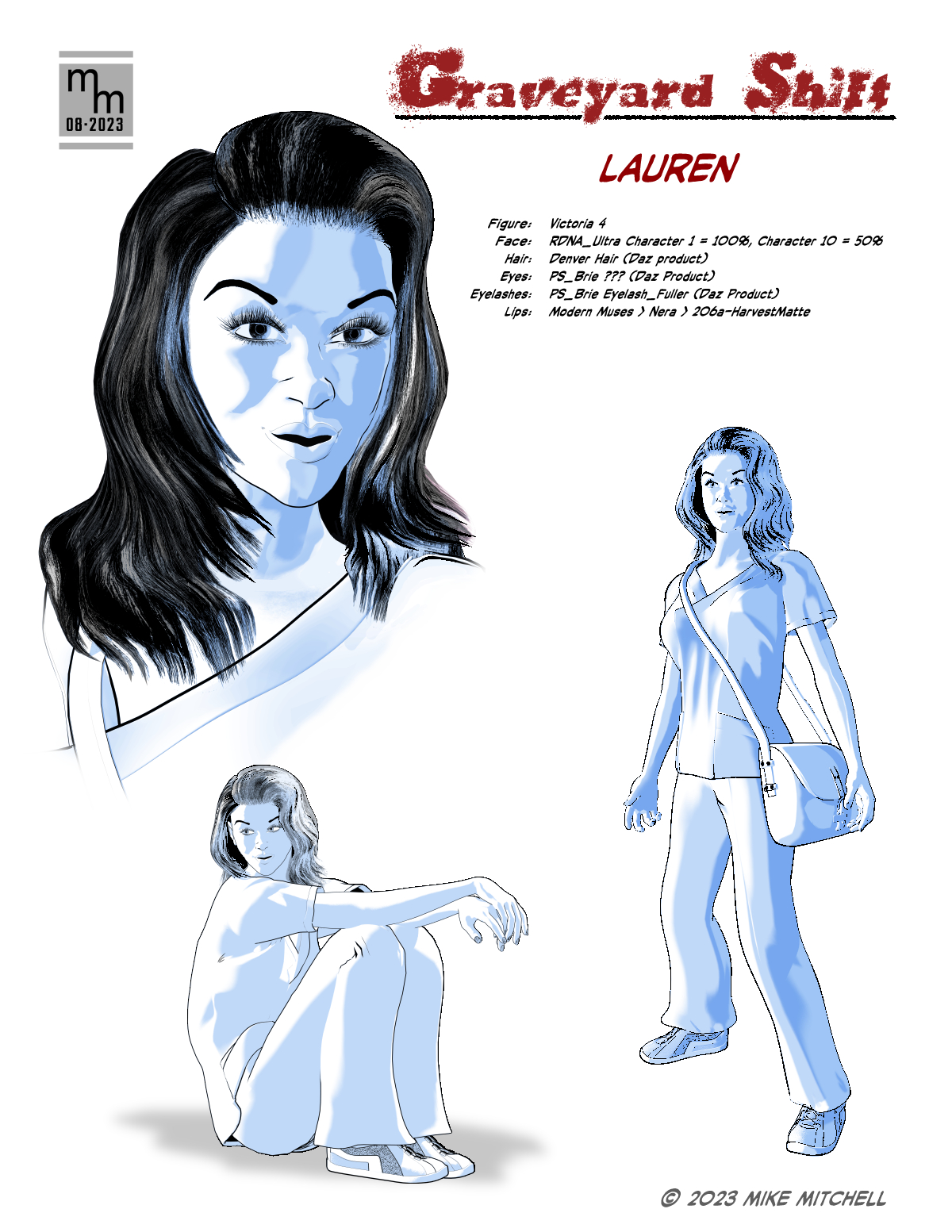
So, spelling settled, I started work on the character sheet. I don't always do character sheets for my own work, but as I'm working with a collaborator, I decided it was something I should do this time around. As it turned out, it also provided me with space to make notes about the various assets and dial settings I used to refine her look.


As you can see, I'm still playing around with the hair color – I'm not sure how light or dark it will be. I'll need to test it with the dark backgrounds called for in the script before I will make that decision. After this, I have three more character designs to whip up.

As you can see in the notes, the main figure is Victoria 4. I've documented the various dial and prop settings on the sheet (I didn't share these with the writer, as this would only confuse him because he doesn't know anything about Poser or 3D art). My standard workflow is in play: I create 2-to-3 renders in Poser 13 and transfer them to Clip Studio Paint for compositing, setting the tones and clean-up.

◄ Back to Graveyard Shift main page

Monday, August 28, 2023

Graveyard Shift 01

 I've started work on adapting a short story into comic format. The exercise is really just so I can take a stab at doing something that I have not written myself. I also think it would be fun to go back and do some public domain horror stories and try to nail down the style of the old Warren Magazines like EERIE, CREEPY or VAMPIRELLA.

I am starting with a short story titled "Graveyard Shift" by Rex Munsee. He's a member of the Snicker Snack Amateur Press Association (APA), which is a type of fanzine. Rex wrote the story a few issues ago, I read it and decided it would be fun to adapt it. So I wrote to him and he agreed to let me do his story, and the results will be printed in Snicker Snack and the Collectors' Club Newsletter.

The story has simple modeling and set requirements, which is a major criteria for my selection process:

  • Few character designs (there are 4)
  • Limited locations / sets:
    • Exterior:
      • Country road a night with a small car driving on it
      • Country road leads to a nice house in the woods
      • Front of the house as she enters
    • Interior:
      • Living room
      • Bedroom
      • Possibly another part of the house, like a hallway or kitchen area
    • Props (key items):
      • Reclining chair (i.e. La-Z-Boy)
      • Lamp, side table, misc. items
      • Hospital-type bed
      • Hypodermic & medical equipment
      • Set dressings (pictures, furniture, etc.)
      • Video/security camera
      • Video monitor
      • Antique mirror
If you're familiar with my workflow, then you know I start out in Poser (a 3D app) and then render line art which is composited and cleaned up in Clip Studio Paint. This makes the first step is to collect the 3D assets I need, and fortunately I already had most of the items above. The exterior of the country road has proved to be the most problematic because I didn't have exactly the sort of hilly environment I imagined when I started to block out the story and make thumbnails.

As for the character design, we'll cover that next time!

Other Posts in this Series

Thursday, August 24, 2023

Captain America illustration selected by Renderosity

 Awesome news! Another illustration I created was selected by the Renderosity moderators to be included in their Poser Pulse Gallery for August. I think this may have replaced their "Staff picks of the Week" feature.

As you can see, this illustration uses my standard workflow of creating the base renders in Poser (in this case, Poser 13) and then combining them in Clip Studio Paint (in this case, version 3.0). In this case, I also added retro comic book colors with the True Grit comic book color tools.

© 2023 Mike Mitchell
Captain America and Red Skull are TM by Marvel Comics

A link to the image – and my notes on its creation – can be found on Renderosity.

A link to the Poser Pulse gallery can be found here.


Friday, January 20, 2023

Retro Coloring 06: Skin Color

As noted previously, coloring comics was a two-step process performed by two different people.. The colorist indicated which colors should be used, but the separator did the actual, physical task of stripping the color separations. This is why there were often errors in the colors printed in old comics; either the colorist made an error, or (more likely) the person doing the separations made an error do to being in a hurry or simple inexperience.

Experience is also something that mattered, a lot. There was a lot of repetition in coloring comics, and as such both colorist and separator tended to skip over common things that were done over and over again. This becomes apparent when looking at old color guides: One thing that is often skipped is the code for Caucasian skin tones. This was a very standard code so the colorist really didn't need to specify it since the separators already knew what it was.

That's all good and fine, except for poor ole me living in the 21 Century! 

I actually had a little trouble confirming that these are the standard skin tones used by Marvel, DC, Archie and Harvey. Okay, it wasn't like I had to delve into books of forgotten lore, but it did take a few days to find and confirm through multiple sources that these are, in fact, the correct codes for standard skin tones from the 1940s - 80s:

  • White People: Y2R2
  • Conan's Skin (redder skin): Y3R3
  • Black People: YR3B2
  • Hulk's Green Skin: YB2

Tuesday, December 13, 2022

Retro Coloring 05: Champions #4

 Anyone who knows me is aware that I have a big soft spot in my heart for Archie comics, so it shouldn't be a surprise that the first color guides I bought were for Archie Comics. I think I have 6 so far, and 5 of those are for Archie titles – some old and two from the late 1990s, and those use the "expanded color palette" that has more variations of the CMY colors, and brings in screens of black, as well. At some point in the future I'll talk more about those colors, but for now I'm going to stick to the classic look of 64-colors (if you don't know what I'm talking about, go back to part one of this series, or read the article in Marvel Age #13: "How to Color Comics the Marvel Way").

Editorial Input on Color Guides

But back to Archie. I love the company's work and I find their simple color guides as a PERFECT starting point for my own efforts (you'll see my own that in an upcoming article when I actually use new digital tools to attempt recreating the original colors of an Archie comic from the 1960s). But, the colors are simple.

Superhero and horror comics had much more sophisticated coloring, and therefore more editorial input. As I said last time, superhero comic color guides are more expensive, typically running about $50 - $100 per page (that's not to say you can't find a few bargains out there, but they are more infrequent). A little hunting got me an interesting find: an 8-page back-up story in the Marvel Comic, The Champions #4 (March 1976), colored by Janice Cohen for about $83.

Unlike the Archie color guides I have shared with you, this color guide is on standard 8.5 x 11 inch letter size copies, which provides a nice big work area for notes and guidance. Unfortunately, I'm not sure who wrote them: Writer, Artist, Editor? If I ever find out I'll update this article.

Take a look at the editorial comments for a behind-the-scenes look at the production of this story (incidentally, I have not yet obtained this comic so I cannot provide you with a scan of it in its printed form; I'll also update that when I can).

Color Guide for Champions #4 (March 1976)


On this page, notice now her skin tones are marked as Y4R3B3.
The use of the number 4 is very surprising because that is part of the "expanded" color palette that (even without adding black (as I'll discuss in a future article) more than doubles the color options from 64 to 125. As noted in the previous article, the letter/number combo represents a specific dot intensity (i.e., fill percentage). In this formula, 4=70%, making her skin tone:


Y4Yellow70%
R3Red [magenta]50%
B3Blue [cyan]50%
This will print as:

The normal skin tone for a black character would be: YR3B2. I'm going to go into this a lot more next time, as I dive into the very important (and illusive) topic of Skin Color.

But on this page (and others) her skin tone is crossed out with pencil marks.
Also, take a look at how someone wrote "OK" on the bed color and blue background in the last panel.


Story and art © 1976 Marvel Comics Group

NOTE: This color guide is presented for the scholarly purpose of discussing how comics were colored in the past. Its fair-use inclusion here recognizes that the underlying story and artwork are the copyrighted property of Marvel Comics.

Next up: Retro Coloring 06: Skin Color

Tuesday, December 6, 2022

Retro Coloring 04: Reggie and Me #25 Color Guide, pt 2

Here's another story from Reggie and Me #25 (Aug 1967). I picked up these 8 pages (2 non-story, and missing the first page) for about $80. Like the other story, this 

I don't have the complete guide for this next story, so I'm including the first page as it was printed, which includes a coloring mistake that is rather revealing! Look at Ronnie's blouse in the first panel and note that incredible crop top she's sporting! There's no way that was kosher at school in 1967! And, as you can see in panel 2, her modesty (and The Bee's dress code) is restored!

Credits:

  • Script: Frank Doyle
  • Pencils: Harry Lucey
  • Inks: Marty Epp
  • Colors: (attributed to) Barry Grossman
  • Letters: Bill Yoshida


On the following pages, I've placed the guide on the left and the published page on the right. I wanted to show you the editorial changes that were made after Barry Grossman submitted his work. Note on page one how the editor indicated that the lower-right box should be red, not yellow. This is the sort of thing that turns up quite a bit in the next color guide I'm going to share with you.


Want to read the whole printed comic?
Check it out here: https://viewcomics.me/reggie-and-me-1966/issue-25


NOTE: This color guide is presented for the scholarly purpose of discussing how comics were colored in the past. Its fair-use inclusion here recognizes that the underlying story and artwork are the copyrighted property of Archie Comics.

Next up: Retro Coloring 05: Champions #4

Tuesday, November 29, 2022

Retro Coloring 03: Reggie and Me #25 Color Guide, pt 1

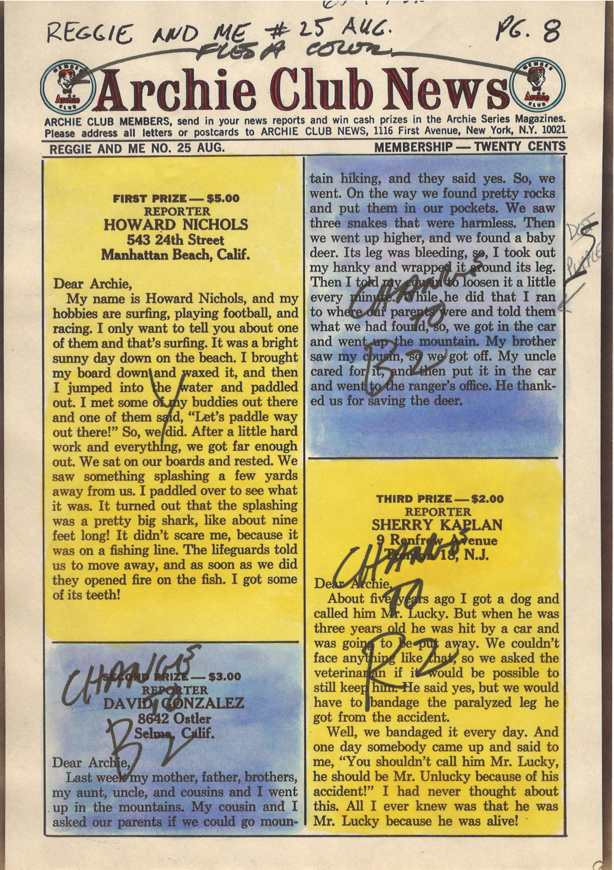
 Color guides are a type of original art created in the production of comic books. They are one-of-a-kind creations with hand work by the Colorist. To be honest, they're not very collectable, at least not when compared to the original art. But that's also part of their charm. For instance, the 6 pages I'm presenting here only cost about $88. Not bad for something created about 54 years ago!

However, I have seen some color guides go for very high figures, especially for covers. If you decide to look into it, you should expect to pay about $50 a page for most comics, more for mainstream superheroes like Superman and Batman. Honestly, you could see $200+ a page for those, and if it's a famous story, multiply that by whatever the seller wants. I recently saw the cover color guide for Amethyst, Princess of Gem World #1 listed at $1,999.

Reggie and Me #25, 

I think Archie is a great place to start with color guides. The colors are simple, straightforward and do not include a lot of special instructions. So, without further ado, here it is. (Note, the copies are on what feels like regular paper; it's kind of thin and definitely shows a little "bubbling" from the application of wet dyes (and you can see the ink stains on the third page. There is an odd, brownish border to the pages, which are about the size of the printed book.)

Credits:

  • Script: Frank Doyle
  • Pencils: Al Hartley
  • Inks: Jon D'Agostino
  • Colors: (attributed to) Barry Grossman
  • Letters: Jon D'Agostino


© 1967 Archie Comics

NOTE: This color guide is presented for the scholarly purpose of discussing how comics were colored in the past. Its fair-use inclusion here recognizes that the underlying story and artwork are the copyrighted property of Archie Comics.

By the way, if you have sharp eyes, you'll notice that page 26 is missing. That page was an ad, so it's not part of the story. Want to read the whole printed comic? Check it out here: https://viewcomics.me/reggie-and-me-1966/issue-25


Next up: Retro Coloring 04: Reggie and Me #25 Color Guide, pt 2

Tuesday, November 22, 2022

Retro Coloring 02: Color Guides

When talking about coloring comics, it's easy to forget something that was once very obvious: Coloring comics was a two-step process performed by two different people:
  1. The Colorist decided what colors went where. This person's job was to start with a stat (later photocopy) of the black & white artwork and then, using special dyes, paint the desired colors where they go. Afterwards, the colorist would hand write color codes on the art. (For more info on this, read last week's blog and don't forget to read "How to Color Comics the Marvel Way" from Marvel Age #13: https://viewcomics.me/marvel-age/issue-13/22.) The finished Color Guide was then handed off to the next person...
  2. The Separator took the Color Guide and then used a variety of physical tools and media (mostly acetate (thin plastic sheets) and cutting and pasting them where they go based on the color formulas provided by the colorist. This was a physical job that was often done by women (at least by the 1960s) and the accuracy with which the separator followed the colorist's guidance was kind of hit-or-miss. By that, I mean that the better comic shops got (and paid for) separators who did at least a workman-level job. They usually got it right, but sometimes (especially on tight deadlines), you'd see color get missed or messed up. But the cheap shops had a lot of problems.

I'm trying to track down some good videos on the physical part of color separations. If I find any, I'll link to them. This one is a good discussion about modern recoloring, and it has a few pics of the separation process: https://www.youtube.com/watch?v=uNYDiJibRM4.

Color separation is now handled digitally with computers (unless you're working with some old-school print-making equipment). So we're not going to focus on that aspect of the process. Instead, we're going to look at some Color Guides.

Color Guides

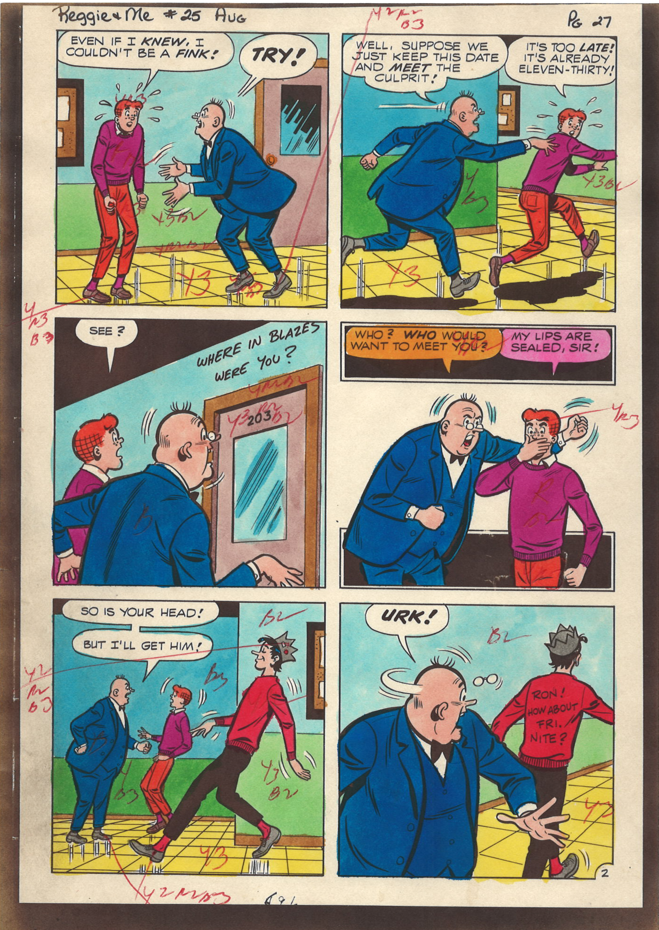
As I said, a Color Guide starts off as a black & white copy of the black line art. The colorist then paints in each color with special dyes (again, that Marvel Age article covers all that jazz) and then makes up the page with the associated codes that relate to the chart published in last week's entry.

Here's what a simple color guide looks like:

Reggie and Me #25 (Aug 1967)

The colors in this guide are attributed to Barry Grossman (by that, I mean most Archie scholars agree that is probably who colored this; it looks like his work and that was his job at the time).

Here's a scan of the printed page so you can compare the two:


Want to read the whole printed comic? Check it out here: